
Welcome to the March edition of the Rising Stars newsletter on successful new fonts. The keyword this month is “eclectic”. Our featured headline face is a sans-serif made of peas. We have a couple of informal brush scripts that are as different as two brush scripts can be. And we feature a great playful picture font for those who are in a framing mood. In contrast, this month’s text font is lucid and smooth. A versatile collection to start the new season with…
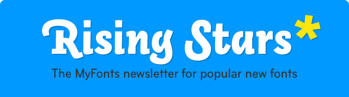
This month’s Rising Stars
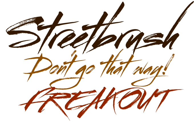
Streetbrush is a brush script font with a difference. It is not the kind of smooth and elegant font that hopes to end up on a soup package or a restaurant menu. It is dirty, fast, and real — a script with attitude.
Before embarking on a professional design education at Parsons, designer Robert Arnow was a graffiti writer in Brooklyn. Over the years he developed a signature style of expressive brush-rendered handwriting and illustration. The Streetbrush typeface evolved out of this, by repeating each letter hundreds of times with brush on paper. Streetbrush represents a unique blend of styles — urban graffiti meets Asian calligraphy. Being extremely detailed in its representation of a brush pulling ink across a textured surface, it is best used for large titling or signage. Have fun!
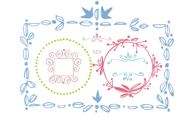
There used to be a time when a majority of advertisements and packaging had hand-lettered headlines and slogans, with matching hand-made borders and ornaments. Today, with shrinking margins and deadly deadlines, we often turn to digital ornaments and picture fonts to add a festive touch to our typographic designs. However, the standard frames and borders offered by layout and drawing programs can be stiff and boring. This is probably why Frames and Borders is so successful. This font from Outside the Line (also known for their delightful Party Doodles and Wedding Doodles) offers a collection of whimsical, hand-drawn frames for your invitation, packaging or book cover designs.
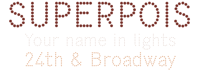
Just over two years ago the Italian design group Studiocharlie presented their cool, clean sans-serif Superbastone. The latest addition to the Superbastone family is a display variety called Superpois. Its name is based on the French word for green pea, and describes its appearance: a sans-serif made out of dots in three different diameters, resulting in a three-weight family. Superpois is, of course, the perfect companion to Superbastone. A very nice bonus is that all three weights share the same width and the same number of “pois”, so that they can be layered in different colors. Depending on your choice of color, the effect can be charming, playful or downright dazzling.
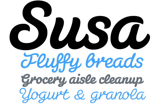
After Flavour, Schoko and other tasty scripts for food packaging , Hubert Jocham recently brought out Susa, a script with a slightly different look. It is a flowing, connected brush script, but has a sturdier character thanks to the almost monolinear strokes — i.e., strokes with hardly any difference between think and thin parts. The curves flow freely, with verticals at varying angles, giving an impression of spontaneity and playfulness. Susa’s bold and heavy weights are ideal for striking headlines, while the lighter weights work well for accompanying short texts in intermediate sizes.
Text family of the month
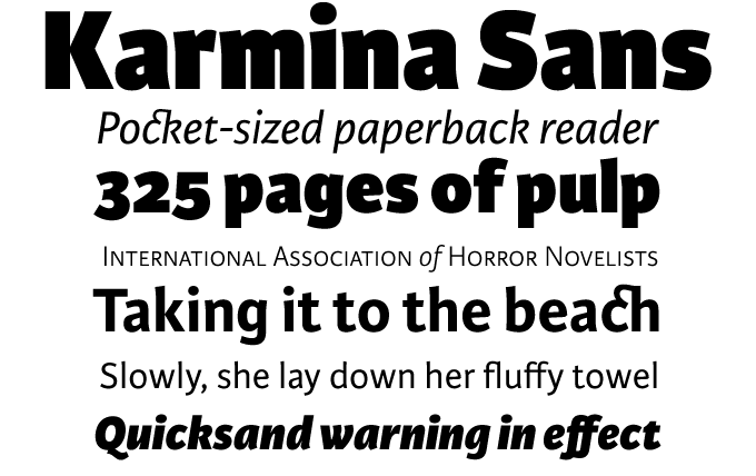
In just a couple of years, Type-Together, the intercontinental foundry of Veronika Burian and José Scaglione, has released an impressive array of well-made text and display faces. The prize-winning Karmina is among their most successful families: a robust seriffed roman for mass production, designed to be virtually indestructible even under poor printing conditions. Karmina Sans follows the footsteps of its successful cousin. While it shares similar stylistic features, it was specifically designed to be a versatile tool for editorial designers. It comes in six weights with matching italics, each of the OpenType fonts including nearly 900 characters per weight, with small caps, multiple numeral styles, scientific superior/inferior figures, and a set of symbols and arrows.
Karmina Sans’ heavy variant delivers one of the darkest and most powerful text styles available, while the text weights are perfect companions for Karmina Serif.
Follow-Up
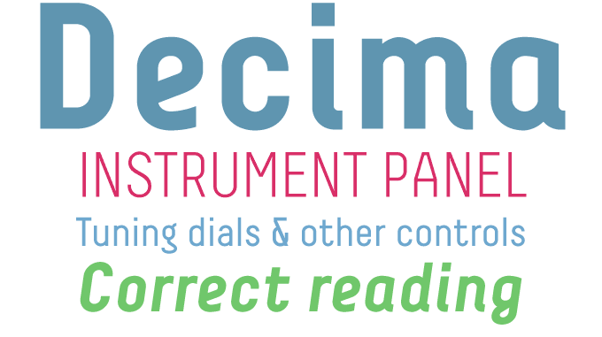
The Decima family, which we featured as one of last month’s Rising Stars has continued to do well. Both Decima and Decima+ are condensed sans-serif families with a clear, simple structure. Decima’s upright has rational, geometric forms, while the italic has more humanistic features and details borrowed from calligraphy. Decima+ combines the upright skeleton with italic shapes, which give it a certain softness. Finally, there’s Decima Mono for those who like the techie look of monospaced fonts.
If you like this font from TipographiaRamis, check out their other typefaces:
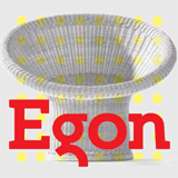
Egon
Egon is an unconventional geometric slab-serif with and industrial and architectural flavor. With three weights in roman and italic, it is an interesting little family for use in publications as a text and display font. It was named after Egon Eiermann as an homage to this great architect.
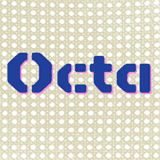
Octa
The Octa fonts combine an angular, octagonal construction with soft, rounded edges, resulting in a typeface that sits somewhere between retro-futurism and techno cool. The family of industrial-looking display fonts consists of five styles, including Stencil, Mono and Unicase varieties. Octa Tile is great for creating solid stripes of text.
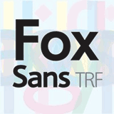
Fox Sans
Fox Sans is based on a completely reworked version of the designer’s original Fox family, which has been available from T-26 type foundry since 2001. The old Fox was redesigned to improve legibility; for the Sans version, flourishes and other picturesque details were successfully removed.
Sponsored font
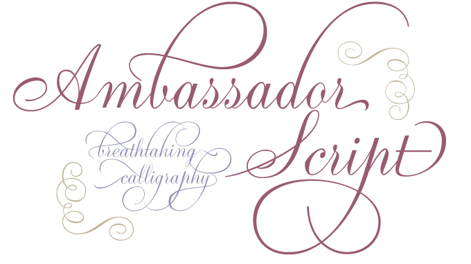
Aldo Novarese’s 1955 “tipo inglese” Juliet was a remarkable venture — a typeface based on English roundhand scripts, but with a more upright silhouette in order to facilitate the punchcutter’s work. Thanks to its legibility and friendly color it became an immediate favorite with magazine and advertising designers. Ambassador Script is Canada Type’s digital version of Novarese’s elegant masterpiece. Going above and beyond its duty as a revival, it has been expanded with a huge number of alternates, swashes, flourishes and snap-on strokes. Whenever lush curves and calligraphic opulence are called for, Ambassador Script is what you need.
Have your say
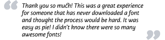
— Sarah in Missouri
26 Feb, 2009
Your opinion matters to us! Feel free to share your thoughts or read other people’s comments at the MyFonts Testimonials page.
Colophon
The Rising Stars nameplate is set in Auto 3 and Bryant, and the Have your say quotation in Karmina Sans.
Subscription info
Want to get future MyFonts newsletters sent to your inbox? Subscribe at myfonts.com/MailingList
Comments?
We’d love to hear from you! Please send any questions or comments about this newsletter to [email protected]