
In typographic circles north of the equator, these past few months will probably go down in history as the Summer of Scripts. Never before has such a rich crop of pointed pen strokes, cunning connections and stunning swashes graced our newsletters. But right now … maybe it’s our users’ reaction to all this opulence, maybe it’s the time of year: these past few weeks we have seen something of a renaissance of the practical and the legible. Which is why this edition of Rising Stars marks a return to good old sans and serif faces — for body text, for display or both (with one pomologically baroque exception). Enjoy.
This month’s Rising Stars
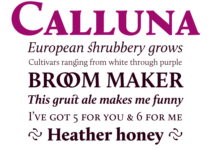
Dutch Designer Jos Buivenga has been a busy man lately. While his text type family Calluna made its steady climb to the top of our Hot New Fonts list (where it sits comfortably as we are writing this) he was already plotting the release of yet another fine font, Fertigo Script Pro.
Calluna, like the popular Anivers, was initially a by-product of the design process leading up to Buivenga’s Museo typeface. While “fiddling around” with different serif shapes, the designer wrote, “…something nice happened: slab-serifs with a direction!” Instead of using the resulting asymmetrical serifs for a new Museo version, Buivenga incorporated the concept in a completely new typeface. Calluna is the designer’s first serifed text family — a robust, clean and contemporary face with interesting details and a forward flow. Thanks to its clarity, it makes for comfortable reading even at extremely small point sizes; its striking details ensure that it can also be used as a display font with personality.
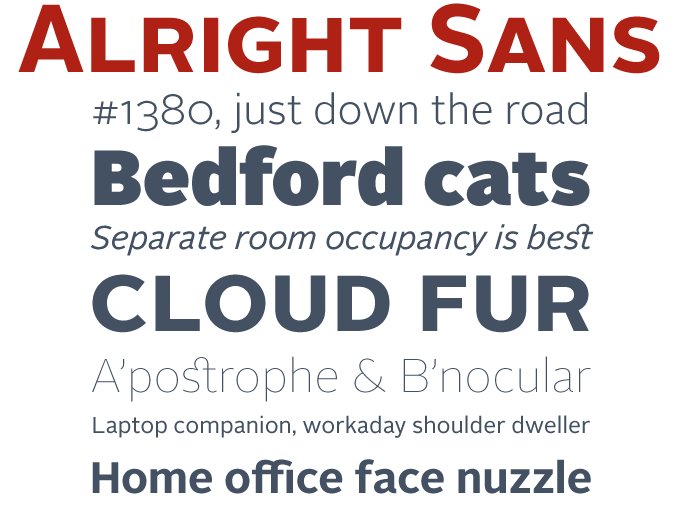
There has been an avalanche of sans-serifs lately — from clean and square to rounded, soft and human. Is there still any room for new and different flavors in the genre? If you’re a typographer who likes the typeface to strike exactly the right note for the job at hand, you’ll probably think there always is. And for the discerning designer, Alright Sans (not a bad name for an Okay typeface) does have something to offer that other grotesques don’t. It is lucid and modest without being bland or stiff. It is also open and relatively wide, resulting in a kind of roundabout economy: instead of using a narrow face at a large size, you can save space with Alright Sans by choosing a smaller size without compromising legibility. Alright comes with a robust set of typographic features, such as small caps (in both the roman and italic), eight sets of figures, case-sensitive punctuation, arbitrary fractions, and more.
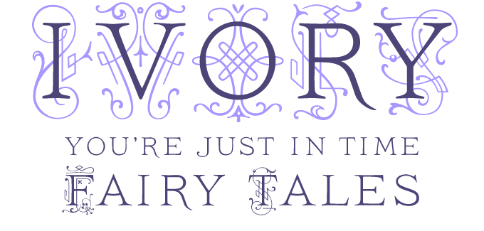
Ivory was inspired by a typeface used in an 1882 compendium about pomology (the study and cultivation of apples and similar fruits). Ornament and typographic fancy abound in 19th-century book design, and this work was no exception. In FaceType’s digital version, the apples were artfully split from the pears, that is: separate fonts were created for the letters and the ornamentation. By layering a text set in “NoSwashes” over the same text set in “Swashes”, nice two-color headlines can be created. For those who simply want to set one-color titles using ornamented characters as initials, there’s Ivory Headline, a font that has the swashed capitals in the uppercase section, and the straight ones in the lowercase section. A warning: the spacing of Ivory NoSwashes leaves room for the swashes and would look irregular without them; so if you want to use Ivory’s fine classic capitals with no ornaments, grab the Headline version. Any questions?
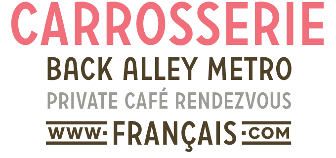
Carrosserie (French for “car body”) was based on the kind of straightforward capitals you may find in hand-rendered signs or book covers from the 1930s. It’s an all-caps sans-serif, strictly meant for display use, but it has some interesting alternate lettershapes that you can play around with, such as an ‘A’ with rounded top or an ‘M’ with diverging legs. There are some great alternate ampersands for creating company logos. Designer Fabian Widmer has radically updated this vintage alphabet to the internet age by adding a set of www domain symbols — check the PDF in the gallery for details.
Text family of the month
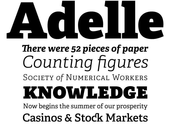
Adelle is the latest offering from the talented duo at Type Together. Adelle is a slab serif conceived for intensive editorial use, mainly in newspapers and magazines. The intermediate weights provide the robustness and indestructibility needed for high-speed newspaper production. Its neutral, unobtrusive appearance, excellent texture and slightly dark color allows it to behave flawlessly in continuous text setting, even in the most demanding editorial applications.
Adelle is more contemporary in character than traditional news faces like Times or Excelsior, and has a more affable personality than mechanical slab serifs like Rockwell. As it becomes larger in print, Adelle shows its personality through a series of easily recognizable particularities. The lightest and boldest versions especially lend style and charisma to book and magazine pages and will perform equally well as part of a corporate identity project.
Adelle offers 12 styles, ranging from light to heavy. The OpenType Pro package includes nearly 900 characters per weight, including small caps, fractions, old style and lining numbers, scientific superior/inferior figures, symbols and arrows. It supports over 40 languages that use the Latin extended alphabet. Adelle’s personality, flexibility and wide array of glyphs make it a real multiple-purpose typeface.
Follow-Up
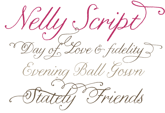
In our August newsletter we presented Nelly Script and its baroque companion Nelly Script Flourish; both fonts have continued to do very well. With these fonts, lettering artist Crystal Kluge, assisted by the prolific Stuart Sandler, has taken her hand-drawn letterforms to a new level of sophistication. Nelly Script strikes a beautiful balance between the liveliness of the hand-drawn and the class of a formal script. More theatrical elements can be added by combining the font with Nelly Script Flourish, a vibrant collection of flourishes & embellished letters with a large variety of alternate upper and lowercase forms.
If you like these typefaces from the Tart Workshop, check out some of their other fonts:
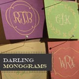
Darling Monograms is a set of elements to create charming monograms and frames for personalizing products. Its ragged edges and curly shapes lend the results a unique, nonchalant charm. For buyers who wish to create and sell products using this font, the Tart Workshop offers different prices based on the number of items you intend to produce.

Seasoned Hostess is a fun and casual script of capitals, with alternate forms in the lowercase section. A perfect blend of playful penmanship and ink lettering, this script will add a personal touch of mild anarchy to your website, scrapbook page or children’s book.
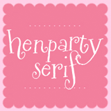
Henparty Sans and Henparty Serif were originally designed for an online tea store. Crystal Kluge’s whimsical alphabets were converted into smart OpenType fonts by Stuart Sandler, making sure that automatic substitution allows the letters to jump up and down along the baseline. Ideal for kid projects, children’s books, scrapbooking, and product branding.
Sponsored font
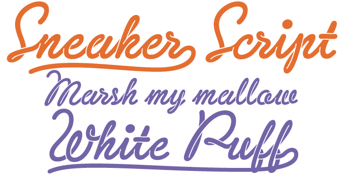
This month’s sponsored font is Sneaker Script from Nagoya’s Flat-It. There were a lot of nicknames for this kind of script when it was popular back in the 1970s: toothpaste script, sausage script, spaghetti type. If you could draw, it was easy: you simply sketched a monolinear connected script with a pencil, then added the 3D-effect when inking the letters. In digital type, it’s never been easy to create similar effects without losing the smooth and casual look of the hand-rendered models. With Sneaker Script, Flat-It’s Ryoichi Tsunekawa has pulled it off convincingly, using sophisticated OpenType technology which automatically selects the right glyphs while you’re typing in OT-savvy layout software, so that all connections look natural.
Check out the Sneaker Script gallery for other effects and colorful ideas.
Have your say
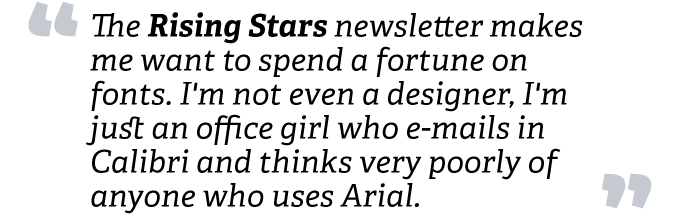
—Jessica in New Zealand
Your opinion matters to us! Feel free to share your thoughts or read other people’s comments at the MyFonts Testimonials page.
Colophon
The Rising Stars nameplate is set in Auto 3 and Bryant, and the Have your say quotation in Adelle.
Subscription info
Want to get future MyFonts newsletters sent to your inbox? Subscribe at myfonts.com/MailingList
Comments?
We’d love to hear from you! Please send any questions or comments about this newsletter to [email protected]