
Over the years, MyFonts has occasionally received mails from customers worrying about the relatively low number of female type designers represented on our pages. Needless to say, this was not on purpose but simply reflected the situation in the typographic world. However, things are changing fast. At design colleges around the world, female type design students now often outnumber the men. And at MyFonts, our list of productive “type ladies” is growing rapidly. This month’s selection of popular new fonts is a case in point. Successful typefaces from Germany, Denmark and the United States are proving that Fontland is not just a man’s, man’s, man’s world anymore.
This month’s Rising Stars
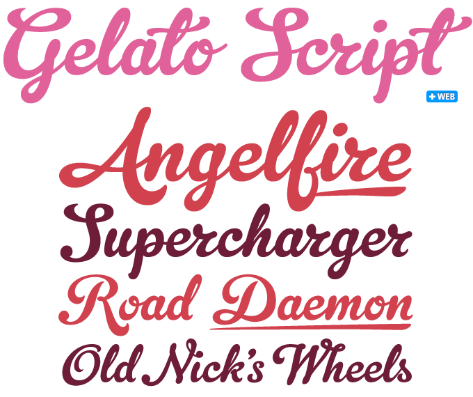
Gelato means ‘ice cream’, and Gelato Script lives up to its name: a mouth-watering, smooth-flowing font that will grace packaging, café menus, vintage automobile magazines and off-the-wall art catalogues, to mention just the most obvious uses. The font is the latest offering from Dave Rowland’s Schizotype foundry and his most successful so far, having reached the #1 slot of our Hot New Fonts list after a steady climb. Influenced by both formal scripts and mid-twentieth century hand lettering, its luscious curves make it attractive to a wide audience. For expert users, it has the additional benefit of being equipped with all the amenities of meticulous OpenType programming. Contextual Alternates make sure letters connect seamlessly, Stylistic Sets offer alternate forms to effortlessly change the mood of the text and apply an underline (read the font page (click “More...”) for details). With 781 glyphs, this font has many faces and speaks many different languages.
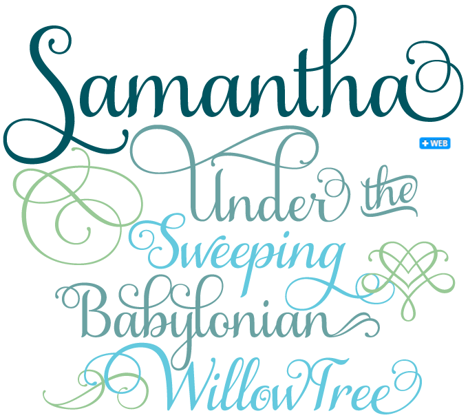
Queen of Scripts Laura Worthington strikes again: her Samantha family is a gorgeous and very usable connected script in two distinct styles (Upright and Italic), with a wealth of flourishes, ornaments and catchwords. With measured rhythm and contrasting strokes, Samantha possesses a smooth elegance with the ability to take on many appearances, from simple styling to fancy exuberance. Over 1,100 alternate and swash letters feature ascenders and descenders that vary in length and complexity. Standard ligatures ensure that this font looks as perfect as possible and 20 discretionary ligatures enliven its style. The addition of 60 ornaments and 45 catchwords offer even more design possibilities. A detailed User’s Guide PDF is available in the font’s Gallery.
This is such a large typeface that Worthington has created a variety of purchasing options to suit all budgets and capabilities: Samantha Italic or Upright Pro is the fully featured package for expert users equipped with OpenType-enabled software; while Swash, Select and Basic versions allow for an à la carte approach to building your ideal glyph set. See the font page (click “More...”) for more information.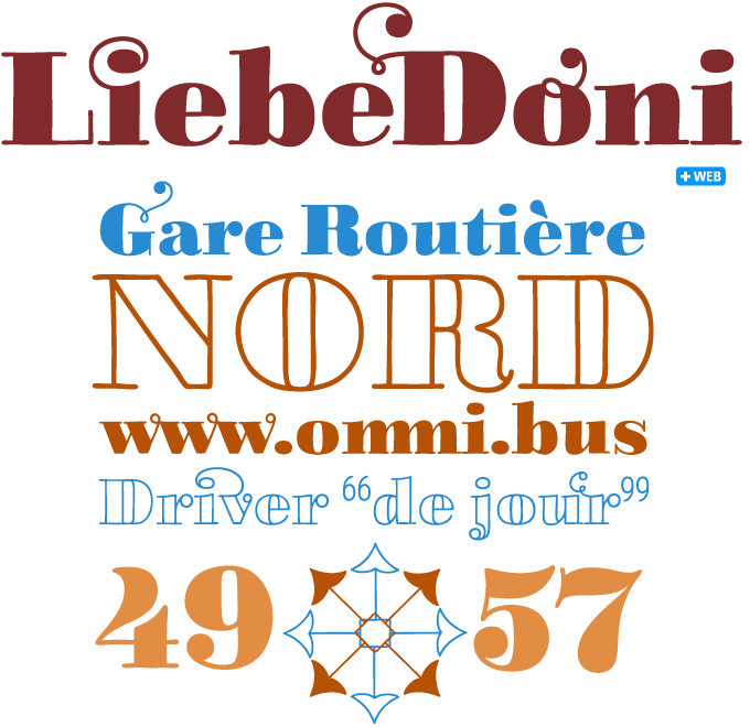
LiebeDoni was bubbling under in our Hot New Fonts list when it was discovered by the good people at Before & After magazine. In an enlightening interview with designer Ulrike Wilhelm, the mag showcased LiebeDoni’s swashy initials, swirly ligatures and other goodies; and Ulrike gave something back by offering readers a tasty discount when ordering at MyFonts. So what is LiebeDoni about? It is clearly a sibling of Ulrike’s LiebeErika, one of our Top Fonts of 2010, combining a hand-crafted look with regularity, lucidity and painstaking attention to detail. Inspired by the types of that famous citizen of Parma, Giambattista Bodoni, LiebeDoni pays tribute to Italian typographic heritage. With its warm and friendly style, plus a host of playful alternates, it is perfect for powerful headlines and impressive invitations. When combining the outline and the filled version, the possibilities for layering text in different colors are endless. Make sure your software supports OpenType if you wish to use the advanced features.
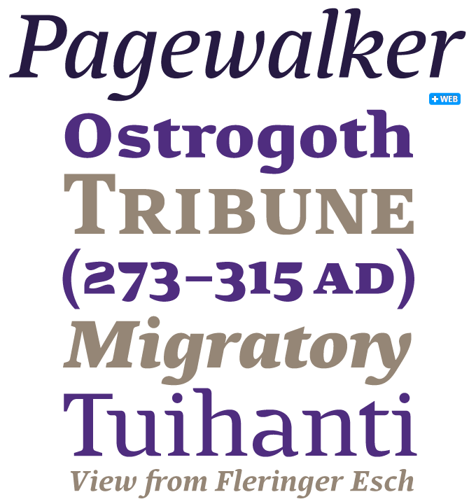
Kostic, a father-and-son venture in Belgrade, Serbia, joined MyFonts earlier this year with a fine collection of original fonts. Their versatile typeface Pagewalker has been the most successful so far. Combining sensual, curvy details with a clear and open silhouette, it is a wonderfully readable text face doubling as a distinctive display family. As the name suggests, the font was made with editorial design in mind. Its high legibility, distinct italics, small caps and OpenType features make it a useful tool for demanding typographers. Used in large sizes, it lends character to packaging, posters, logotypes and web pages. Pagewalker comes with multiple figures sets as well as an extended set of monetary symbols, making it a perfect choice for financial reports and other corporate design jobs.
Text family of the month
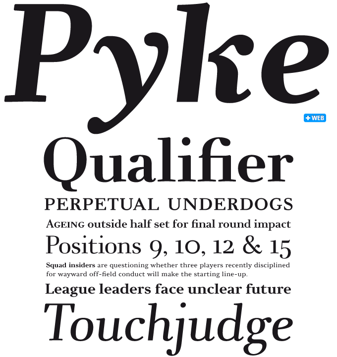
Sofie Beier of Copenhagen, Denmark, is part of a new generation of type designers who underpin their design work with thorough theoretical research. Her focus of interest is legibility, and she has collaborated with one of the most respected researchers in the business, Microsoft’s Kevin Larson. While conducting their joint study on “the most frequently misread lowercase letters” several of her fonts were used as test tools, and Pyke was one of them. Like Beier’s typefaces Ovink and Spencer, Pyke was named after a famous legibility specialist.
The Pyke family does something extra for smooth reading: it offers different designs for different sizes — in specialist terms, it uses optical scaling. Pyke Text is for body text at regular text sizes of 9-14 points, and the more subtle Pyke Display is designed for larger sizes. The Micro version is meant for fine print, such as footnotes and phone listings — font sizes from, say, 5 to 8 points. Micro is markedly sturdier and wider and has less contrast between thick and thin parts. (It can be used large as well for maximum impact, as we did in the “Pyke” font name above.) While inspired by the types of Bodoni, Pyke has a visual logic all its own: a clear, modern-looking type family with the features the demanding typographer expects from a high-quality text and display face.
Follow-Up
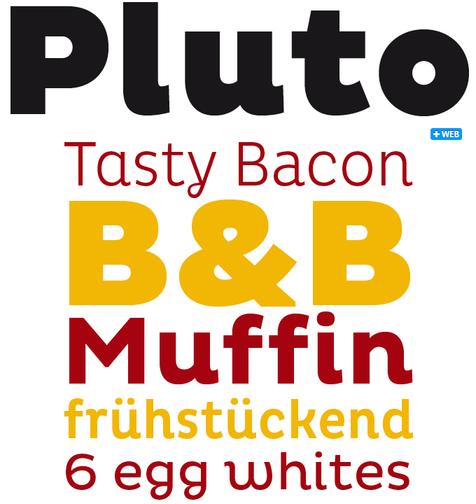
During its first month at MyFonts, Pluto was phenomenally successful. The appeal of its friendly shapes, its clarity and timelessness made sure that the typeface continued to do well — it is still firmly positioned in the Top 5 of our current Best Sellers list. The family comes in eight weights, from Thin to Black, in two widths — 16 fonts in all. Informal yet sturdy and readable, Pluto works well in both text and display settings and is a good choice for food packaging and advertising — and much more.
If you like this typeface from HVD Fonts, check out some of their other fonts:

Brandon Grotesque
With Brandon Grotesque, designer Hannes von Döhren took a fresh look at the geometric modernist classics from early twentieth-century Germany, taking cues from the more stylish and decorative typefaces of that genre. The geometric shapes of the compass and ruler were optically corrected for better legibility and harmony. The rounded corners lend the typeface a softer look.
Supria Sans
Supria Sans has elements of many classic and modernist sources, from industrial Grotesques to Eurostile, but the result has an atmosphere all its own. Supria Sans presents a combination of features that is quite unusual in its genre. It has three styles, including a curvy, feminine Italic as well as a more conventional Oblique, plus a Condensed version. Earlier this year, Supria Sans won its designer one of the coveted TDC Awards.

Reklame Script
Reklame is a German word that means “advertising”, and that is basically what Reklame Script is for. Inspired by the hand lettering of printed advertisements of the 1940s and ’50s, it is a powerful brush script in four weights, from Regular to Black. The four varieties can be combined for extra emphasis — perfect for slogans, billboards, packaging and the like. A stripped-down test font is offered for free.
Sponsored Font: Semplicita
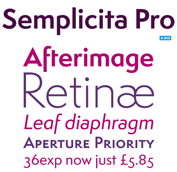
Canada Type’s Semplicita Pro is a new sans serif design that is part geometric sans, part humanist, and part gothic. The typeface is Bill Troop and Patrick Griffin’s reinterpretation of Semplicità, Alessandro Butti’s important 1930 design for the Nebiolo foundry. Fueled by Futura, Semplicità replaced that typeface’s cool geometric character with a warm, humanist soul that is characteristic not of the Bauhaus but of the Italian Renaissance.
Semplicita Pro isn’t simply a revival of Semplicità, which would have looked like a period piece. The designers used their model to solve a practical puzzle: How to make modernist sans serif letterforms truly readable at small sizes yet striking and persuasive in display. The result is an intensely readable sans serif design that gives contemporary designers a widely expressive palette, all within the principle of simplicity leading to better understanding. For more info about Semplicita’s amazing versatility, download the PDF in the gallery section.
Have your say
— kidk, July 9th, 2011
— Ada, San Francisco Bay Area, July 10th, 2011
Your opinions matter to us! Feel free to share your thoughts or read other people’s comments at the MyFonts Testimonials page.