

Dear reader, get ready for one of the most relevant best-of-the-year lists of the font world. MyFonts’ parade of most popular fonts of 2010 is based on sales, so ultimately this is the list that you voted for. And a fascinating collection it is too, offering striking, charming and highly original faces for all tastes and budgets. Some trends? “Friendly and human” is big, with typefaces sporting rounded corners, soft silhouettes or hand-drawn letterforms. Scripts are going as strong as ever. And two cities have risen to prominence as typographic metropoli, 7500 miles apart: Buenos Aires and Berlin. Those are the trends; these are the typefaces — enjoy! And happy 2011 from the MyFonts team.
Brandon Grotesque
Not only was Brandon Grotesque the most successful new sans serif of the year, it was also the best selling 2010 release overall. Designer Hannes von Döhren took a fresh look at the geometric modernist classics from early twentieth-century Germany. Giving Brandon long ascenders and descenders, he took his cues from the more stylish and decorative typefaces of that genre, such as Erbar or Kabel. Brandon Grotesque makes sensible use of the compass and ruler: the geometric shapes were optically corrected for better legibility and harmony. The rounded corners lend the typeface a softer look in large sizes.
Lady René
Lady René is probably the most whimsical and spontaneous font to have come out of Agentina’s Sudtipos foundry, usually known for its elaborate, polished script fonts (of which we will encounter a classic example below). In fact, Lady René was not drawn by one of the collective’s regulars; it is the first typeface by newcomer Laura Varsky. Born out of a love of illustration and a reverence for the written word, her font has the directness and spontaneity of a handmade drawing. Alejandro Paul’s hard work made sure that, although unpolished in nature, the font is technically impeccable, its character set full of surprises.
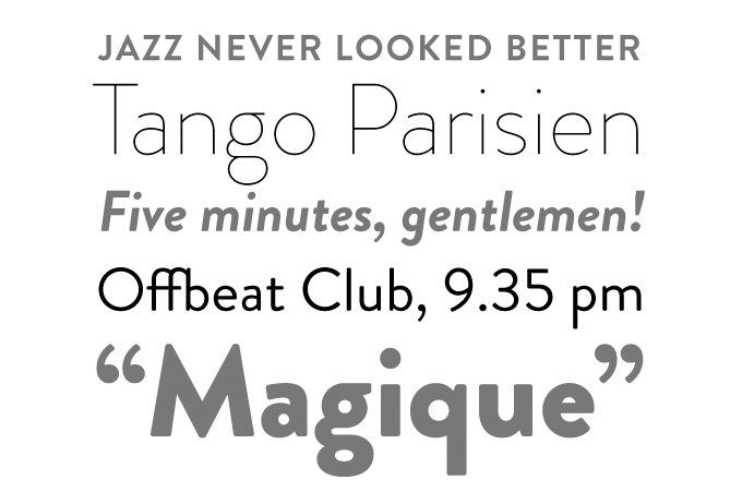
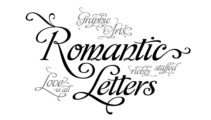
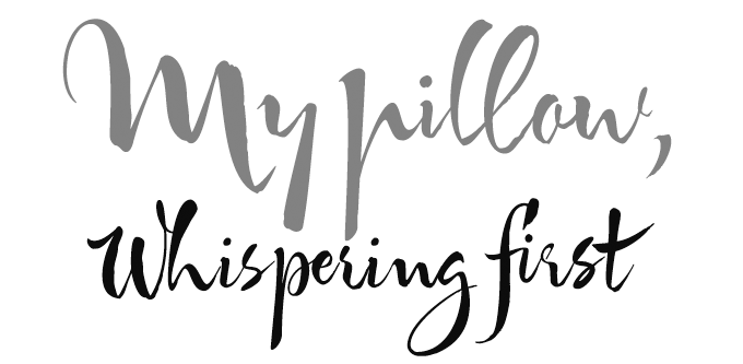
Origins
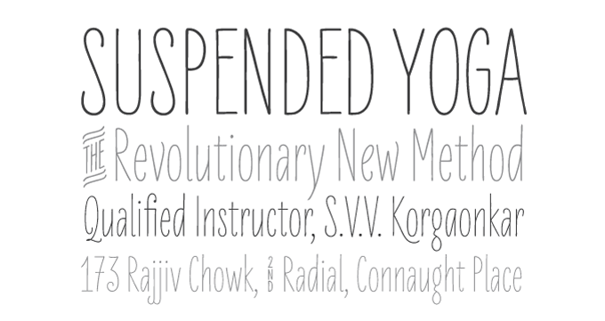
St Ryde
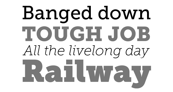
Affair
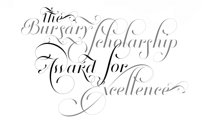
Alejandro Paul of Sudtipos is a master of that fascinating genre in contemporary type design that could be labeled “acrobatic scripts.” His ground-breaking Affair helped define the genre; it became available at MyFonts in early 2010 and has remained hugely popular throughout the year. Affair is one of those OpenType-programmed script fonts that need contemporary layout software to function as intelligently as it was designed; when using such OpenType-enabled programs, the font will help you select the ideal version of each letter in a particular combination to create amazing headlines and logos. Stunning stuff.
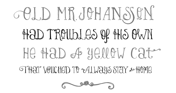
LiebeErika
Let’s hear it for another highly creative character from Berlin: Ulrike Wilhelm. Her one-woman foundry LiebeFonts (which is German for “sweet fonts”) published a series of witty, mildly successful picture fonts during its first year. It was her first alphabetical font LiebeErika that led to her breakthrough, skyrocketing into the upper reaches of our Hot New Fonts list. LiebeErika is special: despite its hand-made look, it is regular, lucid and readable. With well-drawn, supple curves and thin, compressed characters, it has charm as well as sensibility. It is also full of extras, such as cheerful alternate forms and figures, ligatures, nicely designed key words (“and”, “the”, “by”) and more.
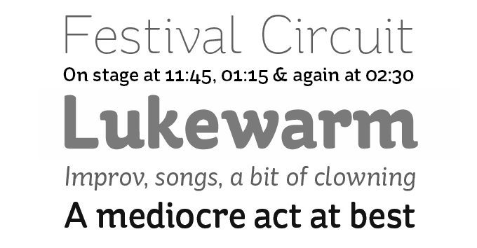
Museo Slab
One of MyFonts’ greatest hits of the past two years is the Museo series from Jos Buivenga’s exljibris foundry. The family started out as a semi-serif, then branched out into the sans-serif genre with the cool, clean Museo Sans. Museo Slab logically completed the suite and, as was to be expected, it has been hugely successful throughout the past year. The sturdy slab serifs combine perfectly with the family’s friendly geometry, resulting in a wonderfully readable typeface.
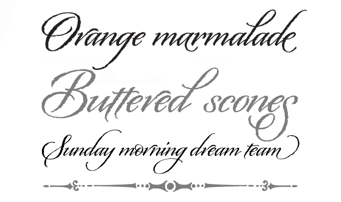
Breathe
In the well-established genre of exuberant formal script fonts, Breathe by Maximiliano R. Sproviero is a special case. Designed to look alive, fresh and airy, the font takes a jump from the work of Didot and his contemporaries from around 1800 to today’s fashion of endless swashes and flourishes. Breathe Pro comes with over 1000 glyphs, including huge sets of alternates, swashes, historical forms, ligatures and more. If you want a less intricate font in the same style, choose Breathe Standard.
Sketchetik
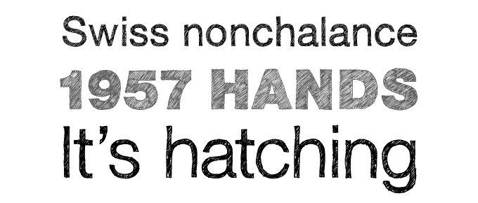
Sketching type was once a skill every graphic designer had to master in order to produce convincing mock-ups and tell the typesetter how the final result should look. With the recent crop of sketched fonts, the mock-up has now become the final product. Of the various hand-made versions of classics we’ve seen the last couple of years, Hiekka Graphics’ Sketchetik is the biggest hit. Based on that 1950s modern classic that is still the world’s best-selling font family today, Sketchetik combines lucid Swiss proportions with a loose hand-drawn look.
Despeinada
Argentinean-born Ricardo Rousselot learnt from some of the best American lettering artists when working in Chicago in the 1960s. Having moved to Barcelona in 1975 he has drawn logos and developed packaging for some of the biggest Spanish brands. Rousselot, now in his seventies, has finally begun publishing his hand-rendered alphabets as digital fonts. Despeinada, the first release from his foundry EdyType, was an immediate hit: it has been the year’s most succesful informal script. Its name means “uncombed” — an apt name for this loose, spontaneous handwriting font that is rough and precise at the same time.
Livory
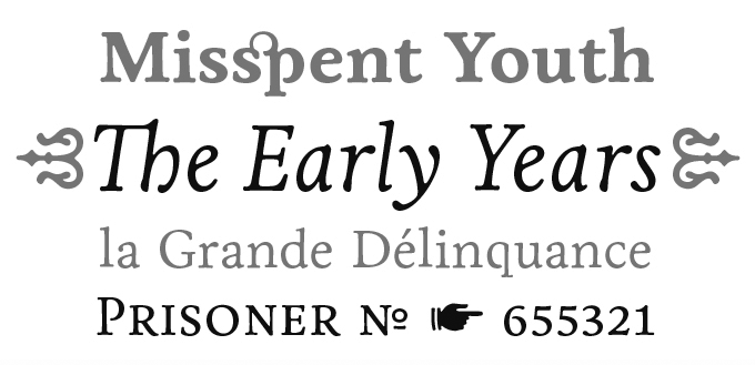
Few foundries have been as successful last year as Hannes von Döhren’s HVD Fonts — in fact, two of his typefaces were among the year’s absolute best sellers. Livory was the biggest surprise: a thoughtful variation on the French sixteenth-century model, it was the year’s most popular oldstyle text font. Designed in collaboration with Livius Dietzel, its aim was to combine classic proportions with shapes full of verve and an audacious “fusion” of glyphs. The result is fluid and vigorous oldstyle without a trace of nostalgia.
Colophon
MyFonts Top Fonts of 2010 was edited and laid out by Jan Middendorp using Nick Sherman’s template, with type specimens by Anthony Noel. The title graphic is set in St Ryde.
Subscription info
Want to get future MyFonts newsletters sent to your inbox? Subscribe at myfonts.com/MailingList
Comments?
We’d love to hear from you! Please send any questions or comments about this newsletter to [email protected]