If this newsletter has a key word, it must be ‘imaginative’. Each of the fonts and families we present this month has found a way of crossing boundaries, defying cliches, or adding just that bit of je-ne-sais-quoi that makes a font innovative or special. Sometimes the magic is in the technology, with fonts proposing stylistic varieties or unique ways of setting a word. Sometimes it is in the details — luscious curves, whimsical terminals or inventive ways of softening and twisting stern geometric shapes. Happy scrolling — and don’t stop until you are all the way down, for our sumptuous sponsored font is already a contemporary classic.
This month’s Rising Stars
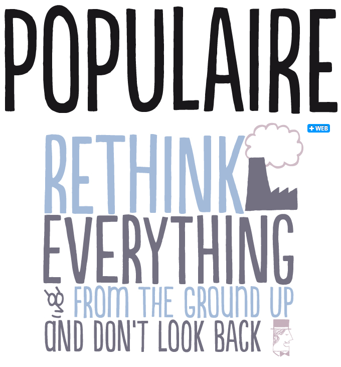
Populaire is the latest offering from PintassilgoPrints, a two-person Brazilian outfit that specializes in spirited display fonts with a playful, handcrafted feel. The font was inspired by the electrifying posters made at the ‘People’s Workshop’ (Atelier Populaire) during the May 1968 student revolt in Paris. Populaire successfully mimics the energy of that period’s hand-drawn and silkscreened posters, bringing freshness and energy to headlines and slogans. The typeface comes with four exchangeable glyphs for each letter, resulting in a flexible font that looks as lively and spontaneous as real hand-lettering. As part of the font, there is also a rich set of ornaments and pictures — abstract, ornamental and revolutionary.
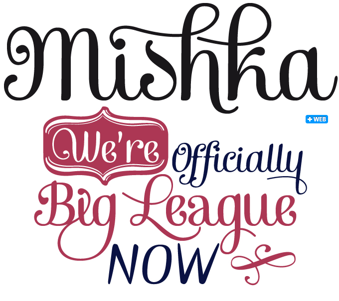
In less than a year the Fenotype foundry has released about half a dozen successful script-like typefaces that recall hand-made pub and shop lettering. With fonts like Verner, Barber and Pepita Script designer Emil Karl Bertell defined his signature style — a playful and personal view of scripts that mixes clear and informal lettershapes with a taste for the exuberant and decorative. Mishka, his latest offering in this vein, is a pleasant upright script that offers its users plenty of options to customize headlines — just activate Swashes, Stylistic Alternates or Contextual Alternates in any OpenType-savvy program. Its small caps are a font within a font: an energetic set of sans-serif caps that combine well with the scripts but offer a distinct style. Mishka Ornaments is a separate font of 90 typographical ornaments designed to work perfectly with the upright and italic script fonts. For the best prices, check out the great package deals.
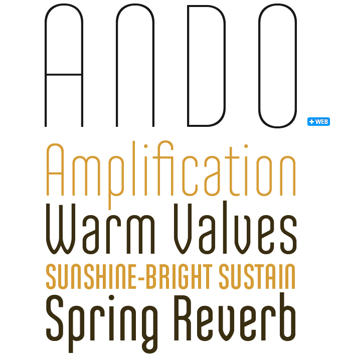
It is amazing how the design method of constructing fonts with circles and straight lines offers designers ever new possibilities to come up with variations on the geometric theme. In the case of Ando, it’s the charming details that set the font apart from the competition — the arched A, M/m, N/n, the parallel strokes of W and V ending in rounded triangles, the quirky strokes on g, k, v and y. The parallel lines and clear shapes of its capitals also make it a perfect font for use in all-caps, lending your headline a distinct Art Deco atmosphere. The fonts, provided in OpenType format, include standard ligatures, diacritics for most European languages and OpenType features such as case-sensitive forms and proportional as well as tabular figures.
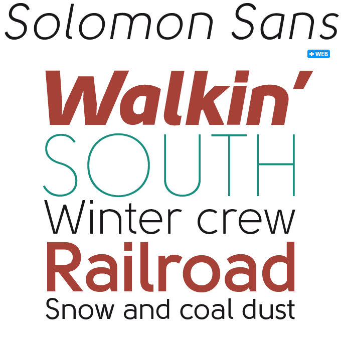
Solomon Sans was introduced in last month’s Creative Characters interview with designer Svetoslav Simov. The ‘sans’ in the font’s name does not refer to serifs but to the ornaments of the mother font, the original Solomon. As a font combining simple, monolinear strokes with joyous swirls, loops and spirals, Solomon is a cheeky crossover between two worlds: modernist geometry and decorative calligraphy. Solomon Sans resolutely takes the basic shapes of that earlier font back to normality, resulting in one of Simov’s most extensive and usable families to date. Solomon Sans has seven weights, is equipped with real italics, multiple figure styles as well as Cyrillic and Greek and is characterized by excellent legibility. This makes the typeface suitable for headlines of all sizes as well as more demanding typographic tasks in web, print, motion graphics and product design.
Text family of the month
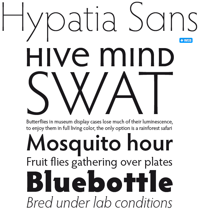
Named in honor of the remarkable mathematician Hypatia of Alexandria (died 415 A.D.), Hypatia Sans was designed by Thomas Phinney, now a senior product manager for fonts and typography at Extensis. Phinney conceived Hypatia in 2002, while working as Adobe’s program manager for fonts, having noted that the Adobe Originals collection did not include a geometric sans-serif. Working under the guidance of Robert Slimbach, it took Phinney several years to complete the upright faces, which were offered as a registration incentive for Creative Suite 3. It wasn’t until 2010, when Phinney’s italics had been completed by Paul Hunt, that Hypatia was released for retail.
Hypatia echoes the basic forms of geometric designs from the 1920s and 1930s, and adds features derived from classical oldstyle typefaces and inscriptional lettering, giving the design a balance between cool geometry and warm organic shapes. The letters are expressive at larger sizes, and are still clear and readable at text sizes in short paragraphs. Its wide range of weights, many alternate glyphs and layout features provide a palette of expressive options. When using programs with full OpenType functionality, stylistic sets allow users to change the overall appearance of the font. Of the 14 stylistic sets, the most remarkable are Stylistic Set #1, which removes the vestigial serifs and makes Hypatia Sans a true sans-serif, and Stylistic Set #2, which substitutes more geometric alternate forms of certain letters (a,g,t,y) and of the ampersand (&). The most unusual set is the unicase small caps (#13).
Follow-Up
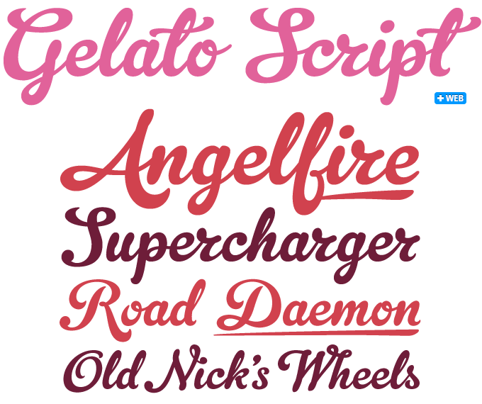
Having been featured in last month’s Rising Stars newsletter, Gelato Script has continued to be wildly successful. Its name is Italian for “ice cream”, and the font is indeed mouth-watering and smooth-flowing — ideal for packaging, café menus and magazines. Influenced by both formal scripts and mid-twentieth century hand lettering, its luscious curves make it attractive to a wide audience. For expert users, it has the additional benefit of being equipped with all the amenities of meticulous OpenType programming. With 781 glyphs, this font has many faces and speaks many different languages.
If you like this typeface from Schizotype, check out some of their other fonts:
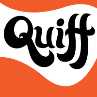
Quiff
Quiff is a laid-back surf-style font with a hand-drawn feel that works best in bright colors and looks particularly good with a big fat drop shadow. It comes with loads of ligatures and alternate forms of s, c, y, g, j and &. Use Quiff for beachside cafés, surf shacks, disco flyers and psychedelic musings.
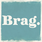
Brag
Brag is a bold as brass display serif with a slight Tuscan flavor. Ideal for headlines, logos and posters, or as an alternative to extra-bold staples like Cooper Black. OpenType features include special ligatures and stylistic alternates grouped into stylistic sets.
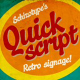
Quickscript
Quickscript makes fifties-style hand-lettering quick and easy. The type is retro but its graffiti undertones give it a modern feel — perfect for posters, T-shirts, café menus and signage. OpenType-savvy applications can make use of ligatures and stylistic alternates, giving the text a more connected look.
Sponsored Font: Burgues Script
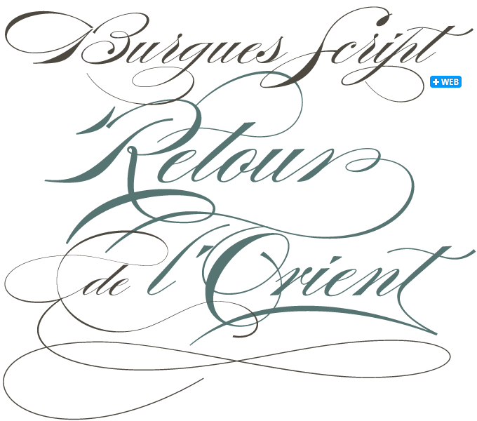
Burgues Script by Alejandro Paul of Sudtipos is a tribute to the late 19th-century American calligrapher Louis Madarasz, whose legendary pen has inspired schools of penmanship for over 100 years. His talent has caused some people to call him “the most skillful penman the world has ever known.” The two main sources for the typeface were the calligraphy examples shown in Zaner Bloser’s The Secret of the Skill of Madarasz: His Philosophy and Penmanship Masterpieces, and C. W. Jones’s Lessons in Advanced Engraver’s Script Penmanship by L. Madarasz.
As Ale Paul wrote, “These two references were the cornerstone for my concept. I had to change many of the letters in order to be able to produce digital calligraphy that would flow flexibly and offer the user a variety of options, while maintaining its attractive appearance. To this end, I made many ligatures and swashes, as well as full flourished sets of letters for use at the beginnings or endings of words and sentences. Madarasz’s method of penmanship was fascinating and challenging to translate into the strict, mathematically oriented language of the computer. … When I think of Madarasz producing a flourished calligraphic logotype in a few seconds, and try to reconcile that with the timelines of my or my colleagues’ work in identity and packaging design, the mind reels. Such blinding talent from over a hundred years ago.”
Burgues is the recipient of prestigious awards, including a Certificate of Excellence from TDC2 2008 and a Certificate of Excellence from Bienal Tipos Latinos 2008.
Have your say
— Veronica, Sydney, Australia, July 9th, 2011
Your opinions matter to us! Feel free to share your thoughts or read other people’s comments at the MyFonts Testimonials page.
MyFonts is on Twitter and Facebook!
Join the MyFonts community on Twitter and Facebook. Tips, news, interesting links, personal favorites and more from MyFonts’ staff.