
This month’s Rising Stars
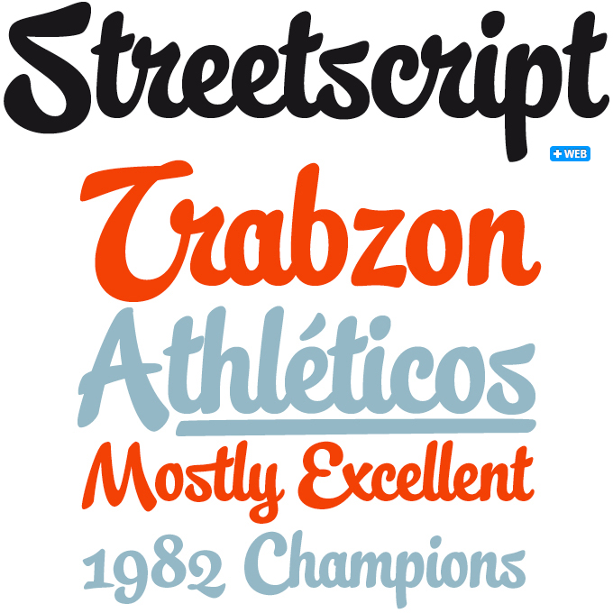
Streetscript is a connected brush script in a style made popular by foundries such as Underware and Sudtipos. Which is not to imply that Schizotype’s is a pale imitation of these foundries’ work: it has a very personal approach and designer Dave Rowland has invested a lot of love and imagination in its detailing. As is customary in such well-wrought scripts, Streetscript contains a wealth of OpenType goodies to connect letters seamlessly and to propose alternate forms according to context. The font offers an underline function, wonderfully expressive oldstyle figures, and various alternate letterforms.
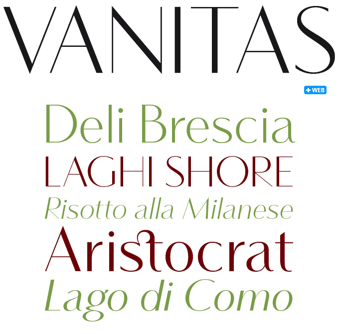
Today’s cutting-edge magazine design favors, on an almost global level, a specific palette of typeface styles. One of these genres is the one that Vanitas represents: a finely drawn, fragile, high-contrast Bodoni-like sans-serif. Vanitas has retained several of the qualities of a Didone: a rational, rather geometric skeleton; simplicity in the detailing; subtle hairlines. It has done away, of course, with the typical straight serifs and ball terminals. Its appearance is clean and modern, replacing some of the 1800s-style shapes with energetic alternatives — the lowercase ‘g’ being a case in point. The result is a rather unorthodox yet elegant and balanced display face with many typographic niceties.
Text families of the month
The output of well-made, usable text faces has been staggering lately. Therefore this month we present not just one, but three great new families. The samples all have the same text and structure to facilitate comparison and get an idea of the number of weights at first glance. Most text fonts presented here are available as web fonts; to check if they meet your standards as fonts for body text on the web, we recommend you make ample use of our webfont preview pages.
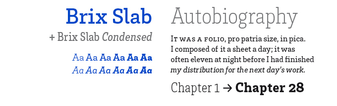
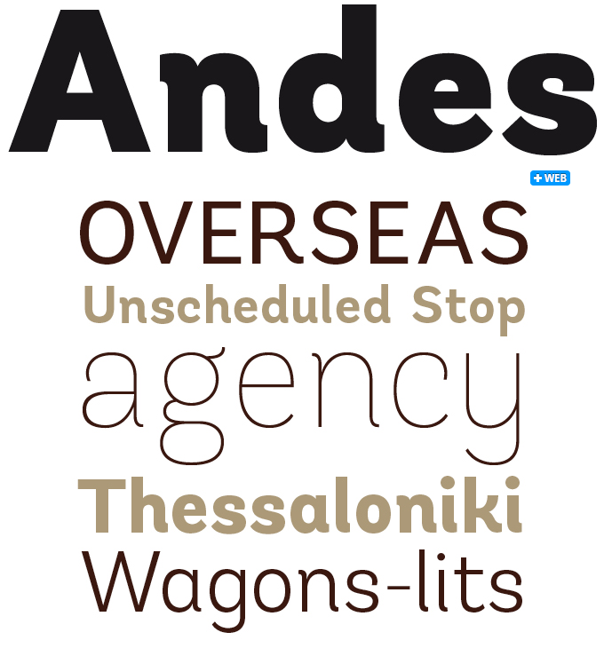
Typefaces, we have been taught, are the building blocks of graphic design; and Brix Slab from HVD Fonts offers building material of a particularly robust calibre. Brix Slab and Brix Slab Condensed form an extended family of 24 fonts, optimized for longer texts and highly readable in small sizes. With more than 700 glyphs in each font, the family is equipped for complex, professional typography.
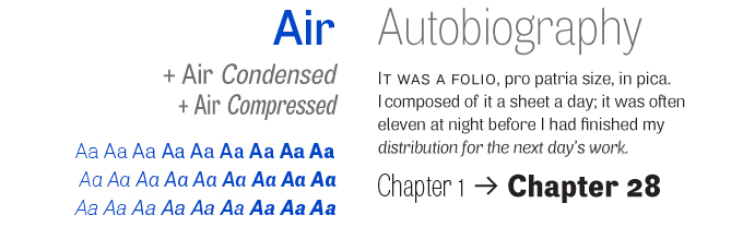
The reason why Neil Summerour’s Air Superfamily comes in a staggering 81 fonts is this: not only does it offer nine weights in three widths, it also comes with two kinds of italics, as shown in the blue sample of Aa’s, above left. The middle row presents the real italics, with more flowing forms; the bottom row shows the modernist Oblique: basically, the upright shapes set at an angle. This makes Air all the more versatile as a modern-day grotesque. It doesn’t stop there: the subtly rounded Air Soft offers another 81 fonts!
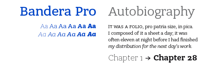
Like Brix Slab, Bandera Pro is a slab serif or Egyptian: a low-contrast face with sturdy rectangular serifs. Although it has many characteristics in common with Brix, including excellent legibility, the overall atmosphere is markedly different — a little edgier in the uprights, a bit more calligraphic and quirky in the italics. Created by Ukraine’s AndrijType, the family offers both Greek and Cyrillic character sets. Bandera Pro has six weights with real italics, small capitals and three sets of digits.
Follow-Up
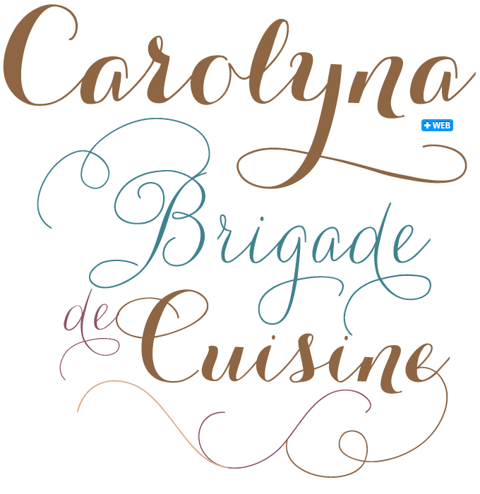
The popular Carolyna Pro made it into last month’s edition of this newsletter, and its success story continues. The Emily Lime foundry followed it up with a bolder sibling, and sassy Carolyna Pro Black soon danced its way to the very top of our Hot New Fonts list. The family’s whimsical and charming take on contemporary calligraphic styles has obviously hit the spot with many of our users. The Carolynas use OpenType features to assist with letter flow and to give each creation that modern, hand-lettered touch. With over 1000 characters, there are many stylistic alternates and fun swashes to choose from. Note: both fonts work best with OpenType-friendly applications.
If you like this typeface from Emily Lime, check out some of their other fonts:
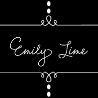
Emily Lime
Like a self-titled debut album, Emily Lime was a bit of a manifesto for the foundry of the same name. Their first font to become available at MyFonts, it has most of the characteristics that mark designer Emily Conners’ work: spontaneity, flow, quirkiness and a lot of OpenType features to help make each typographic design unique and interesting.
Revel
Revel is a peculiar mixture: a stylish blend of high fashion and straddle-legged western-style bravura. Use all caps for a modern sophisticated look; or type in all lowercase for a more youthful rocker effect. This hybrid font comes with alternates, decorative elements, ligatures and even a few swashes thrown into the mix.
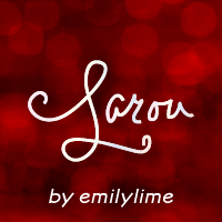
Larou
This script font is probably the craziest of Emily Lime’s creations. Yet even as it sways, rocks and jumps all over the place, it retains its legibility. Larou was created to be original, fun, and imperfect. Letters are not uniformly sized, but are created such that the final outcome is unpredictable and interesting. Larou includes alternates and ligatures to assist with readability and flow.
Sponsored Font: Sommet Rounded
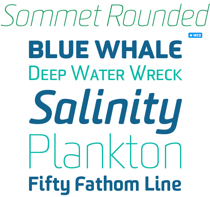
Sommet Rounded is a member of the Sommet suite, the successful superfamily from the insigne foundry. Sommet is designer Jeremy
Dooley’s take on the popular model of the squarish, simplified sans-serif. Sommet Rounded enhances the typeface’s retro-futurist feel by rounding off the terminals. Sommet Rounded has retained Sommet’s condensed, rectangular silhouette and angled horizontals — but the overall impression is friendlier and less formal. In a layout requiring both typographic consistency and a wide range of type styles, the Rounded variant can be easily mixed with the other Sommets. It has several figure styles as well as small caps.
Have your say
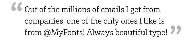
— Evan Frangos (@EvanFrangos) on Twitter, January 9, 2012
Your opinions matter to us! Feel free to share your thoughts or read other people’s comments at the MyFonts Testimonials page.
The Webfont Showcase wants your work!
Let us know about the exciting work you’re creating with our webfonts.
We love to see webfonts used in navigation, layered over images, in logotypes and mastheads, in extended body settings ? basically anywhere text can be set using webfonts.
Find our submission form here, tweet us @myfonts or share something with us at our Facebook page.
We’ll feature the best examples in our Webfonts In Action pages, plus we’re on the lookout for projects to cover in more depth in our case studies.