
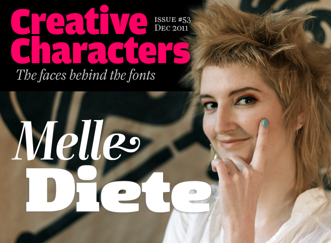
Photo by Christoph Bartholomäus
Her typeface Mary Read was one of Typographica’s fonts of 2008, and in the three years since that first success she has continued to produce typefaces that are both witty and very useful. She is also a talented illustrator as well as a part-time type designer at Luc(as) de Groot’s studio, LucasFonts. After a succession of fonts that combined the frivolous and the well-made, she recently brought out the clean, robust Gingar family, which is currently climbing our Hot New Fonts list with vigorous determination. Meet Melle Diete from Berlin. Refreshingly different.
We conducted the interview in German; the original text is available on our German sister site, MyFonts.de.
Melle, you studied visual communication at the University of Applied Sciences in Potsdam, near Berlin. What did you hope to find there? And did you find what you were looking for?
Before starting my studies, I worked in a small creative agency as a media designer. Typography was my hobby and my passion. The work there was very pleasant; I had wonderful colleagues and I was in charge of the typographic aspects of the studio’s work. But after a few years I had the feeling that I needed to evolve again, the nest had become a cocoon. So I enrolled at the department of Communication Design in Potsdam, and the professors there managed to break me out of the mould. Completely new, creative worlds opened up for me. Back to my roots! Back to pencils, brushes and chalk.
After graduation you published a remarkable series of fonts in just over three years. You’re also an illustrator with a vision and a style of her own. Which came first, and how did you get from one to the other?
Illustration came first, really. I was drawing people, situations, dreams — and at some point I began drawing letters. And from there, turning them into complete alphabets. At Potsdam it took me exactly a year before I had the courage to join Luc(as) de Groot’s Type Design course. I developed a font of my own — Mortelle — in order to qualify myself. Then during the course I made three typefaces instead of the one required. Yes, I was quite zealous…
As a freelance collaborator of Lucasfonts in Berlin, you now work with your former professor on a regular basis. What are the most important things you learned from Luc(as), and what makes it interesting for you to work there?
Luc has supervised me from the beginning, he was even part of the admission committee when I did my entrance exam. I learned an incredible amount from him during my studies, and I am very grateful for that. He introduced me to the teachings of Gerrit Noordzij and Rosemary Sassoon. He helped me train my eye, according to the Dutch method of analyzing lettershapes. And I am still learning today. It’s a never-ending journey.
What is particularly exciting about working at LucasFonts is the ongoing exchanges. On the one hand, Luc(as) and I sometimes play a kind of ping pong, with work pinging back and forth between us. On the other hand, there’s the interchange with my dear colleagues Jan Fromm, Elena Albertoni and Sylvain Mazas. We show each other our latest work, give feedback and counsel each other.
But the kinds of jobs we get involved in are interesting as well. I worked on the logotype for the daily paper Tageszeitung (Taz) for some time. Recently I have participated in the design of fruit and vegetable icons for Miele. That was very enjoyable, because besides the curves of lettershapes I could also contribute my illustrative vein.
Gingar
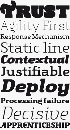
In her description on the Gingar font page, Melle Diete, tongue firmly in cheek yet with genuine pride, describes Gingar as “a proper font.” And quite a family it is. Consisting of thirty styles — no less than fifteen weights, from UltraLight to ExtraBlack, plus italics — it offers extreme impact in headlines, resulting in a very usable, multi-purpose family. Gingar is a slab serif with a difference: striking a nice balance between the playful and the classic, it lends a warm and friendly tone of voice to any display setting. Adding to Gingar’s versatility is a set of special swash characters and ligatures. Melle Diete recommends its use “for fashion, food, wellness, magazines, corporate design projects and many more.”
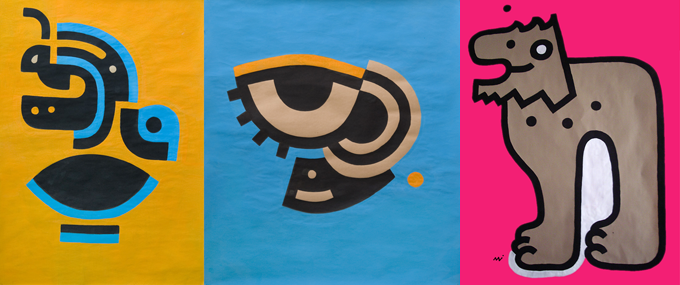
Three gouaches by Melle Diete, titled Bird, See and The Big L.
Let me go back to what you said about the Dutch way of analysing letters. This “Dutch way” has almost become something mythical, but I suppose many people don’t have a clue what it is actually about. Can you say something more about it?
First and foremost, the Dutch are very advanced in terms of understanding the need for graphic design. If you drive through the Netherlands, you seldom see such as thing as bad lettering. Virtually everything has been designed — very pleasant. Within this design typefaces naturally play a very special role.
The Dutch are also internationalists, which is reflected in the line-up of the LucasFonts studio. There is a Frenchman, a Russian, women from Italy, Estonia and Argentina, and three Germans. Different letters and curves are connected, so to speak, to different languages.
But to answer your question more specifically, I need to say something about the way of classifying lettershapes. Typefaces are usually divided into many different categories that refer to the stylistic characteristics of the times in which they were first developed: humanist roman, classicist roman, etc. Luc has cleaned up this conventional history of lettershapes for me according to the principle conceived by his teacher Gerrit Noordzij. All letterforms are simply divided according to two kinds of stroke contrast: expansion (based on the pointed pen) and translation (the broad-nibbed pen). This really enables you to categorize everything quite easily. It’s very practical and, in its way of reducing things to their essentials, it’s very Dutch to me.
What is it you like most about Luc(as) de Groot’s typefaces?
Their forms are complete; the curves are perfectly in place. Exactly on the unit. The fonts are also very well produced. But actually there is no such thing as a perfect typeface: there always remains something to improve. But Luc(as)’ fonts are very, very close. I also like their feminine side, and of course the arc of the ‘d’. Lovely…
Mary Read Italic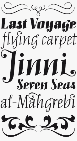
Having selected the original Mary Read for Typographica’s Favorite Fonts of 2008, Joshua Lurie-Terrell wrote: “Subtle curves, sharp contrast and fanciful curlicues give it an outgoing personality which rivals some of the best formal scripts of recent years.” Diete found there was room for improvement — more weights, new capitals — and so she recently issued an upgrade. Called, somewhat confusingly, Mary Read Italic, the new version is in fact no more italic than its predecessor. It simply offers more features and more fun … at a better price.
As you gradually focused more on type design, you must have discovered other heroes or role models as well. Who do you admire?
Emigre and Underware are my absolute heroes. I love the more recent typefaces by Zuzana Licko.
To me, Filosofia is sacred — a fresh look at the classic typefaces of Bodoni, which I greatly admire. Gorgeous! As for Underware: in addition to the fonts, their workshops are very exciting; they invariably lead to amazing results. Pioneers in type design! With each workshop they manage to inspire an entire group of people. What I find particularly interesting about those workshops is the way they combine type and daily life. Building letters out of books and shopping carts, making them with shadows. These letters are even digitized, making for a very high end result — it’s all very intoxicating. The thing I find particularly interesting about Underware is the teamwork that made creating these fantastic typefaces possible.
Some months ago, two spirited Bodoni-inspired type families were released on MyFonts on the very same day, by two Berlin ‘designerinnen’ (female designers) who both studied at Potsdam: your Anne Bonny and LiebeDoni by Ulrike Wilhelm. Were you surprised? Do you think there is a certain logic behind this common source of inspiration?
That was indeed a big surprise. But on the other hand: it’s not so exceptional for something like that to happen — I don’t find it totally astonishing. Anne Bonny took me several years of intensive work, and it’s been the same for Ulrike with LiebeDoni. I let creative ideas flow into the ether, and I believe in the spiritual world of invisible energy. It could have happened even if we had not come from the same town. Overlap in the ether.
And I dare say that Bodoni is a great model for virtually every type designer. He has become a classic, so it is obvious that one might try to create something new from his work. Also, it is clear to see that these two typefaces are totally different, both in their concept and realization. My interpretation is more condensed, hers has an outlined variety. I like the playful ease of LiebeDoni. I’m already looking forward to Ulrike’s next project.
There are type designers who exclusively design fonts with clean, sleek curves, while others specialize in fonts that look spontaneous and hand-made. You do both. Does designing a family like Gingar require a different attitude or mindset from making a font such as Mary Read?
Mary Read was one of my first typefaces. At that point I had just stepped freshly into type design uninhibited, very free and perhaps a bit naive — which is not necessarily a bad thing. Mary Read is my young savage. And Gingar, my new baby, incorporates eight years’ experience in type design. I’ve learned a lot during this time. And yes, it takes a certain amount of experience to develop a typeface like Gingar. What stimulated me when designing this typeface was a new challenge: I wanted to test how big the span can be between an ExtraLight and an UltraBlack. To explore contrast in a completely different way for once. To unite the male and the female.
Fidelia Script is one of your most complex script fonts. How did it come about?
I’ve worked on that typeface, on and off, for five years. Like most of my fonts it originated in my sketchbook, drawn with a black fineliner. My main intention was to bring a lot of dash and vitality into the curves. It should also provide a playground with a lot of special typographic features. There is a lot of love for detail in it, as you can also see from the many ornaments. I am currently working on a companion roman.
Anne Bonny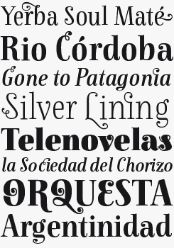
Like its main source of inspiration, Bodoni’s types from around 1800, Anne Bonny is a typeface with pronounced vertical stress: robust verticals, thin horizontal hairlines. In terms of the Noordzij approach as advocated by Diete’s mentor Luc(as) de Groot, it is a pointed-pen typeface with ”expansion” contrast. In spite of its historical inspiration, Anne Bonny is a close relative of Diete’s earlier Mary Read: similar contrasts and proportions, the same light-hearted spirit. Being slightly more formal, Anne Bonny is also the more versatile of the two: it will work beautifully in longer, medium-sized text settings as well as large and extra large headlines.
Mortelle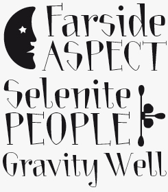
As Melle explains elsewhere on this page, she made Mortelle to prove that she had what it took to join the type class at her school in Potsdam. Of all her typefaces Mortelle is, no doubt, the most innocent and starry-eyed. But it does have a charm of its own, with its weird combination of playfulness and restlessness. The dainty ornaments alone are worth the price of the font.
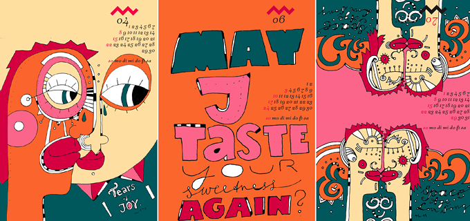
Pages from Melle Diete’s 2012 calendar. A wide range of illustration and art work is presented on her personal website.
You’ve worked for a variety of clients as a freelance designer and illustrator. What kind of work have you done lately besides working on LucasFonts’ typefaces and those of your own?
My latest work was for the Berlin agency Scholz & Friends. They needed a new ampersand for the italic of an existing corporate typeface. They found the default ‘&’ was too pictorial. Another job was a series of illustrations for a film title sequence for PAQT in Berlin.
You live and work in Berlin, which currently is probably the European city with the highest density of type designers per capita. There is an active type scene, conferences, a Type Circle. Is it important for you to be part of that? Is the type world a stimulating thing for you?
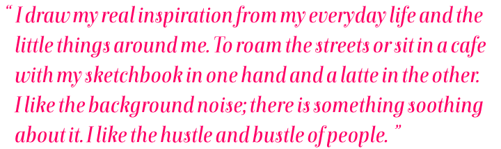
I appreciate those activities in the type world and I occasionally take part. But my real inspiration I draw from my everyday life and the little things around me. Daily life can be quite colorful in Berlin. It is a source of inspiration for me to roam the streets or sit in a cafe, with my sketchbook in one hand, a latte in the other. I like background noise; there is something soothing about it. And I like the hustle and bustle of people. From time to time I get to know people who also sit at a cafe window making sketches — I find it exciting to discover these connections.
There are many creative people in Berlin, and it’s always nice to see the things that people come up with. Exchange is a catalyst for growth. Many friends of mine have done the same studies, or something similar, and we regularly update each other. Or more: a dear friend and colleague of mine, Antonia Ofizier Pereira, lives in the same building as I do. We share a very beautiful creative life and have rocked quite a few jobs together. She sort of specializes in poster design and she’s always delighted to be the first to try out my new fonts. We live in a kind of home community in the Schöneberg district, we all know each other well, we cook together, share a garden: musicians, actors, designers, athletes, etc.
By the way, I think MyFonts should offer a page for each font where people can upload their own work with the font. It would be so interesting to see, for example, what someone in Japan (or any other country) is doing with fonts such as Mary Read or Anne Bonny. I love to travel, and so do my typefaces..
Making fonts has become a very popular activity in recent years: thousands of young people present new fonts and lettering on their websites and blogs. What do you think of these new developments: exciting, or too much of a good thing?
Generally speaking, I think that it is important to have a good education — this is as important in any profession as having passion. You do notice differences in quality in that respect. I can only welcome competition, creativity and interest in this field, and I am pleased with the increased attention for this profession that is so often overlooked or underrated. However, part of the long-term success in the market is a lot of sweat. Impeccable craftsmanship and a strong dose of professionalism are ultimately the key success factors for continued existence.
There must be hundreds, even thousands of talented young designers and illustrators who hope to publish their first font soon. What kind of advice would you give them?
The standards in type design are very high, and consequently making type takes an incredible amount of time. A good friend of mine makes wonderful fonts, but she has not yet managed to get a single one ready for publication. Which is a pity — but yes, it takes a lot of work. My advice? Perseverance is crucial. Keep trying!
Thanks, Melle – it was a pleasure talking to you. We’re looking forward to your next release!
Fidelia Script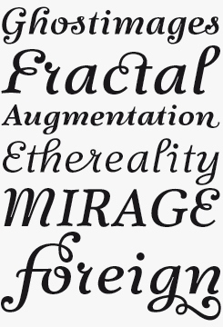
According to its designer, Fidelia Script is “pure OpenType-pleasure.” Fidelia is an italic script in four weights, full of dynamism and lust for life. While it is basically a disconnected script, there are lots of places where letters do connect if the user selects certain OpenType options – see the “os’, “ct’ “the” and “er” ligatures in the sample above. Fidelia is a bit of a chameleon: it can take on different roles and characters in order to make the best of every text. It comes with a heavy load of alternates, ligatures and ornaments, as well as OpenType features for extra stylistic variety.
Curly
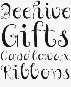
If you’re an illustrator, a designer of children’s books or toy packaging, Curly may be the font you’ve been waiting for. It has a unique, hand-drawn feel as well as a cheeky attitude and a certain whimsicality. It is reminiscent of the hand-lettering that accompanied those endearing pen drawings on early 1960s book covers and brochures. Used in combination with the right style of pictures, the effect can be irresistible.
MyFonts is on Twitter and Facebook!
Join the MyFonts community on Twitter and Facebook. Tips, news, interesting links, personal favorites and more from MyFonts’ staff.


Who would you interview?
Creative Characters is the MyFonts newsletter dedicated to people behind the fonts. Each month, we interview a notable personality from the type world. And we would like you, the reader, to have your say.
Which creative character would you interview if you had the chance? And what would you ask them? Let us know, and your choice may end up in a future edition of this newsletter! Just send an email with your ideas to [email protected].
In the past, we’ve interviewed the likes of Michael Doret, Laura Worthington, Jonathan Barnbrook, Rob Leuschke, David Berlow, Ronna Penner and Jos Buivenga. If you’re curious to know which other type designers we’ve already interviewed as part of past Creative Characters newsletters, have a look at the archive.
Colophon
This newsletter was edited by Jan Middendorp and designed using Nick Sherman’s original template, with specimens by Anthony Noel.
The Creative Characters nameplate is set in Amplitude and Farnham; the intro image features Anne Bonny and Gingar; the pull-quote is set in Anne Bonny; and the large question mark is in Farnham.
Comments?
We’d love to hear from you! Please send any questions or comments about this newsletter to [email protected]
Subscription info
Want to get future issues of Creative Characters sent to your inbox? Subscribe at www.myfonts.com/MailingList
Newsletter archives
Know someone who would be interested in this? Want to see past issues? All MyFonts newsletters (including this one) are available to view online here.