|
Welcome to our monthly newsletter, showcasing some of the most successful fonts of the moment. As usual, our four Rising Stars are selected from the best selling type families on our list of Hot New Fonts, which is updated daily. For those who design books and magazines, the Texts Fonts of the Month section offers a selection of type families that are equipped for complex editorial tasks and immersive reading.
|
|
|
This Month’s Rising Stars
|
|
|
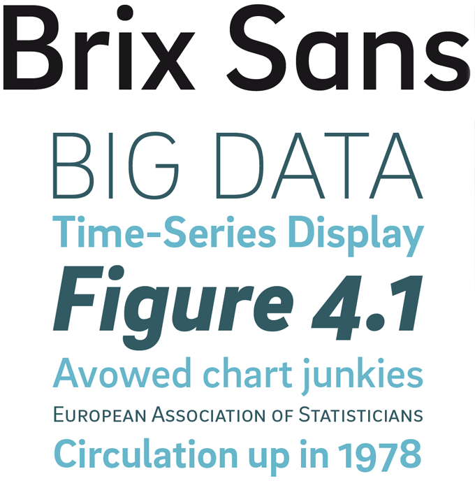
Brix Slab from HVD Fonts was on our list of Most Popular Fonts of 2012 — one of the most robust and readable of recent slab serif families. A great typographic tool for demanding editorial design work, the one thing that it needed to be even more versatile was a sans-serif companion. Now Brix Sans is finally here. It took designers Hannes von Döhren and Livius Dietzel two years to complete it, and the hard work has paid off. The new family is not just Brix Slab with the serifs chopped off: the sans-serif sibling is an independent type family that follows the visual logic of its genre, resulting in a sturdy yet supple grotesque — a family of 6 weights with matching italics that harmonizes well with Brix Slab. Together, the two families are ideal for solving complex typographical challenges. The Brix Sans OpenType fonts feature small caps, five variations of numerals, arrows and extensive language support. The whole family is 80% off until September 27th! |
|
|
 |
|
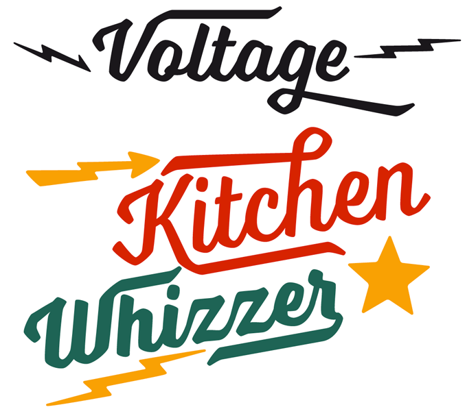
Voltage represents an unexpected and atypical development in Laura Worthington’s body of work. After the confident elegance of her many ornamented scripts, and the playful whimsy of suites like Charcuterie and Adorn, Voltage is something different altogether, breaking free from formal classifications and stressing the spontaneity and personality we treasure in hand-lettering. Voltage emphasizes practicality and uniformity, making legibility priority number one. It’s a muscular, down-to-earth lettering font with subtle references to a past era — think metal lettering on 1950s cars and fridges, but also hand-painted signs. The energetic swashes and alternates are available not only to those who use professional designer’s software, but to everyone with a computer. As Worthington assigned Unicode values to the swashes and alternates, anyone can use their operating system’s Character Map to access them. The options become endless. Electrifying!
Voltage is currently on sale — get all three fonts for the price of one! Offer ends Sept 16 2014
|
|
|
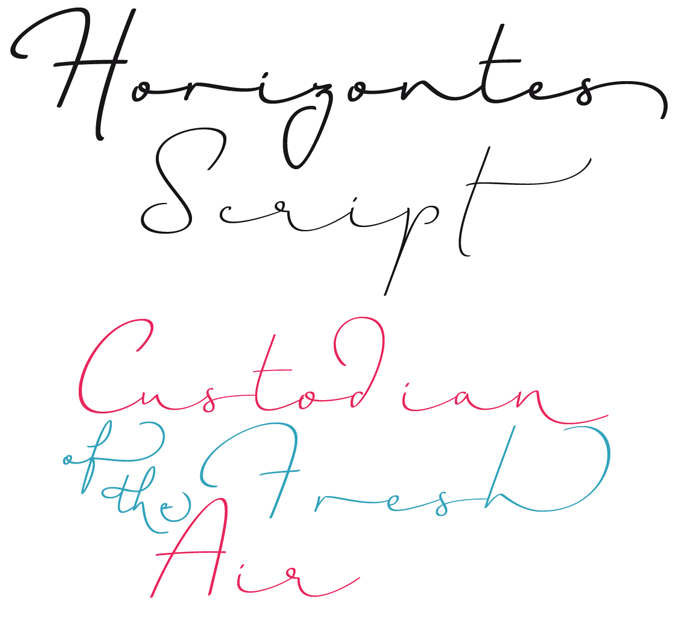
Panco Sassano is a lettering artist and illustrator from Mar del Plata, Argentina; Horizontes Script is his first typeface for Sudtipos, digitized in collaboration with Alejandro Paul. Based on a personal experimental calligraphy project, Horizontes was designed to strike a balance between spontaneity, elegance and beauty, reflecting the blue horizon of his native city. The typeface comes in two weights, which makes it easier to alternate between large and small text sizes. Text set in Horizontes Script looks natural; relaxed yet energetic. With alternative styles of different proportions, a wide range of ligatures, initial letters, terminals, and ornaments, the family works wonderfully in titles and short texts that need to express more than just words. Great for projects that need to connote class and style without being too formal. |
|
|
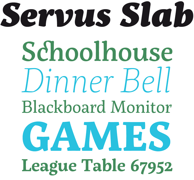
Designer Michal Jarocinski of Warsaw’s Dada Studio began his new font family at the time when his first son was born. He named the typeface “Servus”, which means “Hello” in Poland. Servus Slab is an expressive serif family in the same vein as Jarocinski’s successful Clavo, but the new family has a more pronounced forward movement, an almost nervous energy. It’s the extreme weights we like most: the Thin, Light, ExtraBold and Black weights are wonderfully spirited. Yet the middle weights are great for longer text blocks, and with nine weights plus matching italics the Servus Slab family lends itself to more complex typographic tasks as well — it comes with an ample selection of numeral styles, small capitals, ligatures and other OpenType goodies. |
|
|
Text fonts of the month
Typesetting for books, magazines or annual reports requires font families with special qualities: excellent readability, a generous range of weights with italics and small caps, multiple figure sets (lining, oldstyle, table) and ample language coverage. Here is a selection of recent, high-quality text typefaces.
|
|
|
|
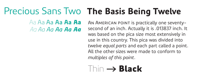
For Precious Sans Two, designer Nick Cooke re-appraised his 2002 Precious Sans, scrutinizing the old letterforms and giving the family a major overhaul. Nearly every character was redrawn, re-proportioned, respaced and improved. Precious Sans Two was produced as an OpenType family in six weights with italics. The typeface now contains small caps and an extensive set of discretionary ligatures, proportional and tabular figures, and a practical set of arrows. Some glyphs that in the original were a bit too quirky (f, g, I) were replaced by calmer default characters but were retained as OT stylistic set features. Precious Sans Two is now ready for mass acceptance.
|
|
|
|
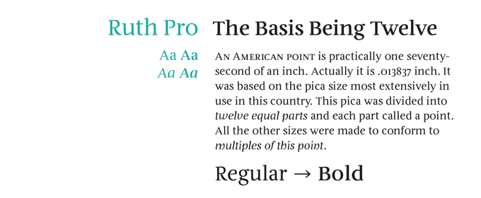
Ruth Pro from Denmark’s David Engelby Foundry is a workhorse type family primarily designed for editorial typography — from books and magazines to posters. It has some affinity with faces like ITC Mendoza and ITC Stone Serif, modern classics that set the tone of contemporary text typography. Yet it has its own distinctive look, carefully crafted according to the classic ideals of book typography. But it doesn’t stop at body text. Ruth Pro’s wonderful dingbats, arrows, alternative characters, ligatures and small caps make it a pretty special display font too.
|
|
|
|
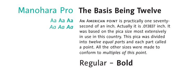
Berlin’s Primetype foundry recently released a rather remarkable text typeface: PTL Manohara by Botio Nikoltchev. For a first typeface, Manohara is very accomplished. It isn’t huge — three weights plus italics, in Pro and Standard versions — but for corporate use it may be all you need. Its shapes are elegant, its atmosphere lively and warm. It also has great language coverage, including a beautifully drawn and very contemporary Cyrillic — no coincidence, as its designer is Bulgarian. A good choice for brochures, stationery and more.
|
|
|
News Round-Up
In this section we pick out interesting news snippets from MyFonts’ own kitchen and from the greater world of fonts, lettering and typography.
|
|
Dan Rhatigan on type...Type on Dan Rhatigan
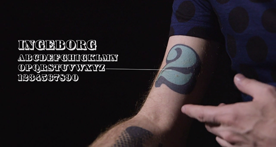
Monotype’s UK Type Director Dan Rhatigan is one of the more unorthodox figures in the type world. A gifted designer and renowned type historian, he has curated the remarkable Pencil to Pixel project and hosts Webinars such as Finding the Perfect Font. He is also somewhat extreme in his love of letterforms — he carries glyphs from his favorite typefaces with him everywhere, all of the time. London agency Grey made this short video on Dan Rhatigan’s remarkable type tattoos.
|
|
MyFonts Feature Focus
Where we take a moment to turn the spotlight back on some of the great features we’ve built over the last year or so.
|
|
iOS Font Installing
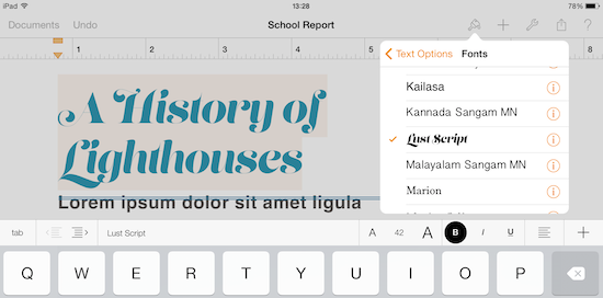
Back in April we introduced a pretty nifty feature; installing fonts on your iOS device. That was a big step forwards in terms of using any font in your iWork applications, and now users of Microsoft Office products can also benefit following an update to Microsoft’s Office for iPad suite. Read more on our Meta.Myfonts blog.
|
|
MyFonts on Facebook, Tumblr, Twitter & Pinterest
Your opinions matter to us! Join the MyFonts community on Facebook, Tumblr and Twitter — feel free to share your thoughts and read other people’s comments. Plus, get tips, news, interesting links, personal favorites and more from MyFonts’ staff.
|
|
|
|
|
|
|
MyFonts Inc. 500 Unicorn Park Drive, Woburn, MA 01801, USA
MyFonts and MyFonts.com are registered service marks of MyFonts Inc. Other technologies, font names, and brand names are used for information only and remain trademarks or registered trademarks of their respective companies.
© 2014 MyFonts Inc
|
|
|
|