
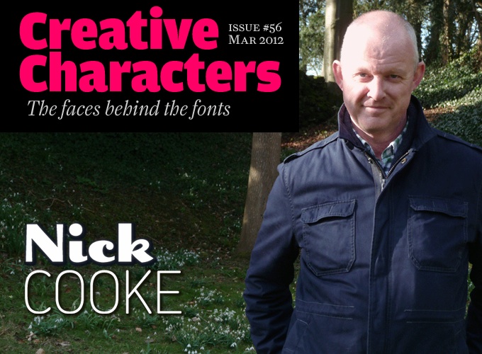
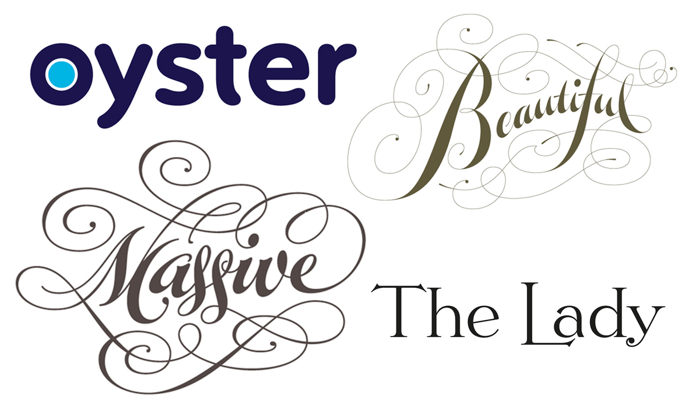
The range of his work is stunning: from the corporate-yet-friendly logo for London’s Oyster card to exuberant script lettering and powerful handwriting fonts. His best sellers are versatile sans-serifs such as Houschka and Chevin, the latter of which is ubiquitous in the UK as Royal Mail’s corporate typeface. A recent series of sweeping updates has catapulted several of his fonts back onto our Hot New Fonts list. He has a soft spot for the letter ‘g’ — hence the name of his foundry, G-Type. From book covers dripping in blood to the most realistic script face on the market — here is the Nick Cooke story, told in his own words.
Nick, I read that you learned about type and lettering by designing book jackets at David Cox Studios in London in the early ’80s. What was that work like?
In a word: monastic. But without the flagellation. There were just three of us in a house on a suburban street in Putney, South London. We hardly talked, there was no radio, just working drawing letters in silence — a very monk-like existence. David Cox was the great-nephew of Eric Gill. Now you may think “Oh wow” at the mention of Gill’s name, but we weren’t producing any work of note; the sole work was producing book covers, mainly really tacky stuff, type dripping in blood, that sort of thing. In the days before computers we did it all with French curves, Rotring pens and an ancient hand-cranked Grant camera. But at least I could get high on Cow Gum while doing paste-up artwork, and it was good training to get an appreciation of letterforms.
Quite often I would choose a headline face but it would need adapting in some way to make it fit the narrow confines of a paperback. Rather than just getting the typesetter (!) to condense the type, I would redraw it so that it was optically correct. I spent ages poring through big headline type catalogs which typesetters used to supply in those days and gradually became fascinated with curves and what makes one font beautiful and another boring or not so attractive. The first typeface with which I became enamored was Matthew Carter’s Galliard. When I first started drawing type I was obsessed with having everything mathematically perfect, although I quickly learned to loosen up and rely on my eye and adopt the maxim “If it looks right it is right.”
Had you been introduced to type design or lettering during your art college days?
Yes, but in a very boring, uninspiring way. We had to very carefully trace the quick brown fox jumps over a lazy dog in 60pt Helvetica Bold all in lower case. I remember one lecturer saying that typefaces don’t have personality which I thought was wrong, but he was the one who set the exercise and he was a big fan of Helvetica. I’m not.
We were also introduced to the delights of copyfitting tables, casting off, and all that archaic stuff used for trying to estimate what size of type would fit in a certain area. The main exam at Blackpool College was for the LSTD (Licentiate of the Society of Typographic Designers), and we had to do a lot of hand rendering of 10pt type for various mock-ups of stationery, brochures, leaflets etc. Good training I suppose, but sooooooo tedious.
But I wasn’t deterred for some reason and learnt virtually everything after I left college.
Apparently, your subsequent apprenticeship at David Cox Studios has been of considerable influence on your type designing career. It’s the kind of experience that is hardly available to young designers any more. Do you think they miss something important?
I didn’t realize it was a unique experience at the time as I thought that was how all design studios operated, never having worked anywhere else before. Looking at headline type catalogs time and time again must have slowly seeped into my subconscious and given me a framework of proportion and balance which I put into practice in my own designs. But I think that if type design is an interest or obsession to somebody they will study and figure out for themselves how to do it like I did (or go to Reading). Nowadays it is actually easier to study letter construction on a computer; all one has to do is open up a font in FontLab or Fontographer to see how it’s done, then spend hundreds of frustrating hours doing it for yourself. I don’t really miss drawing with pencil, Rotring pens and French curves. A computer is a pencil to me; just a tool for drawing, but also much quicker.
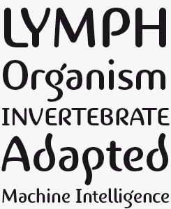
Houschka Pro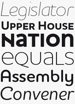
Houschka was named after Georg Houschka, a now-defunct confectioner’s shop in Salzburg, Austria, which decades ago had a wonderful 1930s frontage and a distinctive sign above the door with unique rounded letterforms. Houschka Pro is an expanded and improved version of Cooke’s 1999 original. Character shapes were redrawn, kerning and spacing refined. OpenType features include small caps, alternates, ligatures and four sets of numerals. Houschka Pro is a clean and legible text and display typeface with charming character of its own. The monolinear structure, rounded corners and rolling curves give Houschka a warm and human appearance. For an even softer version, check out Houschka Rounded, shown above in the word “Assembly”.
Organon Serif & Sans
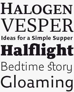
Organon is a stylish text and display suite consisting of a serif and sans-serif family, both in six weights. These components work in tandem to create an elegant, legible and thoughtfully designed typographic tool with compatible cap and x-heights, widths and ascender / descender values. Organon Serif mixes slab and calligraphic traits to create an impressive modern serif face fully loaded with typographic options. Organon Sans sports tapered stems, which give it an attractively robust appearance.
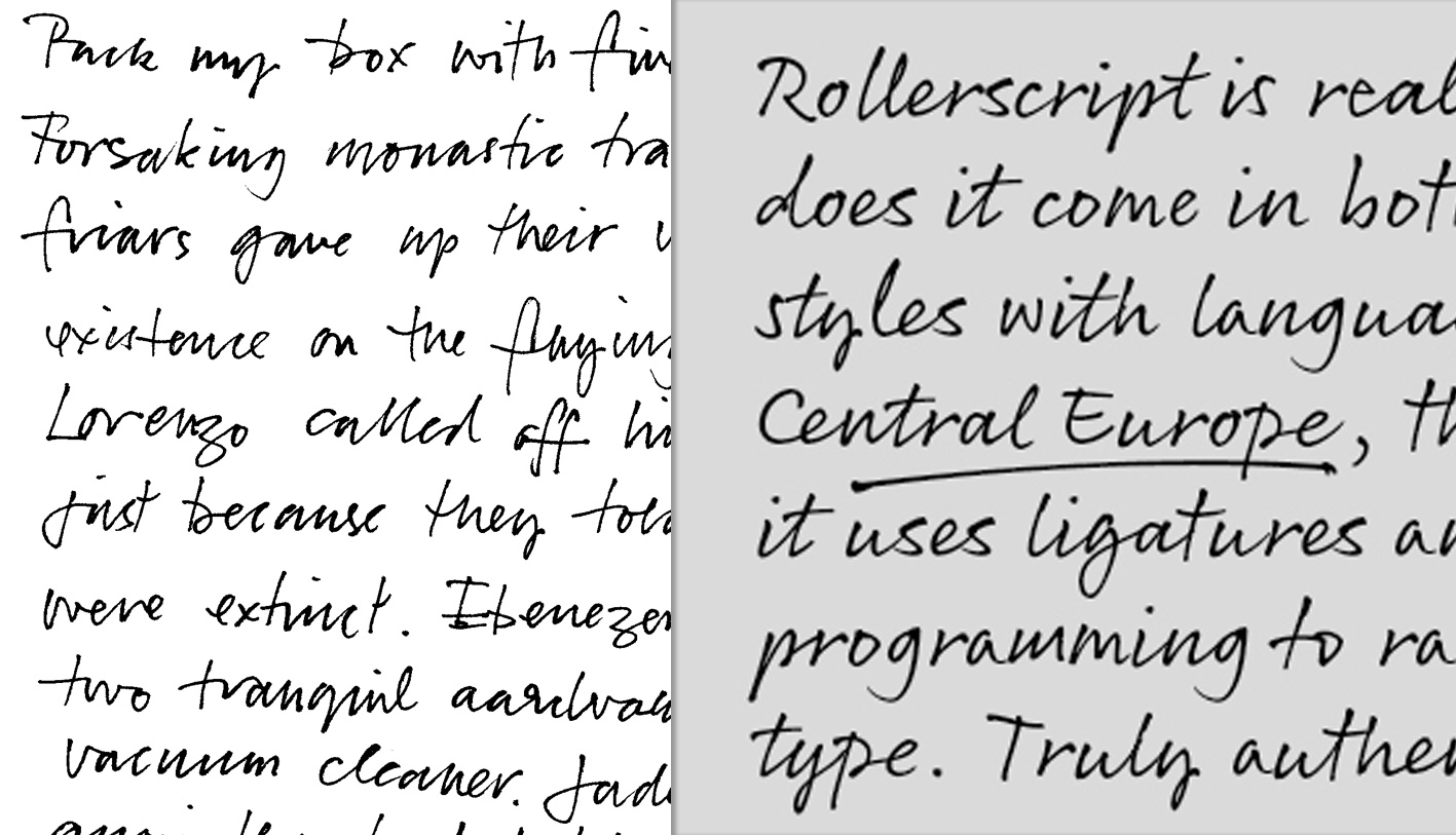
A little teaser for G-Type’s new release, Rollerscript. Left, Cooke’s original handwriting; Right, the resulting font.
You brought out a couple of fonts at FontShop and ITC, then in 1999 started G-Type. What was so attractive about starting your own foundry?
I figured out that it’s best to have an individual collection rather than single fonts or families which tend to get lost quite quickly if swallowed up amongst thousands of others in a reseller’s collection. It’s pretty self-indulgent, doing what you want with nobody telling you what to do, but you do have to be self-motivated and quite obsessive. The main downside of type design is that it’s all speculative, and you have no idea if what you’re producing will sell or not. An investment of hundreds of hours in a font may result in hardly any, or lots of sales. But it’s always gratifying to see a font in use (if used well that is!). G-Type started in 1999 and only this year I finally have my own website g-type.com.
What does the name G-Type stand for?
I like the letter ‘g’, so wanted a name which contained a ‘g’. It was going to be G-Spot, but I thought better of it. I thought G-Type sounded good because it contains a ‘g’ and type, and also sounds like it could be a rather sporty Jaguar.
Is G-Type a solo effort, or do you ever collaborate or outsource? Is networking and contact with other type or design professionals important to you?
G-Type is a completely solo effort. But I do have a colleague who looks after my newly launched website creating all the images, technical and legal writing, and all that behind-the-scenes stuff.
I used to do a lot more networking than I do presently, but I’m now in the lucky position of not having to look for business too much as I have enough commissioned work, and if I’m not working on a commission I have plenty of my own stuff to keep me occupied until I die. I don’t envisage that being anytime soon. Skype is great for keeping in touch, and I recently had a new client in California who got in touch via email, said he liked my work, and would I be interested in creating a logotype for him? We Skyped, he outlined his requirements and I designed his logo. Isn’t technology marvelous? And it also makes anybody in the world (with the technology) so much more accessible.
I go to ATypI occasionally, which is always interesting, and I went to the first TYPO London last year. There are sometimes people at those events who I haven’t seen for years. I usually meet up with my contemporaries in British type design and typography. There is no rivalry between us as we all have our own niches and respect each other’s work. We all have a good “socialize” and may even talk about type for fifteen minutes or more.
“Typographic national identity” has been a theme of several conferences and magazine issues these past few years. Do you think there is still such a thing as, for instance, a British identity in type design and typography?
I think so. I think the most “British” of British type designs are done by Jeremy Tankard. His Bliss typeface is particularly British in appearance in that it has a superficial resemblance to Gill Sans, at least that’s what I thought when I first saw it. The Trilogy series harks back to the early to mid-nineteenth-century advertising types, and the Shire Types have a peculiar Britishness about them. The work of Gerard Unger has an undefinable Dutch feel to it — the word ‘sharp’ springs to mind. I wouldn’t say that any of my work is particularly British — maybe more European. I’m particularly fond of old shop signage and try to photograph it wherever I go. Unfortunately Britain has fewer examples of this now, whereas European cities in Italy, Spain and Austria still have lots which provide inspiration, although I have yet to do a straight copy.
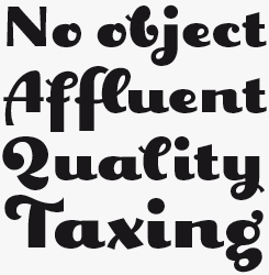
Digitalis
Digitalis is clearly the work of an expert lettering artist and logo designer. With it, Cooke aimed to create an original, aesthetically pleasing rounded typeface using a minimum of strokes, reducing each character to its essential elements. Letters such as ‘a’, ‘d’, ‘e’ and ‘R’ consist of a single, confidently sweeping stroke. Thanks to the subtle modulation of thick and thin parts of the stroke, Digitalis is surprisingly legible when used for longer text settings. As a single weight font it is, of course, most suited for display work — book covers, showcards, posters and packaging come to mind.
Geetype
If the G-Type library has a hidden gem, it is Geetype. Geetype was inspired by a piece of cigarette pack lettering by A.M. Cassandre, the quintessential Art Deco designer, famous for his travel posters and for his quirky, unique Peignot typeface from 1937. In extrapolating the short text lettered by Cassandre, Cooke came up with a wonderful set of striking, jazzy lettershapes. Letters like ‘c’, ‘e’, ‘f’ and ‘Q’ are positively smiling, beaming with glee. And of course, to g-fetishists the peerless lowercase ‘g’ alone is worth the price of the font. One of the most eye-catching display faces in our collection, Geetype epitomizes the 1920s–1930s mood of Hollywood’s golden era; think Greta Garbo, another ‘g’ with strong, emotional screen presence.
You have done custom lettering, logos and typefaces for some very high-profile clients. Which project are you most proud of? How does one build such an impressive portfolio of bespoke fonts and alphabets?
I have recently developed a complete sans-serif type family through a design group for a major UK company with both uprights and italics and a separate stylistic set for headline setting. I also designed the wordmark to go with the graphic device. I was very proud of that and it would have been a huge feather in my cap. Unfortunately some lily-livered wimp at the company got cold feet and handed the entire project over to some other agency at the final stage. At least I got paid for developing a new family which I can now sell myself, which will be available through MyFonts in the near future.
I have been lucky to have been given the opportunities to work on some great projects. Many of them were through Fontworks UK as I did most of their custom work for which I am very grateful. The rest were due to me showing my portfolio to other designers and word of mouth. Perseverance and working for many years is also a good way of building a body of work.
Your Chevin family is the corporate typeface of the Royal Mail. How did that project come about?
Contrary to what you may think, there never was a Royal Mail project. It’s almost inconceivable now to think that an organization as large as Royal Mail would buy an off-the-shelf type family for corporate use. But that is exactly what happened. It was very soon after I released Chevin that it was adopted as their corporate typeface, and I think that it may even have been the first usage of it. I didn’t even know it was being used by Royal Mail until I saw it being used on an advert, which of course made me very happy. Obviously some people think Chevin is a custom Royal Mail typeface, as it’s so closely associated with them.
Chevin has a version with punctured strokes, called Chevin Eco. Was that font seriously conceived as a typeface designed to save on printer toner?
Chevin Eco was just some “greenwash” nonsense which was commissioned for use in the Royal Mail trade magazine. What made it ironically funny is that the holey font was used quite large in white over a photo — using more ink than plain white-out, thus defeating its very purpose. Somehow I think it won’t do much to save the planet.
How much of a contrast is it to switch between your own autonomous projects and those for corporate clients?
Not that much really, except that I know I’m going to get paid for a custom job. Each custom project has different requirements. Whether it is “finessing” a client’s logotype design idea to a complete type family, each job requires careful deliberation to arrive at a solution that fulfills the brief and pleases the client. Although some companies / designers are less typographically aware than others and will suggest gimmicks that look stupid and just don’t work instead of exercising some restraint. Typical conversation:
– Just try this.
– It won’t work.
– Well, try it anyway…
– It’s going to look rubbish, but if that’s what you want…
– Hmm, that doesn’t look too good.
– I told you it wouldn’t.
That sort of thing can be frustrating.
Yet working on my own typefaces is a similar process to working for a client. I still have to produce something that I’m happy with, am proud of, and that customers might want to buy.
Chevin Pro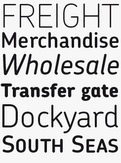
Chevin Pro is a contemporary rounded type family in 6 weights, designed with functionality and legibility in mind. With its open counters and slightly condensed style Chevin can be used for text and is particularly suited to signage. The great Erik Spiekermann wrote that Chevin “is charming without being cute, and very legible even in small sizes because of its restrained shapes and simple construction.” As Royal Mail’s corporate font, Chevin is the typeface that adorns every post office in the UK. The Pro version contains small caps, Greek and Cyrillic character sets; for less demanding users, there is Chevin Std.
Amulet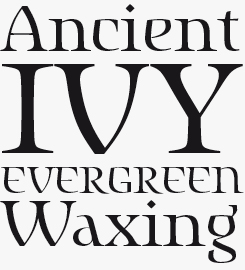
Irish or “Celtic” typefaces can be quite charming, but are also sometimes rather embarrassing stylistic exercises full of nostalgia for a place that, quite possibly, only exists in fantasy novels. Amulet is none of that, precisely because Cooke did not allow it to become derivative or nostalgic. The typeface evolved after a trip to Dublin, where Cooke looked at ancient manuscripts, including the stunning Book of Kells, at Trinity College; yet the Celtic influences were not copied, but assimilated in a set of very personal, idiosyncratic, attractive lettershapes.
Cooke’s commissioned wordmarks and lettering show as much versatility as his typefaces
Your fonts cover a wide scope of styles — from Japanese inspired display fonts and informal handwriting to geometric, clear sans. Is there an approach or “philosophy” of type design that ties this diverse work together?
There is no philosophy whatsoever. They say variety is the spice of life, so I try to design type in a variety of styles to acquaint myself with different genres. I consciously try not to design faces that are “of the moment”; these stylistic bandwagons usually have too many passengers already, without me jumping on too. Many of the custom typefaces I work on can take up to a year to complete, and although each job is a challenge and interesting, by the time the job is coming to an end I’m itching to try something different.
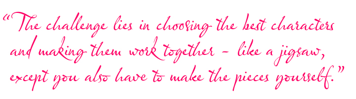
Olicana is a case in point — I was working on a sans family for ages and wanted to do something more expressive. I’m not really a formal calligrapher but my handwriting is OK, so I started trying to write with a steel nib and ink, and after a few pages I thought I could make a font out of it. Most of it was pretty bad and messy. The challenge lies in choosing the best characters and making them work together — like a jigsaw, except you also have to make the pieces yourself. I spent over a year on and off on Olicana, but I was figuring out FontLab at the same time, learning the programming and getting to know the features. There is no set way of producing something like that, it’s just make-it-up-as-you-go-along. Then I got carried away inserting ink blots, fingerprints, splats, crossings out, and then decided to do a swash feature set. It’s hard to know when to finish really, and no font can ever be perfect. There comes a point where you just have to say to yourself “Right, that’s it — done.”
I have also been converting the G-Type collection to OpenType, which is taking much longer than I thought it would, as I find I can’t just do a straight conversion. Some fonts, like Houschka Pro, are complete reworks, some have extra features or style sets, and all have extended language coverage. I put this task off for a long time but it had to be done. Nubian will be a rework when I get around to it and Gizmo will be another revamp to take advantage of OpenType and make it more “realistic” like Olicana.
I usually have at least five designs in progress in various stages of completion. I work on them intensively for a while then usually abandon or even forget them, and come back to them after a few months. I find that this has a beneficial effect as I can see with a fresh eye what needs changing or even if it’s worth pursuing.
A new script in Rough and Smooth styles called Rollerscript will be available soon — see the teaser above. Somebody has already called it the hottest contemporary handwriting face on the retail market. I also have another sans family in six weights plus italics nearly completed. Other styles in the pipeline are a slab, a Didone and a constructed (as opposed to handwritten) script.
I continue to strive to produce new styles with a twist. I enjoy the challenge.
Well, I guess that just about covers the past, present and immediate future of your practice as a lettering and type designer. Thanks for sharing your stories and insights!
Olicana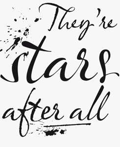
Olicana was the very first G-Type release in OpenType, taking full advantage of the endless possibilities to build interactive script faces using “automatic glyph substitution”: the replacement of certain character combinations by specially drawn ligatures, resulting in a more realistic appearance. Olicana is brimming with alternates, swashes and extra features like ink splats and crossings-out, not to mention the choice of using a modern or ornate styling within the same font! Available in three variants — Rough, Smooth and Fine.
Sovereign Display
This small sample of Sovereign Display can’t begin to convey the elegance and natural authority of this all-caps titling face. To truly savour its dapper shapes and stylish shading, you’d need a larger, possibly huge specimen. But we’re including this foretaste anyway, as the classical Sovereign is so different from the rest of Cooke’s typefaces — more evidence of the designer’s versatility and resourcefulness.
WhatTheFont™ is now on Android!
Ever wondered what the font used in a magazine or poster is? Snap a photo of it and WTF will tell you… Identify fonts in screen grabs, saved images or from new photos.
Available now from the Google Play and the iOS App Store.


Who would you interview?
Creative Characters is the MyFonts newsletter dedicated to people behind the fonts. Each month, we interview a notable personality from the type world. And we would like you, the reader, to have your say.
Which creative character would you interview if you had the chance? And what would you ask them? Let us know, and your choice may end up in a future edition of this newsletter! Just send an email with your ideas to [email protected].
In the past, we’ve interviewed the likes of Michael Doret, Laura Worthington, Jonathan Barnbrook, Rob Leuschke, David Berlow, Ronna Penner and Jos Buivenga. If you’re curious to know which other type designers we’ve already interviewed as part of past Creative Characters newsletters, have a look at the archive.
Colophon
This newsletter was edited by Jan Middendorp and designed using Nick Sherman’s original template, with specimens by Anthony Noel.
The Creative Characters nameplate is set in Amplitude and Farnham; the intro image features Geetype and Chevin Pro; the pull-quote is set in Olicana Smooth; and the large question mark is in Farnham.
Comments?
We’d love to hear from you! Please send any questions or comments about this newsletter to [email protected]
Subscription info
Want to get future issues of Creative Characters sent to your inbox? Subscribe at www.myfonts.com/MailingList
Newsletter archives
Know someone who would be interested in this? Want to see past issues? All MyFonts newsletters (including this one) are available to view online here.