
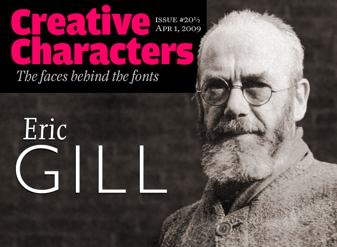
Photo by Claire Loewenthal
Eric Gill has never been easy to pigeonhole: a socialist Catholic, a spiritually minded family man, a keen and active admirer of female and typographic curves alike. For many decades, Gill — a stonecarver, graphic artist, type designer and writer — has been one of the most fascinating figures on the British design scene (although, as he explains in his own inimitable style, he is not particularly fond of “design”). We are extremely proud to have struck up a dialogue with one of the great letter makers of the twentieth century. Meet Eric Gill, a man in love with letters and life.
Mr Gill, when growing up in Brighton and Chichester you showed remarkable drawing talent, and your father taught you about perspective. You then went to the Chichester Technical and Art School where you learned to draw with great accuracy and took a certificate in geometry. But when did letterforms come into your life?
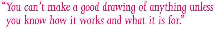
My enthusiasm for lettering had begun in Brighton. From my earliest years I had always been fond of drawing engines and bridges and signals and tunnels. I was very much concerned with the structure and movement and purposes of locomotives, because you can’t make a good drawing of anything unless you know how it works and what it is for. I suppose I was training myself to be an engineer. I think I thought that all engineering was like that — an immense enthusiasm for engines — engines as beings. Now locomotives have names, and these are painted on them with great care and artistry. If you’re keen on engines, you collect engine names (at our school it was as popular a hobby as “stamps”) and if you draw engines you cannot leave out their names. Yet at Brighton this lettering enthusiasm hardly won a specific recognition.
But at Chichester, under the influence of the art master I discovered that letters were something special in themselves and, urged by his enthusiasm, I became expert in inventing what seemed to me later the most monstrous perversions and eccentricities in the way of “new art” lettering. I could almost wish I had that freedom now. And yet we weren’t really free; for we laboured under the tyranny of art school fashion — a harder master more capricious than any “tradition” or than any such rational notion as that the primary business of lettering is to be legible. On the contrary, the primary business of lettering was to be what they called and still call “decorative”. Though I am ashamed of it now, I was jolly proud of it then, and my prowess was highly esteemed and earned me much undeserved praise. The “really important” thing, however, is this: that I was, in a not too inaccurate manner of speaking, “mad” on lettering.
Then you moved to London to work as a trainee in an architect’s office. Frustrated by the procedures of architecture and building, you began frequenting Edward Johnston’s calligraphy classes at the Central School of Arts and Crafts. He later became your friend and mentor. What did your relationship with Johnston mean to you?
I fell in love with him — but don’t make any mistake as to my meaning. I fell in love with him as I might, and indeed did, with Socrates.
It was through Edward Johnston that I finally threw off the art nonsense of the Chichester art school and got away from the amateurishness of my efforts as an architect’s pupil. I won’t say that I owe everything I know about lettering to him — not that it is very much, for I’m no sort of learned person and have never been much of a student of anything — but I owe everything to the foundation which he laid. And his influence was much more than that of a teacher of lettering. He profoundly altered the whole course of my life and all my ways of thinking. Just as “art nonsense” couldn’t stand against him, so also “thought nonsense” was toppled over. I was hasty and careless and ready to jump to conclusions and make rash generalizations. And Edward Johnston was like a perpetual brake on all such rashness.
And as a writer with the pen, a calligrapher — the first time I saw him writing, and saw the writing that came as he wrote, I had that thrill and tremble of the heart which otherwise I can only remember having had when first I touched her body, or when I first saw the North Transept of Chartres from the little alley between the houses. On those occasions I was caught unprepared. I did not know such beauties could exist. I was struck as by lightning, as by a sort of enlightenment. On that evening I was thus rapt. It was no mere dexterity, that transported me; it was as though a secret of heaven were being revealed.
Gill Sans

Eric Gill’s best-known typeface came into being after Monotype’s Stanley Morison spotted the sign Gill had painted for Douglas Cleverdon’s bookshop in Bristol. Morison ordered a typeface based on those monumental sans-serif capitals. During its first decades, Gill Sans was recommended for advertising and display use only. But as readers got used to reading sans-serif, Gill Sans turned out to work well for body text in magazines as well as books. As Gill himself wrote, Gill Sans was largely indebted to the Underground typeface drawn in 1913 by his former calligraphy tutor, Edward Johnston.
Perpetua

Perpetua, too, was commissioned by Stanley Morison. As the supervisor of an extensive program of Monotype text faces, Morison wanted a brand new roman to complement the series of revived classics. Being convinced that none of the era’s expert calligraphers was up to the job, he turned to a stone carver instead. Eric Gill made drawings based on an alphabet he used for inscriptions. Perpetua immediately betrays the hand of its maker — it is the quintessential Gill roman, so distinguished (wrote Morison) that in non-fiction or scientific books, “the effect is more artistic or literary than is wanted.” We are probably more tolerant today.
Carved letters by Gill at the Victoria & Albert Museum, London. Photo by Leo Reynolds.
I understand your fascination for the act of writing. But what exactly is so special about letterforms themselves — and why do you revel in painting them, or carving them in stone?
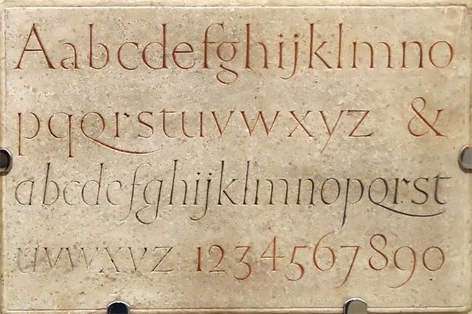
The shapes of letters do not derive their beauty from any sensual or sentimental reminiscence. No one can say that the O’s roundness appeals to us only because it is like that of an apple or of a girl’s breast or of the full moon. We like the circle because such liking is connatural to the human mind. And no one can say lettering is not a useful trade by which you can honestly serve your fellow men and earn an honest living. Of what other trade or art are these things so palpably true? Moreover it is a precise art. You don’t draw an A and then stand back and say: “there, that gives you a good idea of an A as seen through an autumn mist”, or: “that’s not a real A but gives you a good effect of one.” Letters are things, not pictures of things.
At what point did you decide that your destiny was to become a professional lettering artist and a stone carver?
When an eminent painter came to the lettering class to ask if there was anyone among the students who could cut an inscription on a tombstone for him, I was named. Already at the architect’s office I’d got a sort of reputation as a letterer and used to do a lot of lettering on the drawings; so I began to awake to the possibility of doing lettering for a living. And one thing led to another. The tombstone inscription took me about three months of evenings and I got five pounds for it.
Lettercutting — a grand job, the grandest in the world. What could be better? If you’ve never cut letters in a good piece of stone, with hammer and chisel, you can’t know.
Later the lettering business developed in several directions. Lettering in stone was the chief thing but this led to others — drawing letters for books (title-pages and such) and that led to engraving in wood; painted lettering, and that led to quite a brisk trade in shop-facia writing, and me going up and down the country as a sign-writer, and even to Paris, and there was more work than I could do all by myself.
As your studio flourished and you became one of England’s most respected stone carvers, more and more architects relied on you for carvings and inscriptions. Before, they would hand extremely detailed drawings of every ornament to the carver — a practice you despised. What made them trust you as an artist, and not a mere executor of their ideas?
My chief claim was that I could relieve the architect of the necessity of supplying drawings in connection with one craft at least. But such a claim depended upon my ability to give them something better than they could get otherwise. Therefore I had to profess to “know” — and to know better than they did themselves. That was where I was lucky; for I came along just at the moment when the work done by William Morris was bearing fruit in the minds of architects and the influence of Edward Johnston and others was making it clear that fine printing was only one of a thousand forms of fine lettering. And what was fine lettering? It was in the first place rational lettering; it was exactly the opposite of “fancy” lettering. That was the new idea, the explosive notion, and, you might say, the secret. For the world thinks that art and reason are complete opposites, that the artist is the irrational person and all his works the product of caprice and emotional temperament. Art dealers, art critics and artists themselves have more or less consciously conspired to preserve the fiction. Thus art becomes mysterious and a false glamour surrounds it — and better prices.
And what applied to the “fine” arts applied to all the others. As soon a thing was given the title of “artistic” it was supposed to be a work of fancy, and irrational. Artistic lettering meant lettering in which legibility was sacrificed to something called beauty — beauty, “the beautiful”, that which tickles your fancy.
On the other hand, following Morris, following Ruskin, following the universal practice of the world, we were in revolt against the whole conception of art as being irrational.
What is good lettering? That was the job before me. And at every point a justification must be found in reason. Of course we weren’t teetotalers about fancy work, but it must be kept subordinate, and even fancy work should grow out of legitimate occasion. What is decoration but that which is seemly and appropriate?
Joanna

Many designers agree that Joanna — named after his favorite daughter — is Gill’s most interesting, most innovative text typeface. Again, there are similarities with Perpetua. But the strokes are sturdier, with less contrast, and the serifs are simple rectangles. You could argue that Joanna is the first “humanist slab serif”, preceding Caecilia and Scala by half a century. Its Italic is brilliant: narrow and upright, it is still open and clear enough to work well in body text, but also makes an attractive and strikingly modern display face.
Gill Sans Display Variants

After Gill Sans had caught on, British Monotype was eager to capitalize on its success by adding fancy display versions. Most were, at least in part, drawn at the Monotype office with Gill’s cooperation. The most spectacular of these display types is the ultra-bold version also known as Gill Kayo. of which there is also an interesting condensed variety. Gill was mildly amused by Monotype quest for extremity and is reported to have dubbed Kayo “Gill Sans Double Elefans.” Among the other display versions developed during Gill’s lifetime is a series of shadowed capitals.
In conceiving letterforms, how do you determine what is appropriate? For instance, when you invented an innovative concept such as your own Gill Sans, how did you determine which shapes would work optically?
Legibility, in practice, amounts simply to what one is accustomed to. But this is not to say that because we have got used to something demonstrably less legible than something else would be if we could get used to it, we should make no effort to scrap the existing things. This was done by the Florentines and Romans of the fifteenth century; it simply requires good sense in the originators and good will in the rest of us.
Good will seems to be a common possession of mankind, but good sense, i.e. intelligence, critical ability, and that intense concentration upon perfection which is a kind of genius, is not so common. Everybody thinks that he knows an A when he sees it, but only the few extraordinary rational minds can distinguish between a good one and a bad one, or can demonstrate precisely what constitutes A-ness. When is an A not an A? Or when is an R not an R? It is clear that for any letter there is some sort of norm. To discover this norm is obviously the first thing to be done.
The first notable attempt to work out the norm for plain letters was made by Edward Johnston when he designed the sans-serif letter for the London Underground Railways. Some of these letters are not entirely satisfactory, especially when it is remembered that, for such a purpose, an alphabet should be as near as possible to “fool-proof”, i.e. the forms should be measurable — nothing should be left to the imagination of the sign-writer or the enamel-plate maker. In this quality of “fool-proofness”, my Monotype sans-serif face is perhaps an improvement: the letters are more strictly normal.
If legibility calls for the greatest possible amount of “normality”, then what about display type?
As there is a norm of letter form — the bare body, so to say, of letters — there is also a norm of letter clothes; or rather, there are many norms according to the place or purpose letters are used for. A typically moral and conscientious Englishman finds it exceedingly difficult to keep morals out of art talk; he finds himself inclined to think, for instance, that an R ought to have a bow more or less semicircular and of a diameter about half the length of the stem, and a strongly outstanding tail; and that an R with a very large bow and hardly any tail at all is wrong. But moral notions like this are obviously absurd in such a discussion, and we should be ready to admit that any old shape will do to make a letter with.
Nevertheless, seeing the whirl of eccentricity into which modern advertising is driving us, it seems good and reasonable to return to some idea of normality, without denying ourselves the pleasure and amusement of designing all sorts of fancy letters whenever the occasion arises. A man who knows his road can occasionally jump off it, whereas a man who does not know his road can only be on it by accident. So a good clear training in the making of letters will enable a man to indulge more efficiently in fancy and impudence.
Non Solus

Solus was a roman cut for Monotype in 1929, and apparently withdrawn by the company in 1967. A few years ago, K-Type’s Keith Bates discovered it as “a few meager visual snippets”; further research led to better models to work from. Bates found the typeface to be similar to Perpetua in many respects, but also “felt it to have an identity of its own, for me it has a real English schooldays feel.” With its subtle bracketing, this one-weight revival has a warm and friendly feel. Although for legal reasons it was renamed “Non Solus”, the font is “as near to the spirit of Eric Gill’s Solus” as Bates was able to make. A great font for posters and book covers — and surprisingly affordable.
Historiated lettering from a wood engraving by Gill. This print and many other original Gill prints are available for purchase online through the Goldmark Gallery.
You have often spoken and written about the contradictions and injustices of industrial production. You’re notably critical of the way craftsmanship has been replaced by a process in which the job of creating things has been split up into different roles. What are your main objections?
The chief and most monstrous characteristic of our time is that the methods of manufacture which we employ and of which we are proud are such to make it impossible for the ordinary workman to be an artist, that is to say a man responsible not merely for doing what he is told but responsible also for the intellectual quality of what his deeds effect. The ordinary workman has been reduced to the level of a mere tool used by someone else. However much skill he may have in his fingers and conscientiousness in his mind, he can no longer be regarded as an artist, because his skill is not that of a man making things. He is simply a tool used by a designer and the designer is alone the artist.
So we have the designer who designs what he never makes and the worker who minds the machine which makes what he never designs. And we have the salesman who neither designs things nor minds machines but is supposed to know what the public wants. But the public doesn’t know what it wants, and it has no means of finding out.
Gill Floriated Caps

Gill Floriated Caps is based on a single character, which Eric Gill drew as a decorated initial for use on a specimen of his Perpetua type. When Stanley Morison asked him to produce a full alphabet, he refused at first. Morison insisted, and finally Gill drew a few more characters from which the Type Drawing Office was able to create a full set. It was released as a digital font in the 1990s.
Very well put, sir. But industrialism cannot be halted. The process of mechanical production, as you have written yourself, is “the body of our modern world.” And in spite of your skepticism, doesn’t the designer play a central role in this process?
Designer! Of course there must be a designer, a person, a mind, who thinks and contrives how things shall be made; but just because there must be there is no need to talk about him unless — and here’s the trouble — you mean, not the person or persons really responsible for the production of the article, but a person called in from outside and paid to add something. To add what? Ah! What? Well, just that extra quality which in my country the Design & Industries Organisation calls “beauty” or “comeliness”. Why call in a designer if he isn’t going to add something? My one complaint against machine-made goods is precisely this: that they too often hide their light under a bushel of “design”. Think how decent alarm clocks might be if they were just as plain and well-made outside as they often are inside!
If we insist on the ornamental we are not making the best of our system of manufacture, we are not getting the things that system makes best. The process by which a railway locomotive has become the beautiful thing it now is, this process must be welcomed in all other departments of manufacture. … And ornamental typography is to be avoided no less than ornamental architecture in an industrial civilization.
The truth is that a thing fit for its purpose is necessarily pleasant to use and also beautiful (i.e. seen as being in itself delightful to the understanding). I think an artist is not a person who makes things beautiful, but simply one who deliberately makes things as well as he can — whether he is a clock-maker or picture-painter; because machine-made things are very much better when no “designer” has had anything to do with them — when they are just plain serviceable things. I think that if you look after goodness and truth, beauty will take care of itself.
Thank you very much for your insights!
Underground Pro

Eric Gill’s master and friend, calligrapher Edward Johnston, was commissioned to design a typeface for the London Transport system. He drew a sans-serif with classical proportions — a unique concept at the time, and a huge influence on Eric Gill’s Sans. Johnston’s typeface became an icon in typography. P22’s first digital version was produced in 1997 in agreement with the London Transport Museum. Underground Pro, released in 2007, is a complete overhaul: an expanded family of six weights, including small caps and three sets of decoratively underlined headline faces.
Eric Gill quotes adapted from: An Essay on Typography (London, J.M. Dent, 1931); Autobiography (London, Jonathan Cape, 1940); Essays (London, Jonathan Cape, 1947)

Who would you interview?
Creative Characters is the MyFonts newsletter dedicated to people behind the fonts. Each month, we interview a notable personality from the type world. And we would like you, the reader, to have your say.
Which creative character would you interview if you had the chance? And what would you ask them? Let us know, and your choice may end up in a future edition of this newsletter! Just send an email with your ideas to [email protected].
In the past, we’ve interviewed the likes of Christian Schwartz, Dino dos Santos, Jim Parkinson, Mário Feliciano, and Underware. If you’re curious to know which other type designers we’ve already interviewed as part of past Creative Characters newsletters, have a look at the archive.
Colophon
This interview was conducted by Nicholas Planchette, edited by Jan Middendorp with thanks to Laurence Penney, and designed by Nick Sherman.
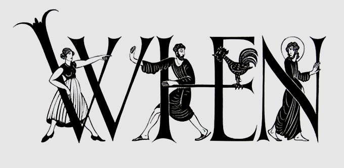
The Creative Characters nameplate is set in Amplitude and Farnham; the intro image features Joanna and Gill Sans; the pull-quotes are set in Joanna; and the large question mark is in Farnham.
Comments?
We’d love to hear from you! Please send any questions or comments about this newsletter to [email protected]
Subscription info
Want to get future issues of Creative Characters sent to your inbox? Subscribe at www.myfonts.com/MailingList
Newsletter archives
Know someone who would be interested in this? Want to see past issues? All MyFonts newsletters (including this one) are available to view online here.