|
This edition of Rising Stars is testament to the enduring popularity of script faces. Loved by type enthusiasts for their warmth and personable appearance, they are a constant in best seller lists, and at the time of writing populate the entire top 4 of our Hot New Fonts. Even though all four of them are scripts, there is a lot of diversity at play, with many different typographic voices — a refined connected italic with lots of swashes, an elegant and joyous script/sans serif combination, a casual eco-friendly brush script, and an eclectic collection tapping into the popular design styles of today. Deciding which one to choose will be the hardest part.
|
|
|
This Month’s Rising Stars
|
|
|
|
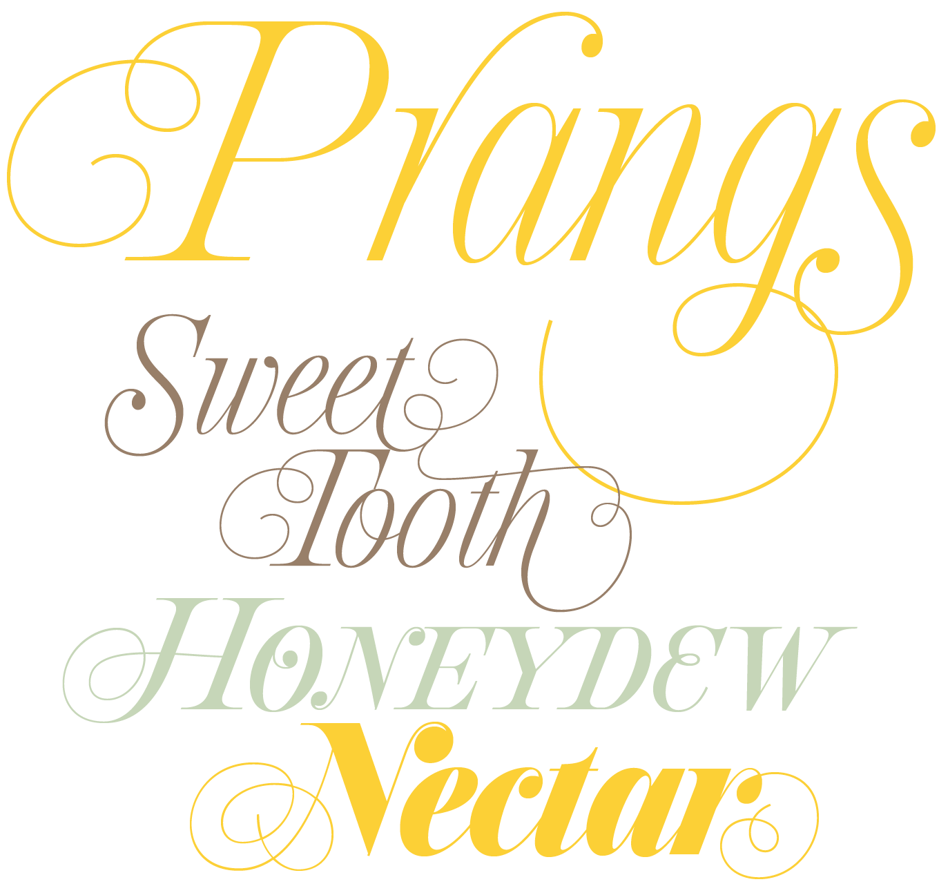
On his continuing search for obscure typefaces begging to be revived, Sudtipos founder Alejandro Paul chanced upon an instructional book by Louis Prang, the late-19th-century Prussian-American printer and publisher well-known for his efforts to improve art education in the United States. The book included a series of alphabets for sign painters, lithographers, illuminators, architects, and civil engineers. One alphabet caught Alejandro’s attention. Simply called “Italic”, the high-contrast Didone came with an interesting twist: the connected lowercase letters make it an unusual hybrid of modern typography and classic calligraphy. Ale immediately envisioned swashes coming out of the fine serifs and terminals. This inspired him to design Prangs, a joyful set of three elegant italics that work wherever moderns need to elevate and scripts to appeal — namely today’s branding, packaging, and glossy publications.
|
|
|
|
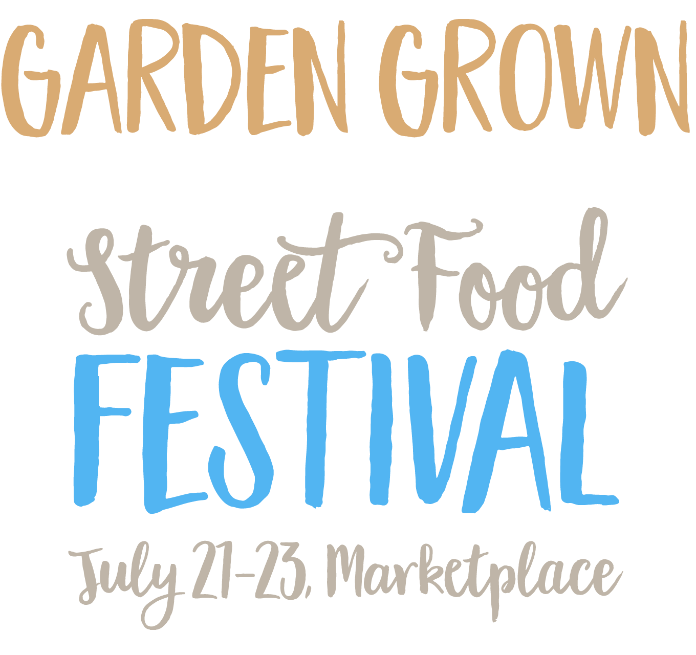
In her Creative Characters interview two months ago, Cindy Kinash revealed she had always been a fan of hand-drawn letter forms. After applying them on shirts in her previous career as an apparel designer, in her current career as a type designer she turns them into popular fonts for other designers to use. The casual font duo Garden Grown is the newest release from her foundry Cultivated Mind. It consists of a relaxed connected brush script and an alphabet of narrow brush sans caps. Alternate character shapes and an extended ligature set introduce some variation in the script. Clearly designed with food packaging, culinary publications, and invitations in mind, Garden Grown not only looks organic and eco-friendly — you can almost smell the freshness of the letters.
|
|
|
|
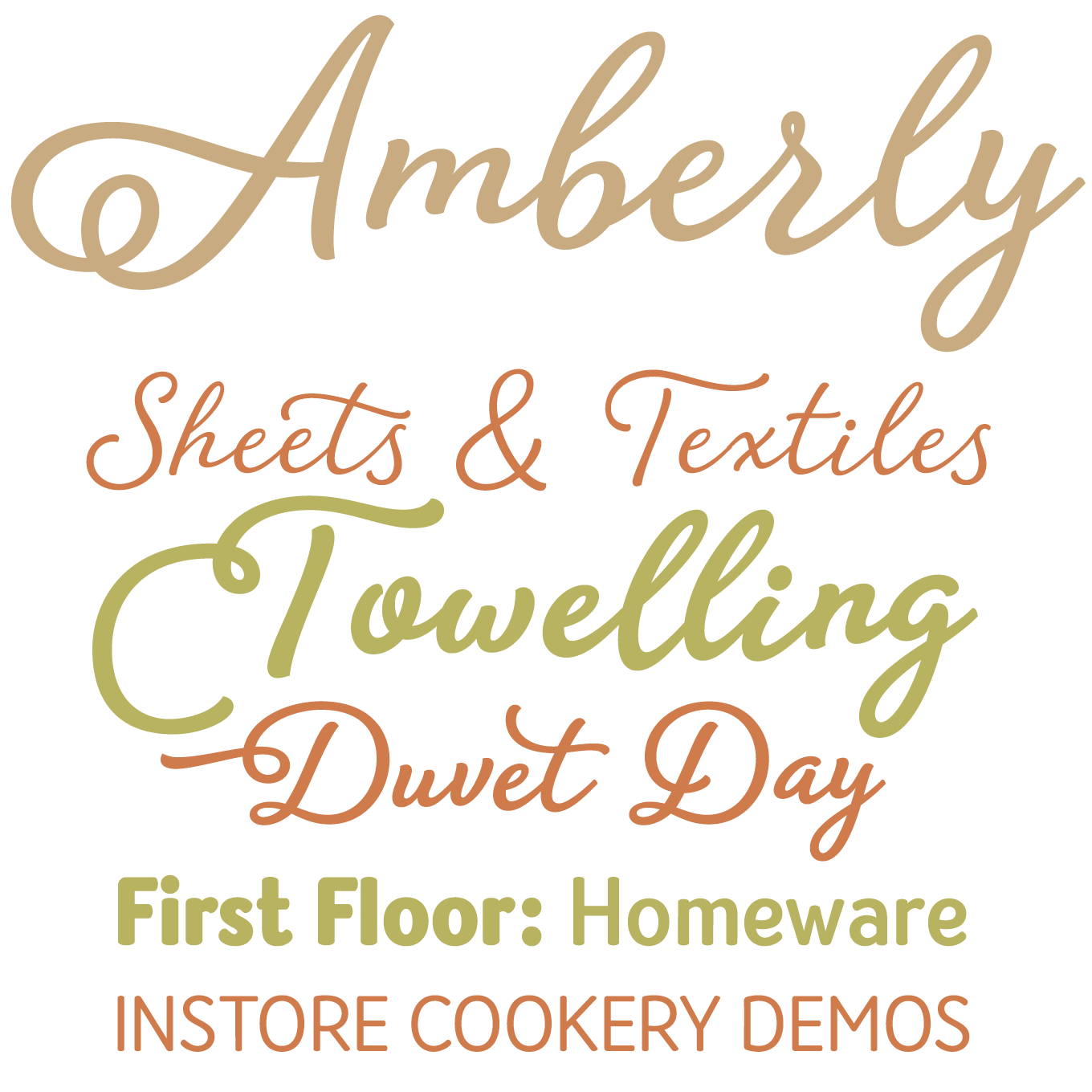
Although she released her very first typeface Brunette barely a year ago, this is the second time in three months that Veneta Rangelova is featured in our Rising Stars newsletter. The success of Guess encouraged the creator and sole designer of the Bulgarian foundry DearType to create a new script and sans combo. While they are similar in concept, Amberly is not as formal as Guess. With less contrast and slightly thicker stroke endings, the connected script looks fresh and charming. Swashes, ligatures and alternates recreate the appearance of real handwriting. Rounded corners and script-inspired shapes make the narrow sans serif a friendly companion to the script. This font family with a playful personality evokes positivity and delight, and will lend a genuine look to your designs.
|
|
|
|
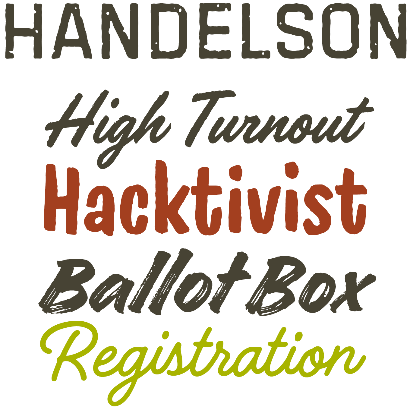
With Handelson Finnish type designer Mika Melvas provides his first all-in-one solution for editorial, packaging, and branding use. The compact yet diverse collection consists of six typefaces with an authentic, hand-made feel. Its two connected scripts — one with slightly rough edges, the other smooth and controlled — feature initial forms and ligatures for a natural look. A third, non-connecting script mimics the energetic strokes of a dry paint brush, while a narrow brush sans adds a relaxed voice to the mix. Contextual Alternates add a randomness to the letters that make the text resemble real handwriting. Two all caps geometric sans serifs complete the collection. The textured block letters emulate old print or weathered outdoor lettering. Combining these fonts allow the user to create diverse typographic designs in a unified style.
|
|
|
Text Fonts of the month
Typesetting for books, magazines or annual reports requires font families with special qualities: excellent readability, a generous range of weights with italics and small caps, multiple figure sets (lining, oldstyle, table) and ample language coverage. Here is a selection of recent, high-quality text typefaces.
|
|
|
|
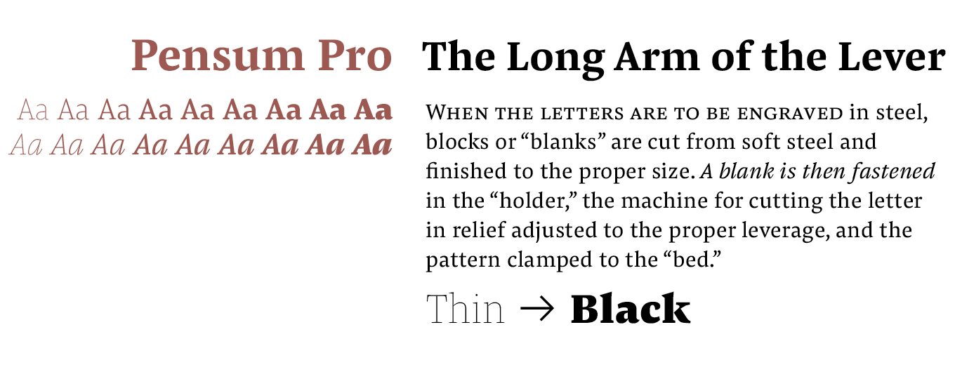
Taking his cue from the brush and the broad-nibbed pen, Nils Thomsen alternates a low contrast and sturdy serifs with surprisingly sharp design details in his text face Pensum. The expertly balanced letter forms render text reliably, making the typeface an excellent choice for immersive reading in books and magazines. More than merely functional, the pronounced ink traps help define the strong personality of the workhorse face, and make the italics sing. While all these elements help Pensum work well in the smallest text sizes, they look striking in display use. The range of weights is impressive. Having such a light Thin is rare and valuable in a stressed serif face, and the Black looks like it can withstand anything you throw at it.
|
|
|
|
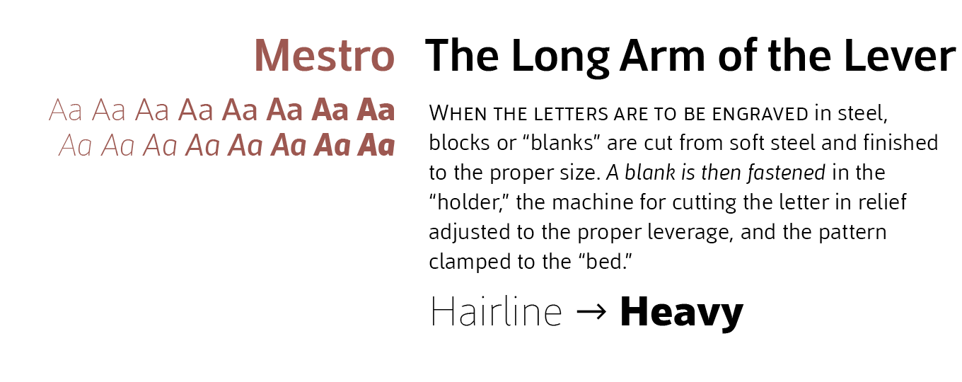
Inspired by German & Dutch typefaces, Mestre is a rational humanist sans serif designed by Pedro Arilla for the Spanish foundry Tipotecture. Its formal yet friendly character shapes exhibit a discreet humanist flair, making it a versatile contemporary hybrid, a functional and flexible solution for many of today’s editorial and corporate requirements. Combining a large x-height, open forms and an almost imperceptible contrast, Mestre reads comfortably in small sizes. Its balanced proportions and solid structure guarantee perfect legibility both on paper and on screen. Thanks to its 8 weights with matching italics, Mestre allows the user to effortlessly build visual hierarchies of any complexity in editorial design, and delivers great performance in branding.
|
|
|
|
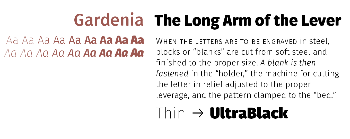
With his contemporary sans serif family Gardenia — the newest release by the Chilean Without Foundry — Mexican type designer Salvador Rodríguez Lagos introduces humanist traits in the grotesque model. With a straightforward structure and a large x-height Gardenia is well-suited for longer texts. Its gently bulging stroke endings gives it an extra friendly soft and appearance. The user can fine-tune its appearance thanks to Stylistic Sets of alternates for key characters: simplified forms in the Roman weights allow for a more compact setting, and script shapes enhance the flow of the Italics. Because the lining numbers are slightly shorter than the capitals they blend well in running text. While the medium weights are fit for text use, the lightest and heaviest perform well in display sizes.
|
|
|
News Round-Up
In this section we pick out interesting news snippets from MyFonts’ own kitchen and from the greater world of fonts, lettering and typography.
|
|
The Flashpocalypse Is Coming
You’ve probably heard the rumblings ’round the web by now that on June 30th, Google will no longer support Flash ads uploaded into AdWords and DoubleClick Digital Marketing. That means that marketers need to start coming up with a new plan yesterday in order to make sure their ad service isn’t disrupted when the Flashpocalypse hits at the end of the month. But why is this all happening? And what is going to be the new best practice in online advertising? Read up on the inherent rise of HTML5 ads on our Meta MyFonts blog.
|
|
Popular Designer of the Month
Each month, we add a new designer to the sidebar of popular designers on our homepage, based on their popularity with customers. This month, our new addition is Elena Genova of My Creative Land.
 Based in Edinburgh, UK, Elena Genova is an icon designer, Adobe Illustrator wizard and lettering artist. She ventured into type design and joined MyFonts with her new type foundry My Creative Land in early 2015. Specializing in informal scripts, she was immediately successful with her first typeface in the genre, the expressive Veryberry Pro. Her collection of informal, expressive script and handwriting fonts is growing at an impressive rate, and she has already notched up her thirteenth full family, La Parisienne, released at the start of May. That follows Storyteller, a suite of mixed, coordinated lettering styles, which has been her biggest success to date. We expect to continue to see plenty of her around here for some time to come!
|
|
|
MyFonts on Facebook, Tumblr, Twitter & Pinterest
Your opinions matter to us! Join the MyFonts community on Facebook, Tumblr, Twitter and Pinterest — feel free to share your thoughts and read other people’s comments. Plus, get tips, news, interesting links, personal favorites and more from MyFonts’ staff.
|
|
|
|
|
|
|
Comments?
We’d love to hear from you! Please send any questions or comments about this newsletter to [email protected]
|
|
|
|
|
|
MyFonts Inc. 600 Unicorn Park Drive, Woburn, MA 01801, USA
MyFonts and MyFonts.com are registered service marks of MyFonts Inc. Other technologies, font names, and brand names are used for information only and remain trademarks or registered trademarks of their respective holders.
© 2016 MyFonts Inc
|
|
|
|