|
|
This Month’s Rising Stars
|
|
|
|
|
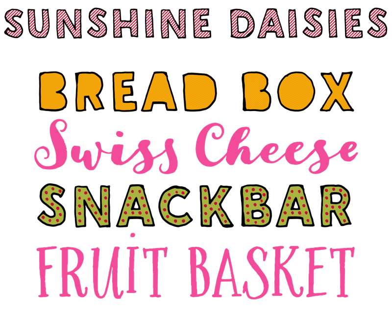
Sunshine Daisies is a new collection of 15 hand-lettered fonts by Edinburgh-based My Creative Land, the one-woman foundry of Elena Genova. The sunny designs are full of joy and warmth. Script is a bouncy connected brush script with lots of alternates, the casual all-caps Serif comes in narrow regular and bold weights, and the sans serif Condensed looks like it was drawn with a felt tip pen. Sunshine Daisies One and Two are two blocky all-caps sans serifs that offer numerous layering options. The outline variants can be combined with solid, striped, or halftone fills, with Dots as an extra option. They also have a built-in pseudo-random function, so two subsequent letters never look the same. The Extras fonts offer fun doodles and borders to complement the typefaces.
|
|
|
|
|
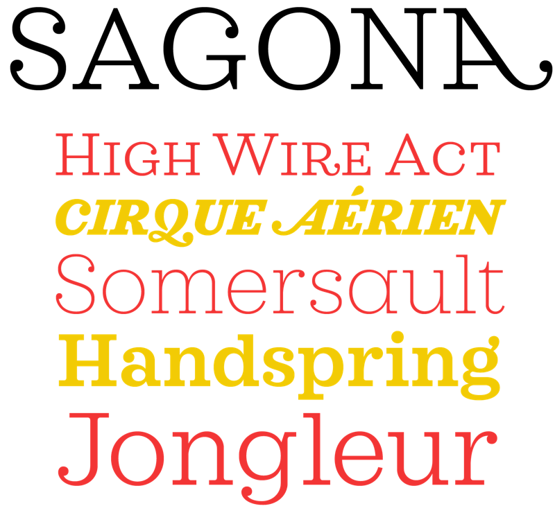
René Bieder has a knack for taking a familiar typographic style and putting a personal spin on it. Sagona, his interpretation of the slab serif, sees him injecting playfulness and warmth in the clarendon/ionic model that dates all the way back to the 19th century. The welcoming atmosphere of the typeface is emphasised by its generous proportions and ball terminals replacing serifs in certain spots. The versatile family works equally well in text and display sizes. A moderate contrast, large x-height, and short descenders and ascenders in combination with sturdy serifs guarantee optimal legibility in print and on the screen. Furthermore all weights are equipped with small caps and all the figure styles needed for body text. Numerous alternates, ligatures, and decorative alternate caps offer welcome flexibility in titles and headlines, making this a great, all-round typographic solution.
|
|
|
|
|
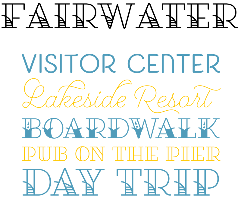
Casual hand-lettered typefaces on the one hand are fun, but their outlines can sometimes lack refinement. Typographic designs on the other hand often come across as cool and impersonal. With Fairwater Laura Worthington offers the best of both worlds — a friendly type family in three popular hand-drawn flavors with beautifully crafted, pristine letter forms. Fairwater Script is derived from cursive handwriting styles popularized in the early to mid 1900s, and includes a plethora of swashes and alternates. It is complemented with the monoline Fairwater Sans, a friendly all-caps face that offers many alternate characters. Fairwater Serif references early-to-mid 20th-century tattoo lettering in four decorative styles that can be layered. The collection also includes a decorative font of 250 ornamental characters with strokes and proportions that perfectly complement the type.
|
|
|
|
|
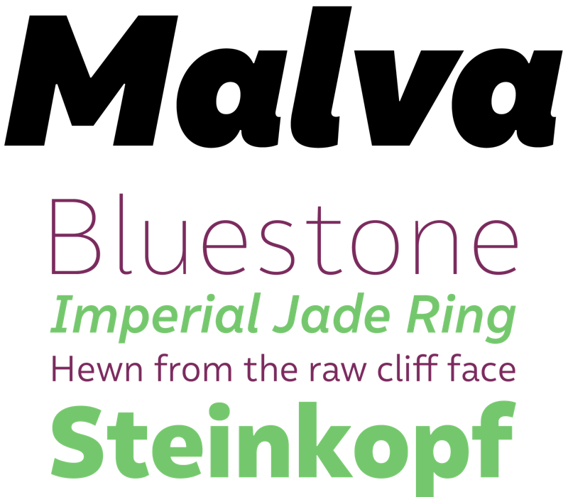
Henrique Beier of the Harbor Type foundry is one of the eight Brazilian type designers profiled in the second edition of 365Typo, the annual of typography. With his latest typeface Malva, Beier adds a touch of friendliness to a versatile sans serif without compromising its professional appearance. This makes the large family the ideal choice for a variety of applications ranging from editorial and publishing to branding and identity work. Because legibility was one of the main concerns during its development, Malva’s proportions are very well-balanced, and special care was taken to differentiate between the characters I, i, l, and 1, which can easily be confused in text sizes. Besides being eminently readable in print as well as on the web and on mobile devices, the lightest and heaviest weights create great titles and headlines in magazines, posters, and ads.
|
|
|
|
Text font of the Month
|
|
Typesetting for books, magazines or annual reports requires font families with special qualities: excellent readability, a generous range of weights with italics and small caps, multiple figure sets (lining, oldstyle, table) and ample language coverage. Here is this month’s pick from the recent, high-quality text typefaces.
|
|
|

|
|
|
Bernd Möllenstädt — best known for the classics Formata and Signata — was the head of the type design department at the legendary Berthold type foundry for over two decades, and succeeded Günter Gerhard Lange as its type director. Shortly before his death, Möllenstädt asked Volker Schnebel to help him develop the early drafts of Classica — a typeface he still had in a drawer — into a full-fledged family. When Möllenstädt passed away in March 2013, Schnebel decided to bring the unfinished masterpiece to fruition. Classica Pro is a dependable, elegant text face for letterpress printing, with soft curves and calligraphic details that make the letters sing on the page. Its open forms and moderate contrast make it a versatile solution for a variety of settings, from poetry to editorial and book typography. Classica Pro’s extensive character set includes everything you need to set high-quality contemporary text. It will charm the reader and turn the reading experience into a smooth, satisfying journey.
|
|
|
|
Under the Radar
|
|
With so many new releases every month you might miss some noteworthy new typefaces. To help you discover them we shine a spotlight on a hidden gem.
|
|
|
|
|
|
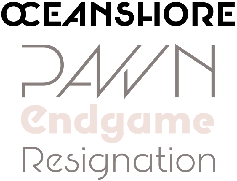
Due to the continuing popularity of geometric sans serifs and the many new designs that appear on the market, finding new, original approaches in this genre can be a little challenging. Instead of looking at well-known classics like Futura or ITC Avant Garde Gothic, Pablo Moreno loosely based Oceanshore on the sans serif display models from the Art Deco period. Moreno then introduced stencil properties, interrupting the strokes in the letters to create new, surprising character shapes. These lend Oceanshore a retro-futuristic look that shines in eye-grabbing headlines, on posters and flyers, and in packaging design. Besides an extended set of ligatures, the six weights from Thin to Bold also feature surprising alternate capitals and capital ligatures that allow the user to create catchy titles and striking logos. This makes Oceanshore an ideal choice for editorial design, branding, and marketing.
|
|
|
|
News Round-Up
|
|
In this section we pick out interesting news snippets from MyFonts’ own kitchen and from the greater world of fonts, lettering and typography.
|
|
|
|
|
Say Hello to Bundles!
We’re reimagining the way you shop for fonts on MyFonts with our release of Bundles — collections of fonts grouped together by your favorite foundries, offered at a killer price. These Bundles will offer you tons of selection and bring enormous range to your ever-growing and evolving font library. Some of them are based on themes, like great fonts for invitations and cards for example, while others are super varied and will open up the doors for interesting pairings and gorgeous layering.
Browse a few of the bundles under the new Bundles navigation at the top of our homepage, where we’ll be releasing exciting new bundles all the time!
|
|
|
|
MyFonts on Facebook, Tumblr, Twitter & Pinterest
Your opinions matter to us! Join the MyFonts community on Facebook, Tumblr, Twitter and Pinterest — feel free to share your thoughts and read other people’s comments. Plus, get tips, news, interesting links, personal favorites and more from MyFonts’ staff.
|
|
|
|
|
|
|
|