
2008 has been a rough ride for many of us, but typographically it has been a triumph. Proudly broadcasting from our much praised new website, MyFonts has observed a continued increase in font quality. Our foundries haven’t disappointed: old friends have continued to deliver excellent stuff; and several well-respected foundries, as well as many promising new ones, have joined MyFonts to enlarge our choice of excellent typefaces. This newsletter lists the year’s most successful fonts in each genre. Based on sales numbers, it was ultimately put together by you, our faithful customers. Thanks for being part of the jury!
Metroscript
Script fonts have always been big at MyFonts. Recently the genre has gained additional appeal thanks to sophisticated new technology. The OpenType format allows type designers to offer several variants of each character, turning fonts into a dream tool for simulating hand-rendered script. With Metroscript, New York lettering artist Michael Doret adapted his trademark hand lettering style for use on the computer, creating one of the most sophisticated suites of script fonts on the market. Metroscript was successful throughout 2008 and proudly holds the title of MyFonts’ brush script font of the year.
Museo & Museo Sans

Nothing prepared us for the phenomenal success of Museo and Museo Sans, the year’s top geometric display fonts. When introducing Museo, a clean yet unconventional semi-serif, designer Jos Buivenga got everyone’s attention by offering three out of the five styles for free. On the strength of the paid weights alone, Museo made it to the top of our list of hot new fonts. When its sans-serif companion was launched some months later, again with part of the family offered at no cost, it smoothly sailed to the top spot as well. Both typefaces are lucid and versatile, great for cool-looking headlines but also very effective in medium-sized texts. As a bonus, we couldn’t resist giving the Museo pair an extra-special award for the year’s best marketing strategy.
Floralissimo

Our recent interview with Gert Wiescher has met with great acclaim; with over 150 fonts, he is one of the most prolific type designers represented at MyFonts. Of his many ornamental fonts, Floralissimo is the one that did best during the past year and therefore earned its spot as the most popular picture font of 2008. Like most of his other ornamental fonts, it is based on vintage material from old catalogs. The flowery ornaments are an elegant addition to any design, lending it an extra touch of romance, nostalgia, or subtle irony.
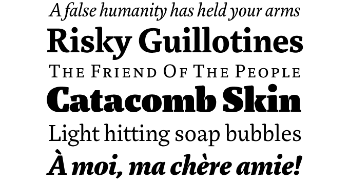
Breuer Text
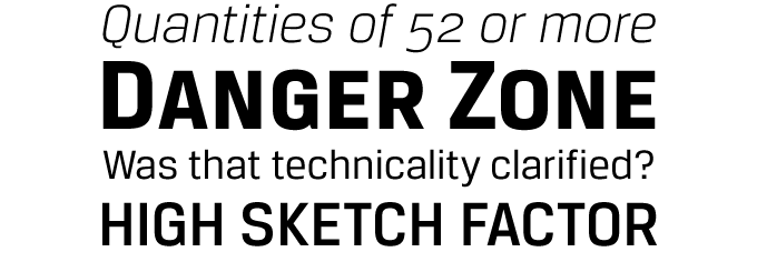
Here at MyFonts we have begun to refer to 2008 as “The Year of the Sans.” Never before have so many well-made, original and versatile sans-serif fonts hit our virtual shelves. In the sub-category of technical sans-serifs, TypeTrust’s Breuer Text did best. Breuer Text has a straightforward nuts-and-bolts logic but, despite the underlying squarish structure, is also rather elegant and reader-friendly. Combined with a more humanist serif font, it is a great secondary typeface for complex editorial design projects; it also performs very well in instructional copy, signage and branding.
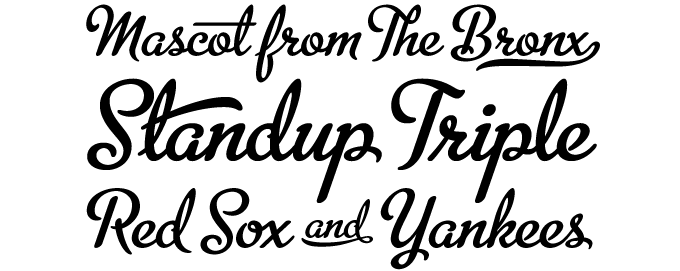
Corinthia
In a year of great script fonts, Corinthia from TypeSETit convincingly took the crown as festive script of the year. Elegant and gracious, Corinthia is somewhat more formal than Rob Leuschke’s other staple typefaces. Its characters connect into a confident cursive flow, making Corinthia a delightful script for invitations, romantic book covers or classy packaging.
Bree
Based on the logo of TypeTogether, the typefoundry of Veronika Burian and José Scaglione, Bree was one of last year’s most successful sans-serif fonts. It was also one of the most original — combining a clean, upright structure with italic-style details. Bree is a highly professional typeface: it is impeccably drawn and comes as an OpenType family with several sets of numerals, ligatures, and a huge set of multi-lingual characters. For cases where a more conventional look is appropriate, Bree offers alternate versions of its most adventurous characters. Bree is 2008’s calligraphic sans-serif of the year.
Darling Monograms
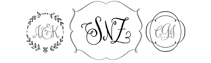
This font by lettering artist Crystal Kluge constitutes a genre of its own. Darling Monograms is a set of elements to create charming monograms and frames for personalizing products. Its ragged edges and curly shapes lend the results a unique, nonchalant charm. Darling Monograms convincingly takes the crown for specialty font of the year. The font also pioneers an unheard-of pricing system, with different prices based on the number of items you intend to have printed with it. You can upgrade anytime if you need more.
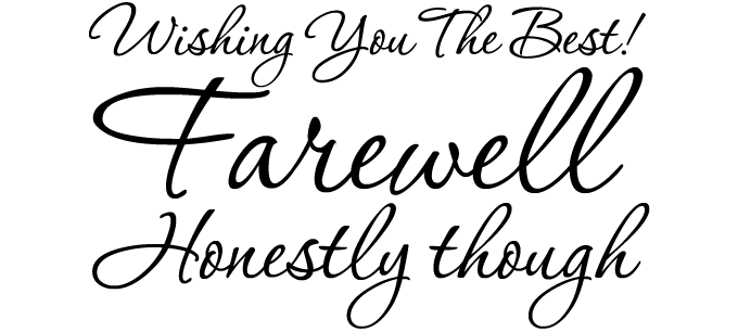
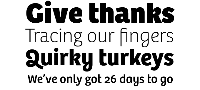
Marat
Although 2008 was a very good year for sans-serifs, there was also an impressive crop of serif fonts. Strikingly original, Marat by Ludwig Übele was the most remarkable of them all: sturdy, compact, and very legible. Its superior quality and unique appearance met with great response from MyFonts’ customers, making it 2008’s best selling serif text font of the year. Although it works beautifully at small text sizes, its bold weights are full of character and can double as attention-grabbing headline faces. Besides the professionally equipped Marat Pro, there’s Marat Std, a more affordable basic version.
HandMade
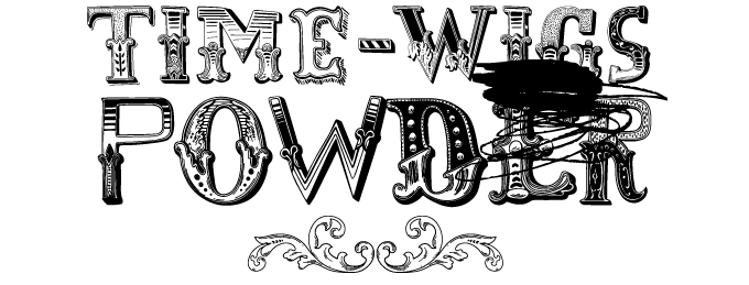
When showcasing HandMade in one of our monthly Rising Stars newsletters, we welcomed it as one of the “outrageous, incongruous, schizophrenic yet adorable display fonts” recently released by the Misprinted foundry. A ramshackle, irreverent montage of bits and pieces from ornamented alphabets, HandMade is one of those fonts that immediately define a style. Love it or hate it, you can’t ignore it. HandMade did very well at the box office, and gracefully stumbles across the stage carrying the crown for novelty font of the year.
Aviano Serif
In last year’s list, Aviano and Aviano Sans from the insigne foundry were “Top display couple.” Designer Jeremy Dooley decided that there was room for more and created Aviano Serif. While Aviano Serif is based on the classically inspired structure and extended proportions of Aviano, the serifs are more regular and sturdy, and the typeface has more weights. A successful revision and expansion of an earlier design, Aviano Serif is the proud recipient of MyFonts’ award for display sequel of the year.
Colophon
The Top 10 fonts of 2008 was written by Jan Middendorp and designed by Nick Sherman. The title graphic is set in Bree.
Subscription info
Want to get future MyFonts newsletters sent to your inbox? Subscribe at myfonts.com/MailingList
Comments?
We’d love to hear from you! Please send any questions or comments about this newsletter to [email protected]