
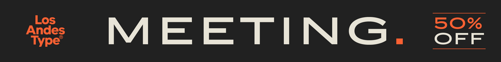


Kairos Sans
Striking, octagonal, sans serif:
the new Kairos Sans
The distinctive, octagonal slab serif Kairos™ now has a sibling: sans serif Kairos™ Sans joins its well-equipped sister font, opening up new areas of application for the athletic and powerful family. Use Kairos Sans – created by Monotype designer Terrance Weinzierl – in combination with the slab serif for sports, outdoors or technical designs, for example.

As sister fonts, the slab serif Kairos and the new, sans serif Kairos Sans share the same basic shape. The letters of Kairos Sans are also not rounded. Designed with an octagonal base, they have a well-known, formal and somewhat stencil-like look. Weinzierl also added interesting details, like the allusions to a Roman font, and gave the lower-case “a” an open and the “g” a two-story shape. The loss of the serifs and the avoidance of any playful detail bring the calm and formal character of the font to the foreground.

 Both Kairos families have the excellent and diverse options: Like Kairos, Kairos Sans is also available in eight weights and three widths. All styles come with an italic, so that the phenomenal number of styles comes to 48 altogether. Kairos Sans Rough, which has an incomplete color application, is also included. In this case you have two weights, Regular and Bold, each with an italic.
 The character options for Kairos Sans also leave no wish unfulfilled. In addition to the Latin, all styles also include Greek and Cyrillic characters. Various numeral sets, small caps and some pictograms and symbols round out the options.


Although Kairos Sans was created as a headline font, the middle sizes are also ideal for short texts. Combined with the sister font, slab serif Kairos, the result is an exciting and interesting contrast that brings out perfectly the potential of both families. Thanks to its quiet charisma, Kairos Sans is suited not only to sports and outdoors applications, but also technical designs.