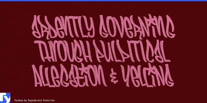
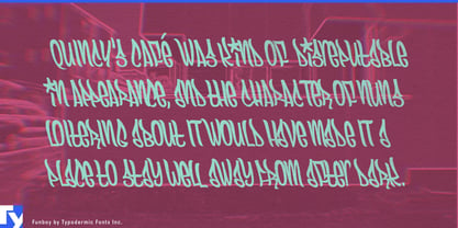
Expressive hand lettering often needs room to spread. That becomes a problem on slim cans, narrow bottles, board graphics, frames, and other surfaces where the available space is tall or elongated rather than wide. A conventional condensed sans will fit, but it loses the irregular movement that made handwriting desirable in the first place.
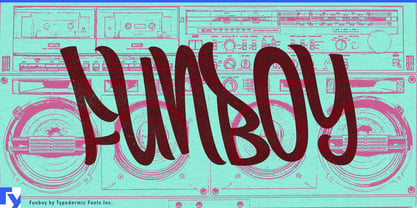
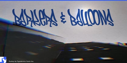
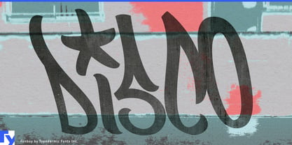
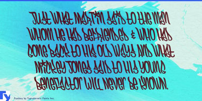
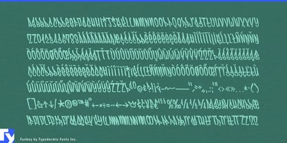
Funboy solves that problem with tall, compressed marker lettering built around loops, bends, and uneven handwritten rhythm. Context-sensitive letter combinations and alternate forms reduce obvious repetition, helping repeated characters and common pairs avoid the mechanical sameness that can expose a digital handwriting font.
Slim beverage packaging is a natural setting. Energy drinks, hydration products, functional beverages, sparkling drinks, and canned coffee need brand names, flavor names, formulas, and limited editions to work on narrow cans. Funboy can run vertically, stack tightly, or occupy a slim central strip while keeping those names lively.
The same advantage carries into hot sauce, chili oil, chili crisp, instant noodles, spicy snacks, and other flavor-driven products. Sauce bottles and condiment labels especially benefit from lettering that can turn long pepper names, heat levels, and flavor variants into compact graphic shapes. Hair styling products such as texture sprays, gels, temporary color, and curl products present a similar packaging problem across bottles, tubes, tubs, and cartons.
Action-sports equipment provides larger surfaces with equally demanding proportions. Snowboards, skis, wakeboards, skate decks, BMX frames, stunt scooters, helmets, and technical bags can use Funboy for model names, rider editions, collaboration graphics, and product-series lettering. Its narrow construction lets a name travel along a board, frame, ski, or deck without consuming the whole composition.
Funboy began with narrow marker graffiti observed in San Francisco, but its practical value reaches beyond graffiti graphics. It brings handwritten motion to places where expressive lettering normally takes up too much horizontal space.