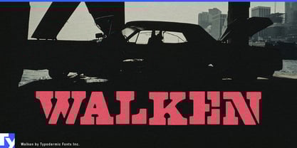
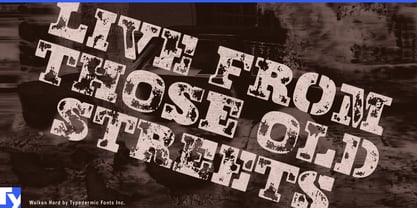
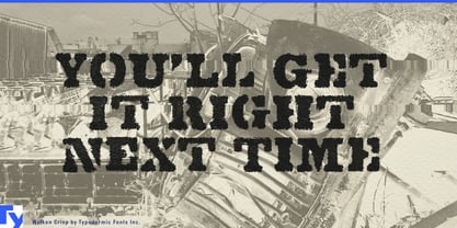
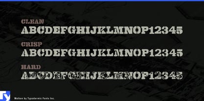
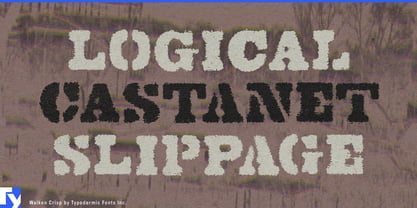
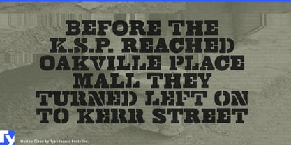
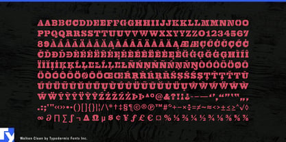
Walken is a heavy slab serif built around an intentionally inconsistent stencil system. Some letters are cut apart while others remain solid, and common letter combinations can shift the pattern again, keeping words from settling into the repetitive rhythm of a conventional stencil. Clean, Crisp, and Hard add progressively more surface wear, ranging from sharp and graphic to heavily battered.
That irregular construction gives Walken a strong role in industries built around physical processing. Demolition contractors, scrap-metal processors, concrete recyclers, aggregate recovery operations, industrial shredders, and heavy-equipment suppliers can use it for crusher and shredder model names, excavator attachments, equipment decals, fleet graphics, catalogues, yard signage, and trade-show displays.
The same visual language fits the expanding circular-industrial economy. Battery recycling, EV dismantling, e-waste recovery, construction-material reclamation, metals processing, and industrial remanufacturing all revolve around machines that disassemble, sort, crush, recover, and rebuild. Walken gives those companies a physical, process-driven identity without defaulting to military stencil lettering.
Construction and jobsite equipment offer another strong fit. Demolition attachments, concrete tools, compact machinery, portable power systems, contractor storage, rugged equipment cases, and heavy-duty hardware often rely on large product-series names and model identifiers across housings, decals, packaging, dealer displays, and sales material.
Off-road and vehicle equipment can use the same toughness for recovery systems, winches, suspension components, skid plates, commercial 4×4 conversions, truck accessories, and UTV hardware. Clean can establish the main brand or product architecture, while Crisp and Hard add increasing abrasion for campaign graphics and secondary applications.
Walken works best where typography needs to suggest machinery, impact, abrasion, and physical work without borrowing the usual military stencil vocabulary. Its shifting pattern of broken and intact forms remains distinctive even before any surface damage is added.