Ignorer et passer au contenu
Accéder au contenu principal

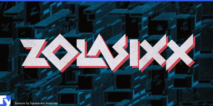
Zolasixx

par Typodermic
Styles individuels à partir de $69.95 USD
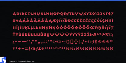
La famille de polices Zolasixx a été conçue par Ray Larabie et publiée par Typodermic. Zolasixx contient 1 styles. En savoir plus sur cette famille

À propos de la famille


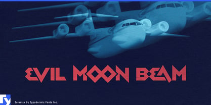
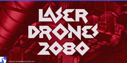
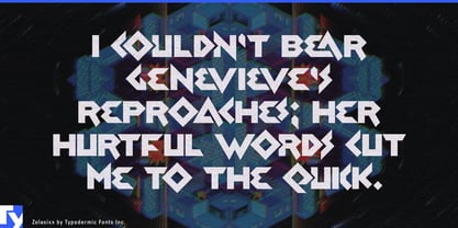
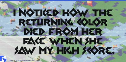
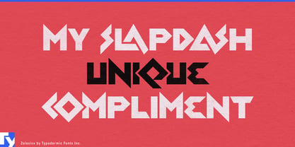
Zolasixx began with the angular logic of early isometric arcade graphics, but its letterforms have taken on a wider life. Diagonals, sharp turns and interlocking shapes make words look as if they are routing themselves through space, assembling into structures or solving small geometric problems.

That makes it especially effective for climbing and bouldering. Route names, competition titles, climbing-gym graphics, hold-set names and event shirts can use the same directional tension found in a body moving between holds across an angled wall. Puzzle games, escape rooms and mechanical puzzle packaging offer another natural fit; Zolasixx’s ligatures and connected forms make short titles feel constructed rather than simply typeset.

Its isometric ancestry also pairs naturally with axonometric buildings, factory diagrams, cutaway interiors, illustrated maps and game environments. Architecture exhibitions, fabrication labs, pavilion projects and modular structures can use the font’s folded, joined geometry without relying on retro styling. Released in 2012, Zolasixx can also read today as part of the experimental geometric design language associated with that period, giving it another route into architectural and fabrication-oriented work.

Zolasixx is an all-caps display face for short, concentrated language: climbing routes, puzzle titles, exhibition headings, structure names and labels within spatial illustrations. Pair it with a quieter sans for instructions, descriptions and specifications; let Zolasixx turn the important few words into a piece of constructed space.

Concepteurs: Ray Larabie

Fonderie: Typodermic

Fonderie d'origine: Typodermic

MyFonts débout: Dec 11, 2012

Zolasixx

À propos Typodermic

Welcome to Typodermic Fonts, a spirited type foundry rooted in Nagoya, Japan, started by the Canadian typeface designer, Raymond Larabie in 2001. Our library brims with 500+ diverse typefaces to fuel creativity in graphic design, advertising, web, and app development. As digital type pioneers, we adopted web fonts and app licensing early, consistently pushing the design envelope. With Canadian heart and Japanese precision, we're your global partners in extraordinary typography. Explore Typodermic Fonts—where creativity meets character.

En savoir plus

Lire moins
