|
Seldom do families have multiple generations with careers in type, but history shows the few who do achieved a large and diverse body of work that is technically precise; the Bentons, Hartmanns, and Hoefers just to name a few. Fewer accomplish such feats while working on different continents, but today’s hyper-connected world has changed all that. Our two interviewees are in Washington D.C. and Belgrade, Serbia, yet being separated by the Atlantic Ocean hasn’t stopped them from building a library that bridges generations, styles and traditions with compelling, award-winning, multi-script designs. Meet the unassuming father & son team behind the Kostić Type Foundry: Zoran and Nikola Kostić.
|
|
|
|
|
Let’s start at the beginning, Zoran. When did you begin designing type? Is it true that you had no intention of even becoming a type designer?
Z: It was in 1987. My friend and I were inspired by articles written by visionaries describing desktop publishing (DTP) as the job of the future, so we decided to start a private business. After raising $8000, we set off and acquired our first Macintosh SE, LaserWriter printer, and established Studio B&Z — the first DTP studio in Yugoslavia.
I had no intention of becoming a type designer. But at the time, there were no Cyrillic PostScript fonts on the market, nor were there any Yu letters in Latin fonts, so we had to become font-making experts ourselves out of pure necessity. We’d already designed the first PostScript Cyrillic font in 1987, and in fact, it was the first one of its kind on the entire territory of the former Yugoslavia. Only veteran users of Macintosh and Fontographer 2.4, which provided Type 3 fonts exclusively, without hints, can appreciate the difficulties we were up against in trying to make a PostScript font. Even a simple task such as remodeling Latin fonts by adding Yu letters was nasty, until Adobe opened the Type 1 code.
While designing the first font, I discovered a whole new world whose beauty and complexity put me under such a spell that I am still captivated to this very day. It was love at first sight, and, I think, forever.
You’ve been pretty productive since.
Z: Since then, I make a Cyrillic font whenever I have some free time, for there is still a great shortage of them. So far I’ve designed: Batke, Beograd, Kostic Sans, Kostic Serif (with Nikola), Lapidary Capitals, Designer Round, Why Square™ and Just Square™, and about ten others that are based on old scripts. The last typeface I completed is HilandarskiUstav, which I reconstructed on the basis of handwritten gospels called Tetraevangelion of Patriarch Sava IV, from the Monastery of Chilandar, Mount Athos, 14th century. It is an OpenType font with 4356 glyphs and symbols, which uses only one keyboard layout. To round up the story about Old Slavic scripts, I also made Monah (6400 characters), Glagoljica and Građanica.
In cooperation with calligrapher Đorđe Živković, who designed them, I produced: FlahScript, Garamond, LepiScript, Manasija, Naisus, Ravanica, Traian.
What was the type and lettering scene like in Serbia in 1987? Was there a lot of competition? Certainly there are more Cyrillic type designers today than ever before.
Z: At that time, the only type designers we knew were Jovica Veljović and Đorđe Živković. They drew letters on paper and we had to deal with PostScript on the computer. There was no one we could ask for advice. When we produced Garamond Cyrillic in 1990, Đorđe Živković drew letters that were 7 centimeters high, which we then scanned and redrew in Fontographer. It took me six months to finish two weights.
For an original typeface, you had to have a drawing of each letter. Then you had to mount ThunderScan (it was an optical scanner that was installed in place of a ribbon cartridge) on the ImageWriter dot matrix printer. You put a drawing in the ImageWriter printer, and the scanner moved left and right over the drawing so as to scan it row by row. When the scan was done, you could import that image to Fontographer’s background. After that, you could draw a letter in PostScript. Only when our studio developed, and ultimately became the most prominent one in the country, did I find the time to make my own original designs.
Wow — six months to finish two weights. A decade later, the font making software had improved. How about Why Square and Just Square, those families each have 14+ fonts?
Z: Those designs were created during the bombing of Yugoslavia in 1999. It started when my son Nikola (a student at the Faculty of Applied Arts at the time) asked me to draw some letters from a logotype sketch he was working on. I thought it was very good, and realized that it could be more than just a logotype. As there was no other work, I began the Square project.
Why Square started with three weights of Latin characters. The war was still raging so I made variant fonts, some with wider capitals named ‘IN’ for initial, and small capitals. As the war went on, I added two more weights as well as Cyrillic variants — totaling five weights, each with Latin, Cyrillic, IN, and small capitals.
The war continued, so I made another design (which wasn’t the original plan), Just Square, in four weights with both Latin and Cyrillic variants. As the war continued, it struck me as annoying when a family only contained four weights, so I created four more weights.
Still the war went on, and I realized it would be good for Why Square to have an alternative; which came to be Designer Round. It had five weights of Latin and Cyrillic. Just when I nearly finished, the war ended.
By this time I had made 46 fonts. Who knows what might have happened if the war had gone on?
|
|
|
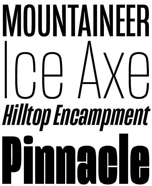
Mongoose is Kostić’s newest release, a condensed grotesque in six weights plus matching italics, designed by Nicola Kostić. An excellent poster face with an equally excellent range of numeral features, Mongoose is up for any data reporting challenge — its condensed width make fitting long numbers in a narrow space a simple task. When set alongside the wider Briller fonts, the combination of thick & thin can create stylistically tasteful results.
|
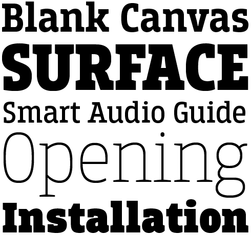
Breakers and Breakers Slab are Kostić’s flagship products. This pair of companion six-weight families were originally conceived for display uses, but they work great in longer text settings too. Their contemporary shapes are well suited for text in mobile apps and on websites.
|
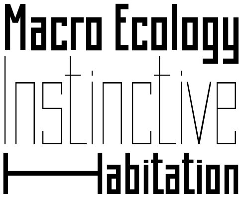
Created during a period of conflict-enforced inactivity, Zoran Kostić’s Square series of blocky, geometeric display faces plays inventive games with width, allowing designers to create dramatic, strongly graphic compositions for eastern-European inflected posters, book covers and product packaging.
|
|
|
|
|
|
Left: A fourteenth century original manuscript of the Gospel of Luke, Monastery of Chilandar, Mount Athos. Right: Zoran’s digitization of the calligraphy seen in the manuscript
|
|
|
Did you intend to turn this into a family business, or was this something Nikola wanted to do? How did you know he too would be a type designer?
Z: In the beginning, Nikola did not show any interest in type design. From time to time I would ask him to do a checkup of the letters I was working on. Being a graphic designer, he had an eye for that sort of thing. Then suddenly, out of nowhere, six years ago, he decided to take up type design. I am thankful for the fact that talent always emerges to the surface in the end—better late than never. Kostić Type Foundry came to be as a result of his initiative.
Nikola, when you were young, what was so interesting about your father’s work? How did you know “this is what I want to do” professionally?
N: I was about 9 years old when my father got the first Mac for his DTP studio, which was in the making at the time. Before that, computers were either meant for serious programming (which seemed boring to me), or for games—something I was only allowed access to if I had good grades in school (which I didn’t). I was always drawing as a kid, so you can imagine my bliss when I realized that you can draw on a computer using a mouse! I was instantly hooked. By the time I got to university, the mouse pointer already felt like an extension of my hand in the vector and pixel drawing programs. In the early ’90s, my father’s studio was the leading company in the field (there were only a couple of Macs in the entire country), so I was exposed to the work of some of the best designers in our region, who came to collaborate with him. There was nothing else for me to do except graphic design.
The process of learning type design wasn’t tracing, right? What would you do?
N: I was allowed to use my father’s studio equipment as I pleased, so as a kid I mostly drew and had fun with vectors. I remember watching him draw letters on the screen for hours and thinking to myself: God, this is boring! I was only interested in graphic design and the result of his work in type design was something I took for granted. Even throughout my studies, professor Olivera Stojadinović tried hard to get me to become serious about type design, but I simply lacked dedication at the time. I was eager to finish school, go off into the “real world” and “create stuff”. Only when I started working seriously on logotypes did I realize the importance of type. I was rarely satisfied with the results from existing typefaces, so I modified them or created custom lettering for most of my projects. That is when the stuff I subconsciously picked up from watching my father’s work kicked in.
When it came to my studies, my father was seriously interested in my calligraphy class performance. I was good at it, and when I scored well at the end of the year (which was no easy task in the class of professor Aleksandar Dodig) Zoran was really proud.
Looking back on it all today, something that seemed to be a long time coming slowly began creeping up on me over time. I came to a point in my life where I became acutely aware of the rather momentary and fleeting significance of most things one might create in terms of graphic design and felt the need to produce something more permanent, something that would stand the test of time. From that moment on, everything settled into place. I’d been avoiding typeface design for so long that I never really stopped to consider the potential of being able to produce something that can be quite long-standing and is so uniquely rewarding. By the time I actually started creating typefaces, I’d already had a decade of experience as a graphic designer. The only challenge was learning how to subject individual letters to working better as a group (anticipating the bigger picture) and getting used to FontLab.
|
|
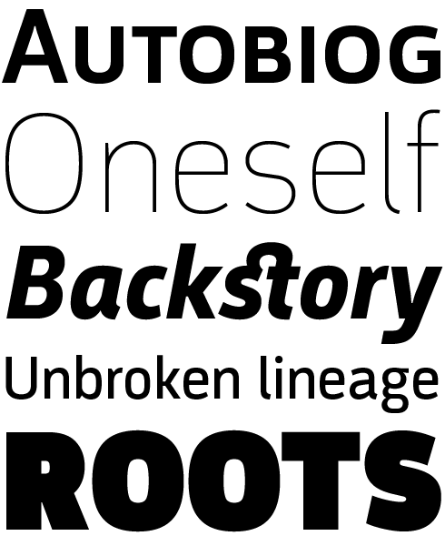
Argumentum by Nikola Kostić occupies a place somewhere in the triangle between DIN®, Eurostile® and, say, Fedra Sans: a technical looking sans with a warmer feel to it, balanced between hard geometric shapes and friendly curves. Equipped with small caps, multiple figure sets and much more, Argumentum is ready for the most demanding of typographic jobs.
|
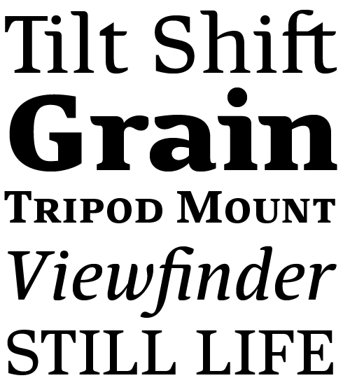
Combining sensual, curvy details with a clear and open silhouette, Pagewalker is a wonderfully readable text face doubling as a distinctive display family. As the name suggests, the font was made with editorial design in mind. Its high legibility, distinct italics, small caps and OpenType features make it a useful tool for demanding typographers. Used in large sizes, it lends character to packaging, posters, logotypes and web pages.
|
|
|
|
You’ve gone on to create award-winning designs such as Chiavettieri — winner at the 2014 Modern Cyrillic International Design Competition, and a 2015 Favorite on Typographica. What were some challenges when creating this family?
N: My main goal was to create a text typeface that was legible in small sizes. I like to make fonts that can serve a specific purpose, something I can use on my own projects. The fact that I was planning on making a new website for our foundry also meant I needed a typeface that would perform well as a webfont. I’ve been researching legibility, proportions, and hinting for a while now, and learned a lot from our own previous releases. Nothing helps you learn better than seeing how your own work performs after at least a year has passed. And it is much easier to learn about type design these days, when great people like Matthew Carter and others have already solved so many technical problems and shared their knowledge with the entire world so generously. After reading about his work on Georgia, one quickly realizes that proportions and spacing in a typeface are crucial for a good on-screen performance.
So the main challenges while working on Chiavettieri were setting the right proportions and spacing, and fine-tuning the design so that it is legible, but also retains its individuality. But then of course, when you’re working on a large set including both the Cyrillic and the Latin script with a proper Italic, it is a particular challenge to keep things consistent throughout the design.
Today fonts can be used on the web, in mobile apps and ebooks. How much do the demands of designing for screen media influence your choices for things like letter shapes and widths?
N: If I’m making a text typeface, it has become crucial. It is obvious that the future of reading will be on screens (yay for trees!). Nowadays screen resolutions still vary a lot (from 72ppi to 4k UHD), so it makes sense to create robust typefaces with large x-height and generous spacing. On top of that, the variables increase significantly when you take into account that it will be viewed from multiple browsers and platforms. However, as the quality of screen resolutions and type display engines improves, I presume this will gradually become less and less important. But aside from that, it is primarily a question of purpose. Each font should have its main purpose, and with this as your starting point, all you need to do is figure out which one suits you or your client.
For example, the last such project we did was a custom sans family for the Radio Television of Serbia, which is a public service broadcaster. Our typeface RTS Sans won their Cyrillic Type Design Competition and it was chosen to be their official corporate typeface. They needed a type family to use in the production of their TV program (news, sports, drama, etc.), as well as on their web portal. So, once I set out to define the basic characteristics of the typeface, which needed to encompass a wide range of media content, naturally my main focus was on the way they would look on-screen.
|
|
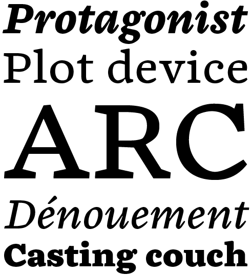
The typographic palette in Chiavettieri has been award winning. It can solve the problems of demanding multi-lingual editorial content while looking sophisticated and elegant, both on-screen and in print. The family includes small capitals for both roman and italic — in every weight — so varying levels of typographic hierarchy can easily be established.
|
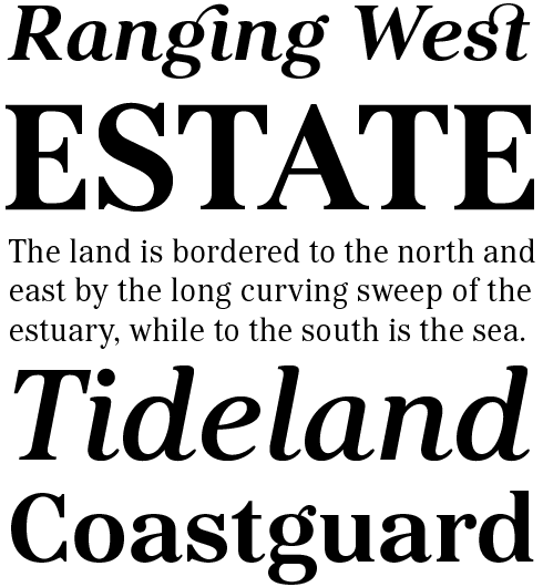
Conceived in the classicist, transitional style of Baskerville and Miller, Kostic Serif was begun by Zoran Kostić around 2002, then abandoned, and redesigned eight years later by Nikola. With tall, clean characters and a large glyph set to support all European languages — Greek and Cyrillic included — Kostic Serif is a good choice for setting body text and excellent for international publications. With multiple figure sets and 31 ligatures, the family is a versatile and superbly legible face for large and small texts.
|
|
|
|
|
|
An intricate hand-lettered illustration by Nikola Kostić
|
|
|
What are your individual roles in the Kostić Type Foundry today? For example, are you both designing? There are several hats to wear: design, production, sales.
N: Nowadays, our roles are pretty much clearly divided when it comes to the workflow of the foundry. We play to our strengths. Zoran has always been technically oriented so he deals with spacing and OpenType functions. After almost thirty years of experience, the speed at which he flies through the spacing and the kerning of a typeface is staggering.
I handle typeface design. For the past six years I’ve set aside all other work. So at the beginning of the process, and by the time I’ve defined the lowercase a, I’ve already made most of the design decisions in my head and I (more or less) know how the rest of the letters are going to look like. When I’m done with basic Latin characters and figures I usually send the files over to Zoran to set the spacing so we can spot potential problems. Then I polish the basic character set and add the rest of the glyphs (punctuation, diacritics, symbols, etc.) and return the files to Zoran again for another pass at fine spacing. When we’re both satisfied with results from thorough testing, he begins kerning and setting up OpenType functions, while I start working on other styles. Once we’re almost completely done with the font family I start working on the marketing materials. Finally, I prepare the packages for our distributors and handle emails.
How do you decide what to work on next? Are you considering building Breakers into a superfamily? The sans and slab are already very nice.
N: Thank you for your kind words, yes, Breakers has been our flagship typeface and we are proud of it. I’ve been thinking about adding Italics to the family, but I can’t seem to get around to doing that—I have too many things on my plate at the moment. I’m not sure about expanding the family with a style other than Italic, something like that would have to be thoroughly tested. We’ve been officially releasing commercial typefaces for six years and our library still has to grow. Which means that, for the time being, I still have new designs to explore because it is important to me that every new release we make fills a certain gap, so as to make our font collection more versatile.
But everything has been put on hold until we finish our foundry’s website, which has been my biggest and main project for the past five months. We’ve been in the business for quite some time now, and a proper online presence has been long overdue. Hopefully by the time you’re reading this, a beta version of kostictype.com will be online.
Thank you Zoran and Nikola. Looking forward to seeing the new site!
|
|
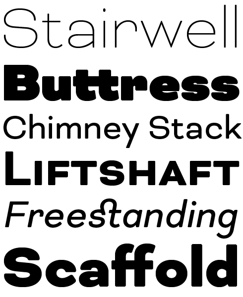
Bicyclette’s foundations in geometry are enlivened by a scattering of humanist letterforms and softly rounded edges. By pulling off the appealing trick of bringing warmth to technically serious sans construction, Bicyclette will make for great interior signage or top level website UI elements; capable of direct instructions while retaining a customer friendly tone.
|
|
|
|
|
Who would you interview?
Creative Characters is the MyFonts newsletter dedicated to people behind the fonts. Each month, we interview a notable personality from the type world. And we would like you, the reader, to have your say.
Which creative character would you interview if you had the chance? And what would you ask them? Let us know, and your choice may end up in a future edition of this newsletter! Just send an email with your ideas to [email protected].
In now past, we’ve interviewed the likes of
Mika Melvas, The Northern Block, Matthew Carter, Ulrike Wilhelm, Maximiliano Sproviero, Dave Rowland, Crystal Kluge and Steve Matteson. If you’re curious to know which other type designers we’ve already interviewed as part of past Creative Characters newsletters, have a look at the archive.
|
|
|
MyFonts on Facebook, Tumblr, Twitter, Instagram & Pinterest
Your opinions matter to us! Join the MyFonts community on Facebook, Tumblr, Twitter, Instagram and Pinterest — feel free to share your thoughts and read other people’s comments. Plus, get tips, news, interesting links, personal favorites and more from the MyFonts staff.
|
|
|
|
|
Comments?
We’d love to hear from you! Please send any questions or comments about this newsletter to [email protected]
|
|
|
Newsletter archives
Know someone who would be interested in this? Want to see past issues? All MyFonts newsletters (including this one) are available to view online here.
|
|
|
|