|
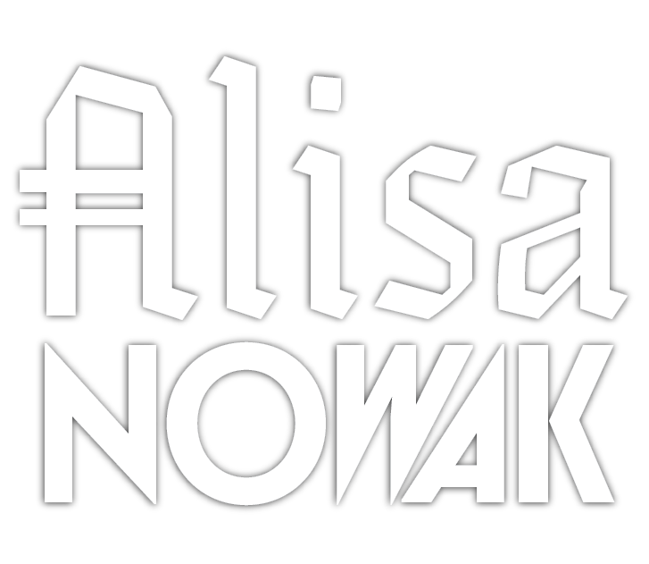
Some young type designers quickly develop into stars, giving lectures and workshops, maintaining an active presence on social networks. Others serve the typographic community more quietly and somewhat anonymously. Alisa Nowak, a German woman in France, belongs to the latter category. So far, she published only a single typeface under her own label, and contributed a very personal design to the TypeTogether library. But for years she worked behind the scenes, as an impressively productive font designer working for Parisian startup Fontyou. And, more recently, contributing successful faces to the growing Indian Type Foundry collection through her activity at BlackFoundry. Alisa Nowak is now slowly carving her own path, finding an individual and very international approach to her craft.
|
|
|
|
|
You are German, and graduated as a graphic designer in Düsseldorf in 2009. How come you ended up in France? And why did you stay?
France — its language and its lifestyle — has always fascinated me. Looking back, I actually spent many language trips, student exchanges and holidays there. I could not get enough of this country.
So there was no question where I was to spend my semester abroad, which was part and parcel of our curriculum. France was a must, and I did not feel like going back home at the end of my term in Besançon, but the imperative to finalize my studies forced me to.
I could not imagine a future in an advertising agency, and somehow I did not yet feel ripe for the working world at the time. During my term abroad, I had already put out feelers for the period after my graduation, and had learned about the French "Post-diplôme", or post-graduate, which some universities offer after the regular studies. So I applied for the “Typography & Language Post-Graduate” at the ESAD in Amiens (Amiens School of Art & Design), and received a positive reply about a week (!) before the start of the 18-month course.
As a result of the post-graduate course, my first professional contacts were in the French typographic network, and this continued throughout, leading to my first job as a type designer. For me it was self-evident. “Didone” sounds so much nicer than “Neo-Classical Antiqua”. At the end of my studies, I even assisted a professor in calligraphy classes, and this made me hang on to the university. I now teach typography at the very same school (not type design, but with a focus on type) in the first and second terms of the Graphic Design course.
You originally majored in a subject that covers quite a broad area: communication design. How and when did you get to focus on letterforms? Was there an experience that became a kind of “trigger experience” for this change of direction?
Yes, there has been such an experience. This was during my term abroad in Besançon, when I took Thomas Huot-Marchand’s typography course. With incredible energy, he managed to convey the subject matter in a way that was simultaneously theoretical and practical. I was immediately fascinated by how calligraphy represented the first steps of type design, and by the subsequent transition to typography. To see a text printed in your own font for the first time: that remains an unforgettable experience.
And then all the details that you could choose to change… to me that was a major discovery about lettershapes and their construction. Up to then, I had not been aware of these details, and I immediately felt a curiosity to continue exploring them.
Perhaps these typographic exaltations were also reinforced by the fact that I am basically not a very good graphic designer and I finally found something in the wide range of our many-sided field that truly appealed to me.
Right after taking your “Post-diplôme” in Amiens you became part of Fontyou, a new typographic company in Paris. The collaboration project they introduced in the first year was unique, and surprisingly effective. I interviewed Fontyou for MyFonts shortly after the start-up, but I’d like to hear your view on how this method worked.
A basic thought behind the project was the realization that across the world there are graphic designers who love letterforms and are able to draw powerful lettering pieces or alphabets, but lack the skills to get beyond that starting point; and that many advertising agencies and graphic designers appreciate precisely this kind of work. We thought it would be a great pity if these designs were never offered as functioning fonts.
The other guiding thought was the conviction that when designing as part of a team, one surpasses one’s own limitations, and produces ideas that one wouldn’t have had when working on one’s own. It’s added value thanks to an explosive diversity of form.
There was an additional wish: to have a near-autonomous co-creation system where one designer posts a lettering piece, another one proposes alternatives, a third one stabilizes the whole thing towards becoming type design, and a fourth one may develop the resulting system into a fully functional font. Each is mentioned as a co-designer, and receives a percentage of the royalties that has previously been agreed on.
In order to make this possible, an online platform was created with the help of in-house coders. Once registered into the system, anyone could post their ideas. Just as in other networks, you could like these ideas, comment them, and even submit direct proposals for alternative shapes using the vector graphics function.
Each post was clearly defined in term of its function — lettering idea or type design — and, depending on its character, freely accessible to add new proposals. This principle led to the creation of several type families, such as the Saya FY family with its companion sub-families Saya Serif and Saya Semi Sans.
That interaction between multiple designers was not so easy to build up and keep going. More posts, more type designers and a simpler structure would have been optimal to get the platform to grow to an even stronger level. But in early 2015 the Fontyou startup was restructured, and both the online platform and the internal type design studio were put on ice. On the one hand that was a great pity, on the other it also made possible various new beginnings.
|
|
|
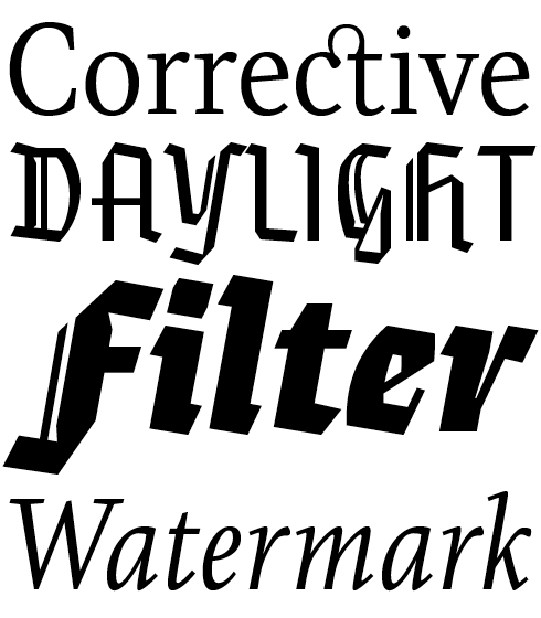
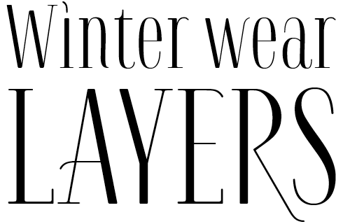
Eskapade is one of those type families that are the result of a type designer’s speculation: “What if…” In this case: what if classic Roman letterforms and German blackletter became good friends and begot offspring? Instead of going for something pseudo-traditional or nostalgic, Nowak adapted forms of “broken script” (where “broken” refer to interrupted strokes) for contemporary use.
On one hand, part of the Eskapade family is conceived for continuous text in books and magazines with good readability in smaller sizes, while on the other hand the face — especially its Fraktur — attracts the reader’s attention in headlines or logotypes, with its mixture of round and straight forms, like in ‘e’, ‘g’ and ‘o’. It can also be used for visual identities, logotypes and packaging. Eskapade Roman is visually compatible, but has a very different, humanist structure. Rather condensed in silhouette, in order to stay close to the Fraktur version, it offers a smooth design, supple Cancellaresca-style Italic, and low contrast style for enhanced legibility.
|
Marianina is one of the lasting successes of the Fontyou spinoff BlackFoundry. Designed by Nowak and Jérémie Hornus, Marianina is an atttactive contemporary font family with an industrial, early-1900s look and a contemporary feel. It works well both in headline sizes and longer texts. With its peculiar ink traps, extreme light and black versions, Marianina offers a trendy tool for a broad range of tasks. Each Roman (condensed and normal) comes in six weights and with an Italic companion.
|
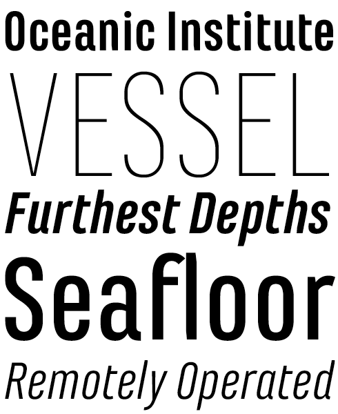
Sperling FY is a typical and fascinating product of the co-creating phase at Fontyou. Jan Dominik Gillich delivered the concept and basic drawings, Alisa Nowak produced a medium-sized family comprising four weights plus italics of condensed, high-contrast display fonts. It’s various things at once: geometric in construction, striking and sometimes deliberately naïve in its structure, classicist in its atmosphere. The italic style features well-designed unusual details in characters like the ‘k’ or the ‘z’.
In spite of its compressed silhouette, it maintains its good legibility in smaller sizes, so Sperling can be used for medium-sized texts in magazines alongside its spectacular use in poster sizes.
|
|
|
|
|
|
|
|
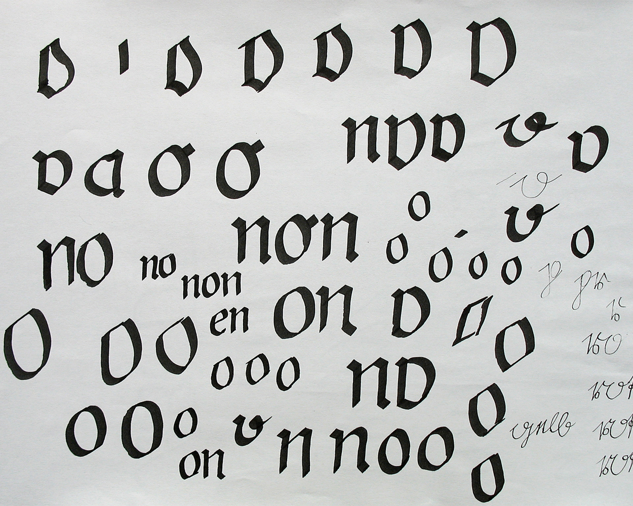
Development Sketches for Eskapade
|
|
|
At Fontyou you had a special role, together with a few other type designers in the team, completing dozens of typefaces by graphic designers and translating alphabets by illustrators and calligraphers into fonts and larger families. What has that been like for you?
At times it was madness — but positive madness. Our working rhythm was very intensive because at times we released a font family each week. Yet it was incredibly exciting to edit so many different fonts. Each project was a new challenge. It is not necessarily easier to further develop existing ideas or half-finished fonts than to start a design afresh. You have to get used to the already existing design, and understand its basic ideas. Sometimes there was no clear distinction between unusual design features and construction flaws, and it was up to us to make the right decision. Of course, the overall construction of each typeface had to be correct, but sometimes it is precisely the inconsistencies that give the final font its charm; so we tried to maintain a healthy average.
For me it was a great mixture of personal creativity — boosted by each project — and the collaborative development of other people’s letterforms. I had to deal with shapes I would never have considered in my own work; but I soon realized that these shapes could trigger completely new ideas, which could make the outcome so much stronger. We did a lot of experimentation and accepted unusual results, which made our catalog quite colorful… while nevertheless executed in typographic black-and-white.
The total process of collective design is quite exciting and varied — I believe it makes you act and think differently. As soon as you’re working on your own idea, you inadvertently develop a strong identification with the (letter-)shapes. It is your own work, it carries your own handwriting in the truest sense of the word, and it can be manipulated without boundaries, changed again and again. You are bound to handle other people’s forms much more cautiously. You wonder whether you have the right to omit certain parts, or whether perhaps they are crucial to the designer. If you intervene too strongly, you have the feeling you might break something. Even if the other designer is not really sitting next to you, you try to bring him or her into the design process, and let them participate. At least I felt like that. Nothing was ever published before all the contributing designers were happy with the end result.
In addition to the design and completion of fonts, I was also very active on our platform through my role as a commentator. I did not comment on all posts — but almost. And I sent off countless amendments, explaining, and motivating the corrections — probably motivated by my pedagogical interest, as well as the desire to convey typographical knowledge. It was definitely a lot of fun to me. Some designers even asked me to correct to their new projects after the active Fontyou period; I was really pleased with that.
|
|
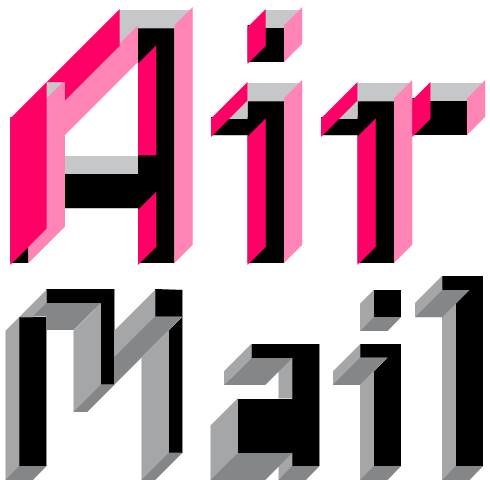
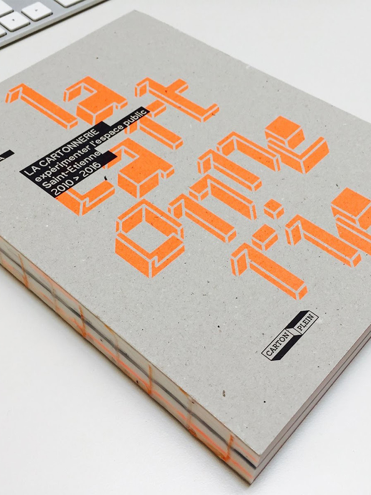
Carton is a collaborative typeface between Alisa Nowak and versatile French designer Sébastien Dégeilh. Carton was originally drawn for La Cartonnerie, an “urban laboratory” in Saint Etienne, as an experimental display alphabet using isometric projection on a large grid. The two designers brought out the resulting, highly original font family on their own label Nowak & Degeilh. The Carton type family is layerable to dazzling, multi-coloured 3D effect. The design of the Bold departs from the earlier strict geometrical forms and increases in contrast and complexity. This paved the way for the creation of a thinner character which can even be used for setting long-form texts.
|
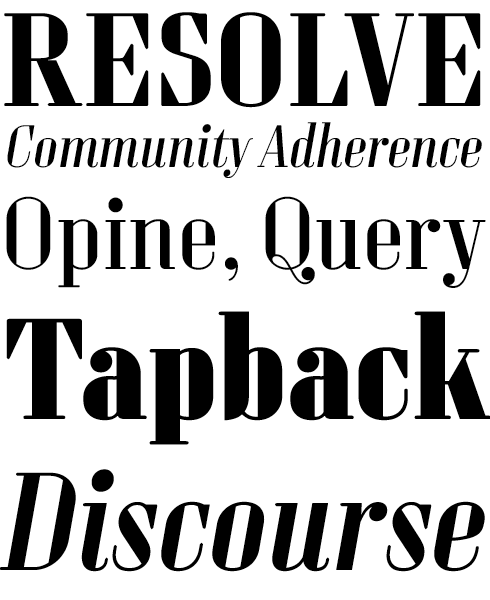
Serafine FY is an elegant and slender display font with high contrast, inspired by lettering work from Canadian artist and type designer Jason Vandenberg, and designed by the production team of Alisa Nowak and Jérémie Hornus. The basic design has elements of a well-behaved Didone, but it allows much more imaginative freedom to its condensed letterforms. One of its particular characteristics is definitely the drawn-out point of the ‘i’ as well as the slightly rounded endings, which lend it a particular charm, working both in larger text sizes and super-large display settings.
|
|
|
|
Most of your works are digital fonts. Are manual disciplines, such as calligraphy, writing, lead and wood, still important to you and your work?
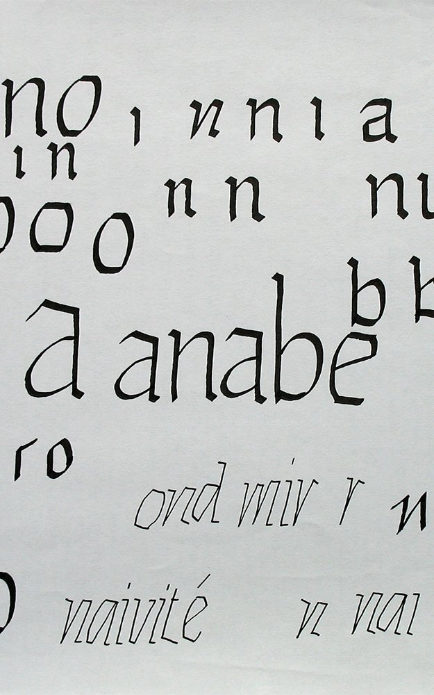
In my current daily practice I work directly on the computer most of the time, making only occasional sketches by hand. However, I would like to have more time to dedicate myself to calligraphy and informal handwriting, both of which were essential for my first major project, the Eskapade font family.
When vectorizing an alphabet you have previously drawn by hand, you are committed to the characters in a different way: At first, every detail seems to be indispensable. This process is very exciting, as sometimes questions arise that do not appear when making work that is immediately digital: Should I maintain the slight curvature or rather completely straighten it? Is the ending round or rather, at a second glance, round-square? When, during the digitization process, you move away from the initial drawing, you get the feeling of discarding something precious. In the direct process on the computer, you can experiment in all directions without being troubled by your conscience.
In 2014, I had the opportunity to work with Fontyou on the design of Algo FY, drawn by Michel Derre. Every letter, every sign, had been drawn meticulously on tracing paper. When digitizing, we worked on the finest curves in order to find an optimal center between calligraphy and typography. To make the font work as a whole, each character was edited on its own; this individuality can be felt in the final project. It was a very instructive and exciting time. Michel was fascinated by the speed at which we worked on the computer — and perhaps also a bit skeptical about it — and in turn our team enjoyed his rhythm and his sense of ownership about the shapes.
Even though I do not have time for my own calligraphy at the moment, at least each typography course I give starts with calligraphy lessons during the first weeks. This is incredibly important for the understanding of the origin of the letters, their construction, the details and the accuracy needed to make them. After just four weeks of calligraphy, other topics are easier for students to grasp, and above all, they become more sensitive users of existing fonts.
Your most personal designs, like Eskapade and Carton, are characterized by original concepts and a playful or experimental approach. Is this a direction you would like to further explore in the future?
Oh yes, absolutely. It’s in fact something that will soon start happening. Starting this summer, I will take more time for my own projects and I will go back to working manually more often. While I’ve enjoyed collaborative design a lot, I am very much looking forward to a phase of boundless research into letterforms. I see it as a phase of re-orientation, taking time for intensive calligraphy and lettering exercises and other experiments in which there should be room for playfulness. Even if I hold the meticulous execution of details in high regard, I have a weak spot for unconventional letterforms, and would love to create more in that vein.
Eskapade is also waiting for new weights — waiting for far too long, in fact. The Carton family should also be expanded, as well as be improved. Its italic variant, based on the same principle (only straight lines) is in fact almost done, but what still needs to be done is the important and time-consuming honing and polishing.
One thing I would like to study more intensively is the German handwriting style known as Kurrentschrift or Sütterlin. I hope to expand my collection of original documents. As the Sütterlin script was only used from 1915 until ca. 1935, there exist relatively few documents, and it is crucial that these are conserved. Without a basic knowledge of its structure rich in curves and curlicues it can be really hard to decipher a text. Some letters are far removed from the Latin alphabet and can easily be mistaken for others. I find its text image fantastically beautiful. Possibly it’s precisely these complex shapes of the Sütterlin script that I find so stimulating; for years they have been in the back of my head, waiting for typographic advancement.
Another dream of mine would be to enroll in a basic letterpress course, or at least a seminar. Up to now I’ve unfortunately never been able to explore these manual techniques. I think it’s high time to catch up on all of this.
|
|
Indian Type Foundry describes Papelli as “an informal sans with a feminine touch”. While everything but girlish, this upright Italic typeface by Nowak and Julie Soudanne does have a dancerly swing, youthful charm, and a practical attitude. Papelli was created with advertising, corporate identity and editorial design in mind. The lowercase cuts are especially inspired by cursive writing, with an appealing roundness and calligraphic overtones: a single-storey ‘a’, curved strokes on ‘v’ and ‘w’ with in-strokes on the upper left, and a lowercase ‘g’ that has a Danish-style truncated bowl for a descender (a more conventional, single-storey ‘g’ is available in a stylistic set). Charming!
|
Inspired by Herb Lubalin’s ITC Avant Garde® face from 1970, Inbox offers a contemporary spin on the geometric sans genre. More whimsical and decorative that most of today’s families in this ubiquitous style, it is a good choice for headlines and logotypes. While the typeface is all-caps, variety comes from its eye-catching ligatures, as well as stylistic alternates. Geometric conventions (letters based on pure circles and triangles) are used across the alphabet, but the alternation of pure geometric shapes with very narrow letters, as well as very unusual ligatures and letter pairs lend the typeface a quirky originality.
|
|
|
|
|
|
|
|
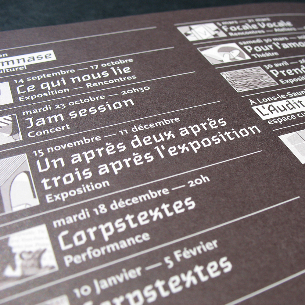
Left & center: Carton in use. Right: Eskapade
|
|
|
You are not exclusively interesting in matters of handwriting and font production. You enjoy other activities as well — fortunately. Athletics, running, is a thing you take pretty seriously, isn’t it?
Yes, that’s quite true. I have been running in my spare time for almost 10 years, and for two years I have been active in an athletics club. The comfortable jogging has been replaced by all kinds of training sessions. I regularly take part in competitions — both on the road and on the trail — and I am proud of my quite acceptable results. Although typography and its related work is my passion, running provides me with a very important balance to my everyday life, during which I often spend entire days in front of the screen. For me, running is ideal stress reduction and an energy source at the same time. Often it also helps to look at general situations, letters, projects, ideas, or concerns from a different angle, and put it all into perspective.
Perhaps the combination of writing and sport is a bit unusual; I cannot judge this. For me it works very well. I like being active in two quite different worlds and I hope that I can continue this lifestyle in the future.
Finally, a more general question. You were born and raised in Germany, and you live in France. English is your third working language, and we both find all that completely normal. Are you disappointed that so many people have begun to believe that the European Union was a bit of a mistake?
I absolutely believe the united Europe is not a mistake. I even think we should all hold together a lot more, implementing transnational projects and policies. If we all stick to certain values and stand for them, we have many more possibilities to get ahead than if everyone tries to develop an individual optimum solution. Of course it is important to preserve one’s identity, but I am firmly convinced that this is also possible while pursuing shared strategies. Europe is what connects the countries within the EU and, moreover, it seems to me irreplaceable for global security.
As a German woman living in France I have become familiar with many advantages of the European Union, and I hope that these will be further developed. I feel very well as a European. After seven years in “a foreign country”, the characteristics of both nationalities gradually mingle. I have the slight suspicion that many of the populists now active have never, or very rarely, traveled to other countries. That they never had the opportunity to look beyond their own nose, and get to know the other side of the border. If everyone did, life could be easier!
|
|
Saya is a family with more than one face. What began as a sans serif family for text and display use, made as a collaborative design by Adrien Midzic with Hornus and Nowak, later received a vigorous massage from the same team, resulting in the more contrasted, elegant Saya SemiSans. Both version sport calligraphic details in each of their six weights and companion italics. Midzic later added a fine Serif version, making Saya into a near-superfamily.
|
|
|
This edition of Creative Characters was edited by Jan Middendorp
Until early 2016, Jan Middendorp was the editor of MyFonts’ Creative Characters series, conducting almost 100 type designer interviews, including a posthumous conversation with Eric Gill. Having discontinued his daily work for MyFonts as a consultant and editor, he continues to contribute occasional writings. Living and working in Berlin, he is now a freelance writer, book designer, a consultant to various typographic companies, and a contributor to Eye Magazine. Among his best-known books are Dutch Type, Shaping Text, Type Navigator (with Twopoints.net), Made with FontFont (with Erik Spiekermann) and “Hey, there goes one of mine!”. In 2017 he set up Fust & Friends, a Berlin typophile micro-organisation with no clear purpose.
|
|
|
|
|
Who would you interview?
Creative Characters is the MyFonts newsletter dedicated to people behind the fonts. Each month, we interview a notable personality from the type world. And we would like you, the reader, to have your say.
Which creative character would you interview if you had the chance? And what would you ask them? Let us know, and your choice may end up in a future edition of this newsletter! Just send an email with your ideas to [email protected].
In now past, we’ve interviewed the likes of
Mika Melvas, The Northern Block, Matthew Carter, Ulrike Wilhelm, Maximiliano Sproviero, Dave Rowland, Crystal Kluge and Steve Matteson. If you’re curious to know which other type designers we’ve already interviewed as part of past Creative Characters newsletters, have a look at the archive.
|
|
|
MyFonts on Facebook, Tumblr, Twitter, Instagram & Pinterest
Your opinions matter to us! Join the MyFonts community on Facebook, Tumblr, Twitter, Instagram and Pinterest — feel free to share your thoughts and read other people’s comments. Plus, get tips, news, interesting links, personal favorites and more from the MyFonts staff.
|
|
|
Colophon
This edition of Creative Characters was guest-edited by Jan Middendorp. Managing editor and designer: Anthony Noel. Editorial assistant: Michael Pieracci. .
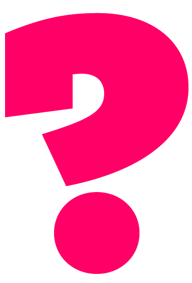
The Creative Characters nameplate is set in Tabac Slab and Rooney; the foundry’s name is set in Eskapade and Inbox ; the quote is set in Carton and the large question mark is in Tabac Slab. Body text, for users of supported email clients, is set in the webfont version of Rooney Sans. |
|
Comments?
We’d love to hear from you! Please send any questions or comments about this newsletter to [email protected]
|
|
Subscription info
Get our monthly designer interviews, popular new fonts, the latest trending promotions and free font goodness to your inbox. Sign up here: MyFonts Mailing Lists
|
|
Newsletter archives
Know someone who would be interested in this? Want to see past issues? All MyFonts newsletters (including this one) are available to view online here.
|
|
|
|