
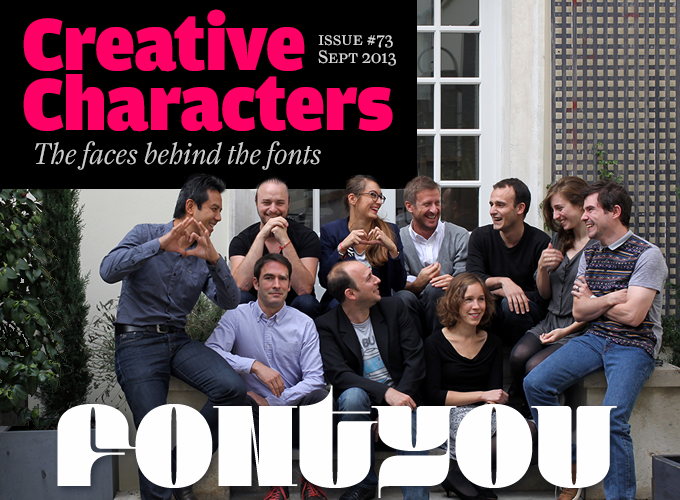
Top row, left to right: Gia Tran, Denis Moulin, Valentine Proust, Gregori Vincens, Alexandre Pichon, Pauline Chasseray-Peraldi, Julien Priez
Bottom row, left to right: Jérémie Hornus, Nicolas Boudriot, Alisa Nowak.
It does not happen very often that we interview designers right after they’ve signed up with MyFonts, and we’ve never interviewed a group as large as Fontyou. But then, the subject of this month’s Creative Characters interview is not your average type design studio. The Paris-based initiative has an ambitious plan: finding new ways to design and produce fonts. Using online tools, Fontyou establishes fruitful relationships between people with complementary skills — lettering artists, type designers, font technicians, and more. The outcome: something that’s greater than the sum of the parts — collaborative font designs with originality, quality, and character.
In your introduction to Fontyou, you proclaim it as “the first collaborative type factory.” How did the idea come about?
It arose from our belief that typographic creativity derives from the primary users of fonts — graphic designers. Graphic designers are in touch with typography, they are aware of the trends and needs of the moment. But type design as a discipline is still limited to a small group of specialists; changing that was our first goal. So Fontyou is for graphic designers first, especially for students who want to learn about type and typography.
Type design is a fantastic and fascinating discipline, but it is difficult and it can be intimidating. So it needs to be democratized and facilitated by proposing user-friendly tools and interfaces. Lots of graphic designers are attracted to typographic creation, but they dare not try because they don’t have the knowledge or because they don’t have time. The purpose is not to trivialize typography, nor vulgarize it, we just want to make type design more accessible.
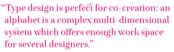
Also, we fundamentally believe that being together makes us stronger. We have been doing design and creativity in a collaborative way with our partners, our teams, our customers. We noticed how powerful collaborative work can be with regards to creative quality, rapidity and efficiency of production. This work method promotes the collaboration between complementary profiles. Actually, type design is perfect for co-creation: its object is simple when looking at its smallest unity, a single character — and pluralistic at the same time: an alphabet is a complex multi-dimensional system which offers enough work space for several designers. For all those reasons, we created Fontyou.
How did the founders of Fontyou find each other? Do you share a common background?
We are all passionate about our common interests: creativity, design, innovation, new technologies, linguistics, interface design. In May 2012, Gregori dedicated his executive MBA HEC essay to a strategic concept for a new collaborative foundry model on the web. Gregori, Gia, and Valentine share a background in type design and branding, and we had a common desire to bring innovation to type design. And Nicolas brings the “geek touch” we needed. Together we mixed our passions and knowledge, adopted and enhanced the project with new ideas and formed the company at the end of 2012. Then the adventure started. New talents joined the team over the following months: Type designers, a UX/UI designer, developers, a digital marketer, researchers…
Fontyou is of course a new kind of foundry, but above all it’s a start-up where design, co-creation and technological innovation are at the heart of our strategy. We use something called Agile Modeling to make sure our development plans are built around the needs of our users, our customers and, on a broader level, our community.
While type design is usually a very individual activity, most Fontyou typefaces are presented as collective creations. Could you describe how this collaboration works among the founding members?
Yes, the first Fontyou fonts (Respublika FY, Exquise FY, Achille FY) have been developed and co-created by our team members, using the classical collaborative working model: initial creative moment; collective corrections; “type fight”; showing glyphs and kerning boards, etc.
The “type fights” are perhaps the thing in our creative process where we differ from other foundries. These are collective sketching sessions, often at the very beginning of a project, where we all express our creativity on paper, and collect the best ideas at the end. We are convinced that these sessions open creative minds and improve our typeface ideas. Also, we never hesitate to share our working files with each other when we have doubts or just need to take a break.
But we think the true innovation brought by Fontyou is this web interface for co-creation which we’ve been developing since May 2013, in private beta for the moment.
The Fontyou model allows the community to co-create fonts, at different moments in the process: in the preliminary phase, by posting an idea, by participating as the Fontyou team is working on font production, or by making proposals for enhancing glyphs, by suggesting a name for the selected fonts, etc. For each step of this process, co-creators earn royalties from the sales of the fonts, from 5% to 50%; the percentage is related to the involvement of each contributor.
By offering this platform for typographic co-creation we hope to offer a unique opportunity for everyone to reveal and develop their creative potential.
We’re conducting research concerning this new paradigm of co-creation, which will certainly evolve during the coming months. We are constantly looking for new ways of using the technological innovations our interfaces represent. We are obsessed by user experience, and we try very hard to bring value to this new experience of online typographic co-creation, by multiple users, in real time.
Exquise FY
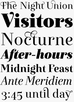
Fontyou was launched on MyFonts with a handful of typeface families, four of which soon reached enviable positions in our Hot New Fonts list. Exquise FY is the most successful of the bunch. Elegant and distinguished, it combines the strong vertical stress of classicist type (think Didot or Bodoni) with playful ornamental details. In spite of its 1800s pedigree, Exquise’s abrupt ductus changes and sharply cut drops make it an utterly contemporary font that is ideal for lifestyle magazines, fashion branding and prestige packaging. It comes in six styles, including a gorgeous Black weight.
Bruum FY
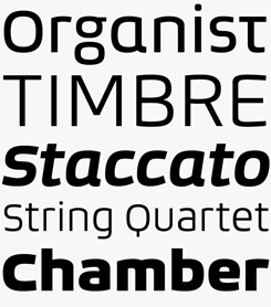
Bruum FY is not just another squarish sans-serif. It has plenty of features that give it just a little more oomph — from the peculiar shapes of ‘A’ and ‘E’ (they look hand-bent) to the quirky alternates for ‘a’, ‘g’ and ‘t’ (shown in the first line above). The abrupt transitions from curved to angular shapes and back give the font family a technical and look that makes for a robust headline; yet the simple and open shapes ensure good legibility in small sizes.
Kaili FY
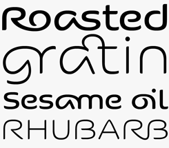
Traditionally, ligatures were designed to solve typographic problems — for instance, to avoid the clash of an overhanging ‘f’ and the dot on the ‘i’. Later, type designers began including ligature pairs to have fun with them. The OpenType font format allows the inclusion of dozens or even hundreds of ligated letter pairs in a single font — and Kaili FY sports a whopping 825 of them. You could say that ligatures are its main theme; but even without them the design would be remarkable, with its wide, supple, monolinear, flowing lettershapes.
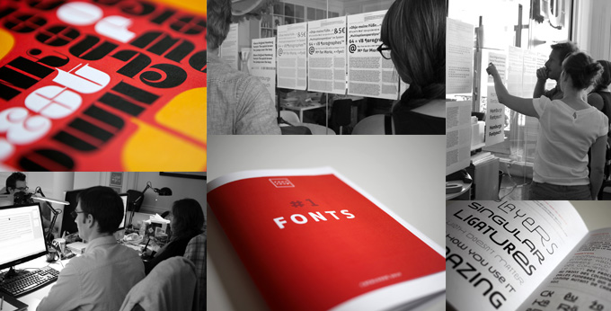
Fontyou graphics and specimen booklets, alongside some shots of the team at work in their Paris studio.
Could you describe how this collaboration worked during the design process of, say, Achille?
Yes of course… Achille, the making of:
We were having our weekly typo-lunch, where we show each other our works in progress of the past week. Every week Gregori had been saying he would like to design a slab serif but needed to find an original idea, and that day he finally showed us a few letters (three or four as far as I recall) of a humanist-style slab-serif with strange asymmetrical serifs. We were surprised at first but we fairly quickly began to sketch together. Alisa proposed to add some ink traps, to echo those strange shapes. Gia immediately saw the strong potential of a black version as “a robust typeface.” A few hours later, we had a good direction. During the following weeks we sat in a lot of creative meetings making collective corrections. Gia and Gregori led the regular and bold design, Alisa led the italic one. As a graphic designer Valentine saw an editorial potential in this font and I proposed to make a small caps set to complete the family. Of course we organized a lot of collaborative creative meetings and correction sessions.
We organized our first naming contest for this font because we wanted to make this step collaborative too. Everybody submitted an anonymous proposal, we voted and we chose Achille. For the benefit of the anecdote there were two good reasons to name this font Achille… First, because of the mythological figure, strong and brave, and secondly as a tribute to its creator, Gregori, who broke his Achilles’ tendon this year.
On MyFonts, Fontyou presents its fonts just like any other foundry. However, your concept of a community for collaborative type design is unique. Can anybody use it? Have you already had new members signing up?
So far the Fontyou community is composed of more than 200 early adopters from all over the world: French, American, British, Brazilian, Japanese, Canadian, Portuguese, Russians… they all post their creations, comment on those proposed by others, interact.
As you said, the concept of a community for collaborative type design is unique. Fontyou is not only a foundry that publishes fonts and promotes them in a catalogue; it’s not only a platform for sharing work and getting exposure — it’s all of that and more. It’s also a real tool where designers can share, interact, help each other and create characters together.
Since July, anyone can request an invitation to the beta on our landing page, we invite new users every week. We are so excited (and sometimes stressed) to see how the community will grow over the coming months…!
Those early adopters are the first users of a brand new service, we’re listening to their feedback and we regularly enhance functionality with them. We have to admit that we are quite impressed and very proud of the general quality of the posts, of the diversity of style and the open-mindedness of the participants. And we are so happy to see that designers who don’t know each other actually interact. It shows that the machine is underway!
The current Fontyou collection consists of around ten font families and three of those have been co-created on the community platform: Squirrel FY, Maryleen FY and Ella FY. Another twenty or so are in development and will be launched in the coming months.
Achille FY
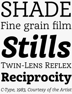
Achille FY is a slab serif with classic proportions, but with plenty of design features to make it stand out from the crowd. A confident interplay of subtle curves and straight lines, a wonderfully readable italic and of course those weird yet endearing asymmetric serifs, shown most striking in the capital ‘H’ on the first line, above. Neither too rigid, nor too round, Achille’s well-balanced shapes and robust structure make the face both legible in small sizes and powerful in big headlines.
Squirrel FY
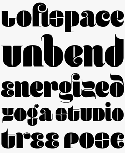
Squirrel FY basically speaks for itself, and not too quietly either. It echoes some of the quirkiest display faces of the 1970s, but with a geometric logic all of its own. It’s the font used for the cover image at the top — and we chose it because it’s so gorgeous, and a little crazy.
You made your first appearance on MyFonts two months ago with half a dozen typefaces designed by the Fontyou core group — all quite original and very well made. How will you be able to keep up that quality when more designers join the pool — do you have some kind of collective quality control?
We believe in three big values: quality, creativity and innovation.
Regarding creativity and innovation, the community is somewhat self-regulating, acting as co-curator and filter through likes and numbers of views and comments. Fontyou’s challenge is to expose everyone’s talent, sensibility and creative style, without prejudice or censorship.
Each week we organize a type design meeting where it’s our turn to select which ideas to take into development, based on the criteria mentioned above.
But our rule number one is quality. We are aware that in type design, it’s a central issue, and of course we anticipate the skepticism of the critics: “Will they ensure the quality of the fonts?” The answer is yes. Alisa, Jérémie, Gia and Julien are all great type designers and they all have different skills (academic knowledge, calligraphic background, graphic design, font engineering…) Each of them has a specified role in the font development process. Glyph check, kerning check, manual hinting (for some fonts) testing etc. and each morning this core group has its own “Type team stand up meeting”!
And in case we ask other type designers to assist us with font development and production (and we certainly will), we’ll make sure they have the same requirements as we do.
If I were asked to describe the Fontyou designs so far, I’d say: innovative with strong roots in typographic tradition. Is that the kind of work you're looking for, or are you open to other styles as well — say, grunge faces and informal handwriting fonts?
We are definitely open to every style. This is Fontyou’s first vocation; anybody’s style, visual culture or knowledge can reveal themselves at each step of co-creation.
A few days ago, Alisa was talking about a font she’s currently drawing and she said that she would never have drawn such a character if she hadn’t have been inspired by one of our users’ posts. “I saw it and I clicked.” She suddenly had a flash of creative freedom she had not expected. That’s what is powerful about our model.
The Ella FY typeface is another example: A few days after we launched the beta platform, Jason, a Canadian graphic designer, posted a nice sketch of some script lettering. Gia was immediately inspired by it and a few days later, he showed us a crazy new idea for a font. We were… pleasantly surprised. He had respected the “innocent” style of Jason’s lettering but he embellished and enhanced it with flourished ornaments. Jason was pleasantly surprised too! “Gia! this is amazing! I love it!” We then exchanged our points of view to make this typeface more original and singular. And today we are all proud of this font!
We could imagine dozens and dozens of similar stories and connections between designers around the world… The academic background of a Dutch type designer mixed with the Latin touch of a Brazilian graphic designer; a French graffiti artist with an English designer who would bring a constructivist touch… We should stop there, enough clichés ;-)
To sum up, there’s no Fontyou style. Creative wealth comes from the users’ connections and from complementary relationships. But there are no compromises over legibility, design quality, balance, technical encoding requirements…
Fontyou’s style is to be innovative, original, and in line with the needs of graphic designers.
Respublika FY
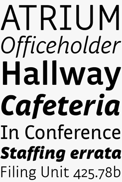 Respublika FY is a typeface by Gregori Vincens — one of the non-collective designs in the Fontyou collection. With its five weights and matching italics, ample language coverage and large collection of numeral styles, it is a real workhorse. Stylistically this sans-serif strikes a nice balance between business and pleasure, clarity and friendliness.
Ella FY
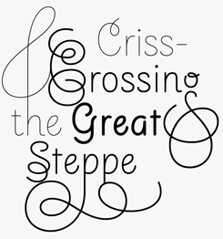
Ella FY’s design principle — letterforms derived from handwriting and simplified into clean unmodulated lines — result in an interesting hybrid: a monolinear upright semi-italic. What makes it particularly attractive to today's graphic designers is its ample arsenal of flourished ascender and descender alternates, offering endless possibilities to create one-of-a-kind headlines and logos. However, the basic characters are interesting enough to create charming text settings even when the drawers full of ornamented characters remain untouched. With three weights, the little family offers plenty of possibilities to combine large and small type on the same page. Access to a glyph picking tool or OpenType-capable software is recommended.
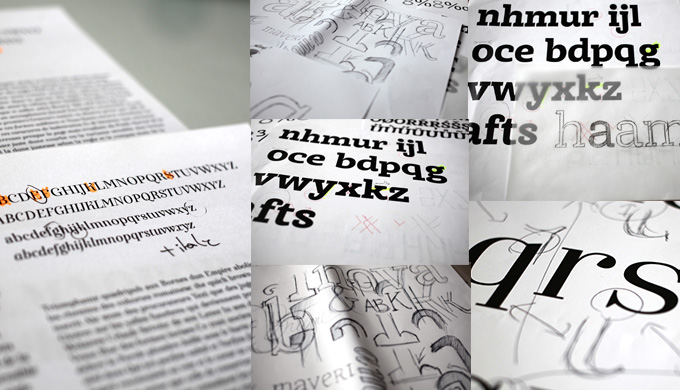
Sketches and proofs of Fontyou typefaces in development.
A practical question. In your video, you describe how the revenues from a font are distributed among all those who contributed to it. Some designers may wonder: what if my design is 90 percent finished and four other people contribute details to the final result? How do you “weigh” each person’s input?
As a platform for co-creation we encourage what Dribbble calls “rebounds” between users, and we are aware of the questions that this method can raise. First, it’s necessary to understand that rebounds can only be done on lettering; typographic inspirations that are in the proposal stage and are not really complete typefaces. Let’s say that they are typographic intentions. At this stage we encourage users to interact and post their own interpretations of a creation. Typefaces are a more complete stage of a typographic project. The community can comment, advise, support but can’t rebound on this typographic project with a graphic proposal. If a typeface is posted in its almost final version on Fontyou, we are in a kind of traditional foundry model. This is certainly possible, and in those cases we’ll adapt the classic royalties policy, but it’s not the kind of situation we encourage.
But we also believe in our ability to adapt. We prefer to have a simple model and to keep a certain flexibility to adjust to the different situations, as co-creation is quiet experimental.
Actually, co-creation does exist in different ways on the platform, that’s why we organize community contests with a reward at the end. The naming contest, for example. Firstly, it’s amusing; secondly, it’s really enriching, and we can discover new talents. Each day we try to improve our model, developing cool tools to reinforce the interactions between users. You’ll discover it very soon! But for the moment, we all enjoy this experience, and it works pretty well!
Thanks for the conversation! I won’t be surprised if you receive a LOT of proposals after this interview. We’re looking forward to seeing the results of all those new collaborations!
Younion FY
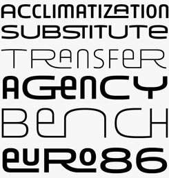
A great name, a playful principle, no-holds-barred inventiveness, careful execution: Younion FY is yet another proof that Fontyou’s collaborative design model actually works. The family comes in two weights, each in three widths that are meant to be combined freely within the same line or word. We’ve seen the idea before — Anisette by fellow Parisian Jean François Porchez does a similar thing. Younion has an intriguing style all its own, though — clean yet friendly, with some references to geometric Art Deco lettering but without a hint of nostalgia. With its huge set of ligatures and interlocked letter combinations, it's a great toolkit for building customized headlines.
Editor’s notes:
Six of Fontyou’s typefaces are on promotion through October 13, 2013.
Invitations to join Fontyou’s private beta can be requested via their website. Including a link to a portfolio site isn't essential, but it will help them evaluate applicants during this stage of development.
MyFonts is on Twitter and Facebook!
Join the MyFonts community on Twitter and Facebook. Tips, news, interesting links, personal favorites and more from MyFonts’ staff.

Who would you interview?
Creative Characters is the MyFonts newsletter dedicated to people behind the fonts. Each month, we interview a notable personality from the type world. And we would like you, the reader, to have your say.
Which creative character would you interview if you had the chance? And what would you ask them? Let us know, and your choice may end up in a future edition of this newsletter! Just send an email with your ideas to [email protected].
In the past, we’ve interviewed the likes of Rosetta, Laura Worthington, Jonathan Barnbrook, Manuel Corradine, Bruno Maag, Emily Conners and Jos Buivenga. If you’re curious to know which other type designers we’ve already interviewed as part of past Creative Characters newsletters, have a look at the archive.
Colophon
This newsletter was edited by Jan Middendorp and designed using Nick Sherman’s original template, with specimens and type descriptions by Anthony Noel.
The Creative Characters nameplate is set in Amplitude and Farnham; the intro image features Squirrel FY; the pull-quote is set in Exquise FY Regular; and the large question mark is in Farnham.
Comments?
We’d love to hear from you! Please send any questions or comments about this newsletter to [email protected]
Subscription info
Want to get future issues of Creative Characters sent to your inbox? Subscribe at www.myfonts.com/MailingList
Newsletter archives
Know someone who would be interested in this? Want to see past issues? All MyFonts newsletters (including this one) are available to view online here.