
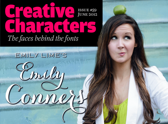
We’ve seen a few meteoric careers on MyFonts before, but the dazzling feats accomplished by the one-woman foundry called Emily Lime has left us seriously in awe. Based in Greenville, SC, this brand new font company managed to score one best-seller after another these past six months. The energetic Southern Belle in charge of the operation has made fonts in a range of styles, but capricious scripts are what she does best. Her peacefully named Bombshell Pro is at the top of our Hot New Fonts list as we speak. And while her alphabets are nonchalant and untamed, the underlying font technology is smart and nifty. Meet Emily Conners, a newcomer with a punch.
Emily, on your designer page you describe yourself as a “southern gal.” What is it like being a southern gal? And what is it like to live and work in Greenville, South Carolina?
It’s great! I love the South. I’m proud to have grown up here because I’m surrounded by good people and some uniquely ‘southern’ ways. It’s true what they say about Southern hospitality! When I meet someone for the first time, I’m likely to hear “It’s nice to see you,” instead of “It’s nice to meet you.” You’d think I’d be used to the phrase by now, but it still makes me take notice. Our southern drawls are also noticeable. They often vary depending on where you grew up. I’m surprised we don’t use accented characters for some of our vowel sounds. Sometimes you can just tell someone is from the South before they even speak. If you see a man wearing a bow tie or pants that have whales all over them, or a woman in a Lily Pulitzer-style dress or anything monogrammed, I feel fairly confident they’re from around here… and they are very likely to be charming and friendly. Those are our modern-day Southern Gentlemen and Southern Belles.
Greenville is a really charming little city. Our Main Street is lined with cute shops and huge trees. At night, all of these trees are lit with white lights that make them sparkle. I love that. There’s even a horse-drawn carriage that treks up and down Main. A short walk will take you right to Falls Park, an historic district that has undergone a remarkable transformation over the last decade. There is this really cool, modern suspension bridge for pedestrians which overlooks the park’s river and waterfalls. I can’t say enough good things about the area… it’s a beautiful place.
Your Emily Lime foundry signed up with MyFonts only nine months ago. What were you up to while Emily Lime got off the ground?
My background may come as a surprise for those who don’t know me because most of my career has been in technology sales, either selling directly or managing a sales team. I’m talking 70+ hour work weeks where we lived and breathed our jobs. (I actually do that now too! But without the high pressure environment.) It was great business experience but I couldn’t see myself continuing that forever.
So as many people do, I decided to do some career soul-searching. I’d acquired enough graphic design skills during my career to make me dangerous. So I took a leap and started learning everything I could about design. I soon started freelancing small design jobs. As my business grew, so did my love for fonts. I jokingly referred to myself as a fontaholic, and actually, I still do. Because I was hooked. I wanted every font out there. I was just so enamored with all of them and their idiosyncrasies. That’s how it all began.
The fonts you released in quick succession this year have been incredibly successful. Did you expect this to happen? What has it changed for you?
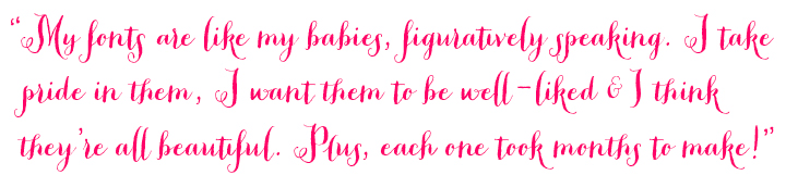
I’d like to say that I expected some amount of success, because I did feel strongly about each of my releases. But it’s probably more realistic to say that I hoped each would be successful. They’re like my babies, figuratively speaking. I take pride in them, I want them to be well-liked and I think they’re all beautiful. Plus, each one took months to make! I think it’s hard not to feel that way about something you created yourself. Still, I’m not so naive to think that just because I like something, everyone else will too. Type design is definitely a risky and subjective business. And it could have easily been a different story.
Luckily, I’ve been really fortunate to have had support along the way. Even when friends and family didn’t fully understand what I was doing, they were still supportive. And that makes any amount of success that much sweeter. (People still sometimes look puzzled and say “Fonts? Like Arial and Times New Roman?” That gets me so tickled.)
I don’t know that anything has changed much yet, except for my ever-growing to-do list. And the fact that you reached out to me for an interview, which I must admit was really thrilling.
Peoni Pro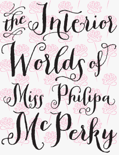
Despite its carefree and capricious appearance, Peoni Pro is technically robust and sophisticated. Offering over 1200 glyphs, it is full of features designed to select the most ideal characters as you type (using OpenType-enabled software). It comes with a set of stylized catchwords, such as “and”, “the”, “from”, etc. There’s a companion font of playful and useful patterns to use as backgrounds, borders or illustrations, and it is… completely free!
Jacques & Gilles
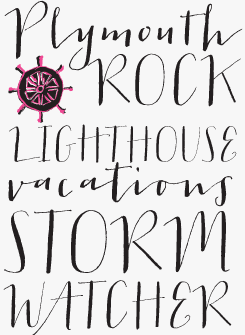
Jacques & Gilles may not have been as hugely popular as some of Emily’s other fonts — but it is quite interesting, and our personal favorite. Based on hand-lettering with a pointed pen, its lower- and uppercase present two distinct “personalities” — Jacques and Gilles. In all-caps settings the font is informal yet very readable (use large!) while combined upper- and lowercase settings look dynamic and cheeky. Jacques & Gilles includes terminal letters and alternates for added fun, ordinals and roman numerals (I,V,X). Check out the two sets of ornaments — one outline, one solid, allowing you to create a cool painted effect.
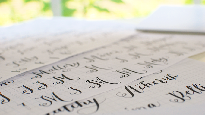
Some of the many sheets of hand-rendered letters that resulted in the Peoni Pro font.
In your fonts, you combine two skills: drawing attractive, informal letterforms, and smart OpenType programming. Who taught you how to do all that?
I taught myself, but I say that only because I didn’t attend a formal educational program specifically for creating fonts. In reality, I still learned from others… I just directed the learning so to speak. Calligraphy is a skill that I work on continuously. Although it can be very difficult and requires a lot of patience, I find it to be therapeutic. It actually relaxes me. I know many people have said the same of knitting, but I’ve tried that and it only frustrates me.
Learning OpenType was a whole different ballgame. But I’m the type of person who likes to figure things out. In the past, I’ve written code for various random things including stock market analysis. So, I felt semi-confident in my ability to figure out OpenType programming. It definitely wasn’t as easy as I expected! But I’ve learned a lot along the way. Mainly through trial and error. Did I mention error?? Originally, I thought creating a font would be a relatively quick process… and then I learned about glyph naming, Unicode and kerning…
Last year, you published your first fonts; besides scripts such as Carloyna and Emily Lime you came up with somewhat eccentric hybrids like Revel (“high fashion meets country & western”) and Logo Sans, a quirky geometric sans-serif. Can we expect more in that vein, or are you going to stick with scripts for now?
You can definitely expect more scripts. I enjoy the traditional calligraphic process so much, it makes designing that much more fun and rewarding for me. But I’m too enamored with other styles of type, that I’ll never limit myself to just scripts. I have a list a mile long of styles I plan to do… but my next few releases are scripts.
How do you develop a new idea? Doodling? Or through a more rational process?
I feel like I have a million ideas and it’s hard to focus that energy sometimes. I have visions in my head of what I want to do. So, typically I’ll draw out the concepts and give them descriptive nicknames so I can remember them easily. At this point, I have to choose which one to focus my energy on. That is a particularly difficult process for me (mentally and emotionally) because I want to do them all right then and there! But that’s just not feasible since each one takes months to create.
So I usually go with the one that I’m simply ‘feeling’ the most. I always have a favorite. But my own hand is probably the biggest dictator of how an idea actually develops. Once I’ve made a choice, I doodle throughout the process and it may completely change the direction of that particular font. I try to stick with my original idea as much as possible, at least until I have all of my characters written out or else I feel like I’ve just wasted time — and a whole mess of paper. I’ve been known to abandon one project and go back to another yet unfinished one and I really don’t like having to re-create a particular style for a few missing characters. Once I’ve moved on from the design phase, it’s hard to go back.
Bergamot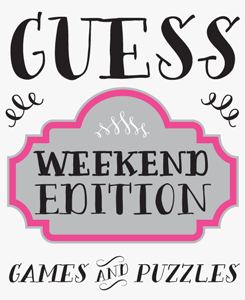
Vintage pharmacist’s labels inspired Emily to create Bergamot. The result is a contemporary all-caps font with a handmade feel. Bergamot comes with four variations for each letter which, thanks to OpenType wizardry, alternate automatically as you type! Having different variants (notes the ‘e’s in “weekend”, above) creates the illusion that your design has been custom hand-lettered. Bergamot also features sets of Frames & Ornaments.
Revel
Revel is a peculiar mixture: a stylish blend of high fashion and straddle-legged western-style bravura. Use all caps for a modern sophisticated look; or type in all lowercase for a more youthful rocker effect. This hybrid font comes with alternates, decorative elements, ligatures and even a few swashes thrown into the mix.
Who is your ideal user?
Professional designers. I wish I could say everybody, but the reality is that my fonts have features and extra letters that aren’t accessible to everyone. Many users are disappointed when they realize they can’t get to the extra characters. And I really hate disappointing people!
In order to get the most out of my fonts, buyers need to have a premium design program (like Illustrator, InDesign, Photoshop). Without access to an OpenType feature or glyphs panel, you’re restricted by decisions I made concerning the standard character set and how it’s intended to function. With OT access, you can override my choices. Now having said that, I do take the time to ensure that my fonts can be used successfully in other programs, like Word or TextEdit.
Some of your fonts have built-in eccentricities which may make them more difficult to use — such as the unusual ‘t’ in your latest font Bombshell Pro. Other designers might include a more ‘normal’ alternative for cases when a less conspicuous letter may be needed, but you don’t do that. Is that a conscious decision?
It is a conscious decision. Usually based on design… but not always. If I can include an alternate that makes a word easier to read or adds style, etc., I often will. But sometimes, as in the case of Bombshell, my font becomes too large due to the high number of glyphs and detail. When a file is too big, it can cause technical problems for users, so occasionally I have to be critical about what gets added and/or edited out.
(PS — I have an update for Bombshell in the works that includes other characters & ligatures that didn’t make the original cut. I don’t plan to add a less conspicuous ‘t’ right now, but I always welcome feedback from buyers if something like this is wanted.)
Bombshell pro 
Bombshell Pro is a whimsical, passionate script font that uses OpenType programming to create realistic informal calligraphy. Bombshell includes long connections between letters to create stylish headings, as well as initial and terminal letters for that extra dash. It comes with roman numerals and “run-on” letter connections. In short, Bombshell Pro has everything needed for going seriously crazy with letters that hop, skip and jump without letting go of each other.
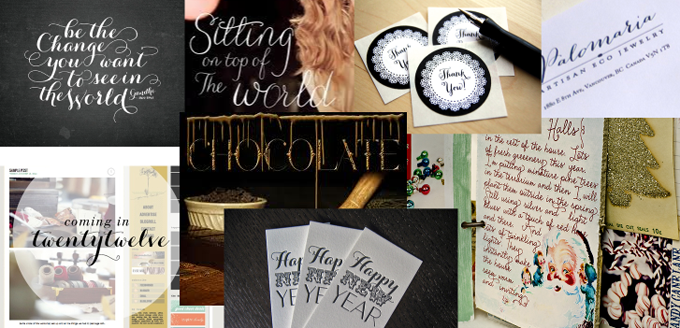
Some samples of Emily’s fonts in use. Designs by Sydney Newsom, Marilenn Alcantara, Dolce Press, Marie L @ Stitch in Time and others.
Do you get to see much of the work that’s being made using your fonts? Have there been particular pieces that have impressed or surprised you?
I do! And those are proud moments for sure. Sometimes customers show me their work themselves, but other times someone else tells me about it or I happen to spot it on my own. I typically see my fonts used on websites, logos or printed items, like invitations. I’m impressed daily by the things I see designers create using one of my fonts. I generally know the big names who license my typefaces, but it’s rare that I have direct contact with them unless they want a custom typeface or something similar. I was particularly surprised when I heard that Carolyna was being used on the packaging of Australian singer Delta Goodrem’s newest single, because I have a song of hers on my iPod, called In This Life. My mom happens to love that song — making it particularly fun news to share with her.
The world of typography is quite a social scene, with conferences, workshops and get-togethers all over the world. As a newcomer, you probably haven’t experienced much of that yet. Are you looking forward to this social aspect of the font business?
Oh yes… I know the TypeCon conference is right around the corner, and I hate to miss it! I’ve been delaying the decision because of other commitments, but I’m really looking forward to meeting so many other designers face-to-face someday soon.
Emily, thanks for sharing your enthusiasm! We are curious to see what you’ll be up to next.
Carolyna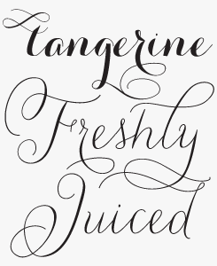
Carolyna reflects the spontaneity and whimsicality of contemporary informal calligraphy. With over 1,000 characters, Carolyna Pro uses OpenType wizardry to select the right variants of each letter to connect seamlessly, automatically replacing letter pairs as you type. If your software does not support full OpenType functionality, use the Cute and Curvy fonts, where what you see is exactly what you get. Carolyna Pro Black is the font’s bolder sister, with even more dynamism and contrast.
MyFonts is on Twitter and Facebook!
Join the MyFonts community on Twitter and Facebook. Tips, news, interesting links, personal favorites and more from MyFonts’ staff.


Who would you interview?
Creative Characters is the MyFonts newsletter dedicated to people behind the fonts. Each month, we interview a notable personality from the type world. And we would like you, the reader, to have your say.
Which creative character would you interview if you had the chance? And what would you ask them? Let us know, and your choice may end up in a future edition of this newsletter! Just send an email with your ideas to [email protected].
In the past, we’ve interviewed the likes of Michael Doret, Laura Worthington, Jonathan Barnbrook, Rob Leuschke, David Berlow, Ronna Penner and Jos Buivenga. If you’re curious to know which other type designers we’ve already interviewed as part of past Creative Characters newsletters, have a look at the archive.
Colophon
This newsletter was edited by Jan Middendorp and designed using Nick Sherman’s original template, with specimens and type descriptions by Anthony Noel.
The Creative Characters nameplate is set in Amplitude and Farnham; the intro image features Logo Sans and Carolyna Pro Black; the pull-quote is set in Peoni Pro; and the large question mark is in Farnham.
Comments?
We’d love to hear from you! Please send any questions or comments about this newsletter to [email protected]
Subscription info
Want to get future issues of Creative Characters sent to your inbox? Subscribe at www.myfonts.com/MailingList
Newsletter archives
Know someone who would be interested in this? Want to see past issues? All MyFonts newsletters (including this one) are available to view online here.