
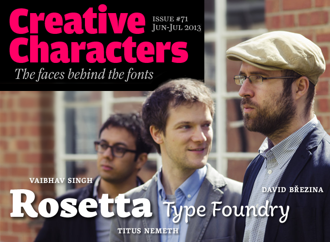
Each typefoundry is unique, but some are more unique than others. Initiated by David Březina from Brno in the Czech Republic, the Rosetta foundry specializes in fonts for writing systems other than the Latin script (the one you’re reading now). Contributing to its growing library of beyond-Latin typefaces is a group of young designers from eight different countries, several of whom have acquired an MA in Type Design at the University of Reading (pronounced “redding” — a town not far from London). We managed to capture three of them at their alma mater, as shown above; they agreed to answer our questions about designing type for the world.
Rosetta has collaborated with more than a dozen independent type designers and consultants. We spoke with the company’s principal, David Březina, who designed the successful Skolar type family; and we exchanged questions and answers by email with two of the designer-researchers who have contributed typefaces and ideas to Rosetta: Austrian-born Titus Nemeth, who designed Rosetta’s Aisha and Nassim type families; and Vaibhav Singh, the foundry’s consultant for Indian scripts, who worked with Březina on Devanagari fonts.
David, you took a degree in Informatics from Masaryk University in Brno. How did you get from there to being a type designer?
Essentially, I fled to something more visual, somewhere where I would feel less like a coding machine. An important part of the transition was my exchange program with the Danish Design School, where I attempted my first typeface design. And it’s been with me ever since. Drawing curves makes me happy.
Is your background in information technology helpful?
Absolutely. It gave me a solid foundation of abstract thinking, I learned several programming languages, and a good deal of theoretical math. I’ve forgotten most of it by now, but it is still there somewhere, like a backlog of inspiration. Also, type design can be very technical; thanks to my background I do not consider that an obstacle. I can do all the geeky stuff like Python macros or complex OpenType features, which is particularly useful with Indian scripts. In fact, I do post-production for most of the Rosetta fonts and scripts. But I do not usually talk about it too much. It is not very important to me and people would ask me to write scripts for them. I would prefer if they asked me to design for them.
As the name suggests, Rosetta specializes in non-Latin scripts. Where does your fascination for non-Latin scripts come from?
Generally, I guess it comes from the aspiration for innovation. It is an indispensable aspect of design and it seems to be quite neglected in type design nowadays. There is so much more to contribute to non-Latin scripts and it can potentially lead to social and cultural changes or at least allow for more variety. Designing another Latin slab serif is hardly going to do that. Although I will certainly design more Latin typefaces in the future.
For me personally, the worldly focus of the MA in Type Design at Reading was an eye-opener. I did not know much back then, but people like Dr Fiona Ross or Jo de Baerdemaeker inspired me and encouraged me to take up the challenge of designing a font for Indian scripts. There I started my first Gujarati typeface (really a beginner’s job from my current point of view) but it showed me what a great adventure designing for Indian writing systems can be. And I wrote a dissertation on the historical developments of the Gujarati typographic script. Since then I designed three Gujarati type families, one for retail, two for clients (including Nirmala UI Gujarati for Microsoft which was done with Tiro Typeworks) and of course all the other scripts in Skolar.
Having released your text typeface Skolar via TypeTogether, you later founded Rosetta with their support. That move has made you a businessman as much as a designer and a teacher. Do you like those practical aspects of running a foundry: networking, administration, marketing, coaching other people?
It is not something I sought, but there was no independent type foundry which could potentially publish non-Latin typefaces by people with a similar set of values. So we set it up. I am learning as I go and naturally I do get some help here and there.
As for networking — I do not have the guts for formal networking, it feels too artificial. Maybe I am naïve, but I believe in genuine friendships. When it comes to marketing, it can be very hard to find an enticing voice without lying or using flawed superlative claims which is something none of us wants to do. In our materials we are decidedly trying to strike a balance between accuracy and fun while avoiding sounding pompous.
Finally, coaching people has been very rewarding. Finishing high-quality typefaces is an extremely tedious process and I am there to help the designers deliver their best. However, my role changes with every project and personality. Sometimes only a little help is needed, other times I need to kick the designer’s ass a lot.
Occasionally I miss the times when I could concentrate on a design of my own, but then something as exceptional as Eskorte or Arek or Huronia is released and all is good.
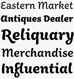
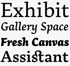
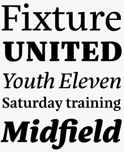
Skolar
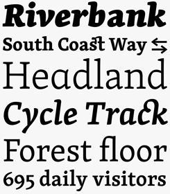
Skolar is Rosetta’s most extensive and fully featured multi-script family. Initially intended for academic publications (hence the name), its high x-height means it works well for immersive reading, yet its distinctive hook-like serifs make it a serious choice for creating erudite documents that look neither pompous nor mundane. The complete Skolar family ranges from light to extra bold with matching italics for each weight. In total, the various packages available support over 90 Latin-based languages, plus Greek and Cyrillic scripts. Skolar Devanagari will be available on MyFonts soon; the Vietnamese character set will be added to Skolar Latin Pro and PE as a free update.
sutturah
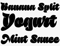
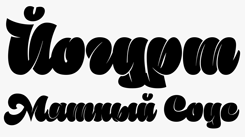
Sutturah by Octavio Pardo is a bit of an exception amid the sensible text fonts of the Rosetta collection: a voluptuous, irreverent display face for Latin and Cyrillic. The font combines very detailed and constructed shapes with a script flavor. Influences range from blackletter to the exuberant, heavy shapes of wood display types. Its rather startling design allows the user to create eye-catching pages with just type: Transferring the unusual style from Latin to Cyrillic was a big challenge but — developed with the help from Sergei Egorov — resulted in something attractive and no less (or more) legible.
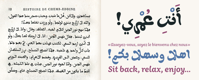
A detail from a bilingual French-Arabic book printed in 1869, L’histoire de Nour-Eddine et Chems-Eddine, which was first shown to Titus Nemeth by DecoType’s Thomas Milo. The Regular weight of Nemeth’s Aisha was based on the Arabic metal typeface used in this book.
Over to Titus Nemeth, an Austrian currently based in the UK. Titus, you’re quite a globetrotter, it seems. Could you tell us something about your background, your travels and your interest in foreign countries and languages?
This has a lot to do with my upbringing, I guess. My family traveled regularly, and we had friends from all over the world. When I was asked as a child what my favorite dishes were I’d reply “couscous” and “ashak” — an Afghan noodle dish!
When I was just a toddler my family spent some two years living in Constantine, Algeria. Apparently, so I am told, I began babbling Arabic, just as little children pick up the languages surrounding them. I also went to the French kindergarten there, having a fair bit of exposure to French language and culture; but it wasn’t only French, I also remember German and Czech friends. My parents took Arabic language courses too and we lived in a normal apartment in the city, not in one of the separate communities that are so typical for the expat community. I really believe that this experience left some lasting impressions that are at the heart of my affinity for Arabic culture.
Like several of the other contributors to the Rosetta type library, you studied type design at the University of Reading. Why did you choose Reading, and how did its program influence you?
I chose Reading because of Gerry Leonidas, the Programme Director of the MA in Typeface Design. When I first inquired there I was quite apprehensive about the entry requirements and the quality of the student work that was being produced. I didn’t think I was going to make it — I was only 22 and my diploma from the Graphische in Vienna technically wasn’t a first degree. It was Gerry who replied to my email, and rather than telling me that I should get some more experience under my belt, he actively encouraged me to put in an application, and made it quite clear to me that I should go to Reading, rather than anywhere else. Reading accepted me, and I never looked back. I think the program in Reading influenced me profoundly — I was quite green when I first went there. It was a tough year in many ways, but boy, how much I learned!
When did you decide to specialize in Arabic, and how did you go about learning the language?
It was part of the Reading program. I had taken Arabic language courses before coming to England, just out of interest and triggered by a memorable visit to Syria in 2002-03, but I didn’t think I could design an Arabic typeface. I thought I might try Cyrillic since I had studied Russian for eight years. But as my portfolio featured a bilingual book in Persian and English, they knew about my interest and encouraged me to pursue it further. It didn’t take much to convince me — I was very keen to try it and told myself that if I don’t learn it now, I never will.
I was lucky to have had such good teachers, especially Fiona Ross, who became my dissertation supervisor, and Gerry Leonidas. Also, help and feedback from seasoned Arabic designers Kamal Mansour and Mamoun Sakkal was crucial to my early learning. After Reading I didn’t feel like staying in the UK and finding a job — I was 23 and felt that I should see a bit more of the world. So I went to Syria to deepen my understanding and learn Arabic. I lived in Damascus for half a year, which was one of the best times of my adult life. It’s devastating for me to see what is happening to this country today; I am actually at a loss for words.
Your Aisha typeface is one of the most original and lovely Arabic / Latin families on the market. Could you tell us something about its history?
Thanks! The term “history” is quite correct, as it began as a revival of an old metal typeface. Thomas Milo, a Dutch specialist in Arabic script, had shown me an old French book from his personal library, printed in this curious and very playful Arabic typeface. I did a little research and found that it had been cut by Marcellin Legrand in the middle of the 19th century. I started to look into it a bit more, and became intrigued by its history — after all it was cut right in the middle of the French colonization of Algeria, something that couldn’t have been a coincidence.
At the time when I came across this old design I was based in Paris, and somehow it made the link back to my childhood years in Algeria. It all seemed really quite surprising. The revival process was much harder than I had at first imagined, and I realized how much interpretation it takes. I kept asking myself “What would Marcellin have done? Where was he doing things that I could do better today?” A very interesting process that was the key for me to make a contemporary, usable typeface.
I absolutely wanted to steer clear of the smudged-edge-kitsch one gets to see with some revivals. I was convinced if Marcellin had had Bézier curves his shapes would be sharp! Because of this aspiration the following steps came quite naturally: it needed a Latin companion, and it needed multiple weights, so I expanded on the original design, trying to echo and reflect its quirks and surprises in the rest of the family. And so, Aisha was born — the name really just suggested itself for this French-Maghribi child.
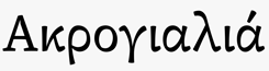
aisha
Relating the story of his discovery of a 19th-century Arabic typeface designed by Frenchman Marcellin Legrand, Titus Nemeth describes this model for Aisha as “curious and very playful” — which is exactly what makes Aisha so attractive. The loopy, brush-like quality of the Arabic makes a smooth transition into the Latin version; both scripts exude a lively playfulness that will be at home in all kinds of branding and advertising projects.
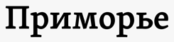
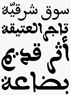
nassim
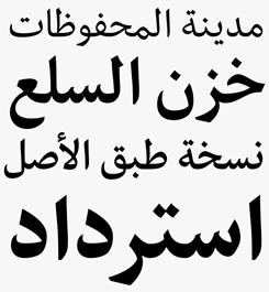
Nassim is Aisha’s more studious cousin and lends itself well to editorial and magazine design. The two versions were developed synchronously and feature complementary weights – a feature not typically found with Arabic typefaces – allowing for more versatile and complex typography. Nassim Latin is available as a stand-alone family; its italics are in the making.
Many designers of Indian or Arabic typefaces aren’t from the countries where those languages are spoken. How important is it for a type designer to speak or understand the language they design a typeface for?
David: This question is always a tricky one to answer. In my humble opinion, understanding the language is surely an advantage, but not a necessity. Knowing the language is useful to find relevant materials and conduct testing, but if you have some helpers you can get by without it. On the other hand, what you have to understand perfectly is the writing system, its tradition and conventions. You need to familiarize yourself with it to an extent that you see more than native readers. Many Latin-centric designers will know the feeling when they first realized that ‘p’ is not a reversed ‘q’ and that ‘o’ is not a circle. That kind of insight into forms is absolutely crucial. In that sense, a writing system is its own world, independent of a language.
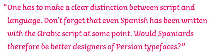
Titus: The link between language and script sometimes seems a little overvalued. Would anybody ask a designer from an Arabic background about their language skills in Persian, Urdu or Pashtu, languages which use the Arabic script but which are linguistically speaking closer to Indo-European than Semitic languages? One has to make a clear distinction between script and language. Don’t forget that even Spanish has at some point been written with the Arabic script! Would Spaniards therefore be better designers of Persian typefaces? As a designer of Arabic or Indian scripts you definitely have to learn a great deal, but that is true for typeface design per se. A native speaker needs to acquire type design skills as well, in an equally long and laborious process.
David: Exactly. It takes time and patience. It is not like you sit, read a bit and you can go and design a non-Latin typeface. It takes a great deal of struggle and patience. It is a flawed idea that anyone who studied type design in Reading can go and design typefaces for any script without previous experience or study. You need to take it slow and learn along the way. Some companies do not allow time for that and therefore the results are sad.
A couple of questions for Vaibhav Singh, an Indian designer currently living in the UK and consulting with Rosetta on Indian scripts. Vaibhav, you took a bachelor’s and a master’s degree at universities in India before coming to the UK; what made it attractive to you to study type design in Reading?
The two main attractions of Reading for me were: the possibility of learning from experts in the field along with a diverse peer group, and the research dimension of the course, with access to original material in the Non-Latin Type Collection of the department. Research-based practice is a professional imperative in type design, especially for Indian scripts, and my course of study could benefit immensely from relevant material preserved in various other archives close by, in addition to the University’s own resources.
What are the main differences between design education in India and the UK? Do universities or art schools in India teach type design and typography in Indian languages?
The main differences, in my limited experience, seem to revolve around the level to which intensive and focused work is undertaken in master’s-level programs. Whereas my previous study involved an approach of extending over many things at the same time on a basic level, the typeface design MA was a year of strong concentration and in-depth work in one particular area, which was certainly a very different experience. I had formally learned about type and typography in India, as I presume most students continue to do, through short modules and occasional sessions within a more diffuse design curriculum.
I am not aware of a dedicated typeface design program in Indian design schools yet; most students who design typefaces do so within the existing educational framework as term-projects or as independent exercises. With the rising awareness of the possibilities of type design in India, this is due for change. The typography of Indian languages, on the other hand, is not a subject that I have seen addressed anywhere. Latin typographic conventions are often transferred directly without much consideration (e.g. drop-caps in a unicase script). Typographic considerations seem to stop at a macro-level threshold, details and minutiae beyond which are mostly ignored and designers seem to find interest only in display types. Perhaps this indicates a belated childhood in our engagement with typography, but there is certainly a promise of maturity somewhere down the line.
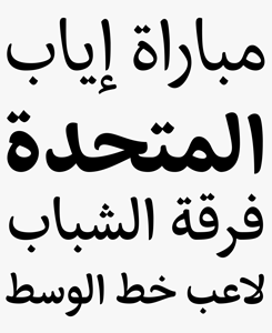
arek
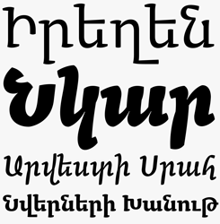
Arek, by Khajag Apelian, is a dual-script Latin / Armenian typeface family in four weights with matching cursive styles. Its distinctive calligraphic form emphasizes the Armenian script’s roots, while Arek is also the first Armenian typeface to offer an upright paired with its cursive companion. Developed as a typeface for school text books, it’s superbly equipped for all kinds of typesetting with OpenType ligatures, lining and old-style figures, and contextual alternates.
neacademia
Neacademia by Sergei Egorov is a response to the prevailing perfection of digital typography. Designed to allow for and even benefit from low resolutions, rough paper, and low-grade presswork, this family will be welcomed by letterpress aficionados who see few suitable fonts nowadays. Neacademia currently only boasts a single weight with an italic, but keep an eye out for optical weights, planned for release in the coming year.
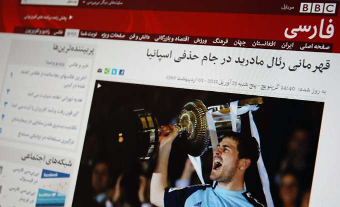
Persian (shown here) and Arabic versions of Rosetta’s Nassim are used on the BBC’s localized websites.
Back to the Rosetta typefoundry. David, in just a couple of years, you managed to put together an impressive library of typefaces by designers from eight different countries. Do the Rosetta designers meet on a regular basis?
Last year we organized the Rosetta Camp to give our designers the opportunity to meet. Not everyone could attend or stay long, but it was great. The idea was to get to know each other and create the sense of a team. For me it is very important to meet people I work with, the virtualization of our profession has gone bit too far. This year we are going to meet again for a Rosetta cruise in the Adriatic. Yes, we will sail together! It is part of a long-term plan to make Rosetta an offshore company.
What are your ambitions and plans regarding growth? Do you encourage other designers to apply? How do you decide which fonts to add to the collection?
The hope is to stay mid-size, at least in the core. Our primary objective is to produce good and culturally sensitive type design in a context where the driving objective is not purely economic. And while we naturally want to support more scripts, we also want to focus on providing a greater variety of styles for the scripts we have now.
Indeed we encourage more designers to apply, and they do not need to be from the Reading or Hague type design schools. Just send us an email and we will reply. The general rules for accepting a typeface are: a) there should be a vision, or at least an interest, to combine more than one writing system within one family; b) the designer has to show the ability to finish the typeface in reasonable amount of time and in a good quality; and c) it should be interesting, i.e. fill a gap either in terms of aesthetics or in terms of functionality. Having multiple scripts is not enough. I would rather have a great design in one script than boring design in many… but it is not always so easy.
Unfortunately, we have limits of how many we can realistically release per year. So I set up a submission date, the end of September, when we will judge all submitted typefaces at the same time. It must be said that we are very picky!
The Rosetta collection comprises fonts for Arabic, Armenian, Cyrillic, Devanagari, Greek, Gujarati and of course the Latin script. Is there a viable market for each of those scripts — at least enough to earn back costs — or are some of your choices purely idealistic?
Our choices are always idealistic. And sometimes it does feel we arrived too early for a party, but that’s part of the game, isn’t it?
Exactly. The dialectics of progress! Thanks to all of you for your insights.
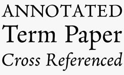
eskorte
Eskorte, designed by Elena Schneider, is a businesslike, compact four-font typeface family designed for use in non-graphical office applications, ideal for legal and academic institutions. With the Arabic script version produced in consultation with Titus Nemeth, this is a harmonious and functional dual-script typeface with, naturally, extensive Latin language support.
MyFonts is on Twitter and Facebook!
Join the MyFonts community on Twitter and Facebook. Tips, news, interesting links, personal favorites and more from MyFonts’ staff.

Who would you interview?
Creative Characters is the MyFonts newsletter dedicated to people behind the fonts. Each month, we interview a notable personality from the type world. And we would like you, the reader, to have your say.
Which creative character would you interview if you had the chance? And what would you ask them? Let us know, and your choice may end up in a future edition of this newsletter! Just send an email with your ideas to [email protected].
In the past, we’ve interviewed the likes of Michael Doret, Laura Worthington, Jonathan Barnbrook, Rob Leuschke, David Berlow, Ronna Penner and Jos Buivenga. If you’re curious to know which other type designers we’ve already interviewed as part of past Creative Characters newsletters, have a look at the archive.
Colophon
This newsletter was edited by Jan Middendorp and designed using Nick Sherman’s original template, with specimens and type descriptions by Anthony Noel.
The Creative Characters nameplate is set in Amplitude and Farnham; the intro image features (from large to small) Arek, Aisha and Skolar; the pull-quote is set in Aisha and the large question mark is in Farnham.
Comments?
We’d love to hear from you! Please send any questions or comments about this newsletter to [email protected]
Subscription info
Want to get future issues of Creative Characters sent to your inbox? Subscribe at www.myfonts.com/MailingList
Newsletter archives
Know someone who would be interested in this? Want to see past issues? All MyFonts newsletters (including this one) are available to view online here.