ust in case you missed last week’s In Your Face newsletter: our quarterly foundry update is a must-read for typophiles. The latest issue introduces a record number of new foundries that recently signed up with MyFonts, as well as great new fonts from many other foundries and news from the type world.
One thing that is noticeable about the latest crop is the abundance of interesting sans-serif typefaces. This month’s Rising Stars features some of the most successful of those text and display fonts that some art directors describe to their clients as “fonts without little feet.”
This month’s Rising Stars
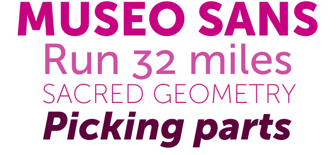
Dutch designer Jos Buivenga made a splash with his first type family on MyFonts: Museo, a spirited semi-slab serif. His foundry, exljbris, has now released the typeface’s sans-serif companion, Museo Sans, offering the font’s medium “500” weight free of charge. As with Museo, the generosity is paying off — many users have decided to expand their collection with some of the non-free weights.
The original Museo’s most striking characteristics are in the whimsical shapes and placement of the asymmetric serifs. Lacking those signature accessories, Museo Sans may be less immediately recognizable — but that doesn’t mean it’s boring! Its clarity and legibility are remarkable, it has some lovely details and its wide range of numerals is both attractive and practical.
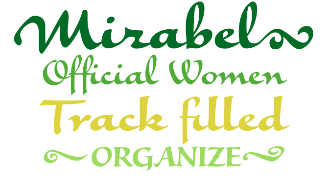
Philip Bouwsma is a prolific calligrapher and designer of script fonts; his recent Bouwsma Text has been hugely successful. With Mirabel, Bouwsma pays tribute to his mother, Beverly. Having developed her unique handwriting in the 1930s “in an act of teenage rebellion,” Mrs. Bouwsma adapted her style to the broad-nibbed Osmiroid fountain pen her son gave her in the 1960s and which she has used ever since.
The original handwriting is rich and varied, freely mixing loops and straight ascenders. This has allowed for the digital version to be split into two interchangeable fonts — one more flamboyant and informal, and the other more classically balanced. Both are equally delightful, and the flourishes are free for all.
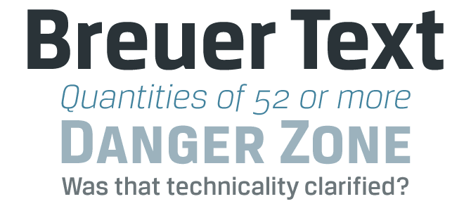
Recently released by TypeTrust, Breuer Text is one of the coolest sans-serifs to have hit the shelves lately. In this age of no-frills sans, it is not an easy task to come up with something original; designer Silas Dilworth has done an impressive job. Avoiding the stroke-of-the-pen logic of a humanist sans, Breuer Text has a straightforward nuts-and-bolts structure but, despite the underlying squarish skeleton, is also rather elegant and reader-friendly. It is especially suited as a secondary typeface in a complex editorial design project, for pull quotes, running titles and subheads — check out the small caps and small caps figures — as well as moderate lengths of body copy. Interestingly, its designer suggests a more specific use: he sees Breuer Text as the ideal typeface “for instructional copy or safety warnings.” Breuer Text includes Small Caps, Old Style Figures and Tabular Figures.
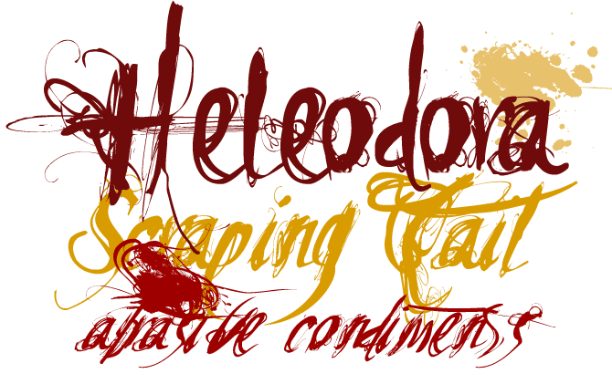
Carlos Fabián Camargo Guerrero of the Andinistas foundry has definitely found a style of his own, and what’s more: through MyFonts he has also found an audience. He specializes in what could be described as “destructive penmanship,” producing one dirty script after another. The recent Heleodora is another variation on the theme to which earlier Andinistas releases such as Alcira and Ninja also danced. It is a family of three based on the same underlying drawing — Heleodora 2 and 3 are slanted and condensed versions of number 1.
Text family of the month
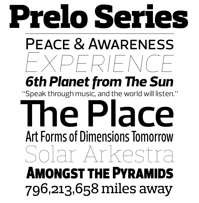
A new release from Dino dos Santos’ DSType is always something to look forward to. With Prelo, DSType has released a brand new family with an interesting structure. The basic typeface is Prelo, a neutral, highly readable typeface for identity, editorial and information design available in nine weights with true italics. Prelo is a versatile typeface with a lot of character that will work well both in text and headline sizes. For compact, space-saving headlines with extra punch there is a narrow version, Prelo Condensed, and an even narrower one, Prelo Compressed. Each of these varieties offers small caps, tabular figures and oldstyle figures, and a Central European character set. Finally, there is Prelo Slab, the slab-serif family that is the perfect companion to Prelo for demanding typographic jobs.
Follow-Up

Having been featured as one of last month’s Rising Stars, Flavour by German lettering artist Hubert Jocham has been riding high on MyFonts’ bestseller list. Like Jocham’s other informal scripts, Flavour is great for packaging. Think chips (crisps if you’re English), soup, soft drinks, TV dinners and even paper tissues.
If you like this font from Hubert Jocham, check out some of his other fonts:
Schoko
A brush script typeface in a similar style to Flavour, but lighter in color and looser in style. It is joyous yet clear, informal yet self-confident. Pronounced “Show-co.”

Mommie
Developed from an earlier font first used by L’Officiel magazine in Paris, Mommie has a strikingly original thick-thin contrast. Mommie was among the winning entries of the TDC 2008 competition.
Schwung
Schwung is another one of Jocham’s confident brush scripts that is ideal for food packaging and product branding. Its elegant rounded swirls get stronger in the alternate version.
Have your say
— Jackie in London, England
29 August, 2008
Your opinion matters to us! Feel free to share your thoughts or read other people’s comments at the MyFonts Testimonials page.
Font credits
The Rising Stars masthead and subheading are set in Auto 3 and Bryant, respectively. The drop-cap J in the introduction is set in Conjur, and the Have your say quotation in Prelo. The small pixel typeface used at the very top is Unibody 8.
Unsubscribe info
This newsletter was sent to [email]. You may unsubscribe at any time at: www.myfonts.com/MailingList
Want more?
All of our previous newsletters are available online at myfonts.com/newsletters/
Comments?
Please send any questions or comments regarding this newsletter to: [email protected]