
This month’s Rising Stars
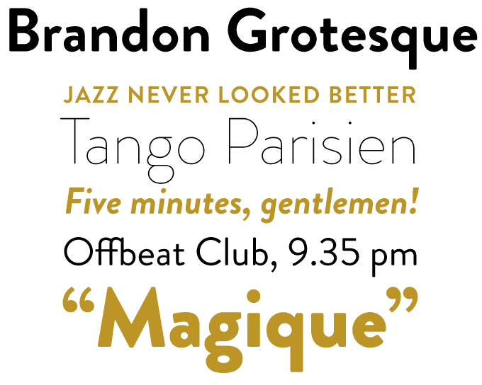
Brandon Grotesque by Hannes von Döhren is a brand new take on the German geometric-style sans serif model that first became popular during the 1920s and ’30s. With its long ascenders and descenders, it recalls the more stylish and decorative typefaces of that genre, such as Erbar or Kabel. Brandon Grotesque makes sensible use of the compass and ruler: while its geometric forms were optically corrected for better legibility, its Black weight — a great performer in display sizes — has perfect circles for counters, which adds to its subtle retro charm. The rounded corners lend the typeface a softer look in large sizes. A modernist face with a warm feel, Brandon Grotesque is well suited for use in headlines as well as longer texts.
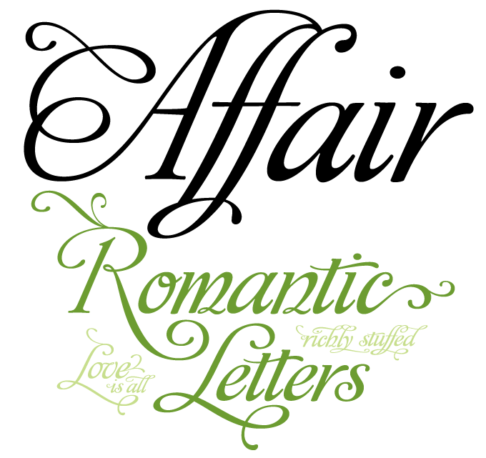
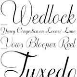
On a visit to New York, Alejandro Paul walked into a library on a whim and, as if by magic, found the 1950s lettering book that would change his life, as well as the face of Argentinian type design. He opened the book at random and suddenly was in “...alphabet heaven: curves and twirls and loops and swashes... To this day I can’t decide if I actually found the worn book, or if the book itself called for me.” The single piece of lettering he saw that day inspired Paul to create Affair, the first of his exuberant OpenType script fonts. Loaded with alternates and ligatures, Affair is a massive toolkit for creating luscious custom titles and logos. The font recently became available on MyFonts, and has been an immediate success — and quite rightly so. For a complete character map, download this PDF.
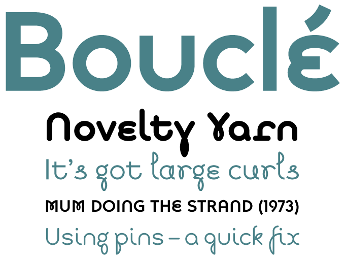
Based in Highland Park, Illinois, TipografiaRamis has been one of the most successful young foundries on MyFonts lately. After Compass TRF and Croog, their new Bouclé family is yet another exploration of geometrically constructed letterforms. Bouclé experiments with unusual solutions, artfully combining Art Deco elements with a postmodern “whatever works” attitude. In some of its details the typeface is reminiscent of Rudy Vanderlans’ Suburban; however, it is a very different typeface indeed. Bouclé offers a choice between the rather straightforward and clear-cut Plain and the more whimsical Round (which has rounded terminals), with a bold variety for each. Bouclé Loopy is, well, the loopy one. A fun family.
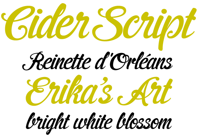
Cider Script is the latest offering from Tomi Haaparanta’s Suomi foundry, the company that also brought us the Suomi Script typeface. Cider Script has similar characteristics — energetic, informal and friendly. Originally developed for a Finnish cider brand, it also looks quite tasty and is therefore a good choice for any kind of food packaging or advertising. Cider’s letters connect in a natural flow; to improve the look of single words — especially those with an “r” in them — it comes with a number of nicely drawn ligatures.
Text family of the month
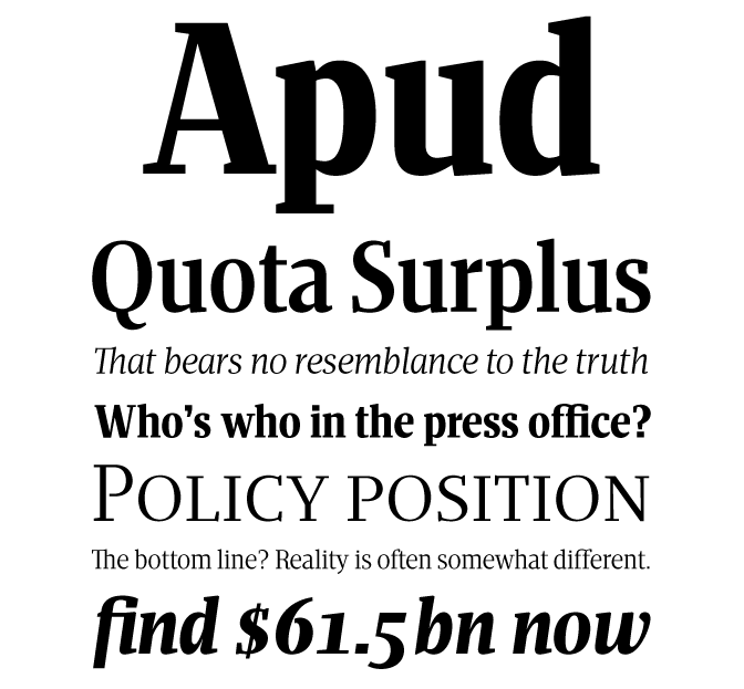
Apud is a text typeface with a difference. It is narrower than most, and could almost be a condensed version of a regular-width roman. But it is not: designer Dino dos Santos conceived Apud as a family in its own right. It is surprisingly lucid and readable, even at small point sizes, so using Apud as a text face can result in some serious space-saving. Another nifty feature: each glyph has a constant width across the four weights of the family, so the weights can be changed at any time during the design process without having to reflow the text.
Apud’s serifs are simple and dynamic: wedge-shaped and short on the left, rectangular and somewhat longer on the right. They contribute to the clean, contemporary look and confident feel of the family. Equipped with small caps and multiple figure sets, Apud is a typographically sophisticated family suited for a wide array of publications. For elegant headlines, combine with Apud Display, a stylish and subtle variation on the same formal principles.
Follow-up
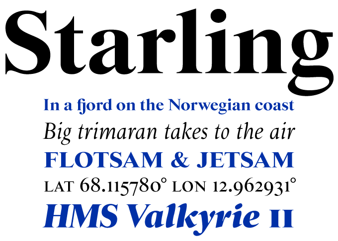
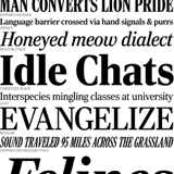
For decades, Mike Parker has been fascinated by the story of the world’s most famous oldstyle, Times (New) Roman. Was it indeed art-directed by Stanley Morison and drawn by The Times’ Victor Lardent? Parker discovered another possible model, designed by the colorful William Starling Burgess. Parker found Burgess’ original superior to the famous newsface — and Starling is his tribute to this nameless predecessor. SInce it was presented as our Text Face of the Month in the March newsletter, Starling has done remarkably well. It is a great alternative for one of the world’s most overused text typefaces, has gorgeous italics and a striking Ultra Black headline set, so the success is well-deserved.
If you like this typeface from the Font Bureau, check out some of their other fonts:
Trilby
The unorthodox principle at work in Trilby is ”reversed stress“: the horizontals are heavier than the verticals. This concept was at the heart of the 19th-century French Clarendon, a forgotten topsy-turvy display style. David Jonathan Ross appropriated the style’s principle to create Trilby, a wonderful new text and display face with offbeat charm and subtle wit.
Biscotti
Biscotti was drawn by Cyrus Highsmith as a custom face for Brides magazine. Conceived to be ”a typeface that makes the reader feel pretty“, Biscotti is a radically simple descendant of the flourished engraved scripts that were traditionally used for such great occasions as a wedding invitation. It is a 21st century typeface capturing the smiling spirit of classical forms.
Rocky
For years Matthew Carter wondered why no Latins with Bodoni proportions had been developed, or why no Bodonis had triangular Latin serifs. He solved the problem by drawing Rocky Regular and Bold with italics to fill the gap, then expanded the family with the aid of Richard Lipton. Rocky provides the editorial designer with a sharp spot of typographic “color”.
Sponsored Font: Comic Book Collection
Canada Type’s popular font collection is already being used extensively in both mainstream and underground comic books, from Crucifix in the many varieties of X-Men comics, Chalice and Hamlet in Elseworlds books, to Chopper, Driver Gothic and Gamer in plenty of others.
This month’s sponsored font collection is their comic book lettering series, which includes a variety of fonts made specifically for filling those speech balloons and thought-containers in comic books. Collector Comic is a mix of Silver- and Bronze-Age lettering in its uppercase slots, and a Modern-Age spin on them in the lowercase cells. Captain Comic is loosely based on the lettering found in the very first Star Trek comics (1967-1970). Caper Comic is made of letters that aim for clarity and readability at both text and display sizes. And Classic Comic uses the ergonomic tilt and wider aperture found in older comic book lettering on both sides of the Atlantic. All four families come in regular and bold, with italic counterparts for each. They are very affordable, and when you buy the entire collection, there’s a family discount on top of that.
Have your say
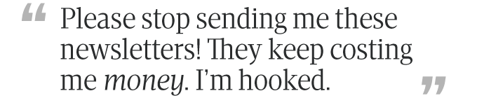
— Janet S, March 11th 2010
Your opinion matters to us! Feel free to share your thoughts or read other people’s comments at the MyFonts Testimonials page.
Colophon
The Rising Stars nameplate is set in Auto 3 and Bryant, and the Have your say quotation in Apud.
Subscription info
Want to get future MyFonts newsletters sent to your inbox? Subscribe at myfonts.com/MailingList Want to get future MyFonts newsletters sent to your inbox? Subscribe at myfonts.com/MailingList
Comments?
We’d love to hear from you! Please send any questions or comments about this newsletter to [email protected]