
This month’s newsletter offers an intriguing encounter with contrasting font styles and atmospheres. No-frills sans serifs, frill-happy scripts, and a couple of text/display families that are much harder to classify. All beautifully drawn, all usable in a wide array of situations. Fonts to make you smile, fonts to play around with. Fonts to impress your boss or boyfriend, fonts for reading, fonts for looking, fonts to remember. Oh yes... it’s September.
This month’s Rising Stars
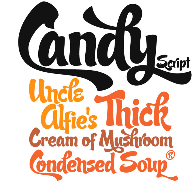
Inspired by Argentina and its culture, Alejandro Paul’s Candy Script captures the lively spirit of the country’s visual vernacular. Candy’s exuberant style comes from the tradition of window sign painting. Its thick hand-brushed characters, with alternates for almost every upper and lowercase letter, radiate confidence and personality. Like many of Sudtipos’ brush scripts, Candy Script is a must-have for studios specializing in food packaging and retail branding, but its possible uses are wide and varied: magazine and catalogue design, bar and restaurant signage, scrapbooking, you name it.
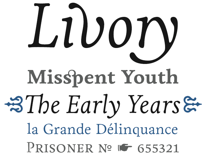
Livory was introduced on the occasion of our recent interview with Hannes von Döhren, and it quickly climbed to the top of our Hot New Fonts chart. Its production history is different from most other HVD fonts in that it was a collaborative effort five years in the making. Designed between 2005 and 2010 by von Döhren and Livius Dietzel, Livory was inspired by the French Renaissance oldstyle faces of the sixteenth century. The designers’ aim was to combine the proportions of these classic oldstyles with shapes full of verve and an audacious “fusion” of glyphs. The result is a fluid and vigorous oldstyle without a trace of nostalgia.
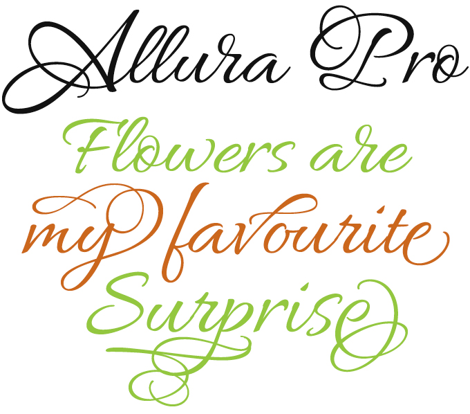
Lettering artist and type designer Rob Leuschke continues to add spirited and delightfully usable script fonts to his already impressive collection. Allura, his most recent offering, comes in three varieties: Allura Regular’s casual characters are simple and clean and very legible, with an almost handwritten appeal; Allura Script and Formal offer more flourish for those occasionally exuberant requirements. The Pro version (which needs OpenType-aware applications) combines all three styles in one font along with extra alternate glyphs and flourished graphics. Professional advertising, display and packaging designers especially will appreciate its maximum flexibility.
Text family of the month
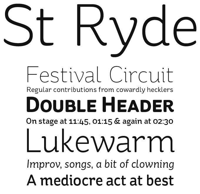
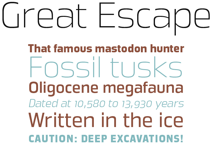
Young German designer Sascha Timplan has been extremely productive lately. Stereotypes, his one-man foundry, recently published two remarkably original type families, both of which have been doing very well indeed. St Marie is a vivacious slab serif with crisp shapes; St Ryde, this month’s Text Face, combines a sophisticated structure with playful details.
St Ryde joins the ranks of lively yet legible typefaces with rounded terminals (think Fritz, Sauna or Haptic) but has a logic and a charisma
all its own. It is a semi-serif rather than a sans; while it swings and bounces at display sizes, it looks more static and regular when used small. With multiple figure sets, small caps and open italics, it was made for serious typographic work, in spite of its unorthodox forms.
To allow all users to test the possibilities of the full font, Stereotypes offers the Regular at no cost.
Follow-Up
If you like this typeface from FaceType, check out some of their other fonts:
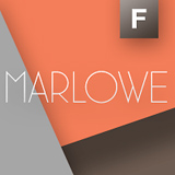
Marlowe
Marlowe by Strangelove’s designer Marcus Sterz is a feather-light typeface of modernist elegance. Marlowe comes as a triple pack: Regular is for headlines and medium-sized text, while the expressive Swirl and Cocktail styles are charming display fonts. Marlowe offers dozens of alternates, ligatures and swash letters.
Darjeeling
Darjeeling combines British elegance and Indian flavor. It is flared like Optima, with a scent of Bodoni. Letters and ornaments can be layered to create astounding pieces of colorful typography. The Regnaments variety contains a combination of the two other styles.

Ivory
Ivory was inspired by a typeface used in an 1882 compendium about fruit cultivation. It reflects the love of ornament and typographic fancy of 19th-century book design. Like Darjeeling, Ivory offers separate fonts for letters and ornamentation, plus a set of characters with built-in ornaments called Ivory Headline.
Sponsored Font: Uni Sans
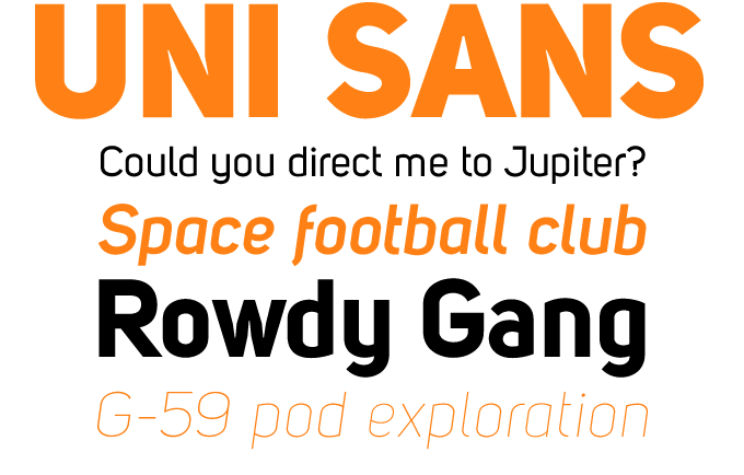
Bulgarian designer Svetoslav Simov has been very successful with geometric display fonts such as Zag and Colo Pro. Uni Sans is probably his most ambitious project to date: a text and display family of constructed sans-serifs in seven weights plus italics. The capitals are similar to DIN’s, but have some idiosyncratic inktraps; the lowercase combines industrial simplicity with avant-garde details, such as the fluid joining of stems and curves and an italic that mixes geometry and calligraphy. A very usable neo-geo family.
Have your say
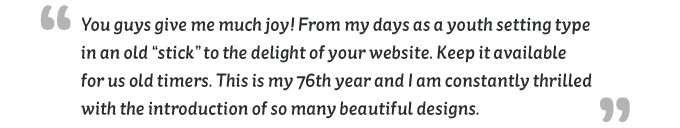
— Bud Schatz, Dayton, Tennessee, Aug. 11, 2010
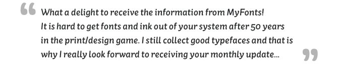
— Bill Armstrong, Liverpool, UK, Aug. 11, 2010
Your experience matters to us! Feel free to share your thoughts or read other people’s comments at the MyFonts Testimonials page.