
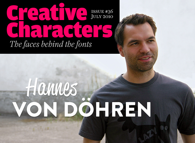
To describe Hannes von Döhren’s recent success at MyFonts as “remarkable” would be an understatement. In less than a year, the German designer has released an astonishing collection of well-made, original typefaces in a wide variety of styles, ranging from the witty, faux-western Cowboyslang to the new Renaissance-inspired Livory. His subtly nostalgic Brandon Grotesque and Reklame Script are both riding high in our current Best Sellers list. Von Döhren is enjoying his new-found independence immensely. Designing type is finally enabling him to do what he can’t get enough of — designing more type.
We conducted the interview in German; the original text is available on our German sister site, MyFonts.de.
Hannes, before turning to type design, you worked as an art director in an advertising agency. How did you discover your passion for type? Does your background in commercial design help you as a type designer?
Like many type designers, I have always been fascinated by letterforms and by the use of type. It was my main reason for becoming a graphic designer. Gradually, my love of typography has become more and more of an addiction.
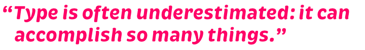
After spending a lot of time exploring the beauty and the aesthetics of individual letterforms, I began to get interested in the way type and image affect other people. Why do people experience certain feelings when looking at things? Which graphic means are linked to what emotional effects? I was fascinated by how influential something consciously designed can be. That was a reason why I moved from graphic design to advertising — to convey messages in such a way that they actually reach their destination. My love for type has remained a guideline throughout; typography for me is part and parcel of graphic design and advertising. Type is often underestimated: it can accomplish so many things.
Who taught you how to make fonts?
I started by designing experimental typefaces for fun in my spare time, alongside my job as an art director, making them available as free fonts on the Internet and using them in personal projects. Playing around with type was such great fun that I became seriously interested in the workings of fonts: their technology, rules and background.
This resulted in larger projects that gradually gravitated towards more traditional type design. I looked at many existing typefaces and tried to analyze how they were made, and why. I became interested in every aspect of type design and font production. Little by little, from all these small building blocks of information that I gathered and processed into my work, I began to produce professional results. It is crazy how you can train your eyes over the years and how you go about things in a totally different way from what you did in the beginning. Yet every type project is a new and exciting challenge in which you encounter new problems that need to be solved.
As for those free fonts — you released about a dozen of them between 2005 and 2007. Through MyFonts you also made available the successful Comic Serif Pro for free. How do you view those early fonts now? Are you comfortable with the fact that they are still widely available on free font sites?
Yes, even if I work in a totally different way now. To me, those fonts are snapshots of the period in which I made them. They are a kind of documentation of my learning process. With each of them, I tried out some new experiment and learned something new, and I had a lot of fun making them. I don’t find these free fonts that bad; and as they are free, they are naturally quite widespread. I am always pleased when I encounter them on the street, for instance on the posters you see covering walls all over the city. It’s a great feeling — you don’t see the commercial fonts in public that often.
reklame script
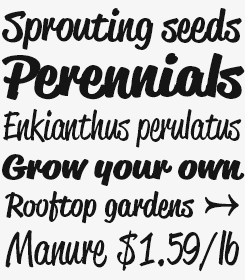
Reklame is an old German word for “advertising”, and that is what Reklame Script is for. Inspired by the hand lettering of 1940s–’50s advertisements, it is a powerful brush script in four weights, from Regular to Black. These varieties can be combined for extra emphasis — perfect for billboards, packaging and the like. The OpenType fonts include double-letter ligatures to avoid repetition, and a stripped-down test font is offered for free.
livory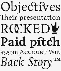
Livory is the latest typeface from HVD Fonts. Designed by Hannes von Döhren and Livius Dietzel between 2005 and 2010, Livory was inspired by the French Renaissance oldstyle faces from the sixteenth century. The designers’ aim was to combine the proportions of these classic oldstyles with spirited shapes and the ‘fusion’ of glyphs, resulting in a distinctive fluidity.
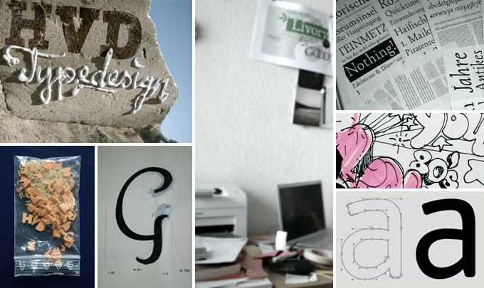
Snapshots from Hannes von Döhren’s typographic universe.
You’ve been amazingly productive during the past year, launching a new type family almost every other month. How do you do it?
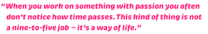
I simply enjoy all of this tremendously, and when you work on something with passion you often don’t notice how time passes. This kind of thing is not a nine-to-five job — to me, it’s a way of life. Most of my typefaces come into being without extensive planning and without meditating about it for a long time. Sure, a typeface is a lot of work and it contains a lot of details you have to consider. But I’m being pushed on by the rapture of seeing how a typeface becomes more complete, more “round” — and each time I can hardly wait to use my (nearly) finished new typeface for the first time. That’s one of the best sensations of the design process: to install a font for the first time, and design something with it.
I have now been a full-time type designer for three years. I’ve created my own foundry and every day I work on new fonts, specimens, and advertising material for my typefaces, plus all the necessary administrative tasks. I’m glad I’ve found this as my work allows me to be active in all the fields I’ve always found fascinating: type, graphic design and advertising.
You’ve designed typefaces in a wide range of styles. How do you decide what to work on next? Have any of your typefaces been designed in response to a precise brief or assignment?
When starting on a new typeface, I simply respond to my impulses: What do I feel like doing? What do I find beautiful? On the one hand, I like to explore new paths — to experiment and devise new forms. On the other hand I like moving in a narrow corridor, design-wise, and within those limitations develop my own personal view on something. I want to understand why the old masters of classic type design made something, to discover their brilliant and sometimes baffling solutions; it gives me great pleasure and I learn something new.
When you make display type, you’re extremely free and the possibilities are almost endless. Text faces, conversely, represent a special challenge because there are so many rules to respect and you need to have a trained eye for proportions and rhythm.
And so I enjoy moving back and forth between the playfulness and freedom of display faces and the discipline and constraints of text fonts, and wouldn’t want to give up either. After a large, time-consuming text typeface project it can be a liberating exercise to assume a more easy-going attitude designing a display typeface.
There are times when an image of how this typeface I’ve just started on should look in use just pops up in my head — and again, I’m already in the middle of a new, exciting type project.
Which designers from the past or present are your heroes — and why?
Oh, there are so many great typefaces and so many designers who have produced great work. To begin with, the classics like Claude Garamond, William Caslon, Giambattista Bodoni, Frederic Goudy, and also Adrian Frutiger… to me, those are the masters who have shown new ways and have established the fundamentals. And then there is the “digital” generation of type designers, among whom there are outstanding personalities: Zuzana Licko, Xavier Dupré, Underware, Kris Sowersby… to mention just a few that immediately come to mind. There are many more whom I respect for their excellent typefaces.
cowboyslang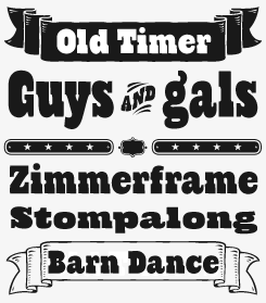
Many recent typefaces tap into the charm and visual power of nineteenth-century wood type and advertising typography. Most of these fonts are polished versions of those brash titling faces. Hannes von Döhren’s Cowboyslang takes the model in a different direction. It has a hand-drawn feel and an informality that is both charming and contemporary. Check out the arrows, catch words, pictures and labels included in the witty Ornaments font.
Bumper
Bumper is one of this year’s heaviest cases — and we mean that literally. Despite its overweight proportions, the font climbed effortlessly to the highest regions of the Hot New Fonts list back in February. Bumper is the perfect ultra-bold sans for large headlines that want to be loud without committing crimes against good taste. There are three degrees of Bumper: from the broad-shouldered Regular via the narrower Condensed to the artfully squeezed Compressed. For heightened typographic tension, try mixing the three widths in one word or line. Use big.
Being a self-taught type designer, do you think it is a good thing that more and more design colleges offer specialized type design education?
Sure, by all means. It helps young designers to develop a certain awareness about type, to recognize the differences between typefaces and appreciate their effect. If you’ve ever tried to draw an alphabet yourself, you know how difficult it is to do well and how many rules must be observed. Students who take a type design class will train their eyes, and these skills will have a positive effect regardless of whether they become type designers, or end up in graphic design or advertising. Type is an important tool, and one should always make conscious choices about the selection of fonts and about typographic techniques.
The road of teaching oneself all of this is certainly more complicated and difficult. It takes great perseverance and patience as you easily stumble into pitfalls and have to find your own way out. The advantage may be that you’re more likely to develop your own style, as you are not formed by a particular teacher.
blow up
Blow Up is a bubbly, sweet font with nice lighting effects. Perfect for use in big sizes on posters or flyers. You can use Blow Up Sans & Blow Up Bling together to influence the color of the highlights.
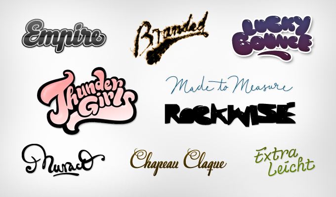
In his hand-lettering for branding and packaging, Hannes von Döhren covers a wide range of styles.
Could you talk a bit about the considerations underlying your typeface Brevia?
When working in advertising I frequently had to deal with companies and organizations that wanted to position themselves as personable and friendly, yet professional. Such adjectives were often used in the services sector, but also in packaging. A typeface is a good tool to communicate those kinds of qualities — to evoke a certain atmosphere when marketing an organization.
I realized there were very few typefaces that managed to combine a feeling of friendliness and likability with a certain clarity. Brush scripts are often inviting, personal and friendly but they lack seriousness and they aren’t suitable for use in longer texts. With Brevia I wanted to develop a family that shows similarities to a brush script, yet offers a certain solidity thanks to its lucid architecture. As any text face must be very restrained in its details, my challenge was to incorporate the brush script characteristics with exactly the right amount of intensity. You should be able to just barely sense it at text sizes — but clearly notice it in larger sizes. I decided to enhance the brush script characteristics with each grade of boldness. Bolder weights are often used bigger, which allows one to emphasize the family’s idiosyncrasies.
Your biggest success so far is Brandon, released earlier this year. Where did the inspiration for that family come from?
My father gave me some magazines from the 1920s and 1930s, which he had found at my grandfather’s; he thought I should have a look at the hand-lettered advertisements. I was fascinated by the surface feel and by the general atmosphere of these magazines; the way the body type was set and the various combinations of typefaces and hand-lettered headlines.
I absolutely wanted to create a typeface with that kind of feel. A geometric face that nonetheless would possess a certain softness and warmth. Because of “bad” printing, the text faces in those magazines had slightly rounded corners, lending them an emotionality that today’s clean-cut type lacks. So I decided to give Brandon slightly rounded-off corners to allow it to radiate warmth in spite of its geometric clarity. Although Brandon with its 12 styles is a relatively large family, each weight has its own aesthetic, for while the weights are based on each other they were all drawn separately in order to give each variety its own details — like the various ‘g’ variations or the perfectly round counters in the Black weight. A real italic was designed to provide additional individuality and to distinguish the font from most other geometric sans faces, making it even more ‘human’.
One of the things I enjoyed most about the Brandon Grotesque project was designing and producing the printed type specimen. I thought the typeface deserved a quality presentation and I wanted to show where it came from — from paper. So I had a brochure printed in a limited run of 50, distributed among the first fifty buyers of the family.
Is there still any hope for those who crave that printed specimen?
Well, not everyone who bought the complete family ordered the brochure… so yes, there are still a few copies left. Whoever bought the complete Brandon family or wants to do so can send me an email with the order number and will receive a free copy. And I’m not planning to do a reprint…
brevia
While most new sans-serifs are clean and minimalist, Brevia is warm, friendly and casual. But despite its soft shapes, it performs very well as a text face. Thanks to the large x-height and the open italic, Brevia remains perfectly readable even in very small text settings. Its heavier weights have an eye-catching appearance in bigger sizes. Each font includes small caps, a wide array of numerals and a set of arrows.
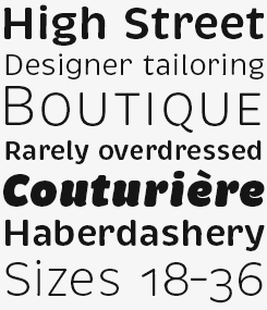
brandon grotesque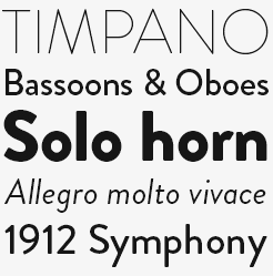
Brandon Grotesque is a new take on the German geometric-style sans serif model that first became popular during the 1920s and ’30s. With its long ascenders and descenders, it recalls the more stylish and decorative typefaces of that genre, such as Erbar or Kabel. Brandon Grotesque makes sensible use of the compass and ruler as its geometric forms were optically corrected for better legibility. A modernist face with a warm feel, Brandon Grotesque is well suited for use in headlines as well as longer texts.
When you worked in advertising you lived in Hamburg, one of Germany’s prime business centers. You are now an independent designer in Berlin, a city with a lively typographic scene and endless possibilities for going out, but economically in distress. What makes Berlin the more interesting place for you to be right now?
I am originally from Berlin and moved to Hamburg to work for an advertising agency. I really enjoyed my time there and I learned a lot. But I often felt nostalgic about Berlin, as I’ve always felt the city to be my home. And so after two years I returned to this huge and eclectic city where I can have all I want and where my friends live.
The decision to take the step towards independence was not so easy for me, as there were many uncertainties. The idea of having to organize everything by myself was daunting. But I must admit it’s been one of my better decisions. It’s very rewarding to take your own responsibilities, to decide what is good and what isn’t, to organize your own time and pace yourself.
Working with MyFonts has been quite a rewarding decision for you. Did you hope or expect anything like this to happen?
Needless to say, I never counted on that. I started doing type design simply because it is my passion to look at typefaces and to design them. During the first few years I kept afloat selling a few display fonts and doing odd jobs as a graphic designer. Following the success of Brandon Grotesque I now experience the great privilege to concentrate fully on type design. It’s very gratifying to see that a vision like mine — “to be able to live off type design somehow, someday” — can actually be realized. I did not know what I was getting into and whether or not my plan could work. RIght now, I’m simply delighted that I can go on make typefaces.
…and so are we! We’re looking forward to your next offering. Try not to work too hard, though.
subway
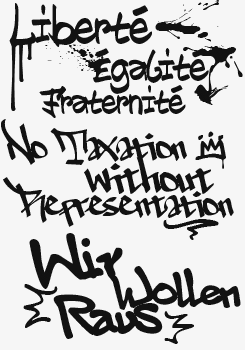
The idea behind Subway was to create a package containing tagging styles typical of graffiti strongholds such as New York, Berlin and Paris. The taggers Shik (New York), Deon (Paris) and Etan (Berlin) came together to show the typical styles of their respective metropolitan areas. The fonts were digitized, spaced, kerned and programmed by Hannes von Döhren. Besides the thorough research, what makes Subway stand out is its extensive sets of styles and wide array of glyphs, including ligatures and special characters.

Who would you interview?
Creative Characters is the MyFonts newsletter dedicated to people behind the fonts. Each month, we interview a notable personality from the type world. And we would like you, the reader, to have your say.
Which creative character would you interview if you had the chance? And what would you ask them? Let us know, and your choice may end up in a future edition of this newsletter! Just send an email with your ideas to [email protected].
In the past, we’ve interviewed the likes of Cyrus Highsmith, Nicole and Petra Kapitza, Rian Hughes, Alejandro Paul, Dino dos Santos, Veronika Burian and Jos Buivenga. If you’re curious to know which other type designers we’ve already interviewed as part of past Creative Characters newsletters, have a look at the archive.
Colophon
This newsletter was edited by Jan Middendorp and designed using a template by Nick Sherman with specimens by Anthony Noel.
The Creative Characters nameplate is set in Amplitude and Farnham; the intro image features Reklame Script and Brandon Grotesque; the pull-quotes are set in Brevia Bold Italic; and the large question mark is in Farnham.
Comments?
We’d love to hear from you! Please send any questions or comments about this newsletter to [email protected]
Subscription info
Want to get future issues of Creative Characters sent to your inbox? Subscribe at www.myfonts.com/MailingList
Newsletter archives
Know someone who would be interested in this? Want to see past issues? All MyFonts newsletters (including this one) are available to view online here.