
As we all know, May is traditionally a month for swashy scripts; for clean yet not-too-trendy sans serif families; and weathered wood type. It’s been like that ever since the first medieval minstrel pasted up his concert posters drawn up in badass blackletter. So who are we to break an age-old tradition? We are happy to announce that this newsletter is filled to the brim with sunny, springy scripts, fresh sans serifs and weathered wood type. Although we do hope for some badass blackletter to come our way again soon. Enjoy!
This month’s Rising Stars
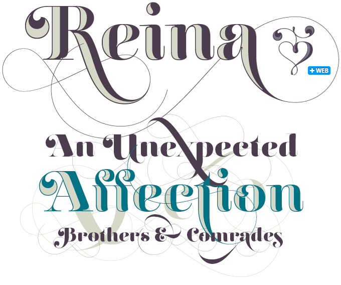
Reina by Maximiliano Sproviero is probably Lián Types’ most sophisticated typeface to date. With its vertical stress and strong contrast between fat strokes and gossamer hairlines, Reina is a display Didone with bells on. Inspired by the classics Didot and Bodoni, and spiced up with influences from 1960s New York magazine lettering from the likes of Herb Lubalin, Reina is up there with the most whimsical of classicist and modern-face titling faces, with traces of copperplate and Spencerian scripts. When none of its alternate characters are activated, Reina works well in medium-sized texts; when activating its OpenType capability and using the swash and decorative varieties, you get a toolkit (and plaything) for making dazzling headlines. In April this year the Society of Typographic Aficionados (SOTA) announced that had Reina garnered an Honorable Mention in their 2011 Catalyst Awards: “Nicely heavy romantic letterform … great skill is shown in the detailing … an excellent feel for the correct flow of curves and displacement of stroke weight,” said the judges.
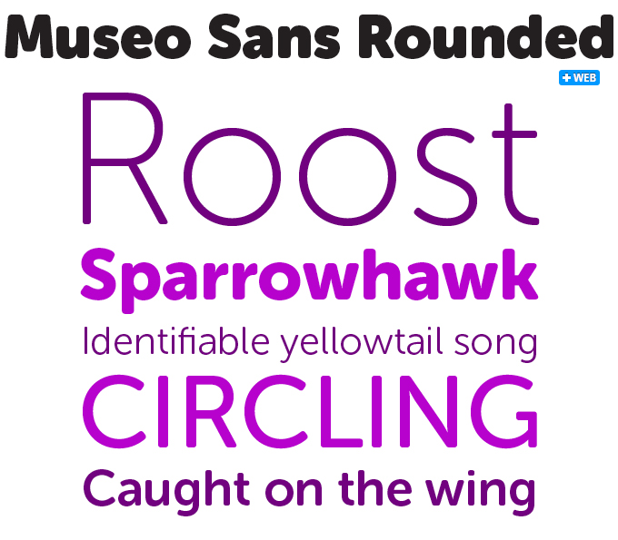
Ever since webfonts began influencing the look and feel of hundreds, and then thousands of websites, Exljbris’ Museo series has been all over the place. This new variety is likely to become as successful as its older siblings. Museo Sans Rounded is a softened version of the Museo family’s best-selling variant, Museo Sans. While the lighter versions are just that — a sans with rounded corners — there are some interesting modifications in the heavier weights. 900 and 1000 especially (Museo weights are numbered, not named) are inspired, cuddly varieties of one of the world’s most popular typefaces today.
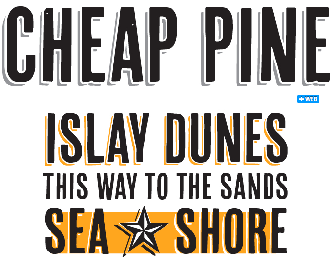
When wood type became the technology of choice for posters advertising shows and trade fairs in the nineteenth century, specialized manufacturers cooked up some really weird and picturesque letterforms. But besides those wicked fat face, egyptian and ornamented letters, printers always liked to keep some normal-looking narrow sans serifs ready for those lines of text that simply had to be there without making a spectacle of themselves. That is the kind of wood type that HVD’s Cheap Pine is inspired by. The font contains arrows, hands, stars and other special glyphs available through the OpenType ligatures feature. You can use Cheap Pine Sans & Cheap Pine Shadow in separate layers to create colored shadows.
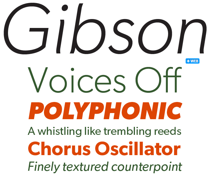
Gibson is a humanist sans-serif designed by eminent Canadian type designer Rod McDonald to honor John Gibson, one of the founders of the Society of Graphic Designers of Canada. Its roman is open and clean yet friendly, a kind of humanized Avenir. But its remarkable warmth and swing comes mainly from the italic, which has subtly bent stems and a wonderful roundness. This is a great basic font for students and budding designers: the eight-font family is available for a token price to make it affordable to all, hoping to raise awareness about type piracy. All the revenues from sales will be donated to the GDC.
Text family of the month
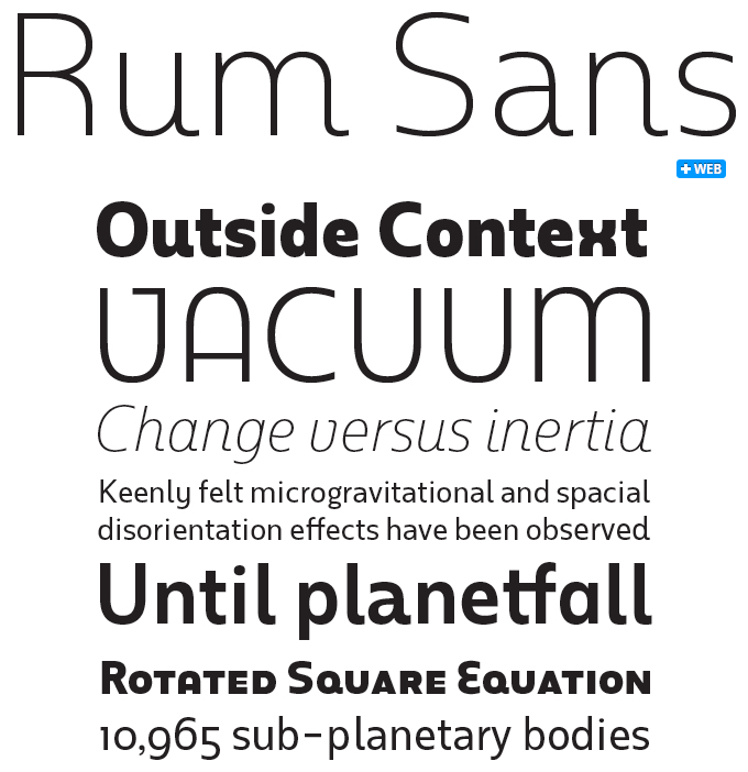
Good things are coming out of Denmark these days. Like last month’s Ovink, this month’s text face was designed by a young female designer based in wonderful Copenhagen. Trine Rask already had some outstanding typefaces on MyFonts: the beautifully crafted text family North, the chic, self-connecting Covergirl and the chubby Rum. That last ultra-fat display type became the point of departure for this new text family, which appropriately is called Rum Sans.
The name Rum has nothing to do with booze: rum is Danish for space or room. The name refers to the design process, as the typeface was designed from the inside out — the letters were formed around its characteristic counters or inner shapes.
Rum feels roomy: open and wide, but not exaggeratedly so. Lucid, supple and contemporary, this typeface will lend character and clarity to anything from shop interiors and designer brands via museum catalogs to web shops. With small caps, multiple sets of numerals and much more, it’s ready for the most demanding typographic job. Its repertoire of slightly eccentric alternates (such as the rounded ‘E’ and ‘A’) will add a touch of Deco to the décor. In short — a beauty.
Follow-Up
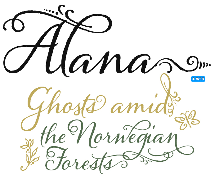
Named after the designer’s younger sister, Alana is the latest addition to Laura Worthington’s library of spirited script faces. It has continued to be a success since its release about two months ago, and so we revisit it here, together with some other fonts by Laura that you might like. Natural-looking and confident, Alana strikes a nice balance between a casual and a formal script face. Based on hand lettering, it indulges in elaborate swashes and ornaments without losing its friendly character and slightly nonchalant look and feel. We recommend OpenType-enabled design software to get the full effect of Alana’s features.
If you like this typeface, you may like to read the interview with Laura Worthington we did last year, and check out some of her other fonts:
Yana
Yana is the first step in a work-in-progress that will eventually become an extended type family. The basic font has three sizes of capitals — normal, small and petite. Yana is loaded with flamboyant swash initials, accommodated in two separate swash caps fonts. OpenType-enabled software recommended!

Liam
Laura likes to name her fonts after friends and family — Liam is dedicated to her “wonderful nephew”. Liam is a playful, hand-lettered serif typeface that bounces off the page with its exuberance and spontaneity. Liam features 130 alternate letters and 52 illustrated ornaments to complement the typeface.
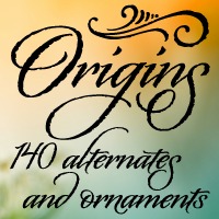
Origins
Origins is Laura Worthingtons’ biggest hit so far — a semi-connected calligraphic script with a confident flow. Based on hand-lettering with a crow quill pen on parchment paper, it has natural, rough outlines that contribute to its subtly antiquated feel.
Sponsored Font: Beau Sans Pro
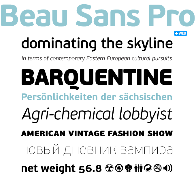
Beau Sans Pro from Parachute was inspired by Bernhard Gothic, designed by Lucian Bernhard in the 1920s. Its first incarnation, named Traffic, was a minimalist text typeface with details drawn from Bauhaus typography. A drastic makeover by designer Panos Vassiliou resulted in Beau Sans Pro. Although the modernist influences are evident, there is hardly a trace of Bernhard’s original left in Beau Sans — a contemporary sans-serif with a distinct personal style. The family comes in a generous range of eight weights with true italics, several styles of numerals and a large number of useful pictograms. It supports Latin, Greek and Cyrillic simultaneously.
Have your say
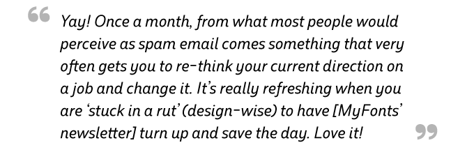
— Jak Ruby, Head of Design, Blackwell Print, Great Yarmouth, UK
April 2011
Your opinions matter to us! Feel free to share your thoughts or read other people’s comments at the MyFonts Testimonials page.