
There are many ways of looking at typefaces. Most of the time we’re not even looking at all: we just read. That’s what good type designers keep in mind when they labor to add something meaningful to the huge arsenal of available typefaces. Just like chairs or shoes, fonts can be a means of self-expression or a way to make the world prettier (that’s why people keep thinking of new chairs, shoes and fonts) but their goal first and foremost is to perform a well-defined task — in the case of type, it’s to give people access to a written text. But contrary to popular belief, type is not invisible. It’s a kind of packaging for texts: it carries a subtle message about its content and may bring the reader into a specific mood. The bigger it is, the louder the message. Get ready for yet another selection of popular, recent typefaces that whisper, ask, or shout: “Look at me!”
This month’s Rising Stars
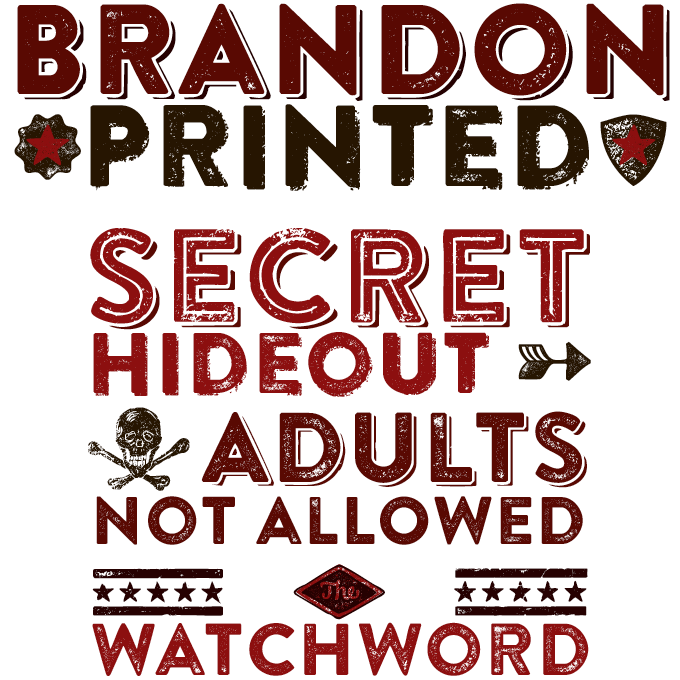
Brandon Grotesque by Hannes von Döhren has been one of MyFonts’ top 5 Best Sellers for years now. As the face is so popular, both in print and on the web, it’s no wonder that there is a demand for new varieties. While Brandon Text, published a year ago, was a modest face optimized for body text, the new Brandon Printed explores the more exuberant end of the spectrum. It convincingly mimics how Brandon would look in (rather careless) letterpress printing, or when turned into rubber stamps. As it is capitals-only, the lowercase positions are used for the same letter but “printed” differently, so that there can be some natural variation when a letter appears twice in the same word. A set of Extras (dingbats, arrows and ornaments) completes the family, allowing users to create leaflets, posters and titles with a look that’s equal parts 1880s poster, 1920s Deco and 1970s punk, all done with twenty-first century technology! The family is 70% off until March 1, 2014.
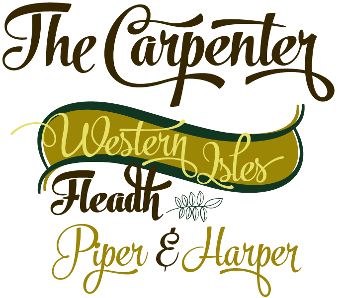
With admirable regularity, Emil Karl Bertell at Fenotype has been publishing a new display family once every two months or so, gradually evolving to higher levels of style and sophistication. Like many other type designers, he frequently returns to his own earlier designs to re-examine the underlying concepts and their possibilities for further development. The Carpenter is loosely based on his 2012 release Mercury Script — showing more flair and offering a wealth of self-assured swashes and alternates. It’s best used in combination with an OpenType-enabled design application. The Carpenter comes in three weights, with a series of lovely ornaments, patterns and pictograms, making it a versatile and easy-to-use script font for creating ambitious headlines, logos and posters with a custom-made feeling. The Carpenter is 35% off until February 21, 2014. For the best price, purchase the complete family!
Text families of the month
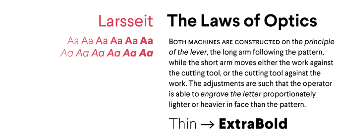
Since joining MyFonts in December 2013, Swiss foundry Type Dynamic has published four sans-serif families that mix modernist references with contemporary typographic savvy. Larsseit is their most successful family to date. With some Neuzeit Grotesk and Avant Garde Gothic in its genes, it offers an interesting mix of shapes, excellent legibility, broad language coverage and typographic sophistication. Also, check out the studio’s latest, a humanist sans called Revisal.
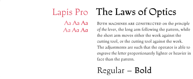
The late Jim Rimmer combined great technical skills with a unique talent for drawing highly original letterforms. Lapis is a striking text- and display family informed by an eclectic mix of influences — from Goudy’s individualist types to European slab-serifs. Canada Type’s Lapis Pro is a lovingly made reworking of the Rimmer Type Foundry’s earlier version, fine-tuned and expanded to include small caps, alternates, ligatures, six kinds of figures, automatic fractions, and more.
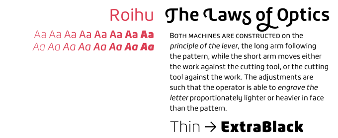
As this month’s selection shows, text fonts don’t necessarily have to be traditional or bland. With its spurless joints between stems and curves, Roihu from Mika Melvas has a clean, techie, almost futurist look. But its readability in long-form texts is fine, and it offers all the typographic equipment needed for demanding editorial work. On top of that, the ample set of swashes — rather unusual in this style of font — offers countless possibilities for custom headlines and logos.
News Round-Up
In this section we pick out interesting news snippets from MyFonts’ own kitchen and from the greater world of fonts, lettering and typography.
Change is good
MyFonts has made a few changes to the website. There’s a new header, in which the old dropdowns have been replaced by simple links, giving direct access to the most frequent destinations. All the rest has been relocated to the footer: links to the blog, information about webfonts and the newsletter archive, and info for aspiring foundries.
 We may have caused you a few moments of confusion (sorry about that!) but we hope you’ll agree that daily navigation has become more transparent, and the website more lucid.
Webfonts at MyFonts

All of the top four Rising Stars fonts are available for licensing as webfonts. Visit Webfonts.info for HTML and CSS versions of this month’s Stars, plus lots of articles, resources and a showcase of web typography in the real world.


ColophonThe Rising Stars nameplate is set in Auto 3 and Proxima Nova Soft. |
Subscription info
Had enough? Unsubscribe immediately via this link: To change your email address or email preferences, log into your MyFonts account and edit your Account Settings. Want to get future MyFonts newsletters sent to your inbox? Subscribe at: |
Comments?We’d love to hear from you! Please send any questions or comments about this newsletter to [email protected] |