
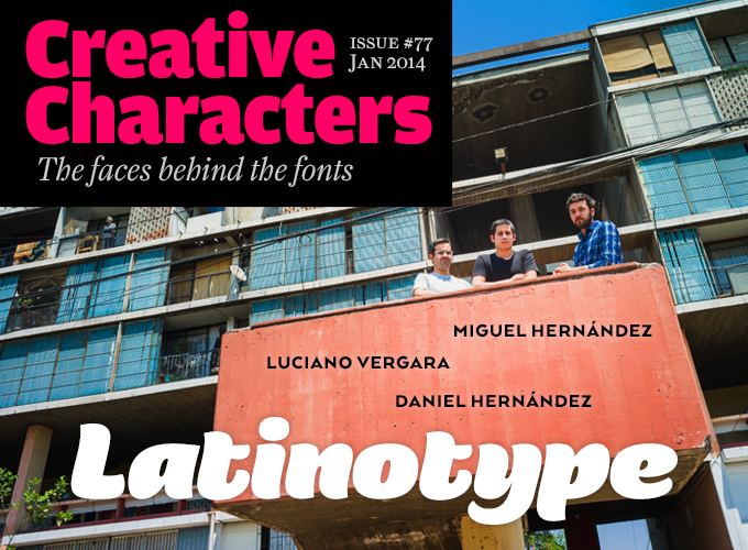
Photo by Sergio Recabarren
Based in Santiago, Chile, Latinotype has been one of the most successful foundries on MyFonts in recent years. Their type library is a rapidly growing collection of typefaces in a wide array of genres. They specialize in colorful display and script faces, but have recently focused on sophisticated text faces as well. The foundry is owned and managed by a trio of type designers, two of whom have the same family name but are unrelated: Miguel Hernández, Luciano Vergara and Daniel Hernández. Yet Latinotype has worked with about a dozen talented, young designers and hopes to welcome more. Meet three of the most productive type designers in Latin America.
|
The first fonts released under the Latinotype label came out in 2007. How did the foundry come about? The name was introduced by Miguel Hernández when he released the typeface Mote and launched the Latinotype.com domain for the occasion. The website had its own little shop and can claim to be the first digital foundry in Chile. The name Latinotype referred to a font collection called Latinopack, a set of pixel fonts based on pre-Columbian scripts that Miguel had designed for Atomic Media (the foundry of Matthew Bardram, who’d also published Susan Kare’s famous screen fonts done for Apple). Like Latinopack, the Mote typeface had a local flavor — it was the authorized digitization of vernacular writing by the Chilean sign painter Juan Cadena. And how did the foundry develop from there? In 2008 Miguel was joined by Luciano Vergara, and a new website was launched ready for Tipos Latinos, the Latin American biennial of type design. We put a lot work into improving the presentation of our fonts as well as coming up with sound licensing models; we built up a small typeface library that was exclusively sold through our website, and began inviting other designers to participate. 2011 was a key year for Latinotype. We were joined by Daniel Hernández, who brought in new fonts as well as his experience of having worked with Sudtipos. We also accepted your invitation to distribute via MyFonts, which led to us committing ourselves more seriously to type design — to view it as a realistic option as a full-time job and not just a hobby. The company was then officially incorporated and got the support of CORFO, a program of the Chilean Ministry of Economics. We also brought out a printed font catalog. The enthusiastic reception our fonts received from MyFonts’ customers was a wonderful surprise. The name “Latinotype” seems to imply a strong emphasis on cultural identity. What are the main characteristics of Latin American visual and typographic culture? There is a pre-Columbian visual idiom in Latin America, a heritage that is part and parcel of our cultural identity, based on the written language that existed before Columbus and the Spanish conquests, and the subsequent arrival of the printing press. This heritage was ignored during the development of graphic design in the Americas and had no influence on type design in Latin America until the advent of computers and the Internet. Many prominent type designers of the digital age began researching this heritage of written language — for instance, Gabriel Martínez Meave in Mexico, Rubén Fontana in Argentina and Francisco Pizarro Gálvez from Chile designed typefaces that reflect that these investigations. It is clear to us, however, that Latin America does not have a typographic tradition in the way it exists in Europe or the United States; in fact, until recently all the fonts used here came from those places. This has dramatically changed during the past few years thanks to the proliferation of type designers from Latin America. As for us, not having a long-time tradition in type design implies that we can work without the burden of the past — very freely, with no fixed paradigms and without fear. Bringing all this together, to design eclectic typefaces and to generate a new mix of styles, just like this is happening in other fields of Latin American culture such as art, music, and so on. It seems that within typography in Latin America, Brazil and Argentina have played leading roles. How would you describe the position of Chile in this respect? In the academic world there have been several important Chilean contributions to the discipline, including the text book Educación tipográfica by Francisco Gálvez, which has been published in Chile and Argentina and was one of the first books of its kind in Latin America. Also, there was an important website called Tipografía.cl; the project was founded in 2001 by designers Kote Soto and Tono Rojas, who are now part of the design group El Cartel; it was one of the first of only a few typography blogs and download sites in the region. There is also Juan Pablo De Gregorio’s blog Letritas (“Little Letters”), on typographic experimentation and analysis. The type design course at the Universidad Católica was the first specialized course in type design in Latin America. As for type design itself, we should mention the duo Francisco Gálvez and Rodrigo Ramírez of the FrescoType studio, whose work has been a catalyst for the growth of our discipline in Chile and Latin America; one of their greatest typefaces is Australis, which won Gold in the Morisawa Awards 2002. There have been other initiatives as well, such as Proyecto Demo, a project that helped create collaborations and friendships between type designers in Argentina and Chile. |
Trend
Trend by Daniel Hernández and Paula Nazal Selaive is Latinotype’s contribution to the latest craze — “chromatic” fonts for layering and multi-colored effects. More so than most recent entrants into the genre, Trend is intended as a complete package for designers, with Sans and Slab variants, slanted forms, ornaments and a complementary hand drawn family, Trend Hand Made. Posters, menus, blackboards and book jackets will all gain a dramatic lift with the depth offered by Trend. Arquitecta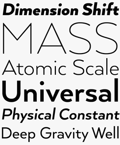
Taking the principles of geometric modernism, but interpreted through a humanist lens, Arquitecta is one of Latinotype’s current crop of releases doing very well in our bestseller charts. That humanist angle makes Arquitecta an interesting and credible choice for extended text settings — which is not always something we can say about typefaces based on modernist ideals. Comalle
Comalle by Juan Pablo De Gregorio is a heavy script that, while acknowledging an origin in hand- lettering, doesn’t attempt to be a literal reconstruction of any particular style or tradition. Its thick forms are intended to create a dense typographic texture for maximum impact on the page. If you read Spanish, check out De Gregorio’s blog Letritas. |
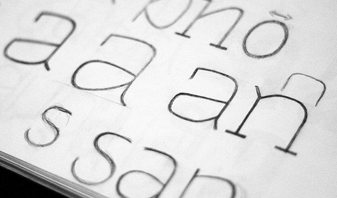
Pencil sketches by Luciano Vergara for the slab serif typeface Schwager.
|
Across Latin America, the developments in type design and typography have been amazing these past ten or fifteen years. Could you mentions some of the factors that have led to this growth? We think there are several factors. A crucial contribution to promoting type design was made by Rubén Fontana in Buenos Aires through his now-defunct magazine tipoGràfica, as well as the Bienal de Tipografía Latinoamericana which he organized (now called Tipos Latinos). More generally, the increasing number of lectures and seminars, such as Proyecto Elemental in Chile, were fundamental in establishing a network of contacts and friendships, and sharing information between people working in the field across Latin America. The development of type design as an undergraduate or graduate program in universities in Argentina, Chile, Mexico and Brazil has been very influential, as these were the forerunners of specialized education, and catalysts of the growth of the discipline in these countries. Access to information through the Internet has created great opportunities; it allows anybody to actively participate in communities where information is shared and take part in a kind of collective learning process. The three partners in Latinotype got to know each other via forums such as Typophile and Flickr — platforms that were very important before Facebook and the boom of social networks — and allowed us to exchange ideas, sketches, technical information, tutorials and literature and track our own growth in this discipline. We are particularly grateful to our friends at Typophile. The emergence and growth of the digital market, which allows small foundries and independent designers to have access to the global market easily and on equal terms, a market where it’s the user who decides. Many foundries who work with a team of designers have some kind of program or plan, just like a book publisher. What would you say is Latinotype’s program, or your goals for the next couple of years? We don’t work with an annual program, but we always have a schedule of typefaces to launch at least two or three months ahead. We try to produce consistently so that we can release two or three font families per month. This is only possible because we work with a large number of designers, and we are always open to working with more. We also like to pass on the experience and knowledge we have gained in workshops and lectures across Latin America, and to find new talent that way. We want to continue growing and adding people to our team, because we believe that the discipline in Latin America has a lot of potential to grow and reinforce its position. Do you have meetings about what styles and genres to work on next, or does that depend on individual decisions? These are decisions made by the type designer(s) working on a specific font. Each designer has the freedom to make creative proposals within the technical standard which we have established. The three of us act as an editorial committee, and each member works with a group of designers and collaborators. This has resulted in different teams, each of which directly supports new designers and comes up with proposals that are then reviewed by the three partners. In our work with designers, we look at their needs, while keeping an eye on emerging trends and styles of fonts. And we try to come up with products that do not yet exist within the retail market. As we work from different physical locations, we have regular informal meetings where we exchange information, discuss new projects, and talk about how to improve the design process, naming and concept of each font family currently in production. |
Grota Rounded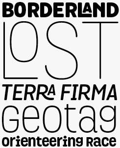
Grota is a unicase family: that’s typographic jargon for a typeface that mixes upper- and lowercase lettershapes of the same height within one alphabet. Grota Rounded, shown here, is its softer, more informal sister. Both versions are very expressive with a gestural character inspired by hand-lettering, and come in six weights ranging from thin to black with companion italics. They’re ideal for branding, posters, logos, and headlines. Ragazza Script
Ragazza Script started life as a college project for Guille Vizzari, whose Esmeralda Pro was a Rising Star in June 2013. Ragazza is a very different kind of ornamental script from the more classically-informed Esmeralda, and like Comalle, doesn’t reference a specific calligraphic model while clearly still part of that expressive world. To access the swathe of possibilities offered by the huge character palette included with the font, OpenType-capable software is recommended. |
|
You keep a keen eye on current trends in the typographic market, which is underlined by the name of one of your most successful fonts, Trend. The ideal thing is, of course, to be trendsetters, not trend followers, and you’ve managed that several times. Do you discuss strategies to achieve that? It is not so easy to set a trend. Certain fonts seem to achieve or enhance trends — as is the case with chromatic layering in the Trend family. As for our strategy, we believe the most important thing is to have a large and varied production of fresh typefaces and to always have at least one font in the current rankings. As Picasso said, “Inspiration exists, but it has to find you working.” In our case: if we manage to set a trend, it is by working hard. The teamwork helps us to constantly generate new energy and new projects, making sure we’re always pushing on, just like an athletics contest. Some fonts have a lot of research invested in them, are thoughtful and have very clearly formulated objectives; others, often by new designers, have the naivety and freshness of early work, with errors as well as positive surprises — a naivety that is often well received by users. What kind of users do you have in mind when designing your typefaces? We work with young independent designers and creative directors in mind. We look at a lot of design work and try to meet their needs, for example most of the display fonts include dingbats or ornaments so that designers have all the typographic tools they need to complete the job. We want to reach as many people as possible, as long as they value our work. Customers of our fonts at MyFonts show their appreciation for our work. That’s a different feeling from releasing a typeface without wanting any remuneration in return; the appraisal for free fonts is simply not the same. We can probably say that the goal of our project is that our typefaces are used on a massive scale, without ruling out elite companies — we love it when a big company uses our fonts. We design for graphic designers, not for other type designers, and generally do not seek prestige. This work is our passion, but it is also our job and we understand it as such. Over the last year or so, there’s been a tendency on MyFonts to allow foundries to offer new fonts at spectacular introductory discounts, and you have not shied away from that. What is your opinion about extreme promotions? For some time now we have been able to ascertain that this strategy does generate a boost in sales volume. Many type foundries from different countries, including some established companies, have been able to position font families at their launch with a temporary discount offer as an incentive for customers. This has changed the market on MyFonts, and for font retail in general. One thing that has happened is that this strategy allows us to reach customers with smaller resources, such as those from Latin American countries. Extreme discounts create new incentives for markets that can not afford to acquire type families at $300 or more. We have seen a considerable increase in orders from countries that hadn’t bought fonts previously. Nevertheless these deals involve a risk. If a font family is accepted by users, you can be sure that you will have a high amount of downloads; but if it is less successful you have a problem, because at such a low price you need many downloads to recover the time you spent of the design. In other words, a low introductory price is no guarantee for success. |
Mija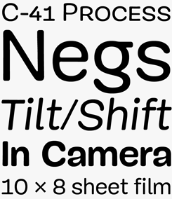
Miguel Hernández has summed up Mija very nicely on the typeface’s family page: “A grotesk vernacular handmade typeface whose imperfections make it perfect.” It’s not so rough as that description suggests, more robust and extremely tolerant, making it very useful for display purposes. The name is a contraction of two Latin American Spanish words, Mi Hija, which translates as my daughter — although, as Miguel explains, it’s a general term of endearment from an older person to a girl or young woman. Schwager Sans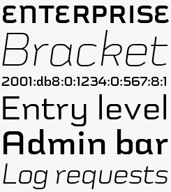
Schwager Sans by Luciano Vergara is Latinotype’s most recent release. A fresher take on the more industrial flavor of its older sibling Schwager, it shares that typeface’s sense of sporty masculinity, and will be well suited to branding and editorial projects that demand a somewhat rugged edge. A number of alternate characters (accessible with OpenType enabled software) allow for finely-tuned headlines and logos. The name of the typeface refers to Federico Schwager, a coal mine owner from an English family who was one of the figureheads of that industry in Chile. |
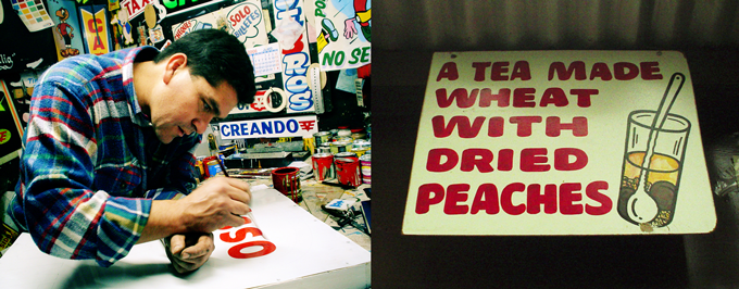
Representing local visual identity, the work of sign painters like Juan Cadena is a source of inspiration to Chilean type designers. Photos by Felipe Pimentel.
|
Your biggest success at the moment is Arquitecta, a co-production between Daniel and Miguel. Can you describe the collaboration process? In conceiving the face, did you look at specific models from the modernist past? Arquitecta is the first product of a special interest for the two of us — neutral and versatile typefaces with a more classic character. We’re quite eager, as a duo, to dedicate ourselves to this kind of project — so much so that we are already working on a second typeface in this line. At the moment we have weekly face-to-face meetings to define the DNA of the design. For Arquitecta, we discussed basic decisions such as the x-height and the use of long ascenders, starting with the Thin and Black extremes, then moving on to a clean and neutral Regular weight. For each step we made piles of laser prints to correct errors; that made us realize there was a need to add inktraps. Simplifying curves and terminals took us about three months of hard work, during which each of us would contribute the results of his individual sessions via Dropbox. The project was also a reason to think about a more professional, more complete character set for our fonts. We’ve noticed a need and demand from designers for geometric sans-serif typefaces, especially related to architectural projects, where typefaces from the Bauhaus era, such as Futura, or referring to Art Deco, such as Kabel, are often used as icons of modernism. We believe that there is still a lot of room to develop new alternatives for digital media, informed by those modern classics yet with a more contemporary look. Luciano, your most recent font is Estandar, which simply means “standard” or “norm”. Could you say something about the thinking process behind the family, and the kind of use you have in mind? Estandar is related to my earlier fonts Antartida and Moderna. It adds humanist features to grotesque and geometric typefaces, and adds characteristics borrowed from the classics of Swiss modernism, DIN or the futuristic work of Aldo Novarese. Mixing all of that with a certain naivety, it brings a fresh touch to an old model. A European designer made a comment to me about the similarity of Antarctica with fonts that were often used in his childhood, so for him, reading these fonts generated a certain feeling of nostalgia. I tried to give the font a vintage touch in the style of the lettering on antique enameled signs that you see in reality TV shows like American Restoration or American Pickers. So the typeface was designed to emulate an impression of typography on vintage signage. Earlier in this conversation, you said that you’re open to proposals from young designers. I’m sure many will be interested. What kind of work are you most interested in? Do these people have to be from Latin America? And finally: do you want to receive complete fonts, or can you assist people in bringing an idea to completion? Yes, we are certainly open to working with more people, we hope to both share our knowledge and learn from it. Some of our new collaborators come with fonts that are almost ready, others with proposals that are in an early stage. We support both types of work — what counts is the potential of the idea. Of course, it will take more time to work with someone who is starting but if the project is interesting we will support it. Latinotype is nourished by the work of its collaborators, so they are an essential pillar of our foundry. We actually do not want to limit our project to Latin America. We hope to grow and so we are open to working with designers outside of our continent in order not to limit the possibilities of collaboration and the growth of the team. The name Latinotype is strongly linked to Latin America, but why not also the Latin alphabet? Thanks! We’re looking forward to seeing your font collection grow and grow! Miguel, Luciano and Daniel would like to extend a big “thank you” to their friends and fellow type designers who believe in Latinotype and its sister foundry Los Andes: Jorge Cisterna, Jko Contreras, Guisela Mendoza, Guille Vizzari, Javier Quintana, Francisco Gálvez, Paula Nazal Selaive, Juan De Gregorio, Eli Hernández and Enrique Hernández. |
Ride My Bike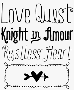
Playful and irregular, with a cheeky, street-smart attitude, Ride My Bike is a lively take on the skinny, hand drawn genre that was particularly popular a year or two ago (it made our Best of 2012 list). There’s a wealth of OpenType possibilities included in the Pro version — including initial and terminal forms, alternates and dingbats — but for those without access to OpenType capable software, there’s Ride My Bike Essentials, a more basic version that will be very attractive to web designers in particular. Romeo & Julieta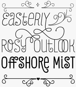
Romeo and Julieta are a pair of complementary, hand drawn font families with plenty of ornamental flourish. Romeo is the heavier of the two, but both are interchangeable and will work particularly well together in situations with different text sizes, but where the designer wants to achieve an evenness of typographic color. To get the most out of these fonts, we advise using OpenType-friendly software. Like Ride My Bike, however, more basic versions are available for anyone without access to the appropriate software. |
MyFonts on Facebook, Tumblr & TwitterYour opinions matter to us! Join the MyFonts community on Facebook, Tumblr and Twitter — feel free to share your thoughts and read other people’s comments. Plus, get tips, news, interesting links, personal favorites and more from MyFonts’ staff. |


|

|
Who would you interview?Creative Characters is the MyFonts newsletter dedicated to people behind the fonts. Each month, we interview a notable personality from the type world. And we would like you, the reader, to have your say. Which creative character would you interview if you had the chance? And what would you ask them? Let us know, and your choice may end up in a future edition of this newsletter! Just send an email with your ideas to [email protected]. In the past, we’ve interviewed the likes of Michael Doret, Laura Worthington, Jonathan Barnbrook, Rob Leuschke, David Berlow, Ronna Penner and Jos Buivenga. If you’re curious to know which other type designers we’ve already interviewed as part of past Creative Characters newsletters, have a look at the archive. |
ColophonThis newsletter was edited by Jan Middendorp and designed using Nick Sherman’s original template, with specimens by Anthony Noel. The Creative Characters nameplate is set in Amplitude and Farnham; the intro image features Arquitecta and Comalle; the pull-quote is set in Roble Alt; and the large question mark is in Farnham. |
Comments?We’d love to hear from you! Please send any questions or comments about this newsletter to [email protected] |
Subscription info
Had enough? Unsubscribe immediately via this link: To change your email address or email preferences, log into your MyFonts account and edit your Account Settings. Want to get future MyFonts newsletters sent to your inbox? Subscribe at: |
Newsletter archivesKnow someone who would be interested in this? Want to see past issues? All MyFonts newsletters (including this one) are available to view online here. |