|
One of the biggest changes in the world of type and typography is a geographic one. A sector that was once was almost exclusively in European and North American hands, is now truly global — MyFonts sells typefaces from six continents. The typographic rise of Latin America has been especially remarkable, and this month’s newsletter is proof of that. Of our four Rising Stars, three come from South America. They combine a strong sense of purpose and tradition with the charm and novelty that we have come to identify with fonts from that part of the world. Europe, true to its tradition, is strongly represented in the text font section. Enjoy!
|
|
|
This Month’s Rising Stars
|
|
|
|
|
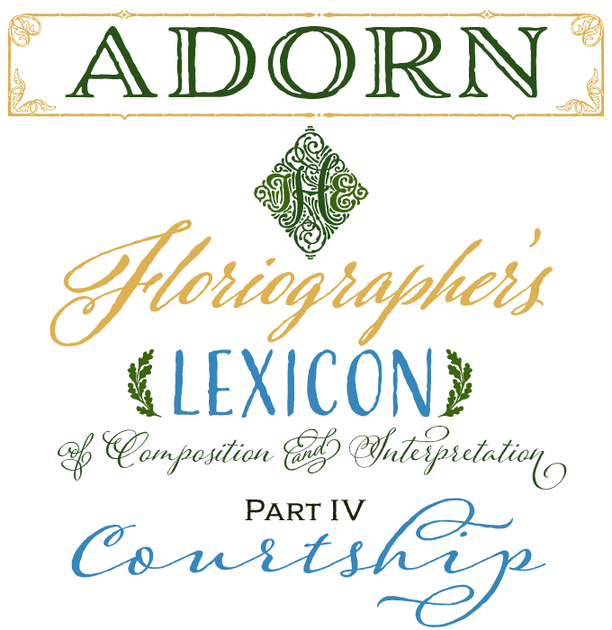
About a year ago, lettering artist Laura Worthington hit gold with Charcuterie, a set of highly distinctive yet compatible fonts. With Adorn, she takes the concept a giant step further. Adorn is a huge suite of lettering typefaces that work together harmoniously, despite their diversity. Its scope is impressive, offering seven display fonts, four different scripts, monograms, ornaments, illustrations, banners, frames, and catchwords. All with a hand-drawn feel, all striking a sensible balance between the immediate attraction of spontaneous lettering, and smart usability.
Anyone in the business of helping others celebrate life — from florists and tailors to event planners — will find something appropriate in the Adorn collection, while graphic designers will find the suite suitable for prints, invitations, wine labels and much more.
The jewel in the crown of this collection may be the three monogram design styles: Adorn Solo for one letter, Adorn Duo for a pair, and Adorn Trio for the classic three-letter monogram.
|
|
|
|
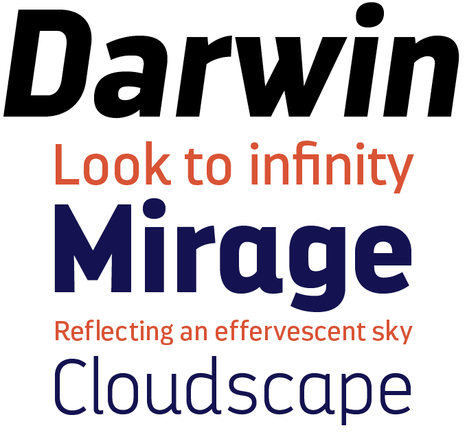
A skeleton based on a rounded rectangle, open and simple shapes: Darwin from Los Andes is a sans-serif in a popular and densely populated genre. But as is often the case in these categories, it has some characteristics that make it stand out from the crowd. Designer Mendoza Vergara had provided charming solutions for specific letterforms, including ‘k’, ‘R’, and ‘W’. In the spicy Alt version, informal details such as those in the top stroke of ‘A’, the round shapes of ‘Y’ and ‘y’, the bottom-right terminals of ‘a’, ‘d’, ‘u’ and so on, lend an attractive rhythm to text settings. Each of these sub-families comes in five weights with matching italics, resulting in a versatile family of 20 fonts in total.
|
|
|
|
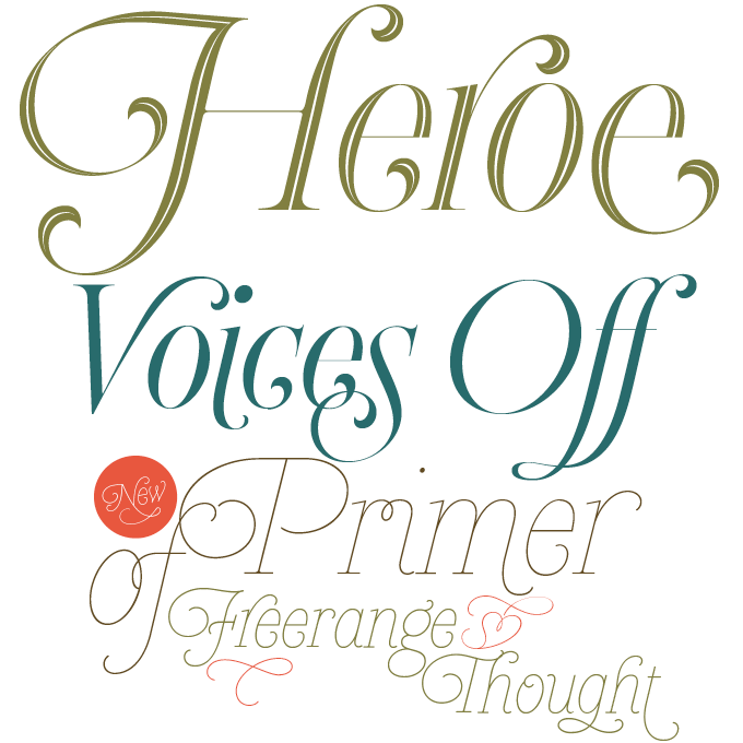
Presented on the occasion of last month’s interview with Maximiliano Sproviero, Heroe (Spanish for hero) is another example of the Argentinian designer’s knack for appropriating and mixing historical styles. It is a return to the genre that brought him his first successes in Reina, Breathe and Aire. A cursive Didone with a highly ornamental character, Heroe will be equally at home making a grand statement on invitations and posters as it will performing more modest display duties in magazine layouts, adverts or on packaging. Available in solid, inline and monoline versions, Heroe offers a wide range of choices for elegant and and sensuality display design. While the Pro styles contain the full set of decorative characters, the cheaper Standard version only has a basic set.
|
|
|
|
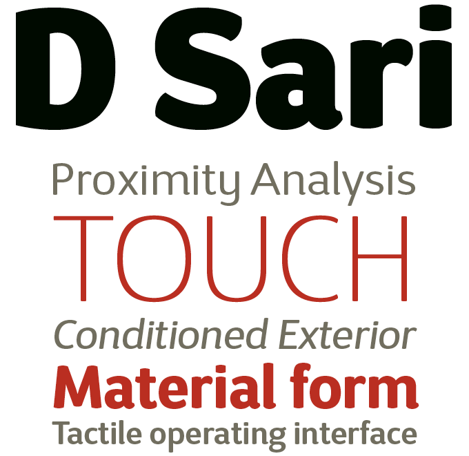
D Sari from Latinotype presents an eclectic mix of references: it has the friendliness and familiar feeling of a neo-humanist sans, with the rounded terminals adding a soft and cuddly feel. With eleven weights plus matching italics, the family is equipped for a wide variety of tasks, being especially well-suited for advertising, branding, packaging and brochures. The middle weights work very well in longer texts; the lightest and darkest version on both ends of the spectrum provide striking headlines. Oldstyle figures offer additional sophistication; and Stylistic Alternates (to be used with OpenType-enabled software) give the user an additional, unconventional style within each font — almost like being given a second typeface for free.
|
|
|
Text fonts of the month
Typesetting for books, scientific magazines, or annual reports requires fonts with special qualities: excellent readability, a generous range of weights with italics and small caps, multiple figure sets (lining, oldstyle, table) and ample language coverage. We’ve had quite a impressive crop of usable text families lately, and so this month our selection comprises not three, but four recent text families.
|
|
|
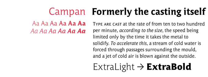
In the three years since joining MyFonts, Dieter Hofrichter of Hoftype has built an impressive library of dozens of usable, elegant text and display families in a wide variety of styles. His latest is Campan: a low-contrast face with small, triangular serifs and some built-in “swing” thanks to its vigorous terminal strokes. With 12 styles, a generous x-height, small caps and multiple figure sets with matching currency symbols, the family is well–suited for ambitious text typography. |
|
|
|
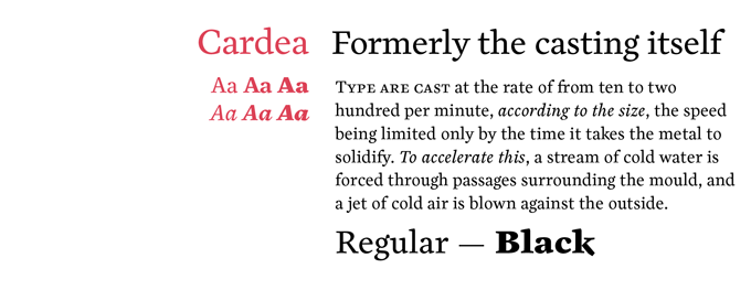
Recently released by Emigre, David Cabianca’s Cardea originated in the designer’s 2003–04 MA Typeface Design experience at the University of Reading. Cardea mixes classical and contemporary characteristics, resulting in an effervescent text face that balances strong contrasts and crisp edges with clarity and communicativeness. The result is a typeface with a sculptural feel that recalls the muscular work of artists like Arne Quinze or Mark di Suvero. The full version comes with small caps, medieval figures, and more typographic features. The very affordable Cardea Basic fonts offer a less fanciful character set.
|
|
|
|
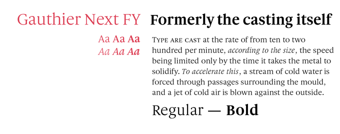
The original Gauthier FY by Jérémie Hornus and Alisa Nowak was published right after we interviewed them and other members of their remarkable “collaborative foundry” Fontyou last year. They have just released Gauthier Next FY, an expanded version with a larger character set that now includes small caps; so finally, the Renaissance-inspired Gauthier is a fully fledged text family. Big x-heights and modest capitals make it highly legible and unobtrusive; the lovely and detailed italics add extra flair.
|
| |
|
|
|
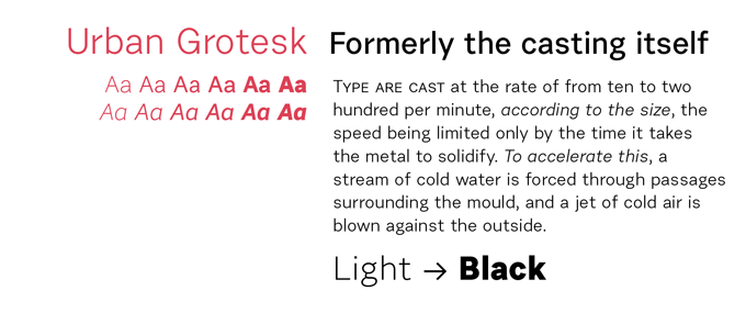
Designers specializing in contemporary editorial work (think magazines, art and architecture catalogs) are constantly on the look-out for readable sans-serifs with a difference. What is often wanted is a grotesque with a bit more personality than your standard advertising gothic or Swiss-flavored modernism; and Urban Grotesk by Tomáš Brousil provides just that. Among the characteristics that make it stand out are the way rounded strokes connect to the stem, a round dot, a low and economic uppercase, generous numerals. The consistent width proportions of the characters result in a uniform text color on a page, and airy metrics help legibility in shorter texts.
|
|
|
News Round-Up
In this section we pick out interesting news snippets from MyFonts’ own kitchen and from the greater world of fonts, lettering and typography.
|
|
Smashing Conference, New York
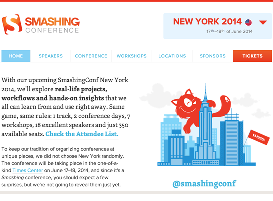
Smashing Conference is a get-together of Web designers focusing on real-life design problems and intelligent workflows. After three highly successful conferences in Europe, the event is now taken to a truly international level with the first North American edition. The basic formula remains unchanged: one single track (instead of running around between different rooms and venues), two conference days, seven workshops, 18 excellent speakers and just 350 available seats. MyFonts is Gold sponsor. The conference takes place next week, June 17–18, 2014, at the Times Center in (Manhatten) New York, NY. Speakers include Aarron Walter (MailChimp), Eva-Lotta Lamm (Google, but also known for her conference sketch books), Oliver Reichenstein (Information Architects iA), Cassie McDaniel (Mozilla) and type designer Jonathan Hoefler of Hoefler & Co.
|
|
Stories of Dream and Design from Iran
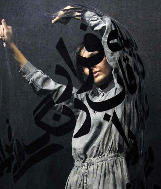
Two influential Iranian artists and graphic designers, Iman Raad and Shahrzad Changalvaee, will present their updated version of a type of traditional Iranian storytelling called “Pardeh-khani” to Seattle audiences during two speaking engagments later this June. In Pardeh-khani a narrator employs an illustrated curtain — scenes are woven together and the narrator flows from story to story using visuals to underline each important character or scene. These interactive talks will be a great opportunity to see how contemporary Iranian artists approach design and other visual art forms.
Event Details:
Two-Headed Imagomancy at the Iranian Festival: June 28, 2014 (5pm–6pm)
Seattle Center Armory
Seattle, WA 98109
FREE
AIGA artists’ talk: July 2, 2014 (7pm–8:30pm)
Tether, 316 Occidental Ave S., 3rd Floor
Seattle, WA 98104
FREE; Reserve tickets in advance from www.seattle.aiga.org.
|
|
MyFonts on Facebook, Tumblr, Twitter
Your opinions matter to us! Join the MyFonts community on Facebook, Tumblr and Twitter — feel free to share your thoughts and read other people’s comments. Plus, get tips, news, interesting links, personal favorites and more from MyFonts’ staff.
|
|
|
|
|
|
|
|
|
MyFonts Inc. 500 Unicorn Park Drive, Woburn, MA 01801, USA
MyFonts and MyFonts.com are registered service marks of MyFonts Inc. Other technologies, font names, and brand names are used for information only and remain trademarks or registered trademarks of their respective companies.
© 2014 MyFonts Inc
|
|
|
|