
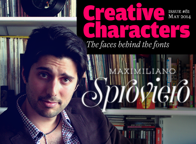
Photo © Delfina Japaz
Seldom has a type designer matured as rapidly and visibly as Maximiliano Sproviero. Having joined MyFonts with his Lián Types foundry in 2008, it took him just over two years to develop an approach of his own, mixing his interest in calligraphy with a growing skillfulness in digitizing the most challenging of curves. He began winning prestigious awards and his fonts were adopted by some of the best designed publications around. Lián Types is now among the most successful foundries specializing in script fonts and ornamented display type. Meet Maximiliano Sproviero from Buenos Aires, Argentina.
|
Maximiliano, you live and work in Buenos Aires, one of the main centers of type and lettering in Latin America. How has the city’s visual culture been instrumental in shaping you as a graphic designer and type designer? As my favorite Argentinian rock singer, Gustavo Cerati, says: Buenos Aires is “La ciudad de la furia” — the city of fury. This city has so much to offer, whether at daytime or during the night. It’s always on the move and, if you are susceptible enough, it can fill your mind with ideas. Due to the fact that typographic history in Argentina, and more generally in Latin America, is not very old, I feel that we are in the process of discovering who we are — our place in the world and how we want to be seen by others. That’s why Latin America has such a wide range of typographers with such different tastes. An example of this can be seen in our most important typeface design competition, Tipos Latinos. As for the lettering styles I prefer, unfortunately Buenos Aires has almost lost its spirit. Only a few neighborhoods, like San Telmo or La Boca, still shine with their Fileteo Porteño lettering style. However, in the last few years lots of people have started to take an interest in typography, calligraphy and lettering. Handmade letters and handcrafts in general are being rediscovered so I’m no longer seen as a “weirdo” when I say I work as a type designer! You seem to have started very early on with making letterforms. Tell us about the very beginnings. Here I must mention the calligrapher Silvia Cordero Vega. She was probably the very first person who made me understand that letters are more than just letters (and she may not be aware how much I have to thank her for). I attended a lecture she gave at the University of Buenos Aires when I was 19. She did a live demonstration of how different calligraphic tools were used. I was delighted — so much so that I started practicing all formal styles the following day. Meanwhile at college we had to design a digital font, so that was the first time I tried to mix aspects of the world of calligraphy with the world of typography — something I still love doing. But if I had to answer this question in a more “psychological” way, I would say that designing type is exactly the field of graphic design that meets my needs. I come from a family of mathematicians and engineers. As a child and as a teenager, what I loved most was mathematics and I even entered many competitions. So now I’m sure you imagine that my body is filled with genes that are oblivious of art, haha. The point is that I believe type design is the most “exact science” of the many fields that exist within graphic design. It allows me to play and express myself, but at the same time it demands concentration and a lot of responsible decisions that follow really strict rules. Sometimes, I go crazy trying to find magic formulas to make auric fields in my fonts. I’ve even read a book of maths about spirals and how they were made in order to draw some of Erotica’s curves. Thank you, Fibonacci! :-) |
Heroe
Sproviero’s latest is a return to the genre that brought him his first successes in Reina, Breathe and Aire. A cursive Didone with a highly ornamental character, Heroe will be equally at home making a grand statement on invitations and posters as it will performing more modest display functions in magazine layouts, adverts or on packaging. Available in solid, inline and monoline versions (with the monoline version also offering variants suited to smaller settings), Heroe is an essential addition to every designer’s toolkit Beatle
Beatle is the result of one of those fanciful speculations that often help type designers develop new ideas. What if Platt R. Spencer and Charles P. Zaner were born in the mid-20th century? What if they had been fans of The Beatles or Cream, instead of Beethoven or Chopin? Beatle is what Sproviero thinks those masters might have come up with, had they been influenced by the music of the 1960s, not the 1860s. “Letters shouting for peace, like a true hippie, with a lot of elegance.” |
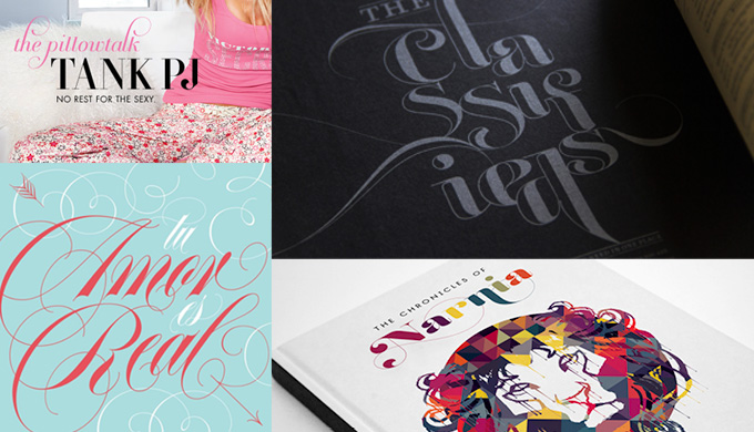
Editorial use of Lián Types fonts: Breathe used by Victoria’s Secret, designed and art directed by Megan Henry; photo art direction by Whitney Critchley; Erotica used on a magnet for local brand Diseño Crudo, designed by Maximiliano Sproviero; Reina in JustUs Magazine, creative direction Lindsay Smith; Reina on the cover of The Chronicles of Narnia, design by Josip Kelava.
|
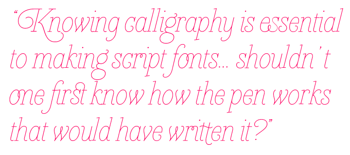
Since joining MyFonts you’ve gone through an incredible development. In just a few years you went from making rather naive calligraphic fonts to sophisticated type systems that have been praised by demanding critics, such as New York calligrapher Paul Shaw. What helped you to develop so fast? I started working as a type designer at age 20, and I guess that explains a lot. I was still a student of graphic design at Buenos Aires University and I still had a lot to learn. It took me some years to understand that, in type, small decisions are the ones which can make a design stand out among others. One important thing I understood was that it’s not necessary to break all the rules to make an interesting-looking font. In fact, that was a bad start. However, I see my past as a positive process. I really can’t complain about it. I like “hating” what I did before, it means I’m still learning. One has to do something that your public is used to seeing, and add a little twist. That’s my philosophy. To accomplish Reina and my more recent fonts, the secret was looking, looking and… looking. We designers are tough critics of what we see, not only with colleagues, but with everybody (poor them)! I think that the more you look, the more you train your eye. You can’t just stay at home waiting for it. You should go out to the streets and start criticizing. Letters are everywhere! As a complement to this, books can teach you how things should be done. Not only books about type (I recommend Typographie by Otl Aicher) but also those on calligraphy. Remember typography wouldn’t exist without calligraphy. Tell us something about your fascination for handwritten letterforms. Sometimes I consider myself a calligrapher rather than a type designer. So in addition to what I said above, I think my fast development can also be explained through my addiction (a healthy one, I think) to calligraphy. I took classes in the States with some of the best calligraphers in the world: Georgia Deaver, Carl Rohrs, Julian Waters, Denis Brown, Yves Leterme, just to name a few. My friend Rob Leuschke opened my eyes in 2010 when he told me about international calligraphy conferences. We met there and nowadays we still learn from each other. Those conferences are like heaven on earth. Hundreds of calligraphers sharing they work with such unique styles. Mouthwatering! What were the main lessons you learned from these calligraphers, and how does calligraphy influence your work in the digital realm? Designing script faces is not a game. They’re not “the easy ones”. They’re not for beginners, as some may think. I’ve seen designers who are great at doing text fonts, but the moment they try making a script font, they simply can’t. A well-made script is like a marvel you just can’t stop staring at. For me, knowing calligraphy is essential to making script fonts (and why not text fonts as well?). Of course, it’s possible to disagree! I even had a “fight” at TypeCon in New Orleans regarding this but — that’s another story. Something I’m seeing more and more often is that type designers forget about the calligraphic tool behind the font. If you’re making a copperplate font, a cancelleresca, a Spencerian, a blackletter, a more casual script, then shouldn’t one first know how the pen works that would have written it? That’s exactly what I learned from those talented calligraphers. I learned there are plenty of secrets that make a letter look amazing, and you learn these things with a tool in your hands. Once you know how the tools work, you cannot be “afraid” of designing, for instance, a lowercase ‘s’. Your decisions flow. In comparison, my very first fonts were faking calligraphy — the sin I’m now condemning! |
Dream Script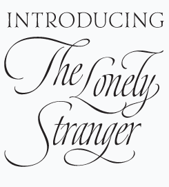
“One of my dreams as a type designer,” wrote Sproviero, “was making a good looking chancery cursive. Full of life, like [the work of] some of the best calligraphers around the world.” Dream Script was invested with Sproviero’s admiration for the likes of Julian Waters, John Stevens and Denis Brown, calligraphers who were instrumental in transforming chancery, or italic script, into a new, exciting and very fresh style of calligraphy during the past couple of decades. Having practiced chancery for several years, Sproviero created Dream Script to emulate the vigor of their work. The typeface has preserved many aspects of handmade calligraphy. “You have to look at it really close to notice it is actually a font,” says the designer, “and that was one of my goals.” Brand
Cheerful, finger-licking tasty scripts for packaging and branding have become a wildly popular species these past few years. Sproviero’s fellow Buenos Aires designers Angel Koziupa and Alejandro Paul are masters of the genre. Brand is Sproviero’s take on the packaging script face; the result is attractive and useful. The family comes in two weights, plus an Inline and a Shade version, which makes it quite versatile. It also come in two price ranges: Pro styles are loaded with huge sets of alternates, ligatures and ornaments, while Std styles have smaller character sets, with no decorative alternates. Brand is mainly intended for packaging but will also work well in papers and magazines, invitations and the like. Thanks to its many features and extras, it provides plenty of material to design a logo or poster. |
|
Yeah, those early fonts seem to come from a different designer. Have you ever considered removing them from MyFonts? Good question. Yes, I considered removing them a lot of times. Also, I think that some of my fonts which once were in your Best Sellers list need updates. Everything is now much more clear to me. And, like I said before, that means I’m growing. When I designed Valeria or Mon Amour, I never imagined they would be such successful fonts on your site. It encouraged me to keep experimenting and learning. They led me to become who I am now and that’s why I still have some affection for them today. Also, I still get tons of emails from customers who say they love those early fonts. So I keep asking myself: what should I do? I even tried to make some updates of them but they somehow lost their naive spirit (which is occasionally something wanted by customers). How do you work today? Is writing and sketching by hand an important phase before you take a font into the computer? It depends on the font and also on how I’m feeling at that moment. Sometimes, if I get really tired of the computer I start playing with ink. I let my soul “do the talking” on the paper till I see potential in some of the traces. My font Bird Script is a good example of this. I did a lot of that one by hand and it was one of the fonts I enjoyed making most. As you know, I tend to do script fonts and to me there’s nothing worse than a font which tries to emulate a flowing written style but doesn’t succeed. Many times, I print my fonts in progress and analyze the shapes to check if they are convincing, if they look real enough. And if they don’t, I grab a pencil and do them again. Many people are self-taught type designers, and when they start publishing early, like yourself, they sort of grow up in public. Others first complete an art school education, including a specialized type design curriculum, before deciding to publish anything. What do you think is the best option? Fortunately, not only designers, but everyone is training their eyes lately. This, of course, ensures a bright future for typography, but it also means that if you want to make a living out of it, you have to be very conscious of what you will be facing. I strongly believe that some years ago it was much easier to sell fonts. Nowadays, customers are getting picky and this leads us, the designers, to study more and more. However, we have to be grateful that we live in an era in which typography still has a big space for innovation. I think we are going through a kind of Renaissance, like some centuries ago. To me, publishing early is no longer a good option. I believe it’d be a waste of time unless the product is really offering something new, interesting and well done; this last term being very subjective for some people. I want to encourage students to go further if they like this amazing field. I think that the experience of attending conferences or getting a qualification in type design is like a shortcut to success. Besides the fonts you create to be used by other designers, are you interested in doing ready-made typographic designs, such as custom lettering, digital or by hand? I’m often asked to make tattoos. Many ask me to make “gestural writing” tattoos, which demand fast (and thoughtful) movements of your shoulder. Some call them whole arm movement. That is the secret to obtain some lively traces. I always warn my clients that many aspects of the final design might not be transferred correctly onto their skin. Remember that tattoos are done slowly and this style needs velocity. That can hurt! |
Live
An exuberant brush script, Live’s energetic nature is a product of the dramatic, physical gestures a designer makes as they form the letters. None of that energy is lost in the transmission to a digital version either, and a generous allocation of alternate and contextual extras help imbue the typeface with that human touch. Live will work exceptionally well for large format print jobs, and for attention-grabbing book and magazine covers, music packaging and fashion branding. Reina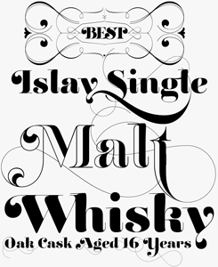
Reina is one of Sproviero’s most sophisticated typefaces. With its vertical stress and strong contrast between fat strokes and wispy hairlines, Reina is a display Didone with bells on. Inspired by the classics Didot and Bodoni, and spiced up with influences from 1960s New York magazine lettering from the likes of Herb Lubalin, Reina is up there with the most whimsical of classicist and modern-face titling faces, with traces of copperplate and Spencerian scripts. When none of its alternate characters are activated, Reina works well in medium-sized texts; when activating its OpenType capability and using the swash and decorative varieties, you get a toolkit (and plaything) for making dazzling headlines. The face won Sproviero an Honorable Mention in the 2011 SoTA Catalyst Awards: “Nicely heavy romantic letterform … great skill is shown in the detailing … an excellent feel for the correct flow of curves and displacement of stroke weight,” said the judges. |
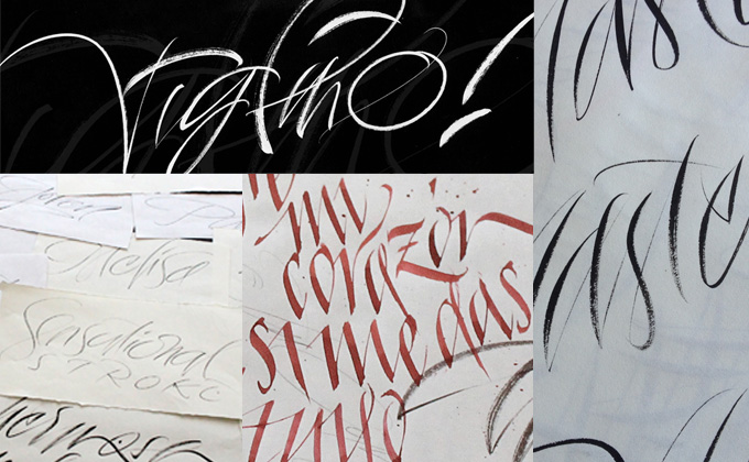
Sproviero’s gestural calligraphy with brushes and pens. Photos by Eli Higa
|
You’ve been in touch with a lot of calligraphers. I have spoken to some who think that typefaces designed to emulate or imitate hand-writing and hand-lettering is a form of competition — some really hate that kind of font. Did you ever discuss this with your masters? What’s your own opinion about it? I’ve got a funny story to tell here. There’s one calligrapher in particular who, every time I publish a new font, writes to me saying the best and the worst things at the same time. Yes, that’s possible. To summarize, he says “Congratulations, that new one is unbelievable beautiful but... Stop it! Please, I hate you!”. I think this is a delicate question though. When I make fonts I take all those good things I learned from them and try to make my own style. I’d never copy them, that’d be so ungrateful of me. When writing the text for Dream Script I named all my masters in the description, and I did that to thank them and to tell the world they should be aware of the insanely good work these calligraphers do. Julian, Denis and John wrote to me saying they really liked the font, and encouraged me to keep practicing. The truth is that I’m also doing my best to be a good calligrapher, and I don’t like making fonts which I can’t do myself by hand. If I can convert what I did by hand to a digital file, I see no reason to be hated. My letters are me! Besides your own Lián Types library, you co-designed some of Sabrina Mariela Lopez’s typefaces for her Typesenses foundry. Could you tell us a bit more about this collaboration? I like thinking that the seeds of what I consider my style were planted when I met my dear friend Sabrina in a typography class at college. We made a font together and shared our knowledge. Sabrina is really great. It’s hard nowadays to find someone who works well. It is even harder to find someone who knows how to co-work. Sabrina is a paragon of efficiency. The fonts we worked on together were made with a lot of passion, and the feedback we got from each other was amazing. I would say it was always a fifty-fifty: If I didn’t like a glyph, I’d tell her my thoughts and she’d accept them without complaining. The same if she didn’t like mine. I think that the fact that we studied at the same institution made us really similar regarding type taste. We even went to Boston together for an international calligraphy conference in 2010 and took the same classes. This experience taught us a lot about letters and then we took our own paths. Working with one or more designers is a great experience but if you’re not open to different ideas, then it isn’t for you. The fonts I make are in some way my paintings, and making a font with another person is like giving your brush to another artist to finish your work. Sabrina deserves it, she gained my respect. Finally, what’s your biggest ambition outside of your work? I love traveling and knowing different cultures. I like visiting the less frequented city districts so I can feel I’m from there. My ambition is to know the entire world and fill my camera (and my soul) with good memories. I think that’s what life is all about. |
String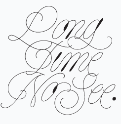
Inspired by the light, natural qualities of acoustic guitars and the airy delicacy of the harp, String’s gossamer-fine lines add a touch of elegant refinement to sophisticated designs — particularly in combination with moody black and white photography. If a little extra stand-out impression is required, String Hole fills in some of the loops with a solid area. erotica
A small sample like the one above cannot do justice to the subtleties of Erotica. It’s a family of luscious curves, striking contrasts and gossamer hairlines. Sproviero was doing exercises in roundhand calligraphy when, at some point in his research of these sensual letterforms, realized that “the world was in need of a really sexy yet formal copperplate.” His full step-by-step account of the design process can be read on the Erotica font page. Taking the rules of copperplate lettering to the extreme, the designer gradually softened the harsh contrasts of his initial design to arrive at this beauty of a display script family, which was completed with a set of ultra-thin and somewhat thicker capitals (for large and small settings), fleurons and an inline variety. |
MyFonts on Facebook, Tumblr & TwitterYour opinions matter to us! Join the MyFonts community on Facebook, Tumblr and Twitter — feel free to share your thoughts and read other people’s comments. Plus, get tips, news, interesting links, personal favorites and more from MyFonts’ staff. |


|

|
Who would you interview?Creative Characters is the MyFonts newsletter dedicated to people behind the fonts. Each month, we interview a notable personality from the type world. And we would like you, the reader, to have your say. Which creative character would you interview if you had the chance? And what would you ask them? Let us know, and your choice may end up in a future edition of this newsletter! Just send an email with your ideas to [email protected]. In the past, we’ve interviewed the likes of Matthew Carter, Laura Worthington, Jonathan Barnbrook, Ulrike Wilhelm, Bruno Maag, Veronika Burian, and Hannes Von Döhren. If you’re curious to know which other type designers we’ve already interviewed as part of past Creative Characters newsletters, have a look at the archive. |
ColophonThis newsletter was edited by Jan Middendorp and designed using Nick Sherman’s original template, with specimens by Anthony Noel. The Creative Characters nameplate is set in Amplitude and Farnham; the intro image features Erotica Capitals Small and Heroe; the pull-quote is set in Heroe Monoline Small; and the large question mark is in Farnham. |
Comments?We’d love to hear from you! Please send any questions or comments about this newsletter to [email protected] |
Subscription info
Had enough? Unsubscribe immediately via this link: Want to get future MyFonts newsletters sent to your inbox? Subscribe at: |
Newsletter archivesKnow someone who would be interested in this? Want to see past issues? All MyFonts newsletters (including this one) are available to view online here. |