
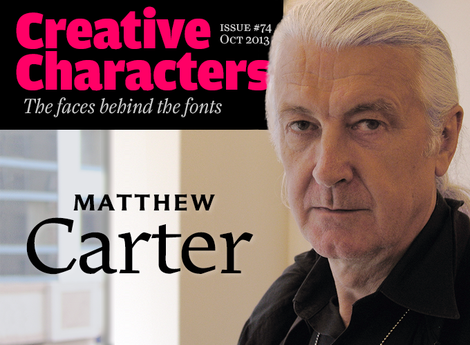
Photo by Jan Middendorp
He’s arguably the most widely read type designer in the world. Verdana, Georgia, Tahoma, Skia: all ubiquitous, all his. Miller, one of North America’s most popular news faces — his initiative. Bell Centennial, drawn for AT&T, has been used in millions of phone books. His typefaces are all across the stylistic spectrum, from elegant renaissance oldstyles via meticulous scripts to indestructible sans-serifs. Having started as an apprentice at age 19, he has been in the business for the best part of six decades and is still passionately interested in the latest technological developments. He revels in working with demanding technicians and challenging projects. Here is our long-awaited interview with Matthew Carter.
|
You are the son of Harry Carter, one of the major British historians of typography of the last century. To what extent did this influence your early career? My father was both an academic and a practicing typographer. Around the time I was born, in 1937, he worked for Her Majesty’s Stationery Office and for the Nonesuch Press. Around 1953, he was hired by the University Press at Oxford with the title of archivist, which meant that he was supposed to look after the historical material there, and research the history of type. History was his first love. But I think one reason why he was such a good historian was the fact that he had designed books, had cut punches, and studied typefounding. His historical knowledge was informed by very practical expertise. At 18, I passed my exams to study English in Oxford. However, when I left school I could not start university immediately. Until the mid-1950s, boys did two years of military service before starting University. As the draft system was coming to an end, I was among the first that did not have go into the army. But the Oxford college that had accepted me was used to students being two years older, and they did not want me right away. They said: we’ll split the difference, go do something else for a year. So in 1955 my parents had to think of something to keep me occupied. As my father had very friendly relationships with Jan van Krimpen and the Enschedé printing company, it was arranged that I would spend that year in Haarlem in the Netherlands as an unpaid trainee. As you know, Enschedé was a very interesting company; they did all the security printing such as passports, stamps and stock certificates, as well as book printing, high quality color work and so on. But there was also the Enschedé type foundry, which was the department where I happened to start my year. The idea was that I would work around all the different departments, but I got so interested that I spent virtually the whole year in the type foundry. And that’s where you learned the ancient craft of punchcutting. Indeed. Paul Rädisch, who had cut Jan van Krimpen’s types, was still there. But there was also a much younger man called Henk Drost, who had been trained by Rädisch. I sat between them, and I learned from both. It was Henk who became my main mentor. A year is not long enough to become a skillful punchcutter, but I learned how it was done, and I had some proficiency. Enschedé was unique in having their own type foundry. Most printers got rid of their type foundries in previous centuries. And what I learned — to make type by hand — was completely obsolete as a profession. So it’s rather curious — that year that was meant to be an interlude… …determined the rest of your life. Exactly. I was supposed to start my studies of medieval English, but I decided I couldn’t face it. I expected to face a problem at home, because my father was a real academic, and had studied at the same Oxford college that had accepted me. To my surprise and relief my parents were really understanding: “If you have become really interested in type and you want to pursue it, then that’s fine.” It was much easier than I’d expected. And so I started to work by myself. It soon became obvious that I couldn’t make a living as a freelance punchcutter. I did a few engraving jobs for Monotype and others, but work of that kind was very rare. So when I moved to London in 1958–1959, I started doing lettering. |
Carter Sans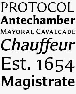
Carter’s latest retail face revisits a genre he has been interested in for a long time: the rather rare category known as “glyphic” — stressed, or contrasted, sans-serifs with tapered stems. Carter designed most of the variants of the family; then Monotype invited the young Berlin-based American type designer Dan Reynolds to help with the final production. “That went very well,” says Carter. “Dan really understood the design and completed it very beautifully. I was delighted, and had no remarks at all when the work came back to me. Just very, very well done.” Charter BT PRO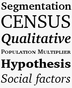
Charter from 1987 was one of the most successful designs Matthew Carter did while working at Bitstream. The typeface was later licensed to ITC, and there are now several versions on the market. Equipped with small caps and oldstyle figures, Charter BT Pro is probably the best choice for professional typography. With its simplified outlines (see the main text for the story behind that) Charter is a sturdy, unadorned, virtually indestructible serif family for a wide range of uses. |
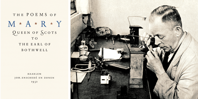
Pre-war publication from Enschedé Publishers and Printers; the title page is set in Jan van Krimpen’s Romanée, cut by the company’s senior punchcutter Paul H. Rädisch (right). He produced all of Van Krimpen’s faces and became one of Matthew Carter’s mentors during Carter’s 1955–1956 apprenticeship in Haarlem.
|
How did you get from there to designing printing types? I was very fortunate. Around 1960 in London there was a small group of graphic designers who wanted to work in a non-traditional international style. They were familiar with contemporary work in Switzerland, in Japan, in the USA. But they faced a problem because the typesetting trade in London was incredibly conservative. Although Helvetica had come out in 1957, it was impossible to find Helvetica in London in 1961. So there was a growing demand for people who could draw lettering in a contemporary style for logos, book covers, and so on. I started this business of designing lettering, which in those days meant of course hand-drawing the letters, copying them photographically, and then pasting up words. It was good training for me, because these were graphic designers who had very high standards and strong ideas about what they wanted. These were people like Alan Fletcher and Colin Forbes, who later became Pentagram, and David Collins. I did a whole Greek sans serif for Collins because Cyprus Airways was a client of his. Colin Forbes commissioned a signage alphabet for London Airport. Then around 1963 I was hired by Crosfield Electronics in London, who were the British manufacturing agents for the Photon typesetting system, known in Europe as Lumitype. My task was to produce fonts for the Lumitype 540 series and in order to do that I had to spend about a week a month at Deberny & Peignot in Paris, because they made the font disks for Lumitype. This brought me in contact with Adrian Frutiger, who had his own studio but came into Deberny & Peignot about once a week. It was also my first direct experience with photo-composition, drawing type and organizing the manufacture of the fonts. And then, in the mid-1960s, you moved to the United States. At the beginning of the decade I had the opportunity to visit New York, and that trip opened my eyes in a most extraordinary way. People use the term “culture shock” very glibly nowadays, but this was a real shock to me. I had grown up in a sort of typographically privileged world in England and I was very cocky. I thought I knew everyone and everything. In a matter of days I realized I was completely ignorant. I visited the studios of Herb Lubalin and Milton Glaser. Also, the yearly show of the Type Directors Club happened to be up, and I saw type-based work that I had no idea about. To be honest, it scared me. On the same trip I met Mike Parker, who had recently begun working for Linotype in New York, and I visited him there. I realized I had two choices. One was to go back to England and act as if it hadn’t happened. The other choice was to say to myself: this is where I have to be, this is where the game is played. And that’s what I did. I made it plain to Mike and to his boss Jackson Burke that I wanted to work at Linotype. There was no immediate opening, but a few years later Mike became director of typographic development. Mike and I had kept in close touch and later became great friends. So I moved to New York in September 1965 with the job of in-house type designer at Linotype. You worked at Linotype for fifteen years, than started Bitstream with Mike Parker, and later became an independent designer. Throughout that amazing career, one of your specialties seems to have been to solve technical problems through type. I’d like to discuss a few of those typefaces. Can we start with Bell Centennial? It was commissioned by AT&T. In the 1930s Linotype had done Bell Gothic for setting the phone books. By the mid-1970s, AT&T had started pioneering the use of very high-speed digital typesetting devices. Bell Gothic started showing big problems when set digitally and printed offset. So they came back to Linotype and said: we think it’s time to revisit the directory typeface. And I got the job. AT&T set up a committee of various specialists to guide us. It was very well-funded and we did a lot of research both before going into digital form and afterwards. They were very cooperative about printing trials on the actual presses, so it was quite a long project and very exciting. From the outset it was destined to be digital. But there was no way of rasterizing type at that time. Nowadays I draw outlines, which get converted electronically into bitmaps for digital composition. At the time there was no computer program that would do that, so I did all that by hand. I would put my drawings on a piece of graph paper, draw in every pixel, and then encode them. For every raster line: turn on – off – etc… Essentially I hand-digitized each of the four faces in the Centennial family. It was my first experience of working digitally and it was enormously laborious, but I learned a great deal from doing that. |
Cascade
Cascade was the first typeface Carter designed after having been hired by Linotype in 1965. When a customer asked for a photo-composition version of Ludlow Script, Carter and Mike Parker decided not to make a copy but design a new face in the same vein. Cascade was named after the great blackout of November 1965, when power failed in the entire North-East due to a “cascade” of power plants shutting down one by one due to overload. Snell Roundhand Script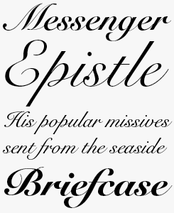
In the days of metal type, printing types based on connected handwriting seldom looked good. Photo-composition solved that problem, and designers were challenged to design script faces that had never been possible before. Hence Snell Roundhand Script, one of Carter’s early fonts for Linotype. Based on the work by the seventeenth-century writing master Charles Snell, this classic English roundhand has remained a mainstay of the Linotype library. Bell Centennial
Designed for telephone books in the 1970s, Bell Centennial has forms that are optimized for small print under difficult conditions. The names of the weights still recall the original use: not Regular or Bold, but Address, Name & Number, Sub Caption, Bold Listing. The giant ink traps were introduced to avoid the cluttering of ink on high-speed presses. Nowadays, the function of those striking shapes is almost completely lost – but graphic designers like their unorthodox look. Especially when used in bigger sizes, Bell Centennial looks very cool. |
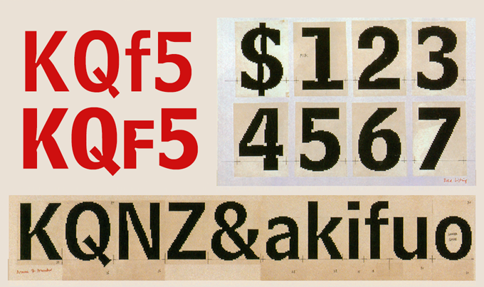
The making of Bell Centennial. Right and bottom: working drawings with hand-rendered pixels. In red: today’s digital versions still come with the exaggerated inktraps design for bad quality printing at very small sizes.
|
In lectures you’ve mentioned you would sometimes set out to solve a technical problem, and by the time the typeface was done the problem had disappeared. That was the story of Charter, done in 1987 — a perfect parable of being one step behind. Charter began when I was at Bitstream, and there was an issue about the amount of data required to store fonts. A serif typeface took twice as much data as a sans, because of all the curves and extra points. So I started doing Charter with a very simplified structure and a minimum number of curves, more straight-line segments, etc. It was very economical compared to, say, Times New Roman. When finished, I proudly went to the head of engineering at Bitstream, but he said: oh, we don’t have a problem with that any longer, we now have more compact algorithms. I was left with a design solution to a nonexistent technical problem. But by that time I had gotten very interested in the idea of the simplified design. The technical raison d’etre had gone, but I persevered with it for completely different reasons, as I was now interested in the design for its own sake. How about Georgia and Verdana? Georgia and Verdana were designed at a time when screen resolution was not as good as it is now. It hasn’t advanced all that much, but the rendering has improved a lot thanks to anti-aliasing and stuff. Verdana and Georgia in the mid-1990s were all about binary bitmaps: every pixel was on or off, black or white. So Microsoft put a lot of care into optimizing these typefaces for the screen. For about 15 years, all the web designers hated me because Georgia and Verdana were among the very few faces that they could use if they wanted to do legible text on the screen. Now they’ve got much wider choices. It’d be interesting to see whether Georgia and Verdana survive beyond the point where there is any technical reason to have them. What do you think when you see them in high-resolution uses today — in print, or in applications like shop lettering? I’m very open-minded about that. What happens most often is that people ask me about IKEA. Ever since there was that big ruckus about the IKEA catalog changing from Futura to Verdana, which I had nothing to do with and didn’t even know about, people ask me about that everywhere I go. I give a talk about something historical and then at the end someone will get up and say: “I started a petition to go back to Futura. You’re a villain!” You get blamed for something you had nothing to do with. There’s a strange misunderstanding. A friendly guy came up to me at a conference recently and said: I signed that petition to go back to Futura. So I asked: what caused you to do that? And he said, well, Verdana is a screen font. You mustn’t use it in print. So I said: OK, well, so you open the IKEA catalog, it’s set in Verdana, with the big prices and everything… how do you tell it’s a screen font? What is it about Verdana that says: this is a screen font? He had no idea. He just knew it because he’d been told. There are many people who make judgments without really understanding what the typographic issues are. Students are interesting — they’ll say things to me like: my professor told me I cannot use Verdana and Georgia in print because they’re screen fonts, but I tried it and it looks perfectly alright. And I can only say: Thank you! Go ahead! There are some peculiarities that came out of the original brief, and those are things I can explain to students. The bold versions of Verdana and Georgia are bolder than most bolds, because on the screen, at the time we were doing this in the mid-1990s, if the stem wanted to be thicker than one pixel, it could only go to two pixels. That is a bigger jump in weight than is conventional in print series. It might actually be something that in the IKEA catalogs works rather well: when using the bold at small sizes, you can really see the difference. |
Verdana Pro
As explained by Carter in the interview, Verdana was created specifically to address the challenges of on-screen display. The generous width and spacing of Verdana’s characters is key to the legibility of these fonts on the screen. To ensure maximum legibility in all sizes, the fonts were hand-hinted by leading hinting expert, Tom Rickner. The use of Verdana is not limited to the screen, though: “My hope.” said Rickner, “is that these faces will be enjoyed beyond just the computer screen. Although the screen size bitmaps were the most crucial in the production of these fonts [their] uses should not be limited to on screen typography.” Georgia Pro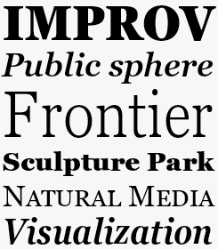
Like Verdana, Georgia was designed in 1996 as a Microsoft system font and hand-tuned for the screen by Tom Rickner. The Georgia family received a major update in 2010 by Monotype, The Font Bureau and Matthew Carter, resulting in Georgia Pro. Based on eighteenth-century “transitional” faces, Georgia was designed specifically to address the challenges of on-screen display with elegant yet sturdy and open forms. The new and expanded Georgia Pro family contains 20 fonts — five weights, from Light to Black, each with matching italics, and a Condensed series. Georgia Pro comes with small caps, ligatures, fractions, old style figures, lining tabular figures and lining proportional figures. |
|
The most recent project where you collaborated with technicians and scientists is Sitka, a new serif family that comes with MS Windows 8.1. You worked in close collaboration with Microsoft’s Kevin Larson, famous for his legibility research, and with the designers at Tiro Typeworks. Did the process change your mind about science? Type designers are often very suspicious of legibility research. Yes, and I was too. I’ve always taken an interest in it, but I often found it was not useful for me as a designer. What I wanted was to find legibility research papers that told me things that I didn’t already somehow know by common sense. When we did Bell Centennial, we were obviously very concerned about legibility — it was for phone books, six-point type on bad paper. But we researched things in a very primitive way. I would put up two different versions of the figure ‘2’ on the wall for example and then we walked back until maybe one of them was indistinct… It was very seat-of-the-pants. When it came to the academic study of legibility, I did not find anything that I could use in a practical way. But then when I met Kevin Larson and got involved in this, it became very interesting. He has very definite ideas about how we read but at the same time he’s not overly dogmatic. Also, there are now better tools that study eye movement, and better understanding of how the brain reads. Talking to Kevin and the rest of the group at Microsoft, I was very intrigued. I would work on the design up to a certain point, then hand it over to Kevin, who would do whatever stage of testing was appropriate. He would generate results and tabulate them, and find very good graphic ways of expressing why this was better than that. Still, a lot of the results were ambiguous or even contradictory. There are still things about reading and the testing of legibility that we don’t understand. But I think we’ve sort of advanced the state of the art regarding this particular kind of typeface and what is useful about testing. What other projects have you been working on these past few years? Apart from Sitka, the other major project was for a large newspaper in London. I think it will be released soon but it’s still sort of under wraps, so I can’t say much about it. At one time all my work, all my commissions, came from publications. Now it’s dried up, apart from the New York Times which is still a very good client of mine. What I like to have in my life is the kind of situation that happened with the Miller typeface. I started it entirely on my own. No-one asked for it; I did not have a client. I was familiar with Scotch romans, puzzled by the fact that they were once so popular, particularly in the States in the latter half of the 19th century, oddly enough, and then they disappeared completely. So I worked on that, Roger Black saw it and proposed it to one of the papers he worked for. And then it sort of exploded. Miller and other families were produced in collaboration with several designers at Font Bureau. Do you like leaving the production work to others? It depends on the nature of the project. I have a close and friendly relationship with Font Bureau and sometimes we do collaborate. What has often happened is that I will design part of a family, then later some of the Font Bureau designers will get involved in extending the family. This happens particularly when a face has gone out into the field and people say: we’d like a lighter version, or a very contrasted display version, or whatever it is. Several of the Font Bureau designers have worked with me on faces which I originated and took far enough for them to know what to do. Miller is a good case in point, because a number of different Font Bureau designers worked on that. Tobias Frere-Jones worked on it in an early stage, Cyrus Highsmith did a newspaper text version called Miller Daily. And then Richard Lipton did some sort of banner display version for very large sizes. So a lot of designers played a role in that. |
ITC Galliard
Carter’s Galliard was originally published as a photocomposition typeface for Mergenthaler Linotype in 1978. It is modeled on the work of Robert Granjon, a sixteenth-century punchcutter whose typefaces are renowned for their beauty and legibility. ITC Galliard is notably a typeface for text, while the italic is very distinctive in occasional pieces such as invitations and informal announcements. A special new version was published in 2013: ITC Galliard eText is a redesign created by Monotype’s Carl Crossgrove for enhanced on-screen legibility. miller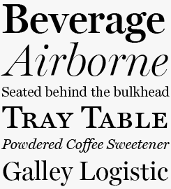
During the past two decades, Matthew Carter has designed newspaper typefaces for the likes of the Washington Post, the New York Daily News and the Boston Globe. In 1997, Font Bureau released his Miller Text and Display, reviving typefaces cut in the early 19th century by Richard Austin in London for foundries in Glasgow — some of the first typefaces designed with newspapers in mind. The series’ immediate popularity with newspapers lead to the design of narrower custom headline styles for papers. |
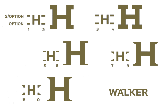
Something completely different: an exclusive typeface for the identity of the Walker Arts Center in Minneapolis. Designed in the 1990s in close collaboration with the Center’s designers, it allowed the designers to play with snap-on serifs. Probably the most experimental design of Carter’s career, it was “the very particular nature of the place and of their requirements that made it possible. It’s a very unique place and, more importantly, they have very unique people working there.”
|
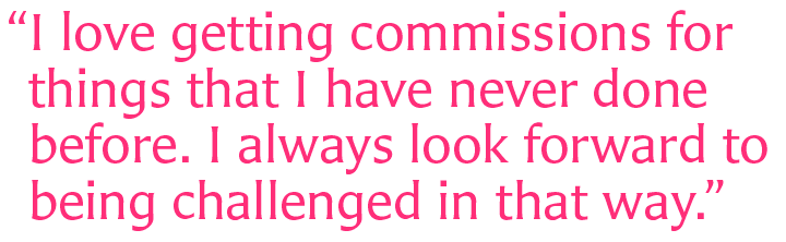
In stylistic terms your work is incredibly diverse, as opposed to the typefaces by designers such as Gerard Unger or Adrian Frutiger, both of whom make fonts that express the same formal principles over and over again. I have a theory about that. I think type designers come in two different kinds. Of the first, Gerard Unger is a very good example, as is Goudy or Zapf. I envy these people because they are designers of genius whose personality comes out in every typeface they design. I’m sure if Gerard designed a new typeface, the first time I’d pick up a newspaper or a magazine, I’d know it was by him. I read his handwriting. His personality shines through in everything he does. I don’t have this kind of genius — I’m more of a chameleon. I think it’s easier for me to get inside the head of other designers. Leslie Cabarga has said about Big Caslon that it was like the spirit of Caslon shining through me. Which is a sort of rather new-age way of putting it. But I would be happy if that were true. I think it’s perhaps easier for me than it would be for Gerard or Hermann or Adrian to channel someone else in that way. It does interest me because in this business we all stand on the shoulders of giants. And if there is a justification for this, it’s because it allows us to see further. So if you ask me if there is a thread that joins, say, Snell Roundhand to Verdana: I cannot see it. I do hope both faces are good in their own way, which are different ways. I love getting commissions for things that I have never done before. I always look forward to being challenged in that way. You’re now in your mid-seventies. Has the thought of retirement ever occurred to you, if I may be so cheeky? To be honest, I don’t have any interest in retiring. I mean, I don’t know what I would do. At 76, I don’t have the same stamina I had forty or fifty years ago — I’m not comfortable working as long hours as I used to. But I’ve never lost any interest in the work. As I just said: I’m always looking for new kinds of projects. Also, I’ve been either a business partner or a freelancer for so long — it’s hard for me to turn down work. You’re never sure where the next assignment will come from, so when somebody offers me a job, I say: yes, please! So I suppose there’s not much in the world that you enjoy more than your work. That’s right. And I don’t like the idea of giving up. When you work for yourself, no one tells you to retire. So… my retirement plan is death, haha. Is that a good note to end on? |
Sophia
The design of this titling face was suggested by hybrid alphabets from sixth-century Constantinople — a Byzantine blend of cosmopolitan influences: Roman classical capitals, early uncials, and Greek letterforms. Sophia includes several alternative character shapes. Some of these have extending strokes that are designed to fuse together with neighboring letters to compose on-the-fly ligatures. Alisal
Alisal was inspired by the Italian book faces created in late-fifteenth-century Venice. These were robust letters, with distinctive serifs, short descenders and a subtle diagonal contrast. Alisal retains the typical traits of these ancient originals, adding striking and very original detailing. Carter has said he had been refining his design for so long that when he was asked to complete the design for Monotype, it was almost as if he were doing a historical revival of his own typeface. The illusion even extended to changes in his work process. While the first renderings of Alisal were done as pencil drawings, now both the preliminary and the final drawings were done on-screen. |
MyFonts on Facebook, Tumblr & TwitterYour opinions matter to us! Join the MyFonts community on Twitter, Facebook and Tumblr — feel free to share your thoughts and read other people’s comments. Plus, get tips, news, interesting links, personal favorites and more from MyFonts’ staff. |


|

|
Who would you interview?Creative Characters is the MyFonts newsletter dedicated to people behind the fonts. Each month, we interview a notable personality from the type world. And we would like you, the reader, to have your say. Which creative character would you interview if you had the chance? And what would you ask them? Let us know, and your choice may end up in a future edition of this newsletter! Just send an email with your ideas to [email protected]. In the past, we’ve interviewed the likes of Michael Doret, Laura Worthington, Jonathan Barnbrook, Rob Leuschke, David Berlow, Ronna Penner and Jos Buivenga. If you’re curious to know which other type designers we’ve already interviewed as part of past Creative Characters newsletters, have a look at the archive. |
ColophonThis newsletter was edited by Jan Middendorp and designed using Nick Sherman’s original template, with specimens by Anthony Noel. The Creative Characters nameplate is set in Amplitude and Farnham; the intro image features Carter Sans and Alisal; the pull-quote is set in Carter Sans; and the large question mark is in Farnham. |
Comments?We’d love to hear from you! Please send any questions or comments about this newsletter to [email protected] |
Subscription infoWant to get future issues of Creative Characters sent to your inbox? Subscribe at www.myfonts.com/MailingList |
Newsletter archivesKnow someone who would be interested in this? Want to see past issues? All MyFonts newsletters (including this one) are available to view online here. |