|
“Less is more” was an adage of Modernist thinking, and much of it still holds true today. Less clutter, less ornament: that’s added value when clarity and simplicity are what’s wanted. But for today’s graphic designer, more can effectively be, well… more. More language coverage in fonts is useful for international organizations or multi-lingual publications. More weights in font families are great for consistency across a complex graphic project. And more ligatures and alternate letterforms — they’re a gift to graphic designers who need that hand-lettered look but don’t have the time or patience to get their hands dirty. Read on in this month’s newsletter for a bit of all that… and more.
|
|
|
This Month’s Rising Stars
|
|
|
|
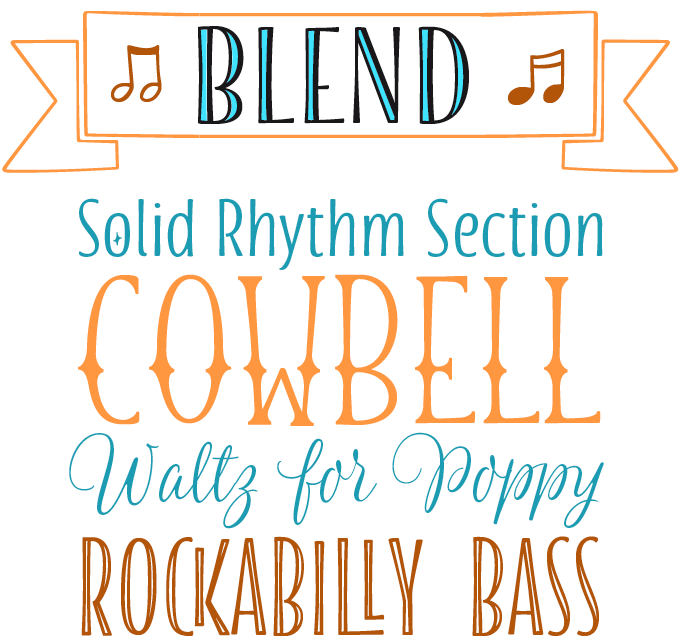
Sabrina Mariela Lopez of Buenos Aires offers a small, attractive library of script and display fonts showing a fondness for flourish and ornament. Her latest offering, Blend, is a huge success — and deservedly so. The name refers to the technique in coffee-making to combine different kinds of beans to get an optimally balanced taste. Blend is a suite that does just that, although here each typographic flavor can also be enjoyed separately. Among the 21 styles are a bouncing informal script, programmed with plenty of OpenType trickery; a wonderful set of condensed romans and two subfamilies of condensed caps, both with layerable Inlines; as well as playful Dingbats and Ornaments (including frames and ribbons). A cute collection that took its cues from the visual universe of bakeries and coffee shops, but can be used for projects as varied as branding, children’s books, wedding invitations, labels, and more. Introductory discount until Oct. 23, 2015.
|
|
|
|
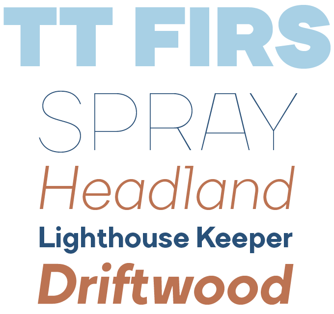
TypeType of St. Petersburg, Russia is the foundry of designer Ivan Gladkikh. With three families in our Hot New Fonts list these past few weeks, Gladkikh is doing very well indeed. TT Firs is his biggest success so far. Firs was designed as a versatile design tool with a pronounced Nordic character. Ivan describes its style as “modern Scandinavian … calm and neutral”. It combines references to the mid-century geometric approach with idiosyncratic postmodern elements, such as the flat top of the ‘A’, flat bottoms on ‘v’, ‘w’ and ‘y’, and a top serif on ‘l’. The family comes in a generous range of nine weights — from Hairline to Black — with matching Italics. The family offers broad language coverage, including — of course — a fine Cyrillic set. TypeType recommends it especially for mobile applications and websites. Introductory discount until Oct. 23, 2015.
|
|
|
|
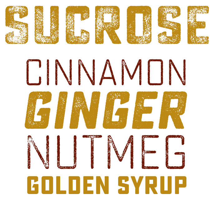
As mentioned in our recent interview with designer Ryan Martinson, one of his Yellow Design Studio’s specialties is a pull-out-all-the-stops approach to rugged textures. Sucrose is his latest type family, offering a high-resolution simulation of letterpress techniques. Its hand-crafted textures come in eight levels of distress for all letters (four for other characters). These increasing levels of “bad printing” can be mixed to create realistic, custom typesettings. One warning, especially for use as a web font: Sucrose is highly detailed and may process slowly on some systems. The 20-font family includes light and bold weights plus clean and slanted versions. Try the demo weights for free! Introductory discount until Oct. 16, 2015.
|
|
|
|
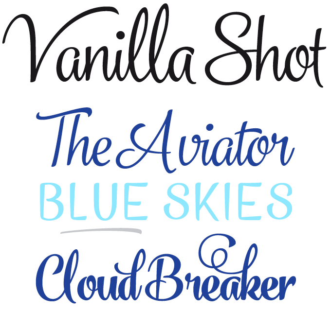
Vanilla Shot is the latest script from Fenotype’s Emil Karl Bertell, one of the young masters of the genre. A joyous connected script in two weights, Vanilla Shot pays tribute to American sign painting and commercial lettering of the 1950s and 1960s. Bertell has been as thorough as ever in recreating the appearance of hand-made custom lettering, giving the user more than 1000 glyphs per cut to play with. Use Swash, Stylistic or Titling Alternates options in any OpenType Savvy program or manually choose from even more alternate characters using the Glyph Palette of your application. Turning on small caps gives you a frisky set of block letters designed to support the script, or to be used as a standalone font. Finally, check out the very affordable Ornaments set of flourishes, banners and labels. Vanilla Shot currently has an introductory discount, but hurry — it ends on October 9th!
|
|
|
Text Fonts of the month
Typesetting for books, magazines or annual reports requires font families with special qualities: excellent readability, a generous range of weights with italics and small caps, multiple figure sets (lining, oldstyle, table) and ample language coverage. Here is a selection of recent, high-quality text typefaces.
|
|
|
|
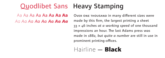
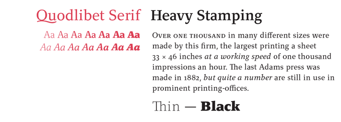
The Czech Signature Type Foundry is a group of friends and colleagues who aim to create large type families designed for a wide array of purposes. Quodlibet, their new set of twin sans and serif families, is a case in point. The serif is informed by Renaissance and Baroque book faces, taking the functional aesthetics of these historical styles into the 21st century. Clear, open shapes are accentuated by subtle detailing. Wedge-shaped serifs add sharpness and direction to the roman. The sans-serif offers rounder and friendlier shapes than most, avoiding the sternness and coldness of many of its contemporaries. With small caps, multiple figure sets, interesting alternates and broad language coverage, including Cyrillic, these two families add elegance and sophistication to complex typographic projects. Both Quodlibet families are on promotional discount until October 10th.
|
|
|
|
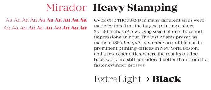
Mirador is a powerful neoclassical font family designed for various usages — ranging from editorial and corporate design to web, interaction and product design. It is a contemporary take on high contrast typefaces that have never gone out of style — defined by elegance, tradition and timelessness. Although Mirador seems to be a display font at first glance, its proportions and design reveal a powerful and characteristic workhorse when set in smaller sizes. Mirador comes in 10 weights with matching italics. It is equipped with ligatures, a large set of alternative glyphs and many more opentype features. Mirador has an introductory discount until November 1st.
|
|
|
|
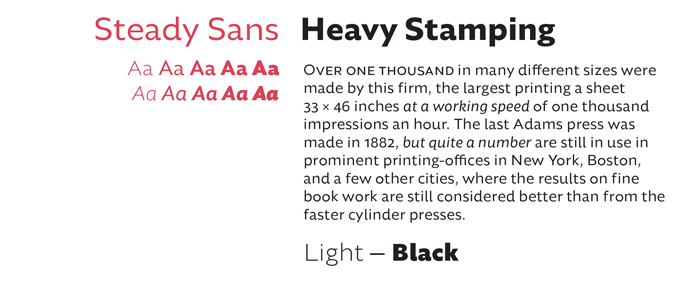
The font families from Galen Lawson’s District foundry tend to offer an interestingly personal take on various genres — check out the monumental charisma of the recent Emiritus. The new Steady Sans is a sans-serif text face with a twist. With quite a bit of Gill Sans® in its genes, it is English by influence but American it its disposition and modernist details — a blend of styles from multiple eras. Helped by its fluid italics, the typeface is wonderfully readable in text sizes, while multiple weights and alternate forms provide a variety of tone for headline use. No introductory discount — just very affordable permanent pricing.
|
|
|
News Round-Up
In this section we pick out interesting news snippets from MyFonts’ own kitchen and from the greater world of fonts, lettering and typography.
|
|
International typographers meet in Brazil
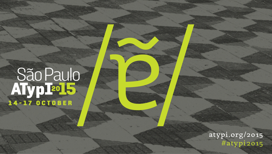
South America is a big player in international type design today, as our bestseller lists and newsletters have shown time and again. So it’s only fair — and perhaps long overdue — that ATypI, the worldwide organization of type designers and typography experts, holds is annual meeting in Brazil. It’s a first — there hasn’t even been an ATypI conference in the Southern hemisphere before. The conference takes place in São Paulo from October 14–17, and is co-organized by some of Brazil’s prominent type designers, several of whom are well-known to MyFonts regulars. It will include workshops by the likes of Sumner Stone, César Puertas, and Alexandra Korolkova, as well as talks by Toshi Omagari, Catherine Dixon, Claudio Rocha, Priscila Farias, Stephen Coles, and many others.
|
|
Tech giants and their typography
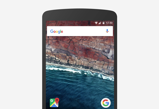
Typography was on the front pages recently thanks to the new Google logo. Predictably some loved it, some hated it. However, opinion was generally favorable to their own account of the evolution of the new logo system. These detailed design stories can be really instructive. To see how another major corporation handles a new approach to typography, we highly recommend this video from Apple, in which Antonio Cavedoni explains the detail and subtleties within their new San Francisco font family which, since the recent release of El Capitan, is now present throughout the Apple ecosystem (on their latest software releases). He explains the principles underlying typeface design and typography in user interfaces, particularly ideas of optical compensation, in a wonderfully engaging way. Take a look and enjoy the obsession!
|
|
FontScout — Explore the MyFonts collection on iPad
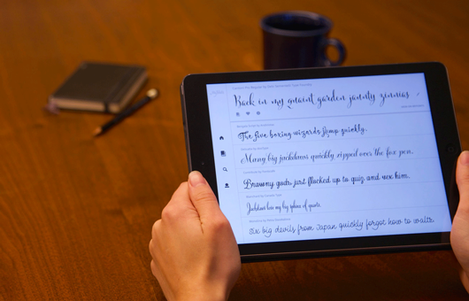
FontScout is the brand new iPad app from MyFonts that gives you a new and different way to explore the world’s largest collection of fonts. Browse the MyFonts collection to narrow down your search to the perfect typeface using our new “More Fonts Like This” technology. Hit the heart button to Fave fonts as you go and add them to albums — everything syncs automatically to your MyFonts account, making it easy to go back to view your top picks later. How much, you ask? It’s free!
|
|
|
|
MyFonts on Facebook, Tumblr, Twitter & Pinterest
Your opinions matter to us! Join the MyFonts community on Facebook, Tumblr, Twitter and Pinterest — feel free to share your thoughts and read other people’s comments. Plus, get tips, news, interesting links, personal favorites and more from MyFonts’ staff.
|
|
|
|
Colophon
The Rising Stars nameplate is set in Aniuk and Rooney Sans. Body text (for those using supported email clients) is Rooney Sans.
|
|
|
Subscription info
It is never our intention to send unwanted e-mail.
Want to get future MyFonts newsletters sent to your inbox? Subscribe at:
MyFonts News Mailing List
|
|
|
Comments?
We’d love to hear from you! Please send any questions or comments about this newsletter to [email protected]
|
|
|
|
|
|
MyFonts Inc. 600 Unicorn Park Drive, Woburn, MA 01801, USA
MyFonts and MyFonts.com are registered service marks of MyFonts Inc. Gill Sans is a trademark of The Monotype Corporation registered in the United States Patent and Trademark Office and may be registered in certain jurisdictions. Other technologies, font names, and brand names are used for information only and remain trademarks or registered trademarks of their respective holders.
© 2015 MyFonts Inc
|
|
|
|