|
|
|
Photo © Sergey Krasavin
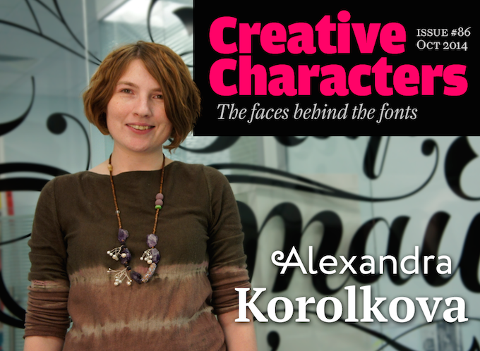
Almost five years ago we interviewed three young women from Moscow who had successfully embarked on a type designing career. For this month’s interview we’ve returned to Alexandra Korolkova, the most talked-about of the three. She is now a principal designer at ParaType, Russia’s major type foundry. She is an articulate advocate for greater meticulousness when designing type for the Cyrillic script — the writing system used by over 250 million people as the official alphabet for their national languages. Her energetic activities as a type designer, letterer, writer, speaker and collaborator (and she has also become a mother) have won her the prestigious 2013 Charles Peignot Award. Her fonts, needless to say, are gorgeous. Enjoy!
|
|
|
Alexandra, since we interviewed you and your two colleagues five years ago, type and typography have continued to grow in popularity. In Russia there’s a very active and energetic young generation of type designers and lettering artists today. What are the factors that have contributed to this typographic renaissance?
I think there are several factors. The rising standard of living across the country has led to a growing popularity of all kinds of professions in the design sector, resulting in a growing demand for better type and typographic professionals in this area; we now have fast and easy internet access, which allows us to find the information we need, and a wide array of works by great designers; and last but not least, our personal reasons. In the 2009 interview all three of us mentioned Alexander Tarbeev and his great influence on young type designers. Much of those energetic young Russian type designers are Tarbeev’s students, and I think that without his enthusiastic but very serious approach to type design itself and type design education, we would have a completely different typographic environment from that we have now. Ilya Ruderman, for instance, who founded the Type and Typography course in Moscow, was his student too, though only for a short time, and he invited Alexander to be one of principal teachers there. Also, there’s a growing generation of self-taught type designers, mostly originating from outside Moscow. I think this is very interesting too.
It seems to me that there is also a renewed interest in the historical aspects of Cyrillic typography and calligraphy. How does this influence contemporary digital type design?
In our typographic world it is quite a popular opinion that, as Cyrillic is so much younger than (for example) Latin, it is still developing and forming. And I think that we, designers who develop type for the Cyrillic script, should learn about its history in order to better understand its nature, and its historical and emotional connotations. Historical studies will not necessarily lead to copying historical forms directly into contemporary faces. However they can form a background that allows us to find natural and original letterforms.
During the past five years, your career as a type designer has really taken off. What have been the most exciting events in your professional life these past five years?
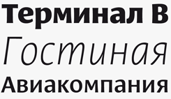
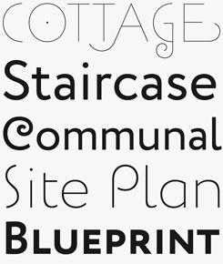
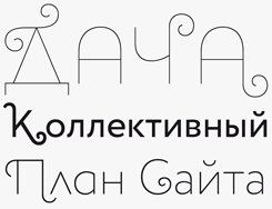
One of the biggest events in my professional life took place as early as in 2009–2010. I was lucky enough to take part in a project called “Public Types for Minority Languages of Russia”. I was a leading designer in the project; my collaborator Olga Umpeleva and I were supervised by Vladimir Yefimov who taught us everything about the complicated glyphs of extended Cyrillic. This project resulted in the PT type system, which includes PT Sans and PT Serif; later we produced PT Mono with support from Google. That means 16 fonts of circa 700 glyphs each in the free version, and a total of 70 fonts in PT Sans Pro and PT Serif Pro, which come with small caps and many additional glyphs, resulting in circa 1400 glyphs per font. So that was a huge amount of work.
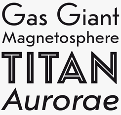
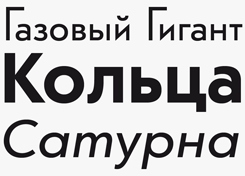
After that I worked on Circe — a human-faced geometric sans-serif; we also did a LiveJournal “reality show” about the working process (sorry, it’s in Russian).
I had to slow down quite a bit after that because of a major event in my private life: the birth of my first daughter. I am still trying to finish the next large type project after Circe — PT Stem. Of course this does not mean that I don’t work. But most of my work from 2012 onwards has been either in collaboration, or quite technical, or related to supervising or consulting other designers. I’ve also done some book designs these past few years, which you can see in my LiveJournal: 35 мая (May 35th), Художники Мурзилки (The Artists of Murzilka), and Охота на Снарка (The Annotated Hunting of the Snark).
A great surprise for me was when I was awarded the Prix Charles Peignot in Amsterdam in 2013. It’s the award that ATypI, the worldwide Typographic Association, gives every few years to a type designer under 35. I had secretly been dreaming of that since 2007, when I saw Christian Schwartz receive the prize in Brighton… getting onto that list of people would really be the highest possible ambition for me, and perhaps for any young type designer. But by 2013 I had almost forgotten about that dream because of the reasons mentioned in the previous paragraph, so I was almost shocked that my old dream became true. I never thought I had done enough for it.
|
|
|
|
|
|
|
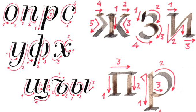
Good Cyrillic type design begins with an understanding of handwritten lettershapes. Here are instructions by Korolkova for how to properly write those letters.
|
|
|
|
Apart from the fact that it was a dream come true, did the Prix Charles Peignot change your career or your perspective?
I think so, yes. Firstly, it made me think harder before saying or doing something because I think the prize means that I have greater responsibility for my works or words. That’s also another reason for maintaining such a slow process with the new fonts. Secondly, I understood the jury’s choice of my candidature as a sign that I should do my best to give more information about the Cyrillic script to the rest of the world. Perhaps too little has still been done, but I’ve written an article — first in Russian and then in English — on some aspects of Cyrillic letterforms, and at this year’s ATypI conference I conducted a workshop for type designers. I also designed a small booklet with some hints on designing Cyrillic for the workshop participants, and now I’m considering making it into a little book. So I think I gained some popularity among non-Cyrillic type people; sometimes I’m asked to review a designer’s Cyrillic or to answer some questions on that subject.
As a speaker you have manifested yourself as a rather stern critic of Cyrillic letterforms. Why is it so important to “get it right” in Cyrillic — and is it especially difficult?
Well, you know, in Latin as well as in Cyrillic typography, there are typefaces of very good quality and of very poor quality, and many grades in between. Why is it important to use good typefaces and to avoid poor ones (except when you are a punk)?
I think it’s the same for any other writing system. You can’t get good typography with bad quality fonts, can you? And this is all the more regrettable when you see a very professional, well-designed Latin typeface that is advertised as having Cyrillic (or Greek, or Arabic, or any other) support, while that part of the font really isn’t usable at all. And even if in Cyrillic we have a typographic renaissance now, there are still too many graphic designers who lack typographic skills, and often cannot distinguish a good Cyrillic from a bad one. So they use typefaces regardless of the quality of the Cyrillic character set. This of course has a negative influence on other designers… even on some self-taught type designers.
I don’t think that it can be in the best interest of any Western type designer to make bad Cyrillic type. In fact, for a non-native designer the most important thing in designing Cyrillic is just paying enough attention to it. I mean: first studying some professionally designed Cyrillic and then testing the font in real texts. It is not that hard, you see. I’ve seen several cases this year when a Latin type designer takes Cyrillic seriously enough and gets a very acceptable result even from the first attempt, and then just polishes the details.
Do you think it is necessary for a type designer to know Russian, Bulgarian or another “Cyrillic” language to design a Cyrillic character set?
I hope not. I think that a type designer just needs to have respect for the writing system. Of course it is always useful to get some help from a native type designer.
You work at ParaType, but also have your personal font foundry, or label. Do you still publish new typefaces at your own foundry?
Before I joined ParaType, I self-published a few typefaces. But as I don’t release fonts outside of my work at ParaType any more, the label “Alexandra Korolkova” publishes works by my partner Vasily Biryukov. This happens quite irregularly, because he is very busy working at his main job — and he also designs faces for ParaType sometimes. I usually supervise his work, so in some projects my name is mentioned as co-designer, though my participation is mostly verbal.
In your body of work, what are the font families you are most proud of?
I’ve mentioned them above: PT Sans and Serif, and Circe. I also love Lilia, an unpublished serif with no straight lines, but in my opinion being proud of a font family also includes its life after release. I hope I’ll be equally proud of Stem when it’s done, and the faces that will follow…
|
|
|
|
|
|
|
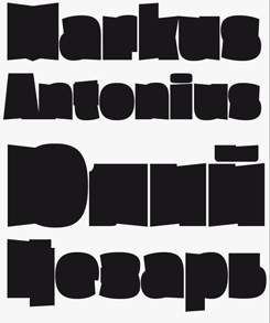
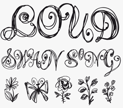
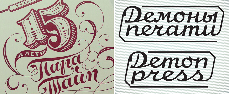
Two examples of Korolkova’s custom lettering. (Please note, these aren’t available to buy as fonts!)
|
|
|
|
Being a full-time designer as well as a young mother, how do you combine these? Do you work at home, or can you bring your child to work? Does Russia have good structures, such as kindergartens, for young parents?
Russia has a lot of kindergartens of different kinds, but fortunately I’m allowed to work at home, so I don’t have to spend much time apart from my daughter, and try to combine working and mother’s activities. Also I can bring her to work when I come there. ParaType has quite a small but friendly office, she’s very fond of it and of my colleagues.
Earlier this year, the Russian and international type world lost Emil Yakupov, ParaType’s principal, who died prematurely and completely unexpectedly. How have you dealt with the loss, and how is ParaType dealing with it?
It was a deep shock. To say that nobody expected this to happen would be putting it mildly; we were devastated. He was really the motor behind ParaType, the strong-willed force that made us do as much and as fast as we could. As for me, being a leading designer at ParaType since Vladimir Yefimov’s passing — he died in 2012, also unexpectedly — I was accustomed to the idea that I could propose any crazy ideas, or be too abrupt, and so on, and that Emil would put everything straight.
And after his sudden death I understood that another part of my childhood has now gone and that I now have to mind my p’s and q’s myself.
As for ParaType, we sort of united even more. We are doing our best to continue and develop Emil’s ideas; now we are finishing the preparation of our new font store website; we continue to extend our type library with any fonts that are needed.
Everyone works with the same sense of quality as ever (or maybe even stronger). But of course we miss him very much.
You have designed fonts in many styles — from informal handwriting to blackletter, from text faces to traditional dingbats. Do you have any favorite lettering or type design genres?
I consider myself mostly a text type designer. It doesn’t mean that I have less of a liking for display faces, but there are more people in the Cyrillic type world who can design a good display face than people who can design a good type family for body text. And as I can do this, I think it is more helpful for Cyrillic typography to design something that people are lacking and that fewer type designers can do. You can see that almost all of my display fonts were more or less quick projects — a kind of procrastination during long and serious projects…
As for lettering, I have two favorite genres. First, something between italic and handwriting, with a lot of swashes, and second, the projects where I need to design the same word in Latin and Cyrillic, as close in spirit as possible.
|
|
|
|
|
|
|
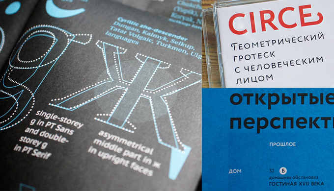
Some of the carefully designed print publications to publicize Korolkova’s ParaType font families.
|
|
|
|
How do you decide what kind of typeface to work on at any given moment?
I’m not only a type designer, I’m a typographer and book designer as well. I also know quite a lot of graphic designers and watch typography-related posts in social media. So I just try to understand what kinds of a typefaces people need most at the moment, and if I like the idea I start working on it. I always keep in mind a kind of list of genres of typefaces which I think Cyrillic typography needs. Sometimes when other type designers tell me about any doubts they have about what to design next, I try to persuade them to make something from that list.
You seem to have a predilection for original designs, as opposed to revivals. Are you one of those designers who aren’t very interested in doing revivals of pre-digital typefaces?
In fact, in the Cyrillic environment, the opposition is not so much between revivals and originals, but between having a predilection for original designs as opposed to cyrillizations of existing Latin fonts. But when speaking of revivals, I cannot say that I’m not interested in them. I simply had no opportunity to try it out yet. I think a good revival really takes a lot of time and effort. But I think I should at least give it a try at some point (I have even designed a dozen letters), though I’m afraid that it will not be an exact revival; rather something that is no closer to a historical example than, say, Mrs Eaves is to the original Baskerville types.
I’m afraid I’m not laborious enough for a traditional, accurate revival, I could never resist the idea to mix something from today or from myself into it.
What kind of type project would be most challenging to work on next?
I have a long-standing wish to design a serif face with quite simple forms, something between Charter and Scala, and optimize it really well for text setting. In the Cyrillic world we now have quite a lot of fresh, contemporary sans-serifs but there is still a lack of serif faces that are really suitable for longer texts. So I think this could really be a serious challenge — to try to oust a little bit Charter Cyrillic which is probably my favorite Cyrillic serif for body text.
Many thanks for your insights, Alexandra. Looking forward to your forthcoming typeface families!
For more images documenting Alexandra’s work at ParaType, have a look at our dedicated Flickr album.
|
|
|
MyFonts on Facebook, Tumblr, Twitter & Pinterest
Your opinions matter to us! Join the MyFonts community on Facebook, Tumblr, Twitter and Pinterest — feel free to share your thoughts and read other people’s comments. Plus, get tips, news, interesting links, personal favorites and more from the MyFonts staff.
|
|
|
|
|
Who would you interview?
Creative Characters is the MyFonts newsletter dedicated to people behind the fonts. Each month, we interview a notable personality from the type world. And we would like you, the reader, to have your say.
Which creative character would you interview if you had the chance? And what would you ask them? Let us know, and your choice may end up in a future edition of this newsletter! Just send an email with your ideas to [email protected].
In the past, we’ve interviewed the likes of Sibylle Hagmann, Sumner Stone, Typejockeys, Charles Borges de Oliveira, Natalia Vasilyeva, Veronika Burian, and Michael Doret. If you’re curious to know which other type designers we’ve already interviewed as part of past Creative Characters newsletters, have a look at the archive.
|
|
Colophon
This newsletter was edited by Jan Middendorp and designed by Anthony Noel.
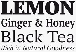
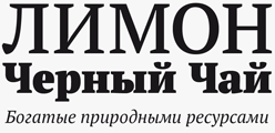
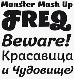
The Creative Characters nameplate is set in Amplitude and Farnham; the intro image features Circe and PT Serif Bold; and the large question mark is in Farnham.
|
Comments?
We’d love to hear from you! Please send any questions or comments about this newsletter to [email protected]
|
Subscription info
Had enough? Unsubscribe immediately via this link:
www.myfonts.com/MailingList
Want to get future MyFonts newsletters sent to your inbox? Subscribe at:
MyFonts News Mailing List
|
Newsletter archives
Know someone who would be interested in this? Want to see past issues? All MyFonts newsletters (including this one) are available to view online here.
|
|
|
|
MyFonts Inc, 500 Unicorn Park Drive, Woburn MA 01801, USA
MyFonts and MyFonts.com are registered service marks of MyFonts Inc. Other technologies, font names, and brand
names are used for information only and remain trademarks or registered trademarks of their respective companies.
© 2014 MyFonts Inc
|
|
|