
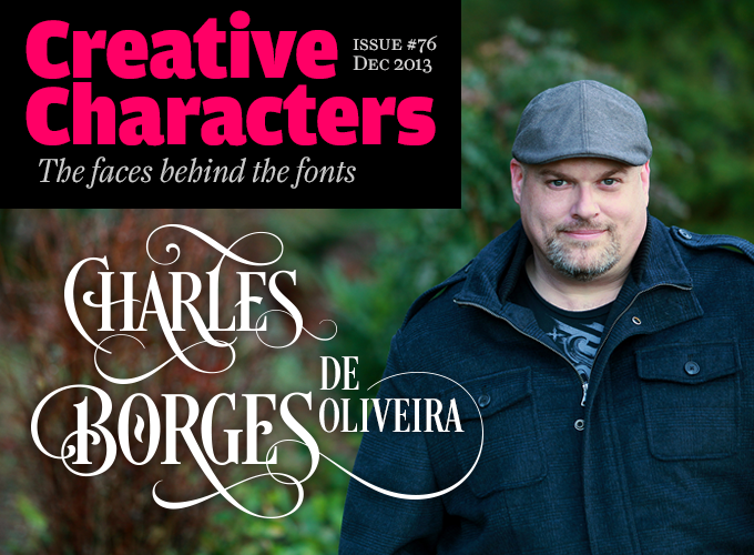
Photo by Gary Hammons
He is one of those lettering artists who learned the craft right at the time when it was becoming obsolete. While passionate about calligraphy and sign painting, he loves working with digital design tools. He has drawn custom logos and titles for prestigious companies. He has produced a string of successful font families, of which the most recent — Desire — took him an estimated 7,000 working hours. He was a mentor to fellow lettering artists Laura Worthington and Debi Sementelli, both of whom he helped to perfect their digital skills. Meet Charles Borges de Oliveira from Borges Lettering, building bridges between hand crafts and digital savvy.
|
Charles, you are a lettering artist as well as type designer. Tell us a bit about how you entered this business. When I was in eighth grade, I knew I wanted to be a sign painter. My mother and father were both very artistic — my mother had been a commercial lettering artist, but gave it up to be a homemaker. As a child I loved to draw and knew that someday I would do something in the artistic field. So at age fifteen I ended up apprenticing at my uncle’s sign company during the summer. But being young and immature, all I really wanted to do was hang out with my friends instead of learning the craft. So that was short-lived. When I was 22, my father encouraged me to go to work for a local sign painter, and I was hired by Allen Sign Company. The owner, Clay Allen, was a journeyman sign painter. I was amazed at what he could produce with a brush. Unfortunately, by the time I got into the trade, computers were becoming mainstream, so I was forced to study lettering after work. Years later, when my kids would go to bed at night, I would go out in my garage and practice my showcard lettering and pointed-brush writing. I taught myself lettering by reading books, studying, and practicing. In the beginning, my goal was to be a journeyman sign painter, but I ended up switching to lettering and type design. I chose to switch professions because I wanted to concentrate solely on lettering. How important is tradition to you? Have you researched the techniques of the past, and studied the history of letter forms? Tradition is crucial. I feel that when you have the ability to letter with a brush, pen, or pencil, you have a firmer understanding of how the letter forms should be constructed. Thus, if you are making your letters digitally, you will know how the strokes should be produced and why the swells go in certain places. I am very excited that sign painting and calligraphy are becoming more popular with the younger generation. When I was starting out, I could not find any local schools that taught lettering. My mother gave me her book from college, Lettering for Advertising by Mortimer Leach. This is by far the best book on lettering that I have found in all of my years in lettering. I studied that book for years. I still use it for reference from time to time. The late Doyald Young did a lot of the inking in that book. Another book that I learned from was Mastering Layout by Mike Stevens. I believe that understanding and mastering layout is crucial for both lettering and type design. One of the things I like most about finishing a type design is making the posters for it. It’s fun to see your letters come to life in a design. Do you still do a lot of work by hand? Half of my work is done by hand and half is done with a computer. All of my script fonts start out by being hand-lettered. Once I have the letters the way I like them, I bring them into the computer and digitize them. Let’s get geeky for a moment. What are your favorite tools? My favorite tool is probably the Tombow ABT Dual Brush Pen. It mimics a pointed brush, but has a nylon fiber tip. It is great for doing brush script lettering — the tip is very forgiving, which aids in making beautiful letters. My font Sarah Script was produced using a Dual Brush Pen. It can produce fine strokes to very broad strokes, though the tip will eventually break down. I am heavy handed, so the Tombow pens do not last long when I letter with them. My favorite showcard brush is the Grumbacher 9355. Unfortunately, they do not make them anymore, but the Mack brush company sells a comparable version. For the student of lettering, a showcard brush is a great way to get into lettering. You can use showcard paint or tempera. It is water-based, so clean up is very easy. The showcard brush has a chisel edge which is perfect for making sans serif letters, scripts, and casuals. My favorite pointed brush is the Scharff 3000 Fine Line Red Sable pointed brush. My friend Stephen Rapp turned me on to these. It is the same brush that he used at American Greetings. These brushes offer a lot of flexibility, but are harder to control until you get used to them. The Pentel Color Brush™ is another favorite of mine. It has a nylon brush tip and takes ink cartridges, though I prefer to manually dip my Pentel brush in Sumi Ink. The Pentel has a stiffer brush tip, which is nice as it aids in control. My font Alpine Script was made with one of these. Pentel now uses my Sarah Script on their Pentel Arts® line. |
Desire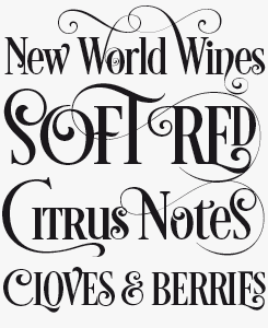
Desire is Borges’ biggest and most substantial typeface to date. Paying tribute to high-contrast classicist display faces such as Bodoni Poster Compressed, Desire takes this genre to a new level of baroque flair. It is well-suited for book covers, editorial design, packaging, advertising, branding and more. With 644 alternate letters, 98 ligatures, flourishes and catchwords, Desire is a different font every time you use it. Choose the Pro version to work with OpenType-enabled software, or opt for the Uppercase and Lowercase varieties to get access to maximum ornamentation on the web and in office applications. Louisiana
Louisiana is a confident yet informal and natural handwriting script, based on the lovely handwriting of Melanie Snedeker. It’s one of those legible handwriting fonts that come in handy for many design jobs… but also for writing a letter or invitation that looks personal without being sloppy. Aloha Script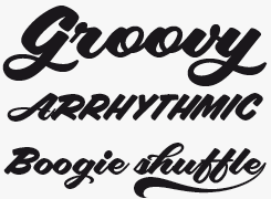
A collaboration between Borges and veteran sign painter Pierre Tardif, Aloha Script is a fun and chunky brush script. There are two fonts on offer here, each with the same lowercase letters, figures and punctuation but with different capitals. Aloha Script Casual has simpler capital forms, and works well in all cap settings. Both fonts have plenty of alternate characters with some extra underlines, ligatures and swashes, and combine well to create distinctive logo designs, packaging and more. |
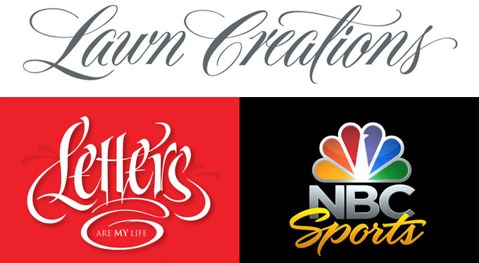
Clockwise from top: Lettering for Dan Antonelli, owner of Graphic D Signs; NBC logo collaboration with David Barton, Senior Designer at NBC Sports and Olympics, and Troika — Borges Lettering designed the word “Sports”; Personal project lettered with a 1/4" Langnickel 6076 Nocturna Brush.
|
How has the development of digital technology influenced your craft, and your daily practice? I love using a computer. It truly is a great tool, especially in the hands of a lettering artist. I think if you took lettering artists from the ’50s or ’60s and showed them what can be done on a computer, they would be ecstatic. I used to fight the computer when I was trying to learn to be a sign painter. I felt it was killing the craft. But the truth is it just opens doors for creativity and productivity. One thing I would like to get into is digital calligraphy. My friend Jordan Jelev is a master at it. Using a Wacom tablet you can mimic the swells of a brush stroke. It’s very exciting. For lettering artists, especially those who make digital lettering pieces, making script fonts is a bit of a paradoxical activity. When you provide graphic designers with fonts that make it possible to imitate great lettering, aren’t you putting yourselves out of work? That is an excellent question. Fonts give graphic designers easy access to beautiful and unique lettering. But it’s not new. Some of the great lettering artists from the past made typefaces for Photo Lettering, Filmotype, and Lettering Inc. This allowed design agencies a lower cost alternative to hiring a lettering artist. In spite of this, there was still a demand for the lettering artist because of how much more can be done with hand-lettering compared to a ready-made typeface. Today, hand-lettering is starting to see a revival. More people are interested in it than ever before. A font is always a font, and everyone can buy it. When it is used in a caption or a logo, someone else’s design could have the same letters, but hand-lettering is all unique, custom design. That is why companies that value hand-lettering still insist on it as opposed to using a font. A good example of this would be the NBC Sports logo [see illustration above]. They could have easily used a nice script font for the word “Sports”. But since it was hand-lettered it has its own unique identity that distinguishes itself from a font. Besides, it had to be designed a certain way so that the bowl on the top part of the ‘S’ would loop around the leg of the ‘N’. Also, the ‘t’ had to go through the ‘C’ all while retaining the same identity as the old logo, but with a modern twist. Early this year a wonderful documentary, Sign Painters, was released. The film shows two things: on one hand, that sign painting in America has come under tremendous pressure from shops making cheap vinyl signs using computer technology; on the other, that real sign painting is still very much alive, and some quality retailers have returned to using it. Are you in any way part of that scene? Do you still get to make things completely by hand, i.e. without using digital means at all? My friend Mike Meyer, who is in the movie, is very much into keeping the tradition of sign painting alive. Another buddy of mine, Pierre Tardif, makes a living as a full time sign painter and is dedicated to teaching and preserving this beautiful craft. Pierre and I teamed up to produce our font Aloha Script. I retired from the sign business years ago, so I do not make signs anymore. However, you will see that a lot of the MyFonts posters and other visuals I created to promote my fonts look like sign designs. I do this because I often miss designing signs and I feel it’s beneficial to see how the font could be used in signage. I still do hand-lettering in my studio, but unfortunately not as much as I would like. Designing type on the computer eats into my lettering time, but I still enjoy picking up a brush or pen and lettering. It’s meditative and a good stress reliever. |
Avalanche
Avalanche is a muscular all caps brush script especially suited for injecting sports brands with an extra dash of machismo and derring-do. A handful of alternates will lend your designs a touch of individuality. Enchanted
Combining aspects of handwriting and brush script lettering, Enchanted’s appeal and utility actually lies in its suitability for setting in longer paragraphs of text. Unusually for both script and handwriting fonts, the characters don’t connect, which greatly improves its legibility in longer settings. Which is not to say it won’t also be a charming and genial addition to any logo designer’s toolkit as well… with a set of swashes and alternate characters included, this is a very versatile typeface indeed. Sarah Script
Borges’ career as typeface designer was launched with Sarah Script, named in honor of his wife. Cheerful, sassy and, er, wonderfully drawn, Sarah Script is a particularly great choice for food labeling where its contrasty form will help jars and tins stand out on crowded supermarket shelves. |
|
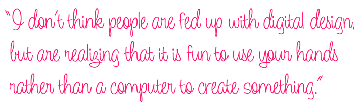
More and more young people want to learn about sign painting, as well as calligraphy. When the Sign Painters movie premiered in Berlin, Germany, a workshop by Mike Meyer sold out in days. So what do you think — is the young generation looking for alternatives to digital design? Are they fed up with it? No, I don’t think people are fed up with digital design, but are realizing that it is fun to use your hands rather than a computer to create something. It’s magical when you produce a letter or a word with a writing tool. It’s a bit similar to the feeling you used to have when seeing certain movies. Today, special effects don’t have so much of an impact on us any more because we know they were created using Computer Generated Imagery (CGI) or a green screen. But before CGI, it was fascinating to try to figure out how they did a particular stunt or special effect. The same is true with lettering. When someone realizes that something is handmade, it conveys that same astonishment of “how did they do that?” I know of at least two lettering artists, Laura Worthington and Debi Sementelli, whom you helped over the first few hurdles in type design and whose fonts have become very successful. That’s really generous… don’t you mind creating your own competition? No, not all. I enjoy helping people. That is probably why I would love to teach lettering someday. Laura and Debi are amazing lettering artists and type designers. I am honored to call them my friends. I first met Laura when I was still employed at a commercial sign company years ago. One of our clients had hired Laura to produce a logo. She sent the logo over and I could immediately tell that it was hand-lettered. So, I emailed her back and asked if she does hand-lettering. She said yes and asked if I needed anything to be lettered. I said no, but I do lettering and type design. This was the start of our friendship. Over the years she sent me samples of alphabets that she made and asked what I thought and if they were good enough to make into fonts. I kept telling her that she should design a font. I think I was becoming a pain because I truly felt that she had an amazing talent for type design and I kept pushing her. So, one year I was working on a website and had some questions about using Dreamweaver® (I am not a web designer). I knew Laura was an accomplished graphic designer so I asked her if she would help me work with that program. She invited me to come down to the college where she was teaching and she would show me how to use Dreamweaver. This was a perfect chance to show her how to use FontLab. It was a crash course really. We dove right in and I showed her how to make a font from her lettering. It was enough to get her started. From there she just took off! I was so happy to see her explode on to the type scene. I always knew she had it in her. I am just glad that she is now making it her career. Besides, now that she is very competent in FontLab, I get to ask her questions when I get stumped on something. To me that is a great thing. Laura and Debi are some of the nicest lady type designers that I have ever met. Their energy shows not only in their work, but in their personality. |
Bounce Script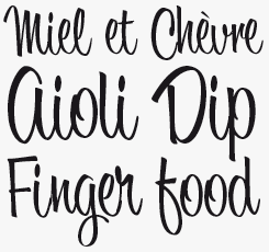
Bounce Script has the structure of a cursive script, yet it is so upright that it almost leans backwards. It’s a classic example of the lively fifties-style scripts Borges is famous for, and will be a perfect addition to any nostalgia or Americana-inflected branding scheme. Alpine Script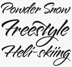
There’s a generous dash of Gallic insouciance to Alpine Script which will bring adventure and travel brands in particular that little bit of extra flair and inspiration. A range of swashes and alternates help make the typeface feel spontaneous and free-spirited, while its professionally drawn and constructed letter forms make it suitably robust and multi-functional. |
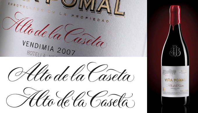
Not a font, but hand-drawn specially for the client: As part of this vineyard commission from Lateral Branding, Borges created several versions of the lettering with different degrees of formality.
|
Compared to some other designers of script and display fonts, who release something new almost every month, you seem to take considerably longer. Any idea how many hours you’ve invested in any given typeface? Why does it take you so long? That is a great question. My fonts range from being developed in three months to five years. Sarah Script took seven months to make while Desire took over five years. I have put over 7,000 hours into it. I am a full-time type designer, so my day is spent making type as opposed to being done as a side project. I am very critical when it comes to lettering and design. I want it to be perfect: I probably redrew the basic letters of Desire over 50 or 60 times. I wanted to capture the warmth of the letter as opposed to being stiff and mechanical looking. That was a challenge in itself. Also, Desire has over 644 alternate letters, 98 ligatures, 8 flourishes and 6 catchwords. That was a lot of work! At one point there were even more alternates, however some were so abstract that I was concerned that people would not be able to decipher what the letter was, so I cut down on them a bit. You’re quite active on Facebook. To what extent does having a social media presence help you in your daily work? While I realize that social media marketing is an excellent tool for getting exposure for my work, I tend to spend more time on lettering and type design. However, the time that I have invested into it has provided several new opportunities. For example, I recently completed a lettering job for a company in India. What kind of advice would you give to an aspiring type designer today? The best advice I can give is to learn how to letter by hand with traditional tools and practice design composition. Even if you are not artistic, you will gain an understanding as to how the letters are formed. Besides, you just might surprise yourself and realize how truly exciting it really is. As for composition design, I believe this to be especially crucial: when you design a character with the composition in mind, you will begin to see that the negative space is just as important as the positive space. You will train your eyes to see balance, symmetry and weight. Something else of importance for aspiring type designers and professionals to consider is this: “Would I use this typeface in my regular workload?” If the answer is no, then figure out a style of lettering that you feel would be considered a work-horse in the graphics industry. Unless you want to design type for fun then there is no need to ask yourself these questions. But for those that really want to break into the type design industry I believe it to be in their best interest to make something that people will truly want and use. Thanks, Charles, for your wise words! |
Sadey Ann
There’s a whole alphabet’s worth of alternate characters in Sadey Ann (for readers outside of North America, that means 26). That sophistication belies Sadey Ann’s child-like innocence; it will work extremely well in literature and editorial aimed at young and almost-grown-up female readerships alike. Mocha Script
Mocha Script is a powerful toolkit for recreating the effect of hand-lettered and painted signs by two veterans of the artform — Borges worked with sign painter Bruce Bowers to create over 240 characters that include alternates, ligatures and special word endings. As well as signage, Mocha Script also works well as a casual handwriting font for letters, postcards and personal messages. |
MyFonts on Facebook, Tumblr & TwitterYour opinions matter to us! Join the MyFonts community on Facebook, Tumblr and Twitter, — feel free to share your thoughts and read other people’s comments. Plus, get tips, news, interesting links, personal favorites and more from MyFonts’ staff. |


|

|
Who would you interview?Creative Characters is the MyFonts newsletter dedicated to people behind the fonts. Each month, we interview a notable personality from the type world. And we would like you, the reader, to have your say. Which creative character would you interview if you had the chance? And what would you ask them? Let us know, and your choice may end up in a future edition of this newsletter! Just send an email with your ideas to [email protected]. In the past, we’ve interviewed the likes of Matthew Carter, Laura Worthington, Jonathan Barnbrook, Ulrike Wilhelm, David Berlow, Emily Conners and Hannes Von Döhren. If you’re curious to know which other type designers we’ve already interviewed as part of past Creative Characters newsletters, have a look at the archive. |
ColophonThis newsletter was edited by Jan Middendorp and designed using Nick Sherman’s original template, with specimens and type descriptions by Anthony Noel. The Creative Characters nameplate is set in Amplitude and Farnham; the intro image features Desire; the pull-quote is set in Sadey Ann; and the large question mark is in Farnham. |
Comments?We’d love to hear from you! Please send any questions or comments about this newsletter to [email protected] |
Subscription infoWant to get future issues of Creative Characters sent to your inbox? Subscribe at www.myfonts.com/MailingList |
Newsletter archivesKnow someone who would be interested in this? Want to see past issues? All MyFonts newsletters (including this one) are available to view online here. |