
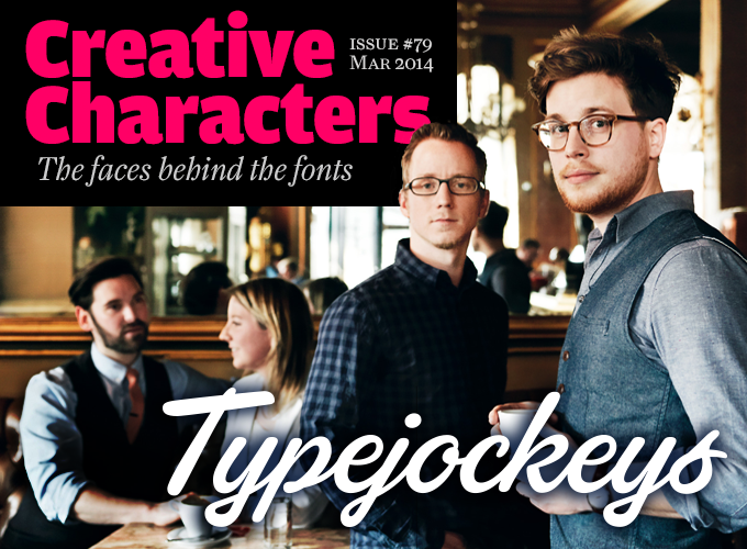
Photo by Andreas Jakwerth
Typejockeys is a small studio in Vienna, Austria. They do a lot of different things — from graphic design to lettering and type design. Outside their country they are best known for their fonts — a small but growing library that is much appreciated by typographic gourmets around the world for their spirited originality and technical precision. They just released three great, affordable display fonts: Freude, Carabelle and the wonderful Sauber Script, making this the perfect occasion to interview the two Typejockeys that specialize in type: Thomas Gabriel and Michael Hochleitner. The team is completed by the duo in the background — co-founder Anna Fahrmaier and graphic designer Stephan Kirsch. Enjoy!
|
Typejockeys is a small company involved in a wide range of activities. Tell us a little bit about who you are and what you do. We have known each other since the age of 14, when the three of us were accepted at a graphic design school in Vienna. We had a very committed teacher, who over the years fueled our interest in typography to a level from which there simply was no way back. Austria is unfortunate in not being able to look back on a rich history of type design. But this disadvantage motivated us all the more to specialize in type. After working and studying abroad, we were all back in Vienna in 2008, and founded Typejockeys a few months later. With Typejockeys, it was never our plan solely to produce typefaces, since our interest in typography extends in a lot of other directions as well. The disciplines in which we work include graphic design (such as corporate design, packaging, editorial, environmental, and digital media), type design (retail as well as custom work) and lettering, which is a little bit in-between those two, if you like. Everything we do is in some way related to the German term Schrift, which covers everything from handwriting to digital typefaces. We love letters, we think about them and work with them with all our hearts. This is the meaning of the “serifed heart” that you can find in all our fonts! Let me get back to the very first thing you said. So Austria actually has high schools that offer a specialized graphic design curriculum? How much of the day-to-day education is design-oriented, what subjects does it cover? The full name of the school translates as National Graphic Education and Research Insitute, but it’s usually referred to as Die Graphische. Students start at the age of 14 and finish with a high school diploma as well as a graphic design certificate. Applicants need to submit a portfolio and pass an acceptance test. Those who are selected receive a five-year education with a strong focus on graphic design: more than a half of your curriculum consists of practice-orientated subjects, such as as corporate design, editorial design, typography, printing and computer training. Theoretical subjects included art history, economics and law or marketing. When applying at the age of 13, we were virtually clueless about a graphic designer’s day-to-day work. For the first two years at the Graphische we didn’t even touch a computer, but learned drawing with a mapping pen and laying out text with scissors and glue. Although by the 1990s this wasn’t of huge practical value in itself, we were taught to work accurately and with the highest attention to detail. This is probably something that today’s Graphische students miss out on, due to laptop classes from day one. Thomas and Michael, you both completed a Master’s course in type design at one of the European institutions specializing in this field — Michael at the University of Reading and Thomas in the Royal Academy KABK in The Hague. Was this essential for you to become the professional type designers that you are? Thomas: Absolutely. Because creating typefaces at a certain level of quality requires a solid knowledge of the basics and an ability to evolve ideas into fully functional families. Before The Hague, I was working on a type family for my final exam work at the Graphische Meisterklasse (Master Class) in Vienna. Pretty soon I realized that I’d reached a level where I could not get any further on my own; at that time in Austria there was nobody who had mastered this field yet. It was hard because I’m a perfectionist, and I struggled to get the details right. In The Hague we started from zero and learned the essential roots and basics of typeface design. The many hours we spent on calligraphy and stone carving effectively opened my eyes. In 2010 I completely reworked the typeface I had started at the Graphische and we released it under the name Aniuk. Michael: For me the type design course at Reading was crucial and instructive, absolutely. The high density of type geniuses there gave me the possibility to talk and work with so many influential people and certainly made me a part of a network that still plays an important role for us every day — counseling and giving advice, working together on projects, and taking the pulse of the type business. |
Ingeborg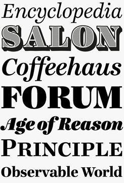
Typejockeys’ most popular typeface is Ingeborg by Michael Hochleitner. As a “modern face” text family, it belongs to the same category as the Bodonis and Didots of this world. What makes it such a good alternative for these classics is its readability: where most digital Didones are rather spindly in small sizes, Ingeborg’s text weights — Regular and Bold — are sturdy enough for comfortable reading, while maintaining the vertical stress typical of the genre. The heavier weights on the other hand were designed to grab the reader’s attention with their idiosyncratic shapes and with a lot of ink on the paper, and richly flourishing companion italics. In addition, striking headlines and logos can be created using the “unicase”; alphabets, a mix of lowercase and small caps, hidden in the text fonts’ Stylistic Sets. Sauber Script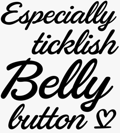
Starting life as one of Typejockeys’ branding commissions (for Austrian recycling company Saubermacher), Sauber Script has just become available for retail licensing. An orderly yet relaxed brush script, it is not as fancy as many similar faces from other foundries — it does not come with a huge arsenal of flourishes and swashes. What it does have is perfectly connecting characters and an ample set of letter pairs to give each line the natural flow of 1950s hand-lettering — clearly an important source of inspiration. It also has exemplary language coverage: all in all, a perfect fit for international branding and labeling projects that are looking for a casual vibe, yet need robust functionality. |
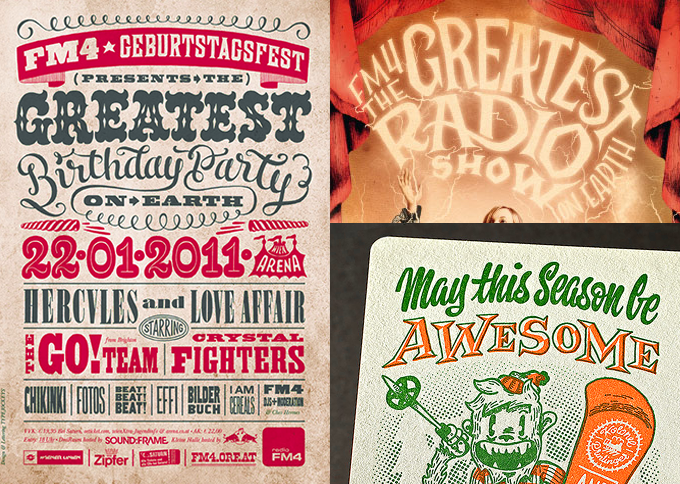
Poster, flyer and postcard designed by Typejockeys using custom-made lettering.
|
These two schools have different approaches to type design. In your daily collaboration, do you ever experience differences of opinion resulting from this? Not really. We do have different approaches, especially in the design process. These differences, however, are connected to personal views rather than to our universities. Both courses help you to develop a sharp eye for shapes and details. Both teach you what differentiates a bad from a decent typeface. And both show you a quite similar way of getting there. We highly value each other’s qualities! Not only with type and lettering, also with the graphic design projects we work on, where Anna and Stephan play an important role. And having known each other for 16 years, we’ve also figured out how to use individual assets to everyone’s benefit. Tell us a bit about your work with pre-digital technologies such as letterpress. Thomas: Well-crafted printed matter — like good type design — is among the kind of details that, once noticed, immediately get appreciation and contributes to the whole package. One of the reasons for us to work autonomously is to be able to stay in control of as many of those details as possible. Michael: In 2010 we purchased an old hand press that we would play around with in our basement. We soon hit our limits with this rather small machine, and met Sarah Bogner, who had just purchased an old typesetting company — now Neue Satz Wien — with several Windmill platen presses and cylinder proof presses. We set up a collaboration with her under the name Kolonel Printinger, which allowed us to produce much more advanced printed products. An example of this is the letterpress printed specimen cover for the Henriette type family. Besides the printing machines we also have the possibility to access two working Linotype machines as well as a substantial collection of Linotype matrices and metal typefaces. I like the simplicity of letterpress and it excites me when I outsmart its limitations. Heavily embossed cotton stock makes me weep, but I also love to hold a beautiful 1920s book in my hand, allowing me to slightly sense the most amazing typefaces of all time. However, I’m sure my most important pre-digital tool is my pencil! It is cheap, never runs out of battery and for me is the most direct way from my head to reality. |
Aniuk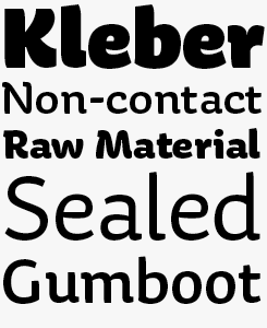
Aniuk by Thomas Gabriel is a very original display type family designed and optimized for use in large sizes. It comes in five robust weights — Regular, Medium, Bold, Heavy and Black — which are perfectly suited for use in magazine headlines, on book covers and posters, or for logo design. With its perfect balance of characteristic curves and edgy details, Aniuk is lively, strong and never boring. It invites its users to be passionate and emotional, and express themselves in colorful ways using a variety of five different weights. |
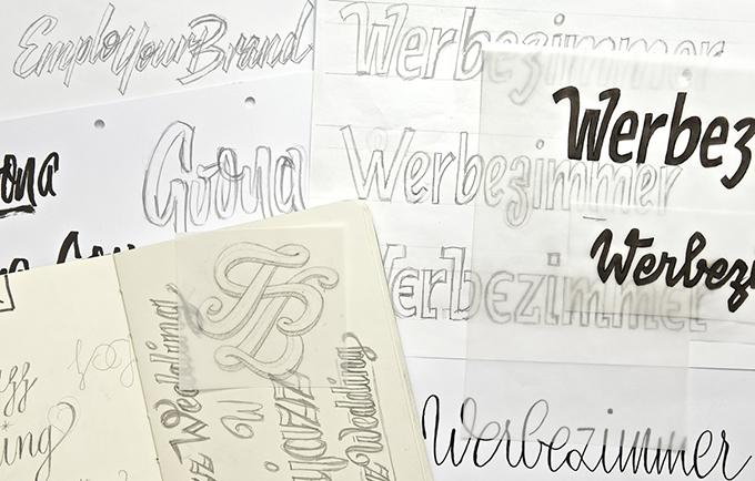
A selection of pencil sketches.
|
Some of your typefaces (perhaps all of them) were originally designed for a client assignment. Who decides that a project needs a bespoke typeface — you or the client? Are clients willing to pay for that? Freude and Sauber Script were custom typefaces for clients. Sauber Script was based on the logotype lettering we produced for Saubermacher, an Austrian recycling company. It was specifically ordered by the client. Freude, on the other hand, was something that we initiated ourself, to complement a book/album artwork project we were working on. It was originally an all-caps design, which was later expanded by adding lowercase letters and refined using various OpenType features, like automatically alternating glyphs. Aniuk, Henriette, Ingeborg and Premiéra are designs we did not create for a specific client. Is it more attractive for you to develop a typeface for a specific project with its client briefing and constraints, rather than to design a pure retail font, and have the freedom to do whatever you like? Both fields are attractive. The former is an assignment: the challenge lies in meeting the clients’ expectations and helping them sell their products. The goal is not to make an all-rounder, but a typefaces that fits better to the client, than anything off-the-shelf. The challenge of the latter is very different. We try to make typefaces that we think the market might need. But we never know if we’re right, until we try. |
Carabelle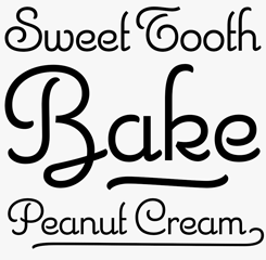
Carabelle is based on Calipso, one of the hidden treasures in the catalogue of the late Nebiolo foundry in Turin, Italy. It’s a very sensitive digitization, capturing with great precision the charm and appeal of the original type, a hybrid between an unconnected script and an Art Deco-styled geometric display face. As Typejockeys wrote: an elegant companion for cupcake shops, wedding invitations or culinary tours through France and Italy. |
|
Much of your work as type designers is rooted in historical references. Henriette, for instance, was based on the street name signs in Vienna. Could you say something about the development of that family? In the 1920s the Viennese government decided to standardize the street signs across the city. Since then, around 7,000 streets and squares in the Austrian capital have been labeled with white-on-blue enamel plates. A typeface was developed especially for the purpose — but we don’t know by whom. It was available in a Regular and a Condensed version, to support short street names like Gaußplatz, as well as longer names like Wolfgang-Mühlwanger-Straße. Since the 1970s, photo-typesetting has been used to produce the plates, which allows the enamel producer to stretch the typeface to the perfect length (which kind of hurts sometimes). As the years went by, the typeface was adopted and redrawn by several enamel factories, who each wanted a part of the cake. These adaptations lead to variations on the design, and to the fact that there isn’t one Viennese street sign typeface but sixteen often severely different versions, which we found in our research (not including derivatives). Henriette is not a digitization of any of those versions; rather, it is influenced by all of them. It is our approach to this piece of Austrian type history. The family now includes Normal, Condensed and Compressed widths, as well as complementary Italics, totaling 30 styles plus a fancy frames font. You’re not the only designers who are inspired by street lettering in Vienna. Luxus Brut by Roland Hörmann, for instance, is based on one of the beautiful old shop signs in the inner city. Is Vienna a constant inspiration to you? Certainly. Since we are serious type nerds, we keep looking at letters everywhere we are. Luckily Vienna had some very talented sign makers, who over the years produced a fair amount of great shop sign letterings around the city. Unfortunately the golden days of this art are long gone, and more and more of these sheet metal beauties are being ripped of the walls. Roland Hörmann not only got inspired to make his marvelous Luxus Brut, but also started collecting these pieces of lettering, saving them from the scrapheap. For our part we try to preserve the most awesome ones by photographing and sharing them over the Internet. Just recently, Roland and his partner Birgit Ecker displayed their collection in an exhibition in Vienna. I suppose that after the recent crop of display fonts, we can’t expect anything new from you immediately. But I can imagine that the next project will be another major release. What do you have in the pipeline? You’re right. We have been working on a major type family since last year. You can expect a release before the summer. Will it have serifs? Probably not. 2014 is looking to be an exciting year for our foundry and we want to keep it that way! |
Henriette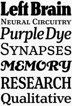
Henriette’s back story begins in 1920’s Vienna with an initiative by the city leaders to standardize street signage. Over the decades, however, the “standardization” resulted in a wide range of subtly different lettering styles, providing Typejockeys with a rich well of source material for creating this intriguing display and text face: versatile enough to handle demanding editorial work; yet so deeply rooted in its geographic origins to offer a truly distinct editorial tone of voice. Freude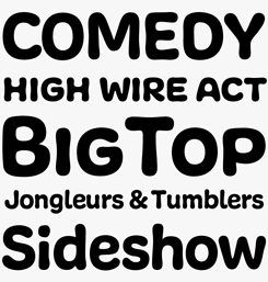
In German, Freude means “joy” — but that simple word doesn’t do justice to the sophistication on offer here. With several variations of each letter, users of OpenType capable software can create natural, playful branding, labeling, posters or, like the project the font was originally developed for, amiable and charming music packaging. |
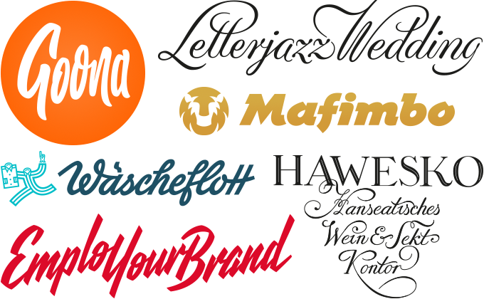
This set of logos shows the wide range of lettering styles Typejockeys master.
|
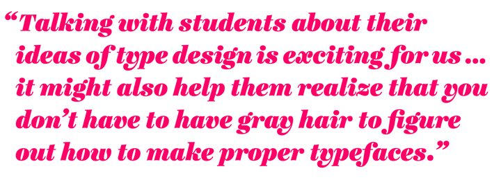
Type design has become very popular among students, and the two of you may be ideal instructors: a wide range of skills, a solid background, and not so much older than the students themselves. Do you see a role for yourselves as teachers, or traveling around the world, giving workshops? What would your most important message to students be? Anna is a part-time teacher of graphic and editorial design in Vienna. Although she is kind of a workaholic, she might admit that combining teaching with full-time work for Typejockeys is rather demanding. The two of us enjoy doing workshops from time to time. Talking with students about their ideas of type design is exciting for us. The small age difference you mention often leads to meeting them on a rather personal level, making it easy to talk frankly. It might also help young people realize that you don’t have to have gray hair to figure out how to make proper typefaces. However, due to the number of projects we have been working on for the last couple of years, we didn’t push the idea of teaching too much. Not because we are not interested, but simply because the time wasn’t right, yet. We’ll see what the future brings, though. We certainly will! Thanks for spending some time with us. |
PremiÉra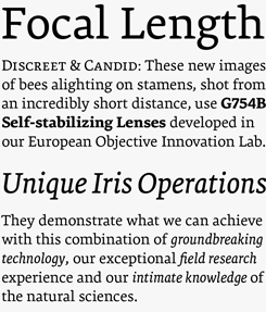
Thomas Gabriel’s Premiéra is a book typeface specifically designed to work in small sizes. It is available in three weights: the “Book” for main text demands and two styles (Bold and Italic) to create different kind of emphasis. A strong x‑height and short ascender/descender make this very legible and elegant typeface suitable for use in books and newspapers. |
MyFonts on Facebook, Tumblr & TwitterYour opinions matter to us! Join the MyFonts community on Facebook, Tumblr and Twitter — feel free to share your thoughts and read other people’s comments. Plus, get tips, news, interesting links, personal favorites and more from MyFonts’ staff. |


|

|
Who would you interview?Creative Characters is the MyFonts newsletter dedicated to people behind the fonts. Each month, we interview a notable personality from the type world. And we would like you, the reader, to have your say. Which creative character would you interview if you had the chance? And what would you ask them? Let us know, and your choice may end up in a future edition of this newsletter! Just send an email with your ideas to [email protected]. In the past, we’ve interviewed the likes of Michael Doret, Laura Worthington, Jonathan Barnbrook, Rob Leuschke, David Berlow, Ronna Penner and Jos Buivenga. If you’re curious to know which other type designers we’ve already interviewed as part of past Creative Characters newsletters, have a look at the archive. |
ColophonThis newsletter was edited by Jan Middendorp and designed using Nick Sherman’s original template, with specimens by Anthony Noel. The Creative Characters nameplate is set in Amplitude and Farnham; the intro image features Typejockey’s logotype; the pull-quote is set in Ingeborg Fat Italic; and the large question mark is in Farnham. |
Comments?We’d love to hear from you! Please send any questions or comments about this newsletter to [email protected] |
Subscription info
Had enough? Unsubscribe immediately via this link: Want to get future MyFonts newsletters sent to your inbox? Subscribe at: |
Newsletter archivesKnow someone who would be interested in this? Want to see past issues? All MyFonts newsletters (including this one) are available to view online here. |