
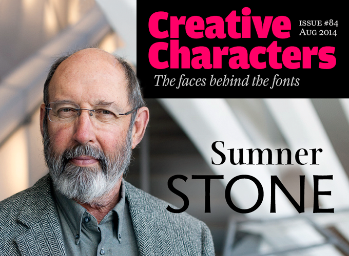
Photo © Paul Eng
This month’s interviewee has been one of the most influential people in digital type design. He was the first Type Director at Adobe Systems, where he supervised the development of the early Adobe Originals. He created ITC Stone, the “superfamily” that included the novel concept of an Informal version. He went on to set up his own Stone Type Foundry, which now has a dozen beautifully drawn text and display families on MyFonts. He is also a teacher at Cooper Union, where one of his students was the young designer that interviewed him for this newsletter — James Minior of MyFonts’ Helpdesk team. Meet the illustrious Sumner Stone.
|
Your work and teachings have influenced numerous designers. Would you indulge us in an exploration of how your craft and career have evolved? I studied calligraphy with Lloyd Reynolds at Reed College in Portland, Oregon, and then went to work for Hallmark cards as a lettering artist. Reynolds was an inspirational teacher. He taught a systematic, well-organized historical approach to making letters. At the same time he presented a very broad view of the nature of letterforms and their meaning and function in a range of cultures both contemporary and historical. Part of my fascination with making letters came from a realization that letters occupy a unique position at the confluence of mental and physical activity. They bind together bodily movement, thinking, speaking, and seeing. Writing formal lettershapes with various tools evokes an energetic meditative state, and so does drawing them as the first step in designing typefaces. I have always enjoyed this process. My exploration along this path is still active. Studying the history and conceptual background of letterforms while I have been designing and marketing typefaces has opened many windows on the past and many doors in the present. My life is much richer for it. For the years I lived in Sonoma County I also had a letterpress shop and did printing and graphic design for the California wine industry. This added another dimension to my experience in working with letterforms. After spending some years teaching and doing calligraphy, lettering and typography, I wound up being responsible for teams of people tasked with making digital typefaces. My work in managing typographic development led me to the become the first Director of Typography at Adobe Systems. The year was 1984. We were caught up in the first wave of typography on the personal computer and it turned out to be a tsunami. That wave is still going strong. How have calligraphy and letter-carving influenced your designs? What are the benefits of basing a new design on these types of letterform, rather than the more mechanical shapes of recent times? My first encounter with making letterforms was through calligraphy, and over the years I have taken a particular interest in epigraphic forms. This background has undoubtedly influenced my type designs. I have only done one type design directly based on calligraphic forms. It is called Davanti. I have recently also released two type designs that are directly based on the Imperial Roman letterforms. They are called Sator and Popvlvs. I was also responsible for initiating the design of the Trajan typeface when I was the Director of Typography at Adobe. Carol Twombly did a beautiful job of digitizing the work that Edward Catich has left us about the Trajan inscription and she also did a fine job of filling in the missing characters. The typeface is now one of the most popular. It seems to be used everywhere. Sator and Popvlvs add a lower case to this class of letterforms. Their capitals are not directly based on the Trajan inscription, but on other inscriptions from the same era. Our legacy of letterforms stretches back more than 2000 years, and there are many beautiful and useful forms. So limiting our attention to only letterforms from the recent past, including the modernist forms to which you are perhaps referring, is very limiting. This does not mean that we have to be limited to directly copying letterforms from the past, no matter what the era. Why shouldn’t we have fresh, original letterforms for the 21st century? This is the direction I have followed in much of my work, and also the direction that I emphasize with my type design students. Let’s go back to the beginning for a moment. Could you share some more on your first encounter with calligraphy at Reed College. Were you immediately hooked? When I attended Reed there was a tradition of making calligraphic banners and posters for all the campus activities. They were written out by the top calligraphy students, and provided a rich visual backdrop to the life of the College. Reynolds had many avid students of calligraphy, and some of them were my friends. Michael McPherson and Anita Laurie Bigelow were among those who helped me get started writing with the edged pen before I ever took a calligraphy class from Reynolds. After graduating from Reed with a B.A. in Sociology, I took some classes at the Portland Museum Art School – Chinese brush painting and ceramics were my favorites. I realized I really liked making things. I had a great half time job with the Post Office and I spent most of my time doing calligraphy. I guess I really became obsessed with making the letters, so that must have been the time when I really became hooked. |
ITC Bodoni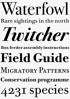
ITC Bodoni was a transatlantic labor of love in which Stone collaborated with Janice Prescott Fishman, Holly Goldsmith, and Jim Parkinson. The goal was to create a Bodoni revival that accurately represented Giambattista Bodoni’s rich stylistic palette. In 1990 the team traveled to Parma, Italy, to examine and photograph Bodoni’s original steel punches and study original Bodoni specimens. The result was ITC Bodoni, a suite that features size-specific designs that Bodoni used, including ITC Bodoni Six, a weight specifically designed for small captions and settings, and ITC Bodoni Seventy-Two, a display design patterned after Bodoni’s 72-point “Papale” font. Stone Serif • Stone Sans
In 1987, Sumner Stone completed his designs for ITC Stone. This “superfamily” solves the problem of mixing different styles of type on the same page by offering three distinctive variations — Serif, Sans, and Informal — that work together seamlessly thanks to consistent cap heights, stem weights, and proportions. As a large integrated family, the Stone types can be mixed successfully in newsletters, business correspondence, books, and packaging. ITC Stone Sans II offers an additional Condensed version in six weights plus italics (lines 4 and 5 in the sample above). |
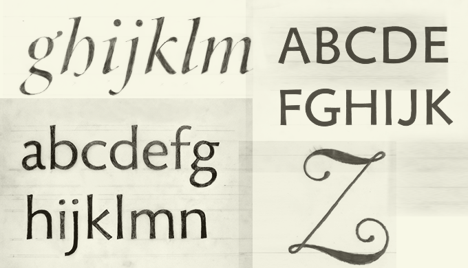
Pencil sketches by Sumner Stone. Clockwise from top left: Arepo Italic, Basalt, Bodoni Swash, Magma.
|
Shortly after jump-starting your career with calligraphy, how did you come to work at Hallmark? What attracted you to that position there? I had seen a film of Hermann Zapf demonstrating his calligraphy at Hallmark Cards – an extract of the film is online now. I was blown away by watching him. Such beautiful and subtle letters were coming out of his hand. I then learned that he spent time at Hallmark as a consultant working with the lettering artists. I spent a couple of months putting together a portfolio and I landed a job working as a lettering artist at Hallmark in Kansas City. Zapf was a kind and generous teacher and clearly identified with us. Our group, the lowly lettering artists, were the last stop on the greeting card production line. We frequently wound up being the ones who had to provide coordination between the artists and the editorial staff to make sure the card would work graphically. There was also a small group of people working on producing Zapf’s type designs and making some of the proprietary lettering styles from Hallmark lettering artists into fonts. These were imaged on the new phototypesetting machine and on the PhotoTypositor. That was my first close-up look at type design and I was quite fascinated. Eventually you became Director of Typography at Adobe. How did that position challenge you? When I interviewed for the job of Director of Typography at Adobe, I told John Warnock and Chuck Geschke, the founders of the company, that I wanted to make new type designs and not just re-format the typefaces that had already been made. They both came from a research environment and put a high value on innovation, so they immediately said, “Of course.” Having a green light and getting the engine revved up are, nevertheless, two different things. We had many tasks on our plate. We first worked on making the “hinting” software work so that the type would be of acceptable quality on the low resolution screens and printers of the day. Now that the widespread use of web fonts has become a reality, hinting is once again a priority for many designers and manufacturers of type. The basic work was done by John Warnock, Bill Paxton and myself in the mid-80s and the software is still being used. The staff of the type group at Adobe also participated heavily in the process through their continual feedback as more and more fonts got hinted. When I first moved into my office at Adobe I made sure that a drawing board was promptly delivered. I wanted everyone to know that new typefaces were going to emerge and I started work on the Stone superfamily of typefaces – Serif, Sans, and Informal. I followed the strategy Adrian Frutiger used in designing the Univers typeface family and designed all the styles and weights together as a system. At first I had some time to spend on the project at the office, but soon enough I was putting in long evenings at home in order to finish the designs. The first LaserWriter and the first Linotype imagesetter were big successes and I think everyone in the type group at Adobe realized that our work on the typefaces was going to be part of a radical change in the way typography and graphic design were produced. I hired Robert Slimbach and Carol Twombly and we proceeded to develop the first important Adobe Originals – Adobe Garamond, Adobe Caslon, and the amazingly popular Trajan. One of the real challenges was expanding my view of what we should be developing. People made typefaces for maps, musical notation, lettering for architectural drawings, etc. Typography was no longer something done only by design professionals. Everyone with a personal computer became a potential user of type, and many people became interested in the physical form of letters for the first time. I think this process is still going on. Fonts are now part of popular culture and typography is becoming a legitimate academic discipline. Now you’re owner of Stone Type Foundry. You’ve accomplished a lot of work over the course of your career! What work are you most proud of and why? I think the Magma superfamily which includes the Basalt, Magma, Munc, Numa, and Tuff type families is probably at the top of my list. Although the typefaces do not have a unifying name they are a proper superfamily. I believe the normal weight of Magma is well suited for setting long passages of text and it, along with all the other members of the superfamily are good for a very wide range of applications. A number of the styles can be mixed together character by character, making them useful for logotypes and other kinds of typography related to identity and branding. For the most part, our typographic tradition has not included designing sans serif typefaces intended to be used for books. The grotesques and gothics really do not qualify even though they are sometimes used, and most of the so-called humanist sans are not really based on humanist proportions and do not function well for this purpose. Syntax, designed by Hans Meier, is one of those that fill the bill. I believe Magma, Munc, Numa, and Tuff also function very well for display. Designing typefaces that can truly be used for both text and display is not trivial matter, so that is one of the reasons I am proud of them. I am also proud of the superfamily that includes Cycles, a typeface that has been used for some very fine books. Arepo, Stone Print, and SFPL are also families in this superfamily. |
Magma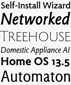
Magma is a humanist sans serif with subtly flared terminals — so it belongs in the rare category of glyphic or incised typefaces. Magma comes in eight weights, has true italics and many special features which make it useful in a large range of applications for both text and display. Munc
Munc shares the same stroke weights and cap heights as Magma, but has a different pedigree historically. Its lettershapes are based on Uncial scripts, the handwriting style from the early Middle Ages which is still preserved in many Irish writing styles. On the European continent, the ancient Uncial letterforms gave way to the Carolingian minuscule, the basis of the later lowercase roman. Stone’s take on the genre is a crisp, contemporary typeface that doesn’t look craftsy or nostalgic. Basalt
Like many of Stone’s typefaces, Basalt has a name that refers to minerals — each a variation, as it were, on the theme of “stone”. Designed with signage in mind, Basalt is a single font containing capitals in wide and narrow versions as well as a set of compatible arrows. Another member of the Magma superfamily, Basalt was first used for signage at the Cecil H. Green Library, Stanford University. Tuff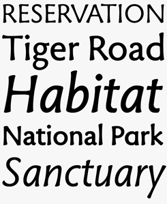
Tuff also began with Magma. Set as text, the two families look rather similar and are quite comfortable as typographic companions. The child-safe softness of Tuff owes something to the letterforms of the earliest extant Greek Manuscript, The Persae by Timotheos in the 4th Century BC. It has some affinity with Morris Fuller Benton’s original Souvenir, and its revival by Ed Benguiat. Stone also cites his own Stone Informal as being an influence on Tuff. |
|
You’ve recently been teaching typeface design at the Cooper Union. What is your approach instructing those students? My approach in teaching the Condensed program at Cooper is to present historical, conceptual, and practical material in parallel. We make pencil drawings, write traditional forms with an edged pen, make type drawings on the computer, and in the end we design at least one version of a digital typeface. Techniques for spacing and testing as well as technical information about producing fonts are part of the mix Also, I am fortunate to teach with Ewan Clayton, Sara Soskolne, Alexander Tochilovsky, and Andy Clymer who are very competent partners at Cooper, and this year we are again privileged to have Matthew Carter doing the final critiques. The certificated program has been very thoughtfully structured by the director, Cara Di Edwardo. Lectures on the history of letterforms and cultural forces that shape them are an important part of the course. Looking at original material is also an important part of the process. We are fortunate that the classes can visit collections at major libraries in New York such as the the Butler Library at Columbia, the NYPL, The Morgan Library, and the Grolier Club. I recently gave a workshop in San Francisco at Letterform Archive, at the actual place where the archival materials are kept. Being able to pull them out of the shelves and look at examples of what I was talking about had an almost electric effect on the participants. I find that teaching people about what I do energizes me in a number of ways and seems to be a factor in generating new ideas for my own work. In 1991, you and a few others went to Parma, Italy to see some of Bodoni’s original material. What did you find, and what made the greatest impression on you? We went to Parma to do research for what would become the ITC Bodoni. Many of the “Bodoni” revivals of the 20th century were based on the work done by Morris Fuller Benton at ATF. These versions were very popular, but I felt that they captured neither the true elegance nor the huge variety of the original Bodoni designs. Giambattista Bodoni cut an incredible number of typefaces with small variations, and of course each one was designed for the size at which it was cast in metal. Our research in Parma was focused on trying to choose some of the archetypal examples of Bodoni’s typefaces. He also did script typefaces, swash capitals, titling capitals, ornaments, and many non-Latins. The design team consisted of Holly Goldsmith, Janice Prescott-Fishman, Jim Parkinson and myself. I also served as the art director of the project. Ilene Strizver and Alan Haley participated as well. My strongest memory to this day is the beauty of the large size punches. It was these letters that made Bodoni famous in his own day throughout the aristocracy of Europe. He was also a fine printer and book designer, but it was the forms of the letters that received the most attention and ultimately were responsible for his immediate success and his lasting influence. As one of the masters of “the digital age”, have you taken any steps to preserve your own work? Certainly preserving digital files presents major challenges. I have all my original analog drawings for the typefaces and also hard copy of the typefaces. The trick with preserving digital files is that they have to be repeatedly copied into new formats and on new media. In this respect they are like books. Anything written on soft materials such as papyrus, parchment, paper, leaves, etc. is very perishable. We have literature from Greece and Rome only because it was copied over repeatedly. There are almost no original manuscripts. If you really want letterforms to last forever, you have to carve them in stone, or impress them on clay that is then fired. We do have many tombstones, memorial inscriptions, boundary markers and the like – over 300,000 extant ancient Latin inscriptions – and many more clay tablets with cuneiform writing on them. However, digital fonts are actually very stable compared to all other computer software. I still have fonts from 1987 that work on my computer. |
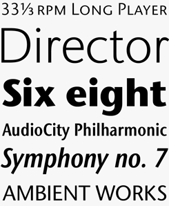
Cycles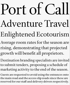
Cycles was designed for use in books and other publications with complex typography using a range of different type sizes. The various versions of Cycles — Five, Seven, Nine, Eleven, Eighteen, etc. — were designed for setting at specific point sizes, as was the practice in the days of metal type. Each has a width, thick-thin contrast and x-height that is optimized for its designated point size, as specified in the name. The Cycles family makes up a superfamily of typefaces together with Stone Print, SFPL, and Arepo. Arepo
In designing Arepo, Stone mixed influences from both the Imperial Roman alphabet and the forms of Giambattista Bodoni to create a refined display typeface. The small family of Regular, Italic and Bold styles is completed by an elegant Swash variant. Issued by the designer’s own Stone Type Foundry, Arepo is part of the superfamily that also includes Stone Print, SFPL, and Cycles. Davanti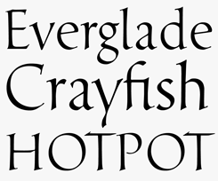
Although many of Stone’s fonts were informed by the handwriting styles of the Renaissance, Davanti is his only font directly inspired by humanist calligraphy. While some of its details recall the Italic cursive, the font is more directly modeled on the upright humanist script that became the model of the earliest roman types by Jenson and others. |
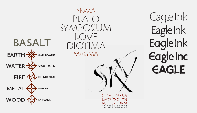
A selection of specimens of typefaces that belong to the uniquely structured Magma superfamily: Basalt, Numa Titling (not yet on MyFonts), and some of Magma’s Alternate shapes.
|
As you described, many of your typefaces belong to one of your “superfamilies”: ITC Stone, Magma or Cycles. What would you advise for a designer about to embark on the process of creating a new superfamily? There are now some superfamilies that include serif, sans, and informal designs. I like to flatter myself by thinking that the Stone families played a part in the growth of that concept. I think type designers should in general think about the potential uses of their typefaces. We are tool makers. The different versions of the Stone typefaces have often been used by graphic designers and typographers for the purpose of providing a unified overall look for a document when the typography is complex. A bit of advice might be to go about designing all the members of the superfamily as a piece following the kind of planning process that Adrian Frutiger used for Univers. One of the pitfalls of interpolation is the tendency to create a rather bland series due to being very conservative about drawing the different poles that are going to be interpolated. Anticipating a possible disruption of the interpolated versions can be very stifling. A look at the difference in form between the ITC Bodoni Six and ITC Bodoni Seventy-Two and then looking at the resulting interpolated Bodoni Twelve might give the prospective designer courage for being adventuresome about the design of the extremes. Understandably, marketing designs can be time consuming. What marketing approaches do you think are most successful these days? Examples of the typefaces in use are very important. For reference, the 1923 ATF Specimen Book is chock-full of examples. This is an important part of what we showed in the Adobe Originals specimen books, and my own book On Stone. Now, exposure online is clearly an important component of marketing. It also helps for a typeface to have a story that goes with it. Outside of design, what do you enjoy doing most? I like the outdoors. Hiking, boating, amateur botany and mycology – these are a major part of my recreation. I also enjoy gardening and cooking. I spent about 5 years being a part-time farmer, but I may have gotten that out of my system. I also like to do black and white nature photography. Any future plans you’d like to share with us? I do want to do more teaching. I enjoy it immensely and I intend to continue. As for new type designs, I am working on a number of them, but I cannot say any more than that. I have consistently written articles for books, journals, and magazines, and I intend to continue writing about typography, type design, and letterform history. |
Popvlvs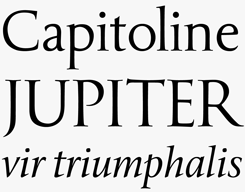
Popvlvs is one of Stone’s typefaces that was directly derived from a classical alphabet: it is his take on the stone-carved capitals of Imperial Rome. Stone has added a lowercase and an italic, both in perfect harmony with the uppercase. A distinguished typeface in just one weight for use on invitations and other official-looking documents, as well as in branding and packaging. Silica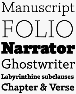
In Sumner Stone’s body of work, Silica occupies a special place: it is a slab-serif based on the proportions and ductus of a renaissance book face. The result is a general purpose type in six weights, from Extra Light to Black; it is upright only. The lighter weights are useful for short passages of text. The heavier weights are a versatile tool for setting headlines. Silica was specially designed to withstand compression using horizontal scaling without compromising the weighting scheme of the design. |
MyFonts on Pinterest, Facebook, Tumblr & TwitterYour opinions matter to us! Join the MyFonts community on Pinterest, Facebook, Tumblr and Twitter — feel free to share your thoughts and read other people’s comments. Plus, get tips, news, interesting links, personal favorites and more from the MyFonts staff. |


|

|
Who would you interview?Creative Characters is the MyFonts newsletter dedicated to people behind the fonts. Each month, we interview a notable personality from the type world. And we would like you, the reader, to have your say. Which creative character would you interview if you had the chance? And what would you ask them? Let us know, and your choice may end up in a future edition of this newsletter! Just send an email with your ideas to [email protected]. In the past, we’ve interviewed the likes of Matthew Carter, Laura Worthington, Jonathan Barnbrook, Ulrike Wilhelm, Bruno Maag, Veronika Burian, and Hannes Von Döhren. If you’re curious to know which other type designers we’ve already interviewed as part of past Creative Characters newsletters, have a look at the archive. |
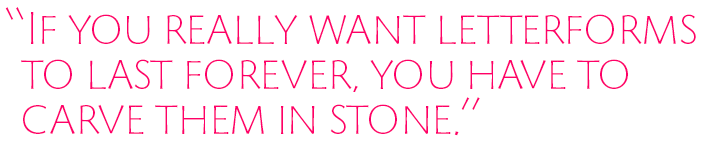
ColophonThis newsletter was edited by James Minior and Jan Middendorp and designed using Nick Sherman’s original template, with specimens by Anthony Noel. The Creative Characters nameplate is set in Amplitude and Farnham; the intro image features Arepo Bold and Magma; the pull-quote is set in Magma Thin; and the large question mark is in Farnham. |
Comments?We’d love to hear from you! Please send any questions or comments about this newsletter to [email protected] |
Subscription info
Had enough? Unsubscribe immediately via this link: Want to get future MyFonts newsletters sent to your inbox? Subscribe at: |
Newsletter archivesKnow someone who would be interested in this? Want to see past issues? All MyFonts newsletters (including this one) are available to view online here. |