|
|
|
What better way to approach the impending new year than with a bunch of fresh and imaginative new type families that explore changeability, transition, reinvention and fluidity? Our selections this month capture all these concepts, from a sophisticated sans that balances precision with an approachable character, to a sharply-cut serif family that is as crisp as the first frost on a bright winter’s day. These families will all be inspiring companions as we slide into the coming year – enjoy!
|
|
|
|
|
This Month’s Rising Stars
|
|
|
|
|
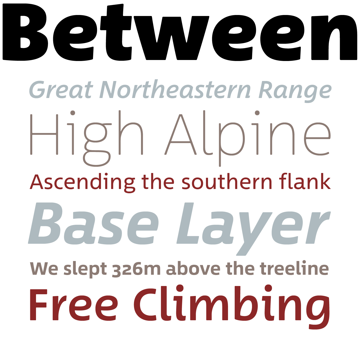
Don’t be fooled by Between™: at first glance, it might seem to be a traditional single-style sans, but look closer and you will see a modern masterwork by Akira Kobayashi, one of the most talented type designers in the world. Between’s flexibility comes from its three states: Between 1, a technical modern square-ish sans; Between 3, a smooth and cheerful informal variety; and Between 2, which straddles the two extremes, marrying the trustworthiness of 1 and the friendliness of 3. Between 2 is designed to complement Kobayashi’s 2007 slab-serif Cosmiqua (a criminally-underused text and display family!)
|
|
|
|
|
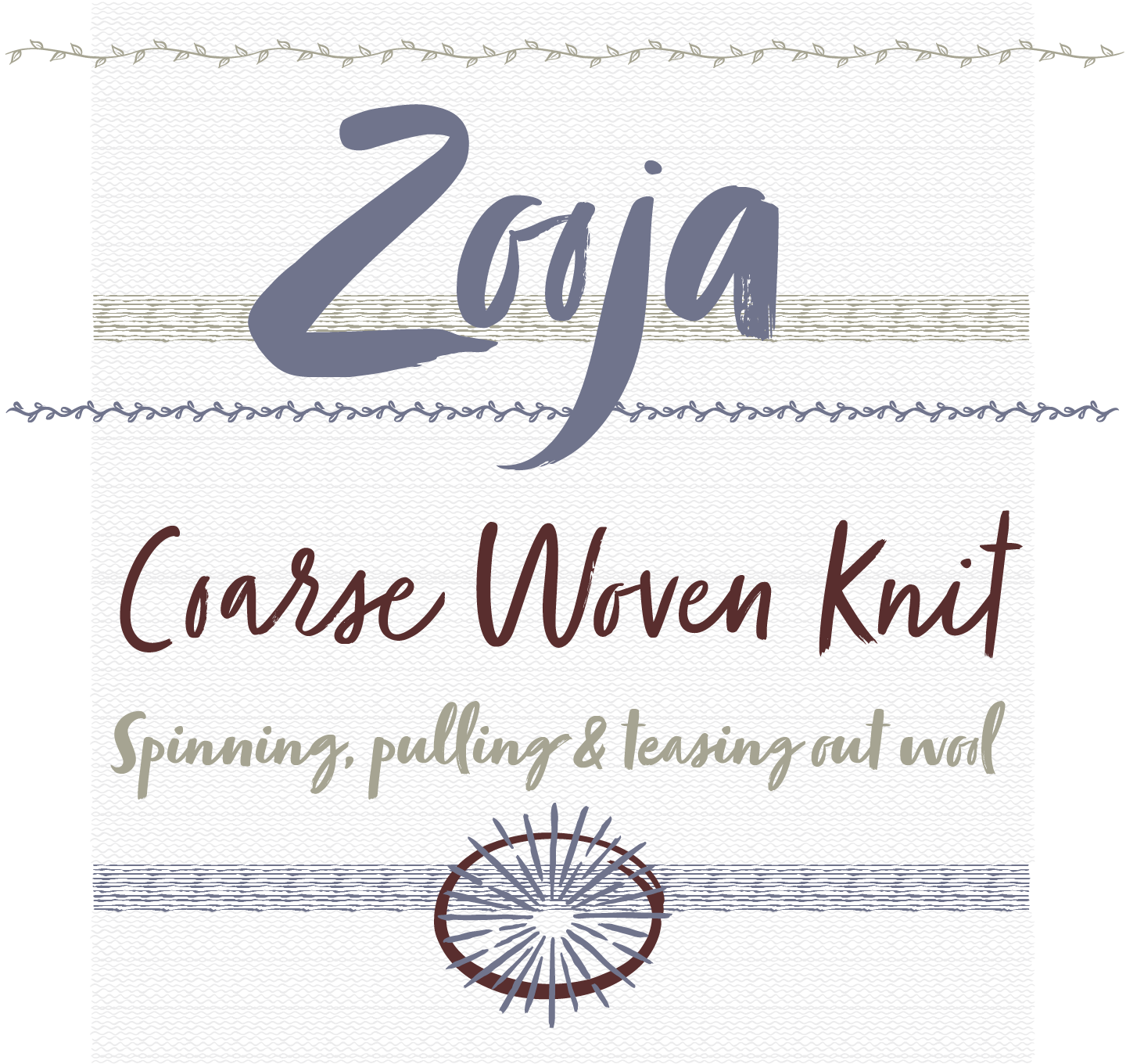
Zooja’s designer, Stephen Miggas, is a developer, calligrapher and graphic designer based in Southern California and known primarily for more than 20 years’ worth of distressed wood type digitizations and delicate scripts. With his newest release, he’s joined the popular trend of immediate, bold hand-drawn scripts in a big way — Zooja is not something to be writ small. In fact, you could even place Zooja at the intersection of Miggas’ most delicate script work and the rough, powerful shapes of his wood type designs. Supplementing this in-your-face script — itself available in two weights, with piles of alternates and a few useful ligatures — are 80 banners, a suite of catchwords, and dozens of illustrations and borders.
|
|
|
|
|
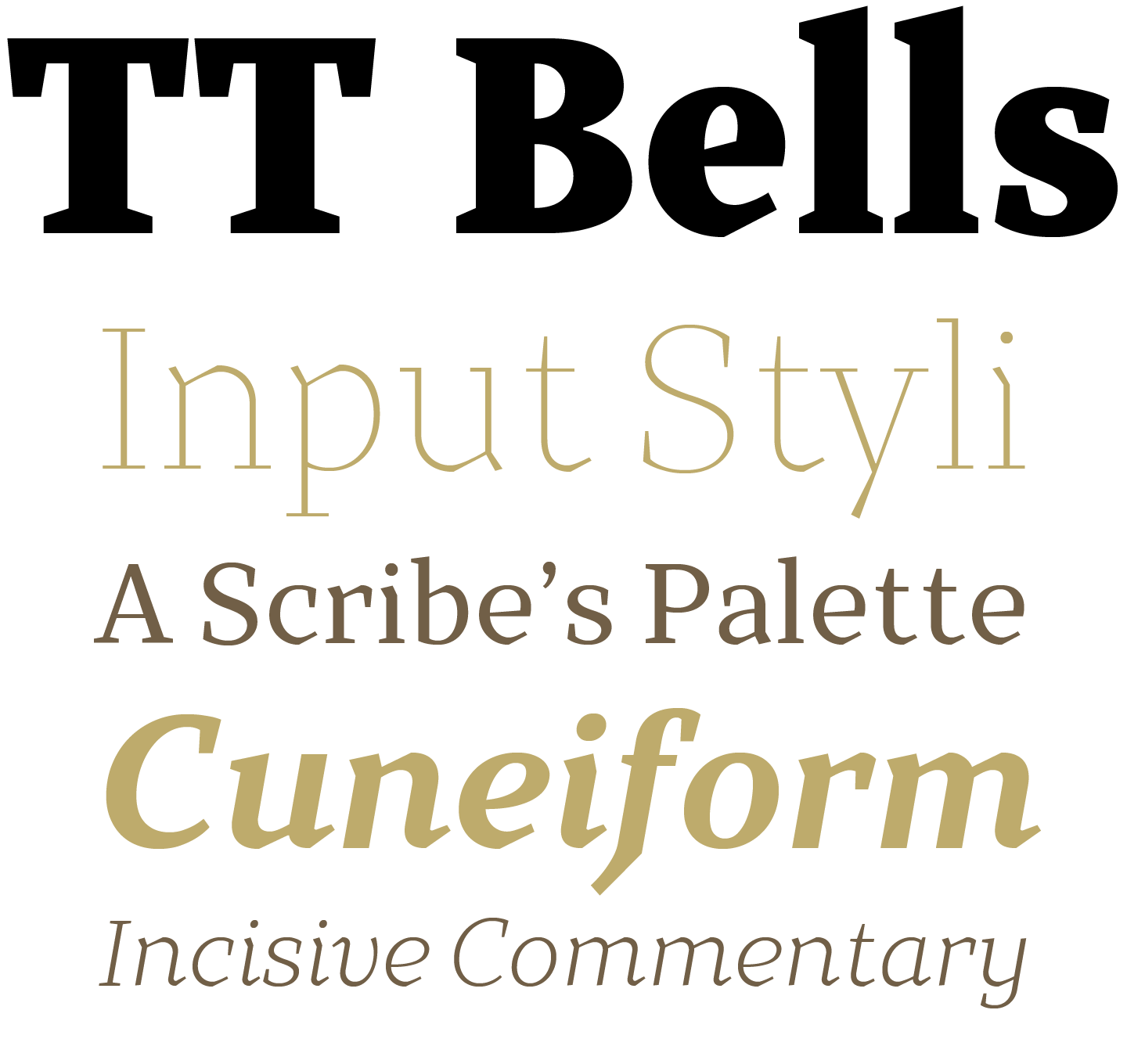
With Bells, Russian designer Ivan Gladikh has created an antiqua with attitude: the aggressive hand-carved angularity of Preissig’s types with a more modern, consistent geometry, spread across five weights and italics. It’s drawn with a broad-nibbed pen, giving it a calligraphic flavor that’s hard to find in many of today’s text families. The high level of detail and contrast, even in the lightest weights, makes this an especially attractive face for poster-sized and larger settings, while the extensive character set — a full complement of Latin and Cyrillic glyphs — makes it especially useful for bookwork.
|
|
|
|
|
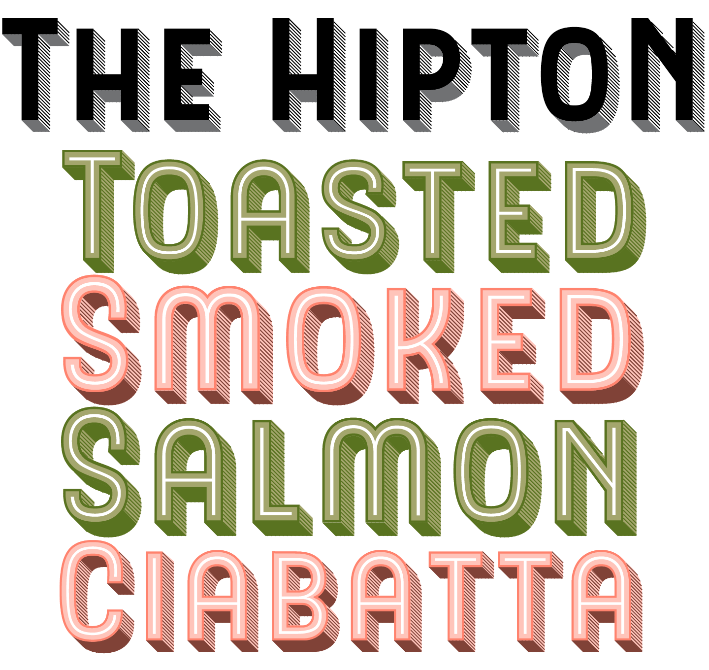
Giving sans families a chromatic treatment — most often influenced by the Victorian, American old west, and Art Deco movements — has become very popular lately. Few people have translated this trend as successfully into type as Indonesian lettering artist Ilham Herry. In The Hipton, seven graphic styles work together to complete the illusion of classic signage with a very attractive twist. The Hipton can get more detailed, if necessary, as the size of the setting increases, with a mix of inline, shading, and extrusion setting a colorful and interesting stage for especially large uses; smaller settings can rely on the normal cut for improved legibility. A set of 50+ helpers, including frames, borders, and a variety of catchwords, completes the look and opens the door to a broader range of decorative settings. I wish I owned a French bistro, as there’s probably no better family in the world for branding it with, but The Hipton will be helpful for a wide range of commercial applications beyond simply the classic packaging and restaurant signage that inspires it.
|
|
|
|
Text fonts of the Month
|
|
Typesetting for books, magazines or annual reports requires font families with special qualities: excellent readability, a generous range of weights with italics and small caps, multiple figure sets (lining, oldstyle, table) and ample language coverage. Here is this month’s pick from the recent, high-quality text typefaces.
|
|
|
|
|
|
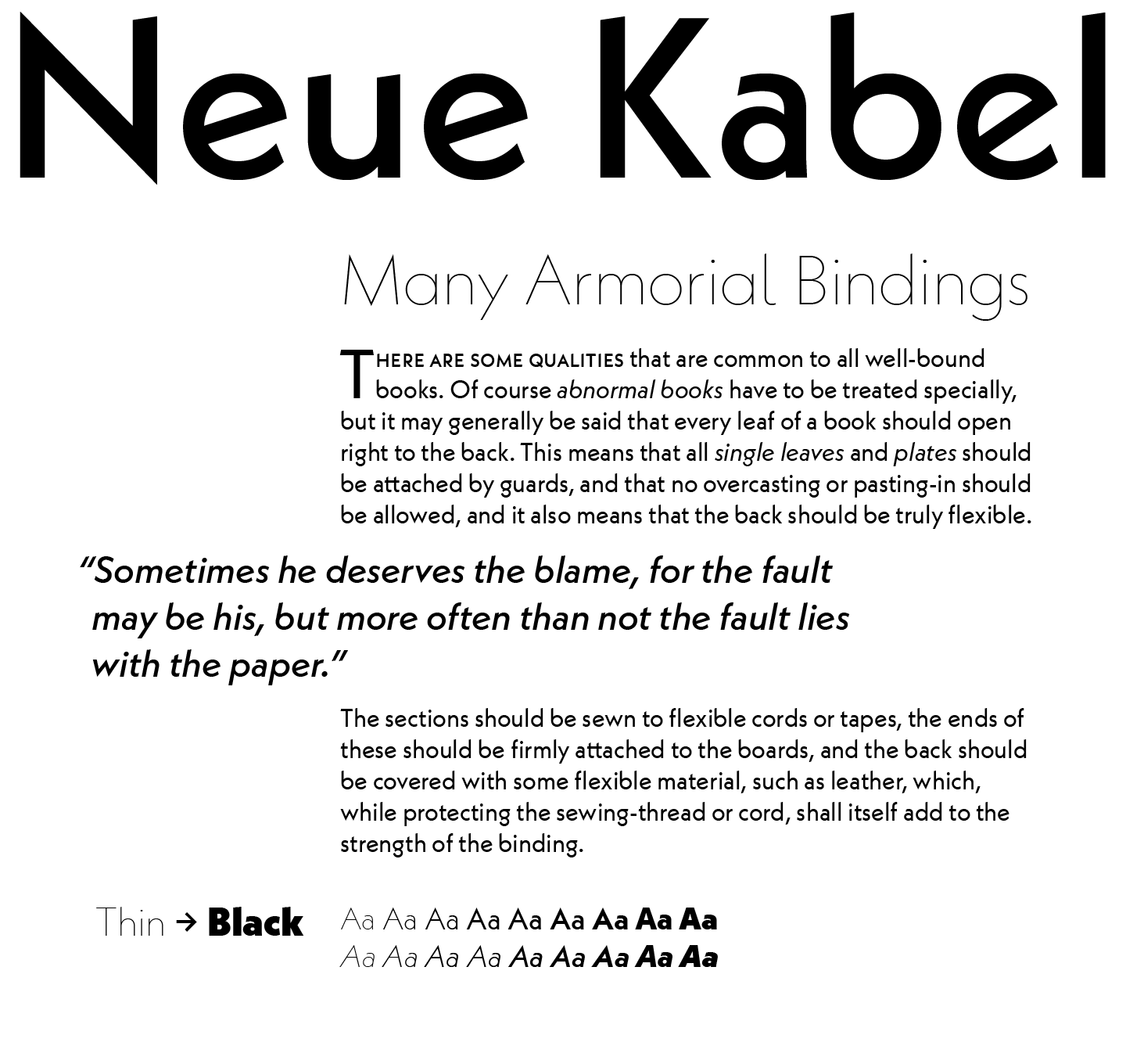
A massive undertaking by university instructor and type designer Marc Schütz, Neue Kabel® is a revival and major expansion of Rudolf Koch’s 1927 sans family. Originally sold by the Klingspor foundry in Germany, it was released at the same time as Futura, and is often seen as the other great geometric milestone of that time. This new version adds enormous flexibility to the entire family: not only is it expanded to nine weights, each with its own italic, but the character set is significantly enlarged and there are dozens of OpenType features, too. Multiple sets of numerals, small caps, extensive alternates, ligatures and arrows supplement the family with loads of extras desirable in larger, longer typesetting projects.
By de-emphasizing some of Kabel’s historic forms, the revival brings us an all-new Kabel: simple and straightforward enough for text, authoritative and unique enough for display. The ability to use historical forms and other alternates — or not — means it can fill any role in between those two states as well.
|
|
|
|
|
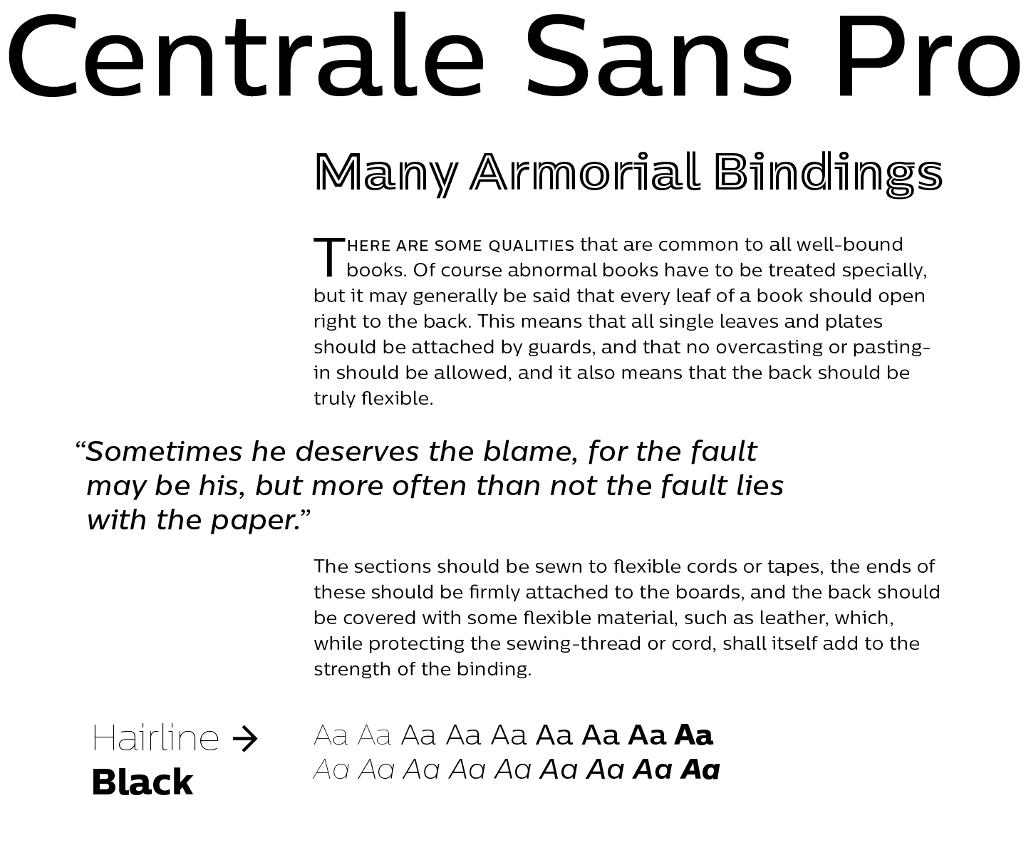
The popular Centrale Sans family has received a big fat upgrade in Bulgarian designers Alexander Nedelev and Veronika Slavova’s Centrale Sans Pro. Following up on the third generation of the design, this — ostensibly the fourth in its ongoing evolution — adds more than 200 glyphs to each of the nine weights and accompanying italics, including extensive support for Cyrillic-alphabet languages, small caps, more numerals, arrows, ligatures, and other OpenType features. The Centrale family itself has grown from a modest modern sans (and one of our most popular faces of 2011, the year it was released) to a type system in and of itself: Centrale Sans and Pro and condensed variants of each, Centrale Inline, and a rounded version.
|
|
|
|
Under the Radar
|
|
With so many new releases every month you might miss some noteworthy new typefaces. To help you discover them we shine a spotlight on a hidden gem.
|
|
|
|
|
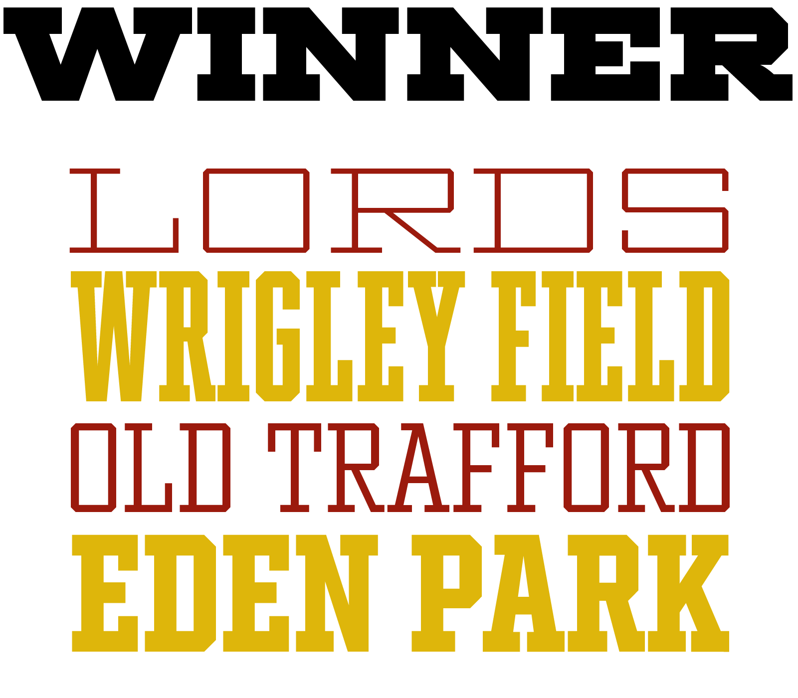
Slab and tech sans faces built for sports-related use are not uncommon — it’s a pretty popular genre, with plenty of non-athletic applications too. But Winner’s 49 cuts (seven weights in seven widths) may take the prize as far as flexibility: 499 glyphs per font (that’s 24,402 in total, if you’re counting) and support for over 200 languages across the included Latin and Greek alphabets is pretty impressive. There are also multiple sets of numbers (and Roman numerals, too, should you need them), alternates, fractions, and more. If you do much work for university or athletics-related clients, this is a guaranteed hit, and a decent wager for anyone else.
|
|
|
|
News Round-up
|
|
In this section we pick out interesting news snippets from MyFonts’ own kitchen and from the greater world of fonts, lettering and typography.
|
|
|
|
|
Free Fonts from Monotype
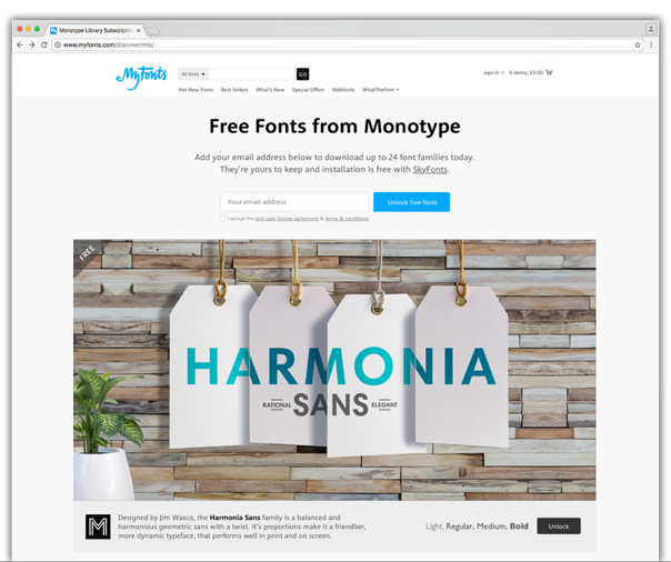
Get your hands on more than 70 awesome free fonts. The collection includes a versatile selection of serif, sans serif, slab, display and script typefaces from the Monotype Library Subscription. All yours to use for free.
|
|
|
|
Popular Designer of the Month
|
|
Each month, we add a new designer to the sidebar of popular designers on our homepage. This month, our new addition is Laura Worthington.
|
|
|
|
|
 Laura Worthington is the amazingly versatile graphic designer, calligrapher, font technician, letterer and foundry head behind an extensive collection of richly elaborate, technically accomplished and genre-defining script and lettering font families. Laura Worthington is the amazingly versatile graphic designer, calligrapher, font technician, letterer and foundry head behind an extensive collection of richly elaborate, technically accomplished and genre-defining script and lettering font families.
A MyFonts staple since early 2010, her 49 releases to date have not only been a consistent presence across our bestsellers and Hot New Fonts lists, her output has often shaped the trends and led the pack in terms of what is popular with type designers and customers alike. Her Charcuterie family established a new concept in how font families are imagined by bringing together a collection of diverse styles and formats united by a common aesthetic and designed from the outset to be a harmonious and complementary type toolkit.
Check out her latest release Fairwater, or explore the diversity of her lettering and calligraphic work with the likes of Beloved, Yana and Funkdori.
|
|
|
|
MyFonts on Facebook, Tumblr, Twitter & Pinterest
Your opinions matter to us! Join the MyFonts community on Facebook, Tumblr, Twitter and Pinterest — feel free to share your thoughts and read other people’s comments. Plus, get tips, news, interesting links, personal favorites and more from MyFonts’ staff.
|
|
|
|
|
|
|
|