|
|
|
Our newsletter for popular new fonts is a multifaceted affair this month, one in which we get to celebrate not one but two excellent recent examples of imaginative chromatic display type, a brand new multi-script family for Japanese graphic designers, a shapeshifting brush script and a frisson-inducing upright italic. Our heads are spinning with all the possibilities on offer here, and we’re only presenting them to you — good luck choosing which to try first!
|
|
|
|
|
This Month’s Rising Stars
|
|
|
|
|
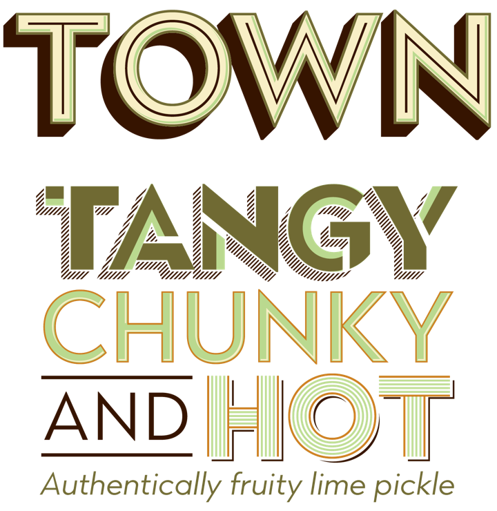
The trend for stackable chromatic type families continues apace, with Jason Vandenberg’s Town only the latest to demonstrate that this is a concept that still has a lot of scope for inventive designers to exploit. Vandenberg’s take on the genre is a substantial contribution, weighing in at over 120 separate fonts spanning a range of weights from Hairline to Black, each with such a choice 3D effects, textures, and patterns that probably not even the family’s designer knows all the permutations. What we can say with some confidence is that this will be an endlessly useful set of tools for anyone looking to build signage, packaging, branding or publishing designs.
Town’s introductory discount ends at midnight EST, March 2nd 2017.
|
|
|
|
|
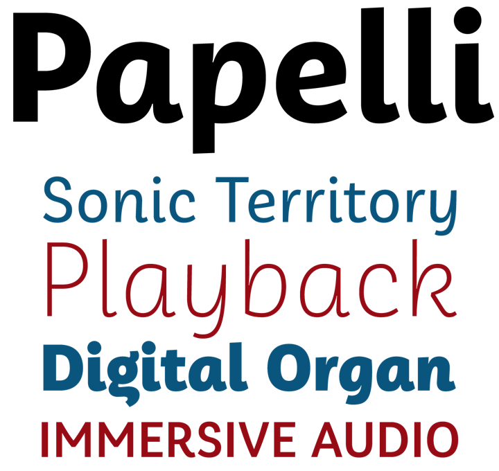
Friendly, feminine and full of personality, six-weight Papelli is a new informal sans — almost an upright italic in many ways — from French designer Julie Soudanne and German designer Alisa Nowak. Released by Indian Type Foundry, it is also influenced by the casual sans work of Veronika Burian, who Nowak worked with previously at TypeTogether. It’s nothing like Nowak’s earlier Eskapade (it’s certainly not blackletter-flavored), but it continues to develop the script and italic forms in an upright, roman shape that is one of the designer’s hallmarks.
|
|
|
|
|
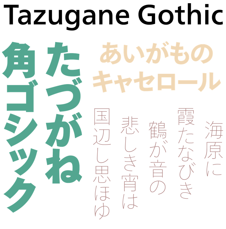
Monotype’s Tazugane™ Gothic family is a first for the foundry and the project’s lead designer, Akira Kobayashi: a comprehensive Japanese type family of ten weights offering seamless multi-script typesetting, designed by Kobayashi and his colleagues Kazuhiro Yamada and Ryota Doi to be a uniquely versatile solution for applications where Latin and Japanese scripts need to co-exist. Judging by its stellar sales and how quickly it’s being snapped up by designers in Japan and elsewhere, it also seems to meeting a long unfulfilled need there too. The Latin portion of the family is the Neue Frutiger® typeface, with spacing and metrics adjusted to match the Japanese. Elements of traditional Japanese handwriting are combined with an original, humanist style making it suitable for all kinds of multi-lingual contexts, from magazines and corporate literature in print and digital media to environmental signage and wayfinding.
Tazugane™ Gothic is on sale until midnight EST, March 10, 2017.
|
|
|
|
|
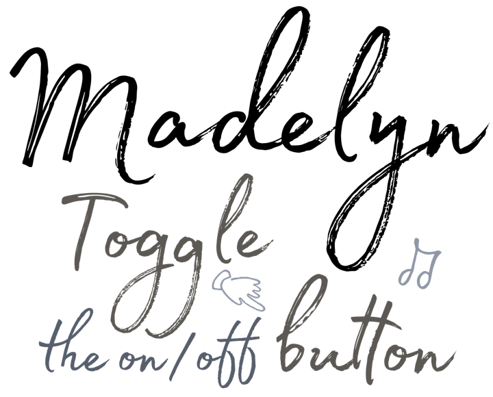
Handwritten and lively, marker-made Madelyn comes in both a regular and solid/less-detailed variety, as well as two fonts full of doodles — swashes, borders, arrows and other miscellany. Designers Jacklina Jekova and Fontfabric founder Svetoslav Simov have constructed 550+ characters, with complete Latin and Cyrillic alphabets — something a little out of the ordinary in this genre, where so many handwritten display faces are available only in Latin script. Several dozen ligatures complete the hand-made appearance and make this a perfect choice for display use.
Madelyn’s introductory discount promotion ends at midnight EST, February 19.
|
|
|
|
Text font of the Month
|
|
Typesetting for books, magazines or annual reports requires font families with special qualities: excellent readability, a generous range of weights with italics and small caps, multiple figure sets (lining, oldstyle, table) and ample language coverage. Here is this month’s pick from the recent, high-quality text typefaces.
|
|
|
|
|
|
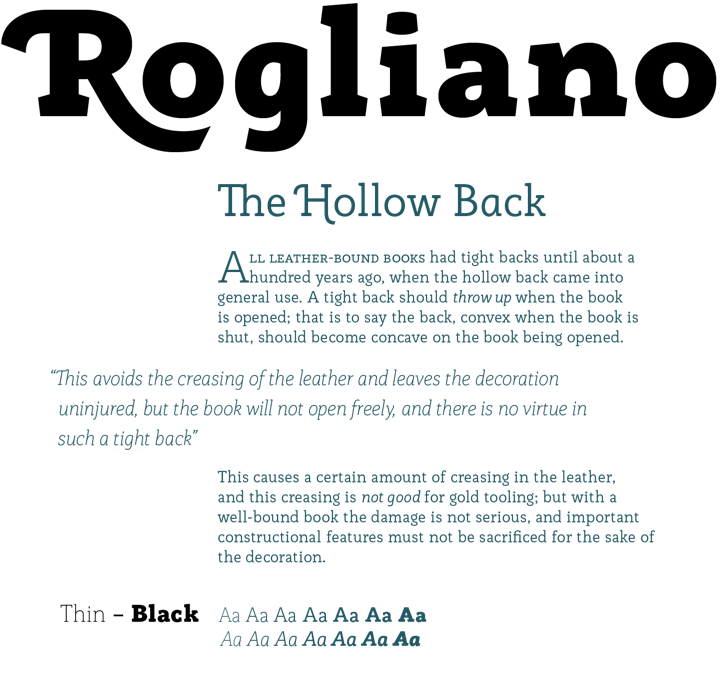
Rogliano is a slightly stressed slab family in 14 fonts — 7 weights plus italics — each including 650+ glyphs. A full complement of ligatures, small caps, swashes and William Morris-influenced borders rounds out this friendly and interesting family. Chilean designer and educator Rodrigo López Fuentes writes that it is influenced by alphabets of both the industrial revolution and Victorian eras, which is certainly apt — there are also hints of Morris’ Golden Type®, which in some ways was of both those eras, and also a reaction to the over-decorated nature of Victorian design.
Extremely legible for small text as well as finely-detailed enough to be very attractive when used in large settings, Rogliano is a fine addition to any multi-purpose type library.
Rogliano is on offer until midnight EST, March 5.
|
|
|
|
Under the Radar
|
|
With so many releases every month you might miss some noteworthy new typefaces. To help you discover them, we shine a spotlight on a hidden gem.
|
|
|
|
|
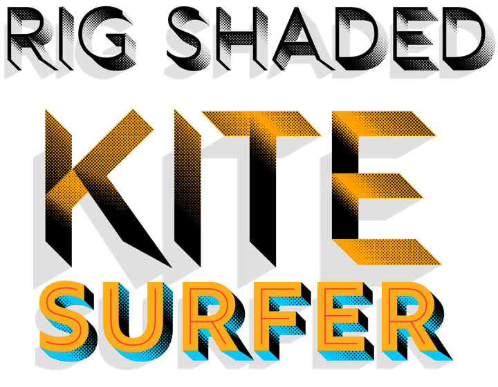
We’ve already spoken about how imaginative some of the chromatic families are that come across our desks, and here’s further evidence: Rig Shaded by Jamie Clarke may not boast the spectacular numbers of its contemporary Town, which we introduced earlier, but it represents a substantial amount of work, with lots of thought and care having gone into its execution. Check out the two shading grades optimized and hand tuned for different optical sizes, or the razor sharp Zero weight. Peruse the thoroughly helpful and well explained manual for more insight into this superb family.
|
|
|
|
News Round-up
|
|
In this section, we pick out interesting news snippets from MyFonts’ own kitchen and from the greater world of fonts, lettering and typography.
|
|
|
|
|
Share the love with font sharing
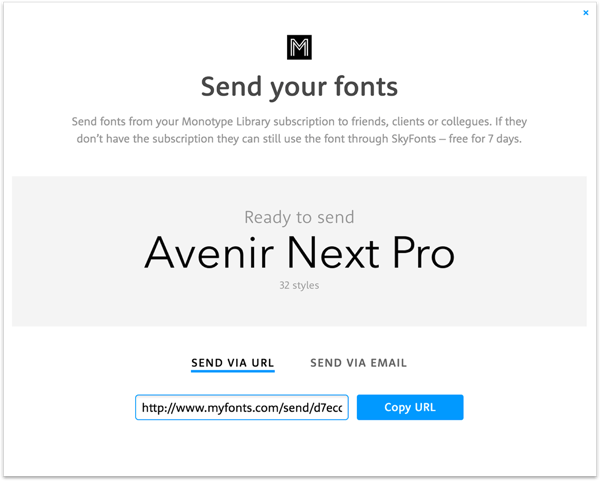
We just added a brand new feature to the Monotype Library Subscription that allows subscribers to send font families to anyone — friends, printers, co-workers, ANYONE — for collaboration, or just for use in their own projects, for free. Recipients do not need to subscribe to access the fonts and they can use them for 7 days with no charge at all through our handy SkyFonts app. Read up about this and all of the other great reasons to sign up for the Monotype Library Subscription.
|
|
|
|
Popular Designer of the Month
|
|
|
|
|
Each month, we add a new designer to the sidebar of popular designers on our homepage. This month, our new addition is Los Angeles-based calligrapher and graphic and type designer Stephen Miggas. He is known for more than 20 years’ worth of both distressed wood type digitizations and delicate scripts. His most recent releases are the bold, hand-drawn Zooja and the delicate and finely-detailed Duende.
 Stephen writes that he has always been drawn to what he calls “unique found typographic phenomena — basically finding (usually a part of) a lettering style in the world and creating a font out of it.” Ultimately, Miggas tells us that the biggest reward for his work “is the sense of a silent collaboration of sorts with the designer or art director using your font as part of their project. It’s as if they said …of all the fonts in the world, I pick yours! It makes it fun to go to the supermarket. How can you not like that?” Stephen writes that he has always been drawn to what he calls “unique found typographic phenomena — basically finding (usually a part of) a lettering style in the world and creating a font out of it.” Ultimately, Miggas tells us that the biggest reward for his work “is the sense of a silent collaboration of sorts with the designer or art director using your font as part of their project. It’s as if they said …of all the fonts in the world, I pick yours! It makes it fun to go to the supermarket. How can you not like that?”
|
|
|
|
We want to know what you think
|
|
|
|
|
Get in touch at [email protected] and tell us what you think of this newsletter. We’re looking forward to hearing from you!
|
|
|
|
MyFonts on Facebook, Tumblr, Twitter & Pinterest
Your opinions matter to us! Write to us at [email protected] or join the MyFonts community on Facebook, Tumblr, Twitter and Pinterest — feel free to share your thoughts and read other people’s comments. Plus, get tips, news, interesting links, personal favorites and more from MyFonts’ staff.
|
|
|
|
|
|
|
|
Colophon & Credits
The Rising Stars nameplate is set in Aniuk and Rooney Sans. Body text (for those using supported email clients) is Rooney Sans. The Popular Designer portrait is by Bea Davies.
|
|
|
|

 Stephen writes that he has always been drawn to what he calls “unique found typographic phenomena — basically finding (usually a part of) a lettering style in the world and creating a font out of it.” Ultimately, Miggas tells us that the biggest reward for his work “is the sense of a silent collaboration of sorts with the designer or art director using your font as part of their project. It’s as if they said …of all the fonts in the world, I pick yours! It makes it fun to go to the supermarket. How can you not like that?”