
Every once in a while, MyFonts sends out a Special Edition newsletter offering a handpicked selection of fonts which although pretty fantastic, never made any of our Rising Stars or Best Of lists. In this issue we feature twelve fine faces that have been noticed by experts but have not yet met with mass success. A dozen original and highly professional designs by high quality micro-foundries. Enjoy!

Maple
St Mika
Stereotypes is the one-man foundry of Sascha Timplan, a young German designer who was still a student when his first fonts became available at MyFonts last year. His typefaces are individualist and witty and, despite their quirky forms, balanced and usable. St Mika is dark in color yet friendly in character: with its unusual shapes it lends an unmistakable personality to headlines, logos and slogans.
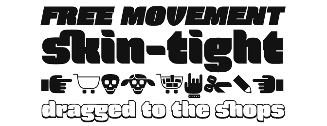
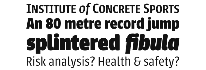
Force
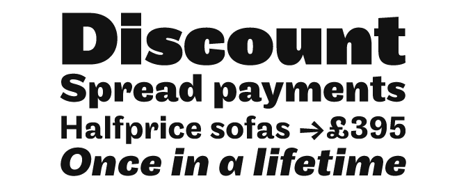
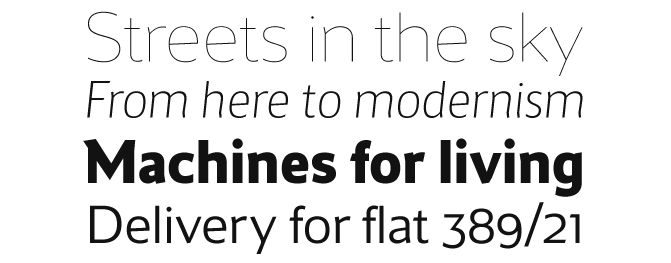
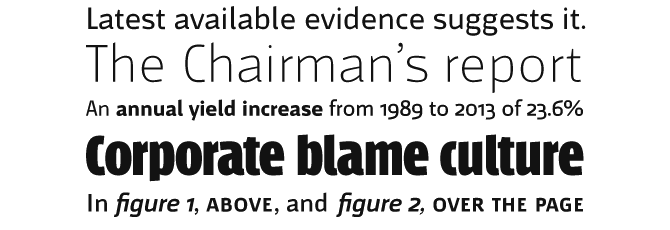
Urbana

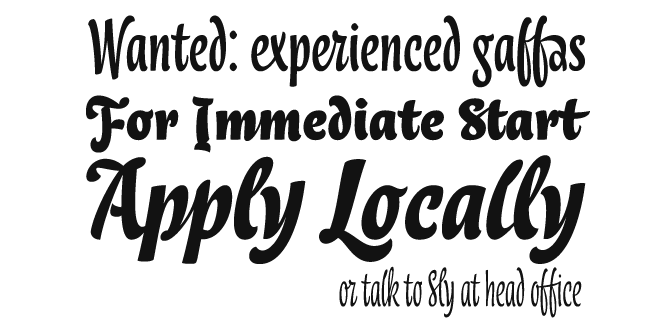
Lokal Script
Dyna
Italian designer Elena Albertoni conceived Dyna while working at a Paris agency specializing in packaging. French supermarkets are full of lettering with a handwriting flavor; Dyna is Elena’s unorthodox contribution to the genre. It dances above and below the baseline, varying the angles of its strokes in a convincingly spontaneous rhythm. It is very cleverly programmed and, when using OpenType-ready software, suggests alternate characters and special glyph combinations on the fly.
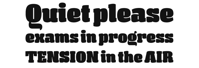
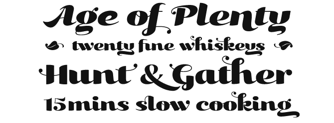
Kari Display
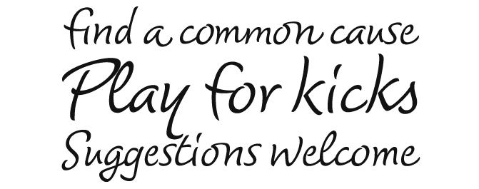
Mary Read
Mary Read by Melle Diete is a modern handwritten typeface inspired by the wind and the sea. Harsh curves are combined with graceful swashes. The font comes with a rich variety of alternates and extras: initial forms, final forms, swash letters, ligatures and ornaments. Use with OpenType-savvy design programs for optimal effect! And if you have a message for the world, layering your text frames will allow you to put your words on a Mary Read flag.

Gesta
Dobra Slab
Dobra from DSType is a very geometric and robust family of compatible Sans and Slab Serif fonts, with editorial design in mind. Dobra Slab, shown here, is a powerful face for magazines headlines but will also work well for branding. Dobra comes in five weights, from Light to Black. The OpenType fonts come with small caps, various sets of figures and ample language support.
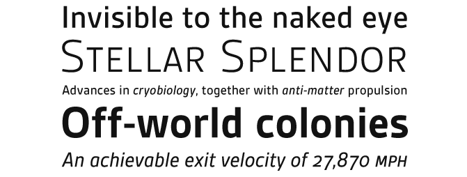
Maya Samuels
Maya Samuels is a stylish and contemporary sans-serif from Swedish designer Hans Samuelson. Characterized by its open, oval shapes and spirited detailing, is has been used for magazines as well as branding. Its wide range of styles includes a subtle Thin version as well as an authoritative Bold, and narrow yet readable italics. Oldstyle figures are built into the extended OpenType version, and accommodated in special OSF fonts for the TrueType version.
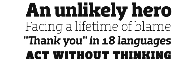
Mr Jones
Mr Jones by Richard Miller offers great value for money: an all-round, friendly, original sans-serif with multiple figure styles and small caps. Originally conceived for print design, the lowercase is wide for legibility at small sizes while the caps are rather narrow to save space and keep an even balance of negative space when used in body copy. The family comes with a distinctive ExtraBold headline face, appropriately called Mr Jones Sr.
Colophon
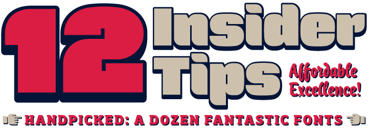
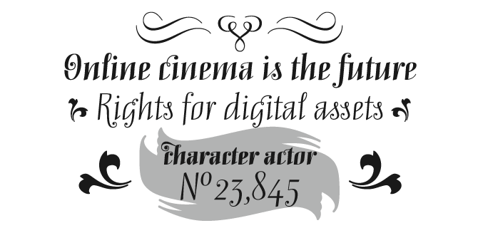
This newsletter was edited and designed by Jan Middendorp and Anthony Noel, on a template by Nick Sherman. The title graphic is set in Force, Lokal Script and Dobra Slab, the subheads are in Bryant and the background image was made using an ornament from Mary Read.
Subscription info
Want to get future MyFonts newsletters sent to your inbox? Subscribe at myfonts.com/MailingList
Comments?
We’d love to hear from you! Please send any questions or comments about this newsletter to [email protected]