
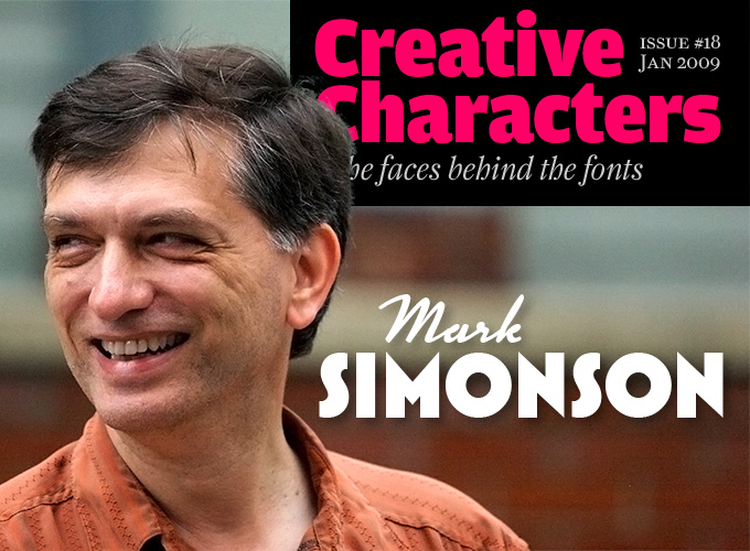
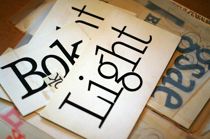
Photo by Eben Sorkin / Eyebytes
He’s one of those designers who live and breathe letterforms, whose hand-lettered titles and brand names look as if they’ve always been there. Based in Saint Paul, Minnesota, Mark Simonson worked as an art director and lettering artist for many years before being able to fulfill a lifelong dream: to become a full-time type designer. Having started out in the pen-and-ink, cut-and-paste era, he has made the transition to digital design with flying colors. Meet Mark Simonson, a contemporary craftsman.
Mark, I read that you founded your own company as an independent graphic designer and lettering artist in 2000. What did you do before you decided to go solo?
I did a couple stints at advertising art studios in Minneapolis as a graphic designer, but my main thing for the first 15 or 20 years of my career was as an art director for magazines and other publications such as Metropolis, a weekly tabloid in Minneapolis, Minnesota Monthly, Minnesota Public Radio’s program guide and regional magazine, TWA Ambassador and Utne Reader.
Lettering was something I had been doing since high school, and I always looked for ways I could apply that skill in redrawing or redesigning the logo or doing lettering for a feature story when it was called for, and later on when I was doing packaging and product designs for Minnesota Public Radio.
During all this time, when I was working as an art director or graphic designer, even back in college, I dreamed of designing typefaces. An ambitious early effort was submitting a design to ITC in 1978, but it was rejected.
When I got my first Mac in 1984, I found out how to make bitmap fonts for it using a developer tool from Apple called Font Editor and, later, a commercial program called Fontastic by a company called Altsys. In 1986, Altsys released Fontographer, a program for creating PostScript fonts. I thought I could use it to design fonts to submit to ITC, where they would be turned into “real” fonts for typesetting machines. Drawing a typeface by hand with paper and ink was laborious and time-consuming, and I thought Fontographer would be kind of a short cut. While I was playing around with this idea, the typesetting industry was turning upside down, and these PostScript fonts were starting to take the place of “real” typesetting.
By the late ’80s, this stuff had almost completely taken over, and all these new companies and people were making fonts and selling them directly to users on floppy disks and CDs. I was freelancing at the time and put some effort into creating fonts for this new market. In 1992, I submitted what I was working on to Mark Solsburg at FontHaus and he picked Felt Tip Roman, Proxima Sans, and Kandal. Felt Tip Roman was closest to being done and only took a couple of months to finish, but the other two were multi-font families and took another two years to complete. During that time, my partner and I had a baby, bought a house, and I got a full-time job again, so it was becoming harder to find time to work on fonts. And once these fonts were released, the small amount of income they brought in — even though one of them, Felt Tip Roman, was a minor hit — didn’t seem to justify the time and effort it took to make them. I set the dream aside for a while.
Both Proxima Sans and Kandal were very accomplished typefaces; they were also very respectful of tradition, especially by early 1990s standards. Who taught you how to do it?
Unless you count a couple of lettering classes I took in college, I’m completely self-taught when it comes to type design. Ever since I can remember, I’ve been drawing letters, often out of boredom or when I was supposed to be doing something else. It’s the default thing I do when I’m doodling. I fell in love with type while working on the newspaper and yearbook in high school. By the time I was in college, this combination of love for type and obsessively drawing letters led to the idea of designing typefaces. I read everything on the subject I could get my hands on — books by Frederic Goudy and Adrian Frutiger in particular. By the early ’80s, I had several typeface ideas going. Proxima Sans and Kandal came out of that period. I made a lot of false starts before any of my fonts were published, and there are many ideas from back then that never made it beyond the drawing board.
Having put your type designing career on hold for a while to take care of your young family… what prompted you to change course again and become a full-time type designer?
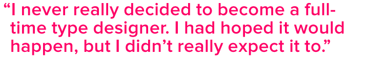
I never really decided to become a full-time type designer. I had hoped it would happen, but I didn’t really expect it to. But then in early 2000, a friend told me about this guy who was looking for fonts to sell at a newspaper trade show, which was to be held in St. Paul that year. I looked at what I had and finished four fonts that had been on the shelf from the ’90s — Refrigerator, Blakely, Felt Tip Senior, and Sharktooth. Nothing came of the guy at the conference, but now I had four fonts that were ready to sell. I discovered a sort of font consignment web store called Makambo and started selling them there. That didn’t last long — their parent company pulled the plug — but MyFonts, which hadn’t been around long at the time, contacted all the people selling fonts on Makambo, including me, and I started selling on MyFonts in spring of 2001.
But, to back up a little, something extraordinary happened at the end of 2000. My partner, Pat, was a contestant on Who Wants to Be a Millionaire. She did well enough to enable me to take six months off my freelance design business to work on new fonts. During that break, I created Coquette, Anonymous, and Mostra. I went back to my freelance work, but my font income began to increase and my dream of designing type full-time started looking a little more possible.
In 2002, I was invited to be part of the second Indie Fonts book, which P22’s Richard Kegler was then preparing. I felt that the number of fonts I had on the market was too small for the number of pages I had to fill, so I went on a crash program to finish 35 new fonts before Indie Fonts 2 was released in July 2003. I added new weights to existing fonts and introduced Goldenbook, Changeling and several others. But I still wasn’t making enough to do type design full time yet.
What made that happen was releasing Proxima Nova in 2005 — a redesign of my earlier Proxima Sans — which nearly doubled the number of fonts (by which I mean single weights) I had on the market. At that point, I was making enough from selling fonts that I didn’t need to do web or print design anymore.
Coquette
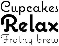
Coquette is Mark Simonson’s personal favorite. As he explains, this unconnected script was not derived from any specific existing source, yet has something familiar about it, as if it has existed forever. Combining an Art Deco feeling with some elements of geometric sans-serif, Coquette is an interesting hybrid that could have been born to French/American parents in the 1940s or ’50s. Coquette has been adopted for a wide range of uses, including packaging, shop displays and books covers.
Proxima Nova
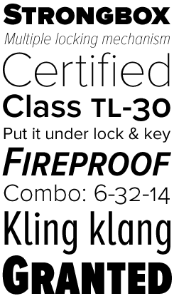
Proxima Nova is an impressive tour-de-force: a sans-serif text family spanning seven weights and three widths — 42 full-featured OpenType fonts in all. Stylistically, Proxima Nova bridges the gap between geometric typefaces like Futura and 19th-century “industrial” faces such as Akzidenz Grotesk. The result is a very original hybrid that combines the straightforward clarity of the geometric sans with the excellent readability of humanistically inspired faces.
Equipped with small caps and multiple figure styles, the basic Proxima Nova fonts provide the demanding typographer with all that she may expect from a professional text font. Nevertheless, supplementary fonts (Proxima Nova Alt and Proxima Nova ScOsf) are included to offer those same features to users of programs that do not yet support all OpenType features, such as Microsoft Office and Flash.
Kinescope
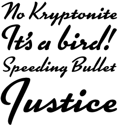
This dashing, stylish script was inspired by hand-lettered titles in Fleischer Brothers' Superman cartoon series from the 1940s. This font features advanced OpenType magic to automatically choose the most aesthetically pleasing letter shapes as you type, as well as providing extended language support. As always, recent versions of Adobe Creative Suite and QuarkXPress 7.0 or later are strongly recommended to be able to benefit from full OpenType functionality.
Some of the semi-finished artwork for Kandal from 1978 that Mark prepared in order to submit the design to ITC.
You master a wide range of lettering and type designing styles, many of which are rooted in the American visual culture of the near and distant past. Who are your main heroes and examples? What is your favorite style or period?
Most of my influences I can trace back to when I was starting out in the ’70s — Push Pin Studio, ITC (Herb Lubalin, Ed Benguiat, Tom Carnase and all those guys), Jim Parkinson’s lettering and typefaces for Rolling Stone, Phil Martin’s Alphabet Innovations, Michael Doret, and some of the stuff that Letraset was doing back then. I really like the idea of recreating or re-imagining earlier periods through lettering and typography — taking something old and making it new. I tend to gravitate towards ’30s and ’40s lettering styles, but I also enjoy working in other styles.
For a designer, what is the main difference between doing a lettering assignment, say, for branding or packaging, and designing a complete font? Is it different now from what it was like when you started out?
With lettering, each letter only needs to look good within the context of the particular word of phrase you are drawing. With a font, every letter needs to look good with every other letter in the font in any conceivable combination. With lettering, the shapes of the letters are freer, not bound by the requirement to be interchangeable and modular.
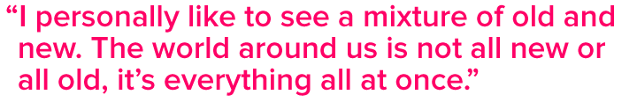
There’s a general tendency in American typography and illustration to create images that refer to shapes and tastes from the past. Do you ever feel trapped by nostalgia? By irony?
Not really. I personally like to see a mixture of old and new. The world around us is not all new or all old, it’s everything all at once. The idea of creating only things that look new and different seems limiting. Anything totally new ends up looking hopelessly dated sooner or later anyway. Very few designs are truly timeless and I don’t know if it’s possible to design something like that intentionally. If I want nostalgia, I’ll watch an old movie or look at old photos. When I decide to work in some period style, it’s usually because I just like the way it looks. Every era comes and goes, and a lot of beauty goes with it. When I look at old lettering, I try to think what was in the artist’s mind, try to bring back lost ideas, things that could be appreciated in the present, although maybe not in the same way. But I enjoy fresh, new things, too. I don’t really see a conflict. I enjoy the contrast.
Mostra
In the 1930s, the high point of Art Deco in graphic design, many countries had their own variant of geometric-yet-decorative lettering for posters and advertisements. Mostra (the Italian word for “exhibition”) is based on the alphabets created by Italian poster artists such as Plinio Codognato.
Each of Mostra’s weights includes three all-caps fonts: a basic font including the most conventional letterforms, and two secondary fonts with alternate versions of some characters. Those different letterforms can be mixed in a single word or line to capture the perfect mood or style for your coffee packaging, magazine or book cover.
I remember seeing your early work as an illustrator and lettering artist when I became interested in Garrison Keillor’s Lake Wobegon stories on Minnesota Public Radio. Tell us about your relationship with Public Radio.
I started working with them in the late ’70s as a freelance art director for their program guide. Later, I worked there full-time for about five years; I was responsible for all their design and graphics. This included packaging and products for Garrison Keillor’s A Prairie Home Companion radio show, and there were lots of opportunities for me to do lettering with that since the show often evoked an earlier time. While I was there, government subsidies for public broadcasting were being taken away. One of the things Minnesota Public Radio did to try to make up the difference was to publish a mail order gift catalog. It was called Wireless. It became so successful it had to be spun off into a separate company, Rivertown Trading, in order to preserve MPR’s non-profit status. After I left MPR in 1985, I continued doing projects for both companies, especially anything to do with Garrison Keillor, and eventually agreed to work full-time for Rivertown Trading. In 1999, Target Corporation bought Rivertown Trading, renaming it “target.direct”. I stuck around for another year, but by then, the company I’d grown to know and love didn’t seem to exist anymore and I left.
Many type designers who like to evoke past styles are avid collectors. How about you?
I don’t know if I’m a collector so much as a pack rat. There are a few things I collect on purpose, like type specimen books and printed ephemera, such as old magazines. Lately, a lot of this “collecting” has been supplanted by digital photos. I carry a small camera with me at all times now. If I see some interesting bit of lettering or typography in an antique store, I take picture. It’s not quite as nice as having the real thing, but it sure saves space.
Goldenbook
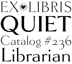
Goldenbook is based on the logotype of a literary magazine from the late 1920s called The Golden Book. It was an era when type designers were carefully, respectfully, trying to modernize the age-old structure of the oldstyle roman. A subtler contrast, longer extenders, sharper serifs… a gentrification of letterforms. Mark Simonson has brought those forms up to date, expanding the alphabet into a three-weight family with exemplary care. Goldenbook is not a text face — it is meant to be used large — but does include both old style and lining numerals.
You’re also, at times, an outspoken commentator on things typographic. Probably the most linked-to article on your website is a fiercely critical article on Arial. Do you actually get emotional about type? What was the most amusing or striking reaction to that piece?
What upsets me most is simply ignorance about type among graphic designers — about its history or how it’s used. But I try not to take it too seriously. There are more important things in life to worry about. And for people who do care about type, thanks to the web it’s easier than ever to learn about type.
I like to think my Arial article has contributed to that. Almost all the feedback I’ve gotten has been positive. One funny story I got was from a designer who said he secretly substituted Helvetica whenever his clients asked for Arial on their jobs. They never noticed.
Of your own fonts, which is your favorite? Why?
Coquette is my favorite. It’s one of my more original designs and I learned some important things when I did it. It started out as a logo idea for the Signals mail order catalog. The idea was rejected, but it kind of grabbed hold of my imagination and I sketched out what it might look like as a typeface. It seemed to bubble up from my subconscious fully formed. I can identify things that were probably in the back of my mind, like Typo Upright and Kabel, but there are a lot of things, like the little ball on the inside of the “o” that I’m not sure where they came from. One thing about it is that even though it’s new and original, it has this kind of familiar feeling, as if it’s always been around. It’s a bit mysterious. The other thing I learned from it was not to rely so much on geometry. My early attempts to digitize it failed because I tried to construct it with perfect circles. Compared to my sketches, it looked stiff and lifeless. Once I let go of the circle, and learned to trust my eye, it all fell into place.
Refrigerator Deluxe
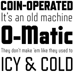
Refrigerator Deluxe is the enhanced version of the original Refrigerator, a condensed, geometric sans-serif inspired by mid 20th-century lettering styles. This new OpenType version of Simonson’s popular family comes with an expanded multiple-language character set, extra ligatures, alternate letterforms and fractions. Refrigerator is perfect for evoking the era that produced huge, humming fridges, but also graces the covers of books on contemporary politics or urban culture.
Proxima Nova has become a huge success. Are you working on another major text type family?
Yes. Lately, I’ve digitized a lot of older fonts that I didn’t design. I’ll continue to do some of that, but I want to get back to doing my own designs. I’m working on a big family that has both serif and sans-serif members. It’s partly a revival, but I don’t want to say too much about it. I don’t know how long it will take to finish, but I’ve got the foundation in place. I started working on it a few years ago and set it aside in order to get OpenType versions of some of my other fonts out. Since then, I’ve been itching to get going on it again. I expect by the time this interview is published I will be working on it again.
Finally, the self-serving question: in what way does your collaboration with MyFonts influence the way you operate?
MyFonts isn’t the only distributor I work with, but it’s the only one that sends me an e-mail every time I sell a font. It might not seem important, but those e-mails help in a funny way. It may sound superstitious, but when I’m not working on fonts, my sales go down. When I’m working on them, sales go up. So, if I have a day when I haven’t gotten many MyFonts e-mails, that means I need to get back to work on fonts. I know it sounds silly, but it works.
Well, your sales do risk going up after this interview. Don't let it interrupt your work flow, though. We definitely want to see more stuff soon!
Felt Tip Roman
Mark was ahead of his time in 1989: he was one of the very first designers to realize that his own handwriting could be made into a useful digital font. Felt Tip Roman became a very popular typeface; Bold and Heavy weights were added to broaden its usefulness. Other Simonson fonts based on the same principle include Felt Tip Senior, based on the handwriting of the designer’s father, and Felt Tip Woman, modeled on the handwriting of designer Pat Thompson.

Who would you interview?
Creative Characters is the MyFonts newsletter dedicated to people behind the fonts. Each month, we interview a notable personality from the type world. And we would like you, the reader, to have your say.
Which creative character would you interview if you had the chance? And what would you ask them? Let us know, and your choice may end up in a future edition of this newsletter! Just send an email with your ideas to [email protected].
In the past, we’ve interviewed the likes of Christian Schwartz, Dino dos Santos, Jim Parkinson, Mário Feliciano, and Underware. If you’re curious to know which other type designers we’ve already interviewed as part of past Creative Characters newsletters, have a look at the archive.
Colophon
This interview was conducted & edited by Jan Middendorp, and designed by Nick Sherman.
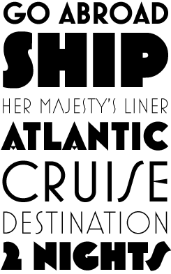
The Creative Characters nameplate is set in Amplitude and Farnham; the intro image features Kinescope and Mostra; the pull-quotes are set in Proxima Nova; and the large question mark is in Farnham.
Comments?
We’d love to hear from you! Please send any questions or comments about this newsletter to [email protected]
Subscription info
Want to get future issues of Creative Characters sent to your inbox? Subscribe at www.myfonts.com/MailingList
Newsletter archives
Know someone who would be interested in this? Want to see past issues? All MyFonts newsletters (including this one) are available to view online here.