Pular para o conteúdo
Pular para o conteúdo principal

Abrahams

por Zeptonn
Estilos Individuais a partir de $15.00 USD
A família de fontes Abrahams foi desenhada por Jan Willem Wennekes e publicada pela Zeptonn. Abrahams contém 1 estilos. Saiba mais sobre esta família

Sobre a família


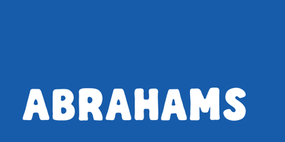
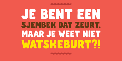
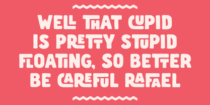
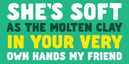
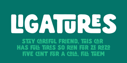
Abrahams is a warm, hand-drawn display typeface characterized by bold, rounded letterforms that exude expressiveness and approachability. Its organic shapes blend strength with softness, making it ideal for playful branding, eye-catching headlines, packaging, posters, and logo design.

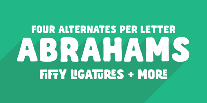
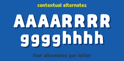
What sets Abrahams apart is its natural, hand-lettered rhythm. Each character features four alternate drawings that automatically rotate through Contextual Alternates, subtly preventing repetition and capturing the lively imperfections of authentic lettering. The outcome is typography that feels crafted rather than composed.

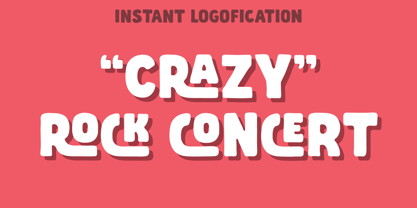
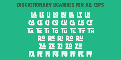
For added personality, Abrahams includes discretionary ligatures that introduce stylish, retro-inspired interlocking letterforms. It also offers standard ligatures, ordinals, and an extensive Latin character set with accented characters, making it suitable for a diverse range of languages and professional applications.

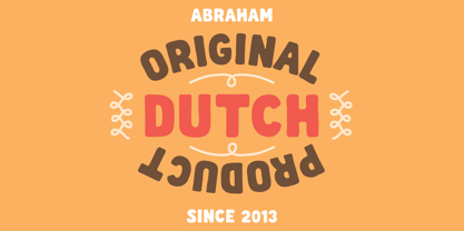
Abrahams is remarkably versatile, fitting seamlessly into contemporary branding as well as vintage-inspired designs, adding warmth and character without falling into cliché. Whether you're designing a logo, food label, café menu, editorial headlines, or social media graphics, Abrahams has a unique ability to give words an instantly distinctive identity—almost as if they were custom lettering from the outset.

Features: - Hand-drawn display typeface - Four automatic contextual alternates per character - Retro interlocking discretionary ligatures - Standard ligatures - Ordinals - Extensive Latin language support with accented characters - Alternates for a natural handwritten appearance

Designers: Jan Willem Wennekes

Fundição: Zeptonn

Estreia na MyFonts: Jul 23, 2026

Abrahams

Sobre Zeptonn

Zeptonn is the creative studio of Dutch designer Jan Willem Wennekes. With a background in illustration, art direction, and graphic design, Wennekes brings a distinctly hand-drawn sensibility to type design. His fonts are known for their organic curves, soft edges, and approachable character, translating the craft of the illustrator’s pen into expressive digital letterforms.Zeptonn’s portfolio focuses on display typography: bold, playful, and highly distinctive fonts intended for use in headlines, logos, packaging, and other applications where personality and impact are key. The designs balance weight and softness—strong, solid shapes that remain friendly and inviting thanks to their curved contours and subtle irregularities.Underlying this typographic voice is a broader design philosophy rooted in optimism, simplicity, and imagination. Zeptonn typefaces are not neutral workhorses; they are fonts that radiate warmth, tell stories, and spark interaction. Whether used in branding, editorial design, or poster work, they bring a human touch that is as vibrant as it is versatile.

Ler mais

Ler menos