


Pular para o conteúdo
Pular para o conteúdo principal

Addlethorpe

por Typodermic
Estilos Individuais a partir de $69.95 USD
Família completa com 4 fontes: $109.95 USD
A família de fontes Addlethorpe foi desenhada por Ray Larabie e publicada pela Typodermic. Addlethorpe contém 4 estilos e opções de pacote familiar. Saiba mais sobre esta família

Addlethorpe Complete Family

4 fontes

Melhor Valor!

Por Estilo:

$27.48 USD

Pacote de 4 estilos:

$109.95 USD

Sobre a família


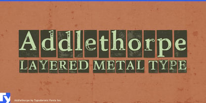
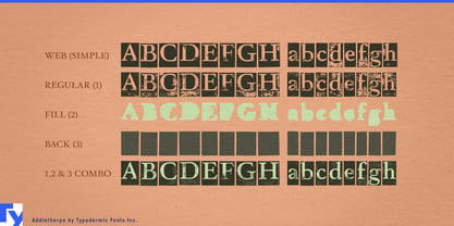
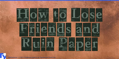
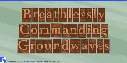
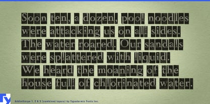
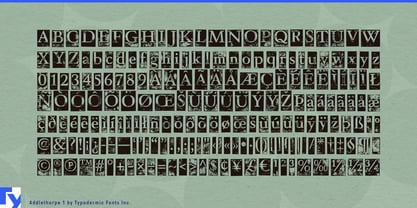
Most distressed typefaces imitate the mark left by printing. Addlethorpe goes one step backward and shows the thing that made the mark. Each character sits on its own battered metal block, turning a word into a row of physical components rather than a clean outline with texture applied afterward. Separate letter, fill and backing layers can be combined, recolored or offset independently, giving designers unusual control over how assembled, misregistered or dimensional the typography appears.

That makes Addlethorpe particularly useful for specialty printing and packaging production. Paper companies, label converters, foil and embossing houses, ink manufacturers and print-finishing firms can use it on print-fair booth walls, sample-book covers, substrate launches, swatch kits, factory-tour graphics and packaging-award displays. Different layers can carry separate brand or process colors, allowing the construction of the lettering to remain visible rather than disappearing beneath a single distressed surface.

The layered structure also opens possibilities for motion graphics. Blocks, fills and printed faces can separate, shift and reassemble across trade-show screens, launch films and process demonstrations, treating the typography as a set of components rather than a static effect.

Circular building materials provide a contemporary extension. Architectural salvage companies, reclaimed-brick suppliers, material banks and reuse marketplaces deal with components that have previous lives, irregular surfaces and individual histories. Addlethorpe’s letters behave much the same way visually: a word looks assembled from separate worn pieces rather than manufactured as one immaculate object. Material-library walls, salvage-depot graphics, reclaimed-component catalogs and reuse-pavilion headings can make that idea visible without falling back on generic recycling imagery.

Modular interior systems offer another related role. Acoustic panels, demountable partitions, modular shelving and prefabricated interiors are built from repeated units that combine into larger structures. Addlethorpe can handle product-family names, showroom graphics, configuration displays and architecture-fair headings where the individual blocks in the typography echo the modular logic of the product itself.

Printing history remains a literal and useful territory. Typography exhibitions, publishing anniversaries, book-arts programs, printing museums and documentaries about mechanical composition can use Addlethorpe when the physicality of movable type needs to be visible rather than merely implied by an old-style serif.

Addlethorpe works best where the idea of components matters: printing processes, modular systems, reclaimed materials, production environments and exhibitions about how things are made. Instead of showing only the finished impression, it exposes the pieces underneath.

Designers: Ray Larabie

Fundição: Typodermic

Fundição Original: Typodermic

Estreia na MyFonts: Apr 2, 2008

Addlethorpe

Sobre Typodermic

Welcome to Typodermic Fonts, a spirited type foundry rooted in Nagoya, Japan, started by the Canadian typeface designer, Raymond Larabie in 2001. Our library brims with 500+ diverse typefaces to fuel creativity in graphic design, advertising, web, and app development. As digital type pioneers, we adopted web fonts and app licensing early, consistently pushing the design envelope. With Canadian heart and Japanese precision, we're your global partners in extraordinary typography. Explore Typodermic Fonts—where creativity meets character.

Ler mais

Ler menos
