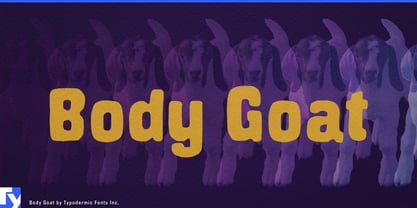
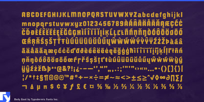
A strong color palette can lose some of its force when the typography occupies too little of the surface. Thin lettering and dry-brush textures may technically use the accent color, but there simply isn’t much of that color on the page. Body Goat takes the opposite approach. Its compact, heavily filled letterforms put broad areas of color into the composition while keeping enough irregularity around the edges to feel painted rather than mechanically solid.
Body Goat is less about showing the path of a brushstroke than about the paint itself as material. The letters feel heavily loaded, with substantial interiors and slightly unruly contours that suggest pigment pushed across a surface. In a two- or three-color layout, a headline can become a major part of the palette rather than a thin typographic layer sitting on top of it.
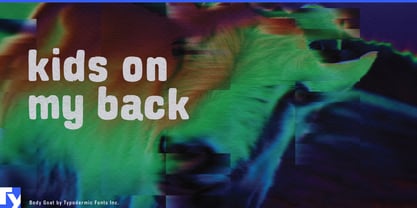
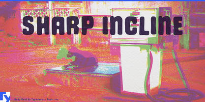
That makes Body Goat especially useful for screen-printed graphics: T-shirts, tote bags, skate decks, surf graphics, gig posters, merchandise, and limited-run prints where a small number of strong colors need to do a lot of work. Short words and compact headlines have enough mass to balance illustrations, halftones, photographs, and saturated backgrounds.
Color-driven packaging offers similar possibilities. Hot sauce labels, snack bags, candy, frozen treats, canned drinks, kids’ products, and craft supplies can use Body Goat almost like another piece of color blocking. Instead of placing type inside a colored shape, the lettering itself can provide much of that shape.
There is also a natural connection to paint, craft, and mural work: brushes, rollers, craft paint, decorating products, DIY workshops, school art programs, public murals, summer camps, and museum activities. Body Goat’s dense forms suit projects built around strong pigment and physical coverage rather than delicate brushwork.
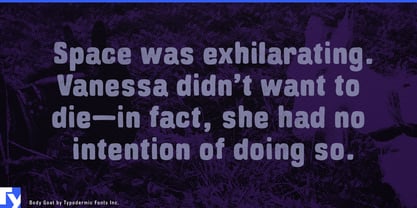
At display size, Body Goat sits somewhere between lettering and graphic shape. A short headline can carry enough visual weight to anchor a busy composition, while the painted contours keep that mass from feeling sterile. It is for designs where the typography needs to do more than wear a color; it needs to help put that color on the surface.