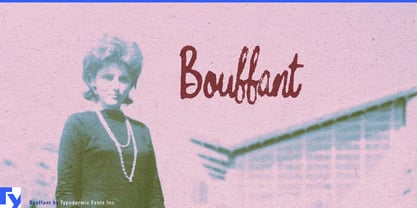
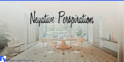
Mid-century lettering is easy to restore too well. Clean curves and polished vectors can reproduce the style of an old sign while losing the thing that made the original object convincing: years of handling, sunlight, weather, and imperfect reproduction. Bouffant keeps some of that history on the surface.
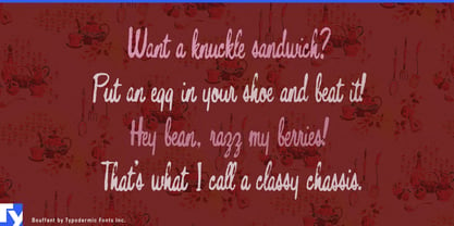
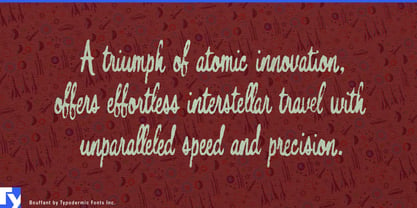
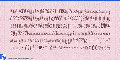
Its compact script grew from an old sign-painter’s guide that had survived through a crude scan and automatic tracing. The missing and damaged forms were rebuilt rather than simply cleaned up, preserving the curls and commercial rhythm while allowing the lettering to remain visibly worn. Pair substitutions help common combinations flow more naturally and reduce obvious repetition.
That makes Bouffant especially useful for period production design. Films, games, exhibitions, and television series set in the 1950s or early 1960s need the everyday commercial layer as much as the iconic neon sign: bakery boxes, supermarket jars, motel brochures, diner condiment bottles, beauty-salon windows, recipe cards, poolside notices, and appliance decals. Bouffant can make those objects look as though they have already been around for a while.
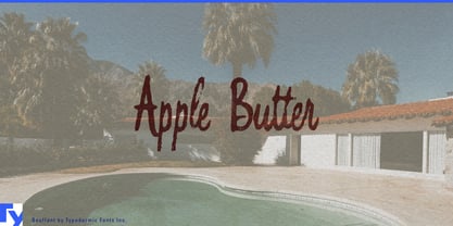
The same quality suits nostalgic pantry ranges and retro housewares. Apple butter, pie filling, bottled syrup, pancake mix, canned fruit, recipe boxes, enamel canisters, aprons, and tea towels can use Bouffant as the decorative handwritten layer while cleaner typography handles practical information. Restored motor lodges, diners, drive-ins, bowling alleys, and roadside attractions can carry it across signs, menus, postcards, souvenir shirts, and merchandise.
Bouffant is strongest when mid-century commercial lettering needs to look as though it survived rather than being freshly reconstructed. Its curls establish the period; the worn surface makes the object feel used, handled, sun-faded, and already part of somebody’s past.