


Pular para o conteúdo
Pular para o conteúdo principal

Daphyre

por Typodermic
Estilos Individuais a partir de $69.95 USD
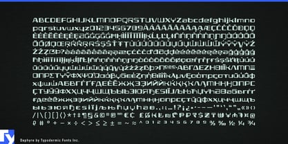
A família de fontes Daphyre foi desenhada por Ray Larabie e publicada pela Typodermic. Daphyre contém 1 estilos. Saiba mais sobre esta família

Sobre a família


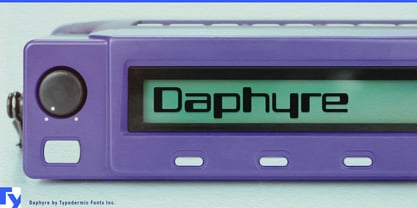
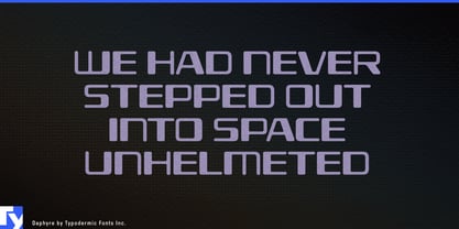
Machine-readable lettering has a peculiar visual authority. Daphyre borrows some of the simplified geometry associated with MICR characters, then loosens it into broad, open display forms. The result suggests scanning, processing and verification without looking like literal cheque typography.

That makes Daphyre especially useful for systems that sit between people and machines. Contactless payment cards, transit passes, prepaid fare systems and ticket wallets can use it for card-program names, service identities and large labels, while a more conventional sans handles account details and instructions.

Credentials offer a similar role. Hotel keycards, employee access cards, visitor passes, convention badges and event credentials all contain information intended to be checked or authenticated. Daphyre can handle the organization name, access level or pass title, adding a technical flavour without implying that the lettering itself is machine-readable.

Parcel lockers, courier services, baggage systems and automated pickup stations extend the idea from verification to routing. Surrounded by barcodes, QR codes and tracking numbers, Daphyre works well for the human-facing layer: service names, locker graphics and station headings. Warranty cards, authenticity certificates, inspection labels and numbered inserts can use the same visual language when a product needs to feel registered or verified.

Ticket machines, check-in kiosks, access-control stations and payment terminals tie these applications together. Daphyre is strongest at the identity and display level; system names, service names and large headings rather than dense interface text. Its simplified MICR flavour turns the visual language of machine recognition into a display face for contemporary payment, access, logistics and verification systems.

Designers: Ray Larabie

Fundição: Typodermic

Estreia na MyFonts: Jan 26, 2022

Daphyre

Sobre Typodermic

Welcome to Typodermic Fonts, a spirited type foundry rooted in Nagoya, Japan, started by the Canadian typeface designer, Raymond Larabie in 2001. Our library brims with 500+ diverse typefaces to fuel creativity in graphic design, advertising, web, and app development. As digital type pioneers, we adopted web fonts and app licensing early, consistently pushing the design envelope. With Canadian heart and Japanese precision, we're your global partners in extraordinary typography. Explore Typodermic Fonts—where creativity meets character.

Ler mais

Ler menos
