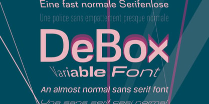
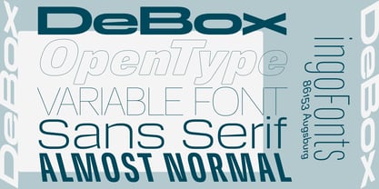
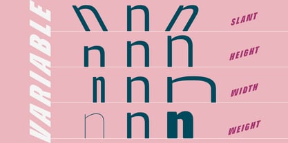
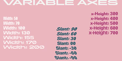
De Box Variable Font
De Box Condensed Hairline
De Box Condensed Hairline Short
De Box Condensed Hairline Tall
De Box Condensed Hairline Italic Short
De Box Condensed Hairline Italic
De Box Condensed Hairline Italic Tall
De Box Condensed Hairline Slanted Short
De Box Condensed Hairline Slanted
De Box Condensed Hairline Slanted Tall
De Box Condensed Thin Short
De Box Condensed Thin
De Box Condensed Thin Tall
De Box Condensed Thin Italic Short
De Box Condensed Thin Italic
De Box Condensed Thin Italic Tall
De Box Condensed Thin Slanted
De Box Condensed Thin Slanted Short
De Box Condensed Thin Slanted Tall
De Box Condensed Light Short
De Box Condensed Light
De Box Condensed Light Tall
De Box Condensed Light Italic Tall
De Box Condensed Light Italic
De Box Condensed Light Italic Short
De Box Condensed Light Slanted Short
De Box Condensed Light Slanted
De Box Condensed Light Slanted Tall
De Box Condensed Short
De Box Condensed Tall
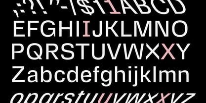
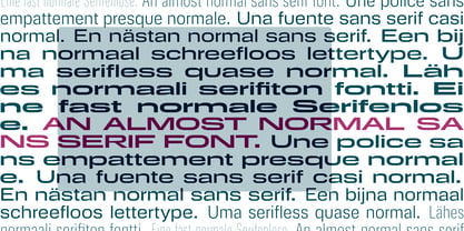
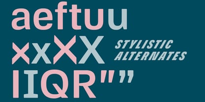
De Box Condensed Regular
De Box Condensed Italic Short
De Box Condensed Italic Tall
De Box Condensed Italic
De Box Condensed Slanted Tall
De Box Condensed Slanted Short
De Box Condensed Slanted
De Box Condensed Medium
De Box Condensed Medium Tall
De Box Condensed Medium Short
De Box Condensed Medium Italic Short
De Box Condensed Medium Italic Tall
De Box Condensed Medium Italic
De Box Condensed Medium Slanted
De Box Condensed Medium Slanted Short
De Box Condensed Medium Slanted Tall
De Box Condensed Bold Short
De Box Condensed Bold
De Box Condensed Bold Tall
De Box Condensed Bold Italic
De Box Condensed Bold Italic Short
De Box Condensed Bold Italic Tall
De Box Condensed Bold Slanted
De Box Condensed Bold Slanted Tall
De Box Condensed Bold Slanted Short
De Box Condensed Black Short
De Box Condensed Black
De Box Condensed Black Tall
De Box Condensed Black Italic Tall
De Box Condensed Black Italic
De Box Condensed Black Italic Short
De Box Condensed Black Slanted
De Box Condensed Black Slanted Short
De Box Condensed Black Slanted Tall
De Box Hairline Short
De Box Hairline
De Box Hairline Tall
De Box Hairline Slanted
De Box Hairline Slanted Tall
De Box Hairline Slanted Short
De Box Thin Short
De Box Thin Tall
De Box Thin
De Box Hairline Italic Tall
De Box Hairline Italic Short
De Box Hairline Italic
De Box Thin Italic
De Box Thin Italic Tall
De Box Thin Italic Short
De Box Thin Slanted Short
De Box Thin Slanted Tall
De Box Thin Slanted
De Box Light Tall
De Box Light
De Box Light Short
De Box Light Italic Tall
De Box Light Italic
De Box Light Italic Short
De Box Light Slanted Tall
De Box Light Slanted
De Box Light Slanted Short
De Box Regular Short
De Box Regular Tall
De Box Regular
De Box Italic Short
De Box Italic Tall
De Box Italic
De Box Slanted
De Box Slanted Tall
De Box Slanted Short
De Box Medium Short
De Box Medium Tall
De Box Medium
De Box Medium Italic
De Box Medium Italic Tall
De Box Medium Italic Short
De Box Medium Slanted
De Box Medium Slanted Tall
De Box Medium Slanted Short
De Box Bold Short
De Box Bold Tall
De Box Bold
De Box Bold Italic
De Box Bold Italic Tall
De Box Bold Italic Short
De Box Bold Slanted Short
De Box Bold Slanted
De Box Bold Slanted Tall
De Box Black Tall
De Box Black Short
De Box Black
De Box Black Italic Short
De Box Black Italic Tall
De Box Black Italic
De Box Black Slanted Tall
De Box Black Slanted
De Box Black Slanted Short
De Box Expanded Hairline
De Box Expanded Hairline Tall
De Box Expanded Hairline Short
De Box Expanded Hairline Italic
De Box Expanded Hairline Italic Tall
De Box Expanded Hairline Italic Short
De Box Expanded Hairline Slanted Tall
De Box Expanded Hairline Slanted
De Box Expanded Hairline Slanted Short
De Box Expanded Thin Tall
De Box Expanded Thin
De Box Expanded Thin Short
De Box Expanded Thin Italic
De Box Expanded Thin Italic Short
De Box Expanded Thin Italic Tall
De Box Expanded Thin Slanted Tall
De Box Expanded Thin Slanted Short
De Box Expanded Thin Slanted
De Box Expanded Light Tall
De Box Expanded Light Short
De Box Expanded Light
De Box Expanded Light Italic Tall
De Box Expanded Light Italic Short
De Box Expanded Light Italic
De Box Expanded Light Slanted Short
De Box Expanded Light Slanted
De Box Expanded Light Slanted Tall
De Box Expanded Tall
De Box Expanded Regular
De Box Expanded Short
De Box Expanded Italic Tall
De Box Expanded Italic Short
De Box Expanded Italic
De Box Expanded Slanted
De Box Expanded Slanted Tall
De Box Expanded Slanted Short
De Box Expanded Medium Short
De Box Expanded Medium
De Box Expanded Medium Tall
De Box Expanded Medium Italic
De Box Expanded Medium Italic Short
De Box Expanded Medium Italic Tall
De Box Expanded Medium Slanted Short
De Box Expanded Medium Slanted
De Box Expanded Medium Slanted Tall
De Box Expanded Bold Tall
De Box Expanded Bold Short
De Box Expanded Bold
De Box Expanded Bold Italic Tall
De Box Expanded Bold Italic Short
De Box Expanded Bold Italic
De Box Expanded Bold Slanted Short
De Box Expanded Bold Slanted Tall
De Box Expanded Bold Slanted
De Box Expanded Black Tall
De Box Expanded Black
De Box Expanded Black Short
De Box Expanded Black Italic
De Box Expanded Black Italic Short
De Box Expanded Black Italic Tall
De Box Expanded Black Slanted Tall
De Box Expanded Black Slanted
De Box Expanded Black Slanted Short