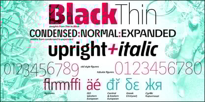
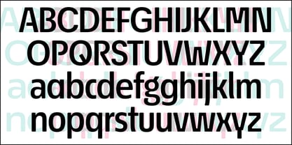
Econo Sans VF Book
Econo Sans VF Book Italic
Econo Sans Thin Condensed
Econo Sans Thin Condensed Italic
Econo Sans Extra Light Condensed
Econo Sans Extra Light Condensed Italic
Econo Sans Light Condensed
Econo Sans Light Condensed Italic
Econo Sans Condensed
Econo Sans Condensed Italic
Econo Sans Medium Condensed
Econo Sans Medium Condensed Italic
Econo Sans Semi Bold Condensed
Econo Sans Semi Bold Condensed Italic
Econo Sans Bold Condensed
Econo Sans Bold Condensed Italic
Econo Sans Heavy Condensed
Econo Sans Heavy Condensed Italic
Econo Sans Black Condensed
Econo Sans Black Condensed Italic
Econo Sans Thin
Econo Sans Thin Italic
Econo Sans Extra Light
Econo Sans Extra Light Italic
Econo Sans Light
Econo Sans Light Italic
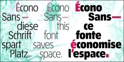
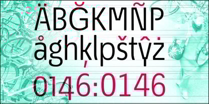
Econo Sans Regular
Econo Sans Italic
Econo Sans Medium
Econo Sans Medium Italic
Econo Sans Semi Bold
Econo Sans Semi Bold Italic
Econo Sans Bold
Econo Sans Bold Italic
Econo Sans Heavy
Econo Sans Heavy Italic
Econo Sans Black
Econo Sans Black Italic
Econo Sans Thin Expanded
Econo Sans Thin Expanded Italic
Econo Sans Extra Light Expanded
Econo Sans Extra Light Expanded Italic
Econo Sans Light Expanded
Econo Sans Light Expanded Italic
Econo Sans Expanded
Econo Sans Expanded Italic
Econo Sans Medium Expanded
Econo Sans Medium Expanded Italic
Econo Sans Semi Bold Expanded
Econo Sans Semi Bold Expanded Italic
Econo Sans Bold Expanded
Econo Sans Bold Expanded Italic
Econo Sans Heavy Expanded
Econo Sans Heavy Expanded Italic
Econo Sans Black Expanded
Econo Sans Black Expanded Italic