Pular para o conteúdo
Pular para o conteúdo principal

Eitel

por Rosario Nocera
Estilos Individuais a partir de $19.00 USD
Família completa com 6 fontes: $69.00 USD
A família de fontes Eitel foi desenhada por Rosario Nocera e publicada pela Rosario Nocera. Eitel contém 6 estilos e opções de pacote familiar. Saiba mais sobre esta família

Sobre a família


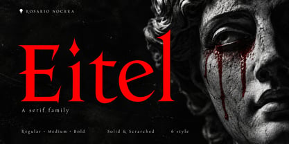
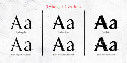
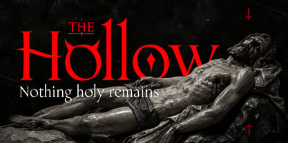
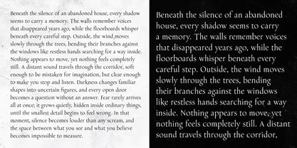
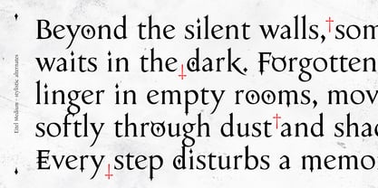
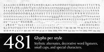
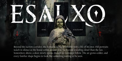
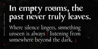
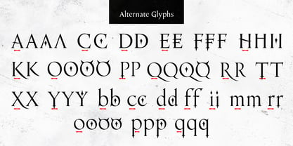
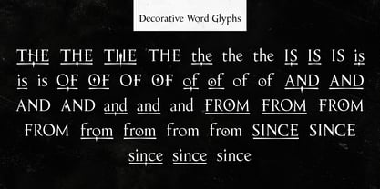
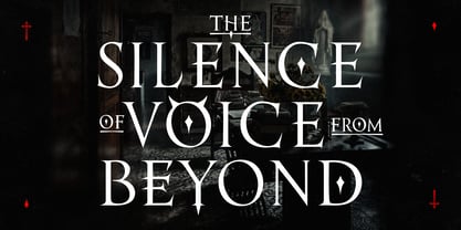
Eitel is a captivating serif type family crafted for the realms of horror, gothic fiction, and mystery. Its sharp serifs, flowing curves, and pointed details blend classical elegance with an unsettling presence, imparting a distinctive character that feels both refined and sinister. Suitable for both display and text, Eitel transitions seamlessly from large, expressive headlines to smaller paragraphs and extended text layouts. It is an ideal choice for book covers and interiors, film and television titles, theatre productions, album artwork, and posters. The unique letterforms also enhance branding and artwork that evoke an atmosphere of suspense or a darker identity. The family comprises six styles: Regular, Medium, and Bold, each available in Solid and Scratched versions. The Solid styles showcase the crisp contours and sculptural qualities of the letterforms, while the Scratched versions introduce a worn texture that adds depth and a sense of decay. These three weights provide flexibility for establishing hierarchy across titles, supporting text, and comprehensive editorial compositions. Each style includes 481 glyphs, featuring stylistic alternates, small caps, decorative word ligatures, and special characters. Horned forms, diamond details, and extended terminals enable designers to create a more dramatic expression for selected letters. Additionally, decorative versions of common words such as “the,” “is,” “from,” “since,” “of,” and “and” offer further opportunities for composing distinctive titles, integrating even the smallest elements into the overall design.

Designers: Rosario Nocera

Fundição: Rosario Nocera

Estreia na MyFonts: Oct 4, 2026

Eitel

Sobre Rosario Nocera

Rosario Nocera is an independent Italian type foundry shaped by the expertise of an art director and graphic designer. With a robust background in visual communication, the foundry specializes in crafting distinctive typefaces that blend expressive character, originality, and practical versatility. The collection primarily delves into display typography, featuring font families tailored for bold headlines, book covers, film titles, posters, branding, and editorial projects. In addition to these expressive designs, the catalog also offers versatile type families suitable for smaller headings and, in select cases, extended passages of text. Horror, fantasy, gothic atmospheres, and mystery serve as recurring sources of inspiration, alongside nature, organic forms, and environmental themes. From dramatic serif typefaces to experimental lettering and contemporary sans serifs, each family is meticulously developed with its own visual identity and creative purpose. The foundry's philosophy is rooted in the belief that typography should transcend mere word communication; it should create atmosphere, evoke emotions, and provide every design project with a distinctive voice.

Ler mais

Ler menos
