Most brush scripts work beautifully when the designer controls the words. Dynamic systems are less cooperative. A sports template eventually receives MVP or U18; a restaurant promotion gets BBQ or BLT; personalized merchandise arrives with USA, BMX, or somebody’s surname typed entirely in capitals. Many scripts handle flowing words gracefully, then fall apart when several capital letters have to stand together.
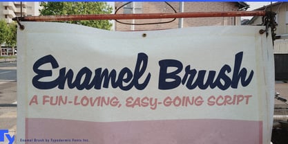
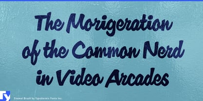
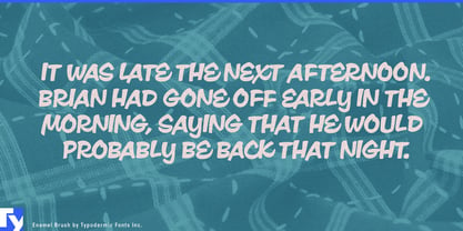
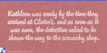
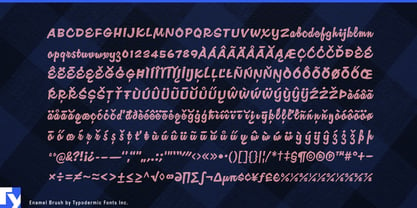
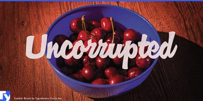
Enamel Brush is unusually good at surviving that problem. Its capitals come from a tradition of mid-century commercial brush lettering in which uppercase forms could combine into convincing words rather than behaving like a row of oversized initials. The strokes are broad, blunt, and emphatic, giving the design more of a painted advertising voice than elegant calligraphy. Mixed-case lettering still flows naturally, but capital sequences can remain part of the same visual system.
That makes Enamel Brush particularly useful for automated sports and motorsport graphics, where changing player names, team initials, classes, positions, and abbreviations arrive long after the original template was designed. MVP, BMX, GT3, P1, DNF, USA, or an unexpected surname can appear without forcing the design to abandon its brush-lettered headline voice.
Customer-personalized merchandise creates the same challenge. Garage signs, team shirts, automotive decals, bowling shirts, tumblers, and souvenir products may let customers enter whatever wording they want; sooner or later somebody types AJ’S GARAGE, BMX DAD, or the entire family name in capitals. Digital food promotions face similar surprises with BBQ Bacon Melt, BLT Special, XL Sundae, or IPA Night.
Enamel Brush also works well for changing venue and hospitality graphics, from bowling centers and roller rinks to drive-ins and retro resorts, where DJ Night, VIP Party, BBQ Weekend, tournament names, and seasonal promotions cycle through screens, social graphics, merchandise, and signs. It is a brush script for situations where the designer cannot know every word in advance; the painted character stays intact even when the copy refuses to behave like script.